
Wireframes are a powerful way to spot issues before they become expensive problems. But what’s the right approach?
Have you ever poured your heart and soul into a website design, spending weeks tweaking every pixel to achieve perfection? Only to launch it with fanfare and then…crickets? Disappointed user engagement metrics reveal a harsh truth: your masterpiece is confusing and frustrating to navigate.
Design free website wireframes with Justinmind

Or maybe you’ve been on the other side, part of a large design team where communication breakdowns lead to a never-ending cycle of revisions. One stakeholder wants the hero image bigger, another wants a complete layout overhaul. By the time everyone’s “brilliant ideas” are implemented, the website resembles Frankenstein’s monster — a stitched-together mess that achieves none of its original goals. We, here at Justinmind, want to let you know that you’re not alone. There’s a simple solution: UI website wireframe design.
Website wireframes tend to be compared to the classic blueprints for any construction project – a clear picture of how things are going to look, in broad strokes.
They are meant to be a practical map, so everyone can see exactly what goes where inside the project. They can be incredibly handy in terms of both product development and communication – aside from being relatively cheap to build.

Just like your good old blueprint, your wireframe has the potential to become your dream-house with the right interactions and components that make an experience great. The wireframe is meant to show your website’s structure, and show the main components of each screen.
Any given wireframe can be split up into 3 different components:
- Information architecture: organize every piece of content and visual components to ensure a logical and enjoyable user experience.
- Navigation /structure: show global and secondary navigation elements to make sure users can move freely around the product with ease.
- Layout design: includes a few visual elements of the interface before the heavy lifting of visual design begins.
A wireframe is basically a map to your website. They are meant to be simple, making wireframes a fast tool to get the design going. But there is another concept at play here, which relates to the degree of detail you apply to your website wireframe: the level of fidelity.
Like most things in UX design, there’s no one-size-fits-all answer for wireframe fidelity. It’s about finding the sweet spot between time investment and getting the details you need at the right time.
Low-fi wireframes are great for tossing around a bunch of rough ideas quickly. They won’t win any beauty contests, but they’ll help you figure out where things should go without getting hung up on fancy details. This is especially handy if you’re short on time.

High-fidelity wireframes, on the other hand, can get pretty close to the real deal. Some designers even throw in real content and interactions to get a super clear picture of how the final product will work. But all that detail takes time to create, so they’re best for later stages when you’re ready to polish things up and get feedback from stakeholders.
The key thing to remember is to start low and slow. Don’t jump straight into high-fidelity heaven. Sketch out some low-fi wireframes to nail down the basic structure and information architecture first. That way, you can make sure your house is built on a solid foundation before you worry about fancy wallpaper.

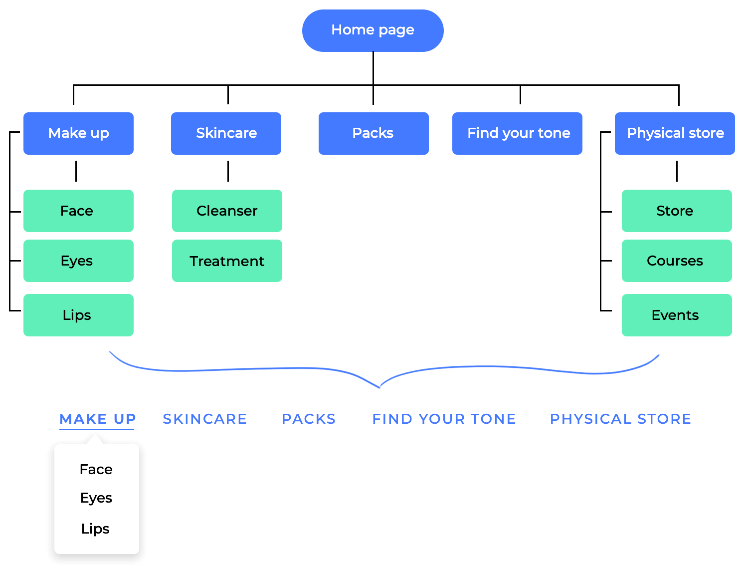
Imagine building a house without a blueprint. Sure, you might eventually get walls and a roof up, but it would likely be inefficient, disorganized, and potentially lead to major problems later on. The same goes for building a website — a sitemap acts as the blueprint for your UI website wireframe, laying the groundwork for a smooth user experience and a successful website.
Taking the time to create a clear and well-defined sitemap upfront will lead to a more efficient design process, a user-friendly website, and ultimately, a successful online presence. Here are more reasons why building a sitemap before diving into your wireframe is essential:
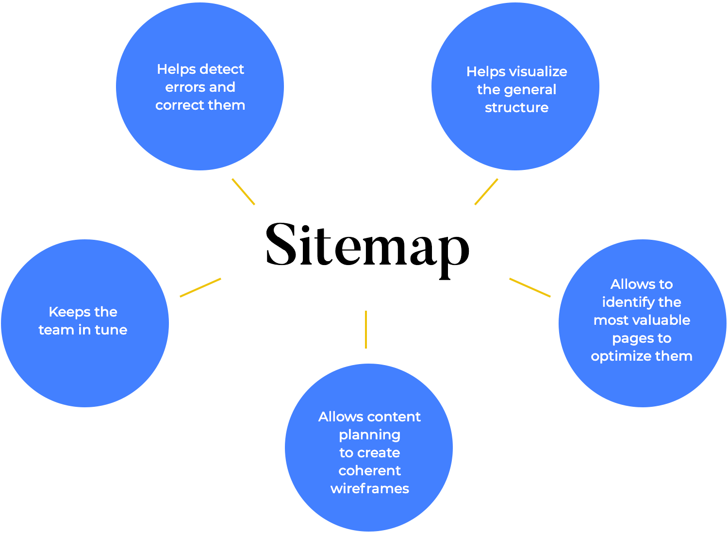
A sitemap forces you to think about the big picture. It helps visualize the overall structure of your website, ensuring all the necessary pages are accounted for and logically connected. By planning the logical flow users might take, your wireframe can guide them through a journey, from browsing categories to specific products or important information. The sitemap also ensures consistent content presentation across pages, creating a sense of familiarity and reducing complexity. Ultimately, a good sitemap lays the foundation for a user-friendly website reflected in your wireframe. This clarity translates to your wireframe, creating a website that flows intuitively for users.
Not all pages are created equal. A sitemap allows you to identify the most important pages (like your homepage or product pages) and prioritize their placement and functionality within the wireframe. A sitemap isn’t just a list of pages, it’s a tool to identify your website’s MVPs (Most Valuable Pages). These traffic magnets, like your homepage and product pages, deserve special attention in your website wireframe, which means that you must give them a prominent position for easy discovery and optimize them for conversions.
A well-defined sitemap also helps you understand the user’s goals on each page. For example, the “Contact Us” page should prioritize clear contact information, while the “About Us” page focuses on building trust with elements like testimonials. Finally, the sitemap allows you to visualize the content hierarchy. The homepage might offer a high-level overview with clear CTAs leading users to more detailed content on specific pages. By prioritizing based on traffic, user goals, and content hierarchy in your wireframe, you create a website that caters to user needs and achieves your business objectives.
When considering the hierarchy of information, this translates to prioritizing elements in your wireframe. For instance, a homepage sitemap outlining a company overview might lead to a wireframe with a captivating hero image and a concise mission statement to grab attention, followed by sections with more details.
Also, by understanding the type and amount of content planned for each page you can then design a visually appealing wireframe that avoids overwhelming users with text. A long blog post sitemap, for example, would inform a wireframe that incorporates clear headings, bullet points, and even explanatory images to make the content easier to digest. Just like an outline of an article!
A well-organized sitemap is the secret weapon for a website that delights users with its intuitive structure. Imagine a theme park map guiding visitors to exciting attractions — that’s what a sitemap does for your website. It translates into a user-friendly wireframe by designing a logical flow between pages.
An e-commerce sitemap, for example, might outline a path from browsing categories to product pages and checkout. Your wireframe would then reflect this journey by positioning elements to guide users through that process.
But it’s not just about the path — a clear navigation system is crucial too. The sitemap prioritizes this, ensuring your wireframe incorporates a user-friendly and consistent navigation menu across all pages, acting like clear road signs throughout the theme park.
A sitemap acts as a shared vision, ensuring developers, designers, and content creators are all on the same page from the start by outlining the website’s structure and goals. This early collaboration goes a long way in identifying potential issues like missing pages, confusing navigation, or content gaps before any design work begins. Catching these snags early in the sitemap phase saves time and resources compared to fixing them later in development when changes are expensive.
But the benefits go beyond just avoiding headaches. A well-defined sitemap also empowers each team member to focus on their specific role. Developers get clarity on the technical structure, designers can visualize the user experience based on the planned content and navigation, and content creators can brainstorm content specific to each page. By acting as a roadmap for everyone involved, a sitemap streamlines the entire website development process.
While online generators offer a quick and convenient option, crafting your sitemap manually grants you more control and flexibility. Here’s a breakdown of the steps involved in creating a sitemap by hand:
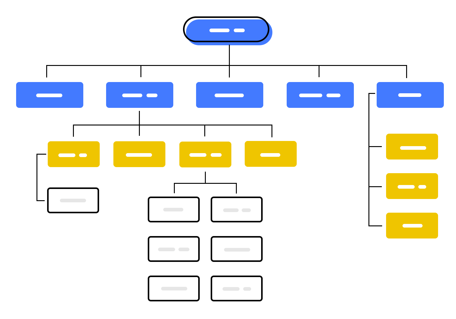
- Brainstorm and list your pages: Start by brainstorming all the pages you envision on your website. This might include your homepage, about us page, contact us page, product or service pages, blog posts, and any other relevant content.
- Organize the hierarchy: Once you have a list of all your pages, organize them in a hierarchical structure. Imagine the most important pages (like your homepage) at the top, branching out to more specific pages (like product pages) nested underneath. This hierarchy reflects how users would navigate through your website.
- Include additional details (optional): While a basic structure is essential, you can enhance your sitemap by including additional details for each page. This might include the page title, a brief description of the content, the frequency of updates (if applicable), and the priority you assign to that page (high, medium, low).
- Use a spreadsheet or document: There’s no special software required. A simple spreadsheet program like Microsoft Excel or Google Sheets, or even a word processing document, can be used to create and organize your sitemap.
Design free website wireframes with Justinmind
User flows ensure your design prioritizes the actions and information users truly need, keeping things focused and user-friendly. They also help identify the natural flow between different parts of your interface, resulting in clear and intuitive navigation within your wireframe.
But user flows aren’t just about the happy path — by mapping them out, you can proactively uncover potential roadblocks or confusing elements before any design work begins, saving time and resources down the line. Ultimately, user flows put the user at the center of the design process, allowing you to create website wireframes that anticipate user needs and deliver a smooth, intuitive experience.
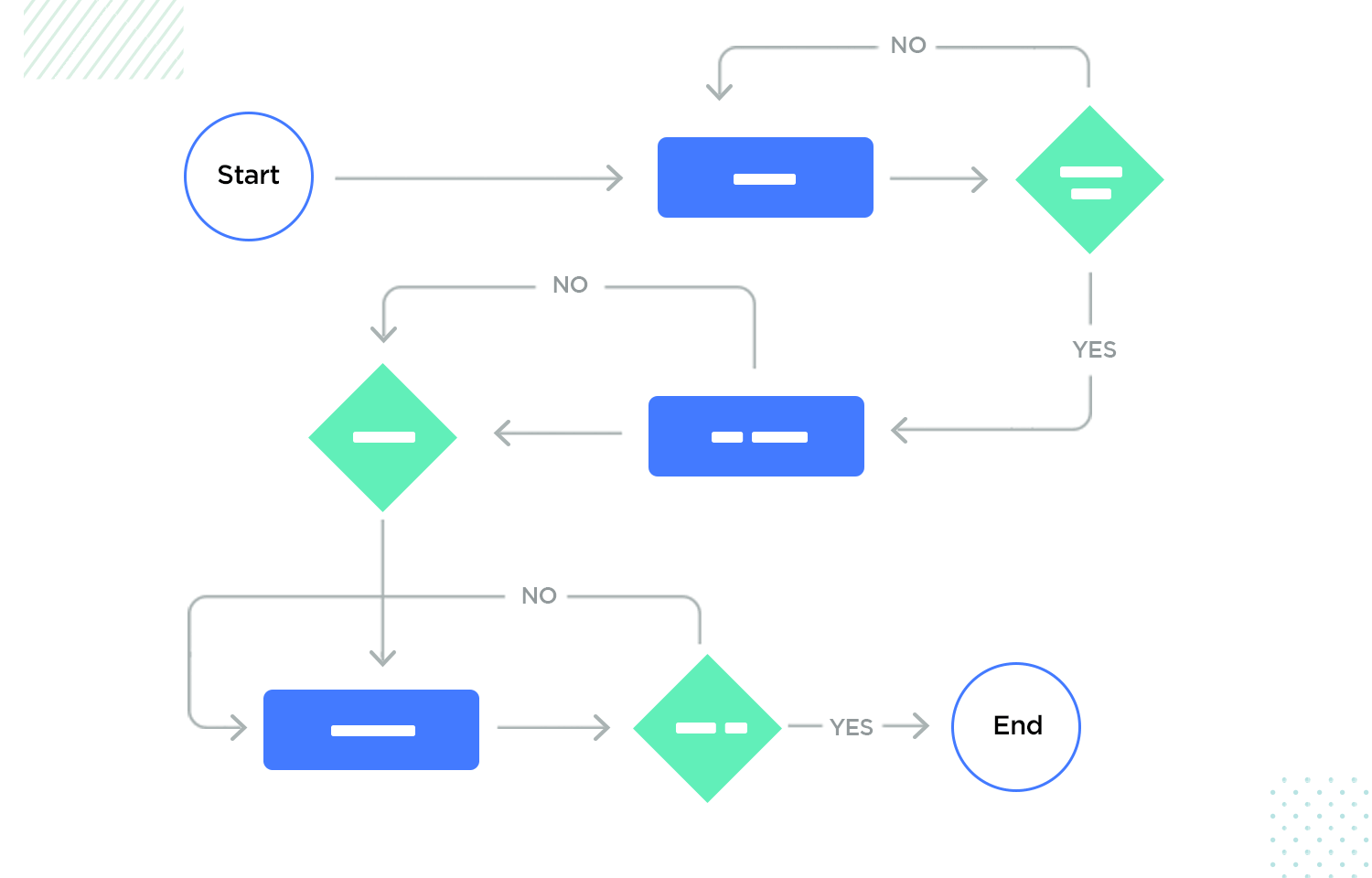
Here’s a step-by-step approach to creating user flows for your website wireframes:
- Define user personas: Start by identifying your target user personas. These are fictional representations of your ideal users, with specific goals and needs. Understanding your personas helps you tailor the user flows to their specific journeys.
- Brainstorm user goals: For each persona, brainstorm the key goals they might want to achieve on your website or app. Examples might include “purchase a product,” “find contact information,” or “read a blog post.”
- Map out the steps: For each user goal, map out the specific steps a user would take to achieve it. This might involve listing out page visits, interactions with elements, and decisions they might make along the way.
- Visualize the flow: There are various ways to visualize your user flows. Simple flowcharts with arrows connecting actions are a good starting point. More complex user flows might benefit from wireframe sketches or user journey maps that depict the entire user experience.
- Refine and iterate: User flows are not set in stone. As you develop your website wireframes and gather user feedback, revisit and refine your user flows to ensure they remain aligned with user needs and goals.
This section will guide you through the essential UI elements you’ll need to include in your website wireframe, ensuring a clear and effective layout for your users.
First things first, let’s create the overall layout for our web wireframe.
In a new web prototype, go to the Screens palette in Justinmind’s editor. Notice that one screen has been created for you by default. Click the ‘+’ icon and create three additional screens. Name your screens as the pages you would like them to reflect to be able to identify them as you work.

Next, let’s create a template with all the content that will appear on every screen of the site. To do so, go to the Template palette. Drag a header from the Headers category in the Web components library and place it on the canvas inside your template.
Your Homepage also needs a footer. There’s a great range of footers to choose from within the Web wireframe kit. Drag your chosen footer to the canvas to add it to your template.
Your header and footer will appear in all of your wireframe’s screens.
Now it’s time to design your website’s Homepage.

In the Screens palette, select the Homepage screen. Notice that the header and footer we created for our wireframe also appear in this screen. To reproduce our Homepage, drag a content block to the center of the canvas. This will be where the body of the Homepage goes.
To create the body of the screen, you could use individual Rectangle, Text and Image widgets. Alternatively, you can choose from the selection of readymade screens in the Web wireframe widget library.
If you’d like to preview your site’s features, consider using a slider or carousel. These allow multiple pieces of content to occupy a single region on your Homepage. If designed appropriately, they can be a great navigation resource and help you inform users.
Now select the Features page (in the Screens palette).

First, let’s create a search bar so that users can search for features and other useful information on our site. Drag the block to the canvas and place it below the header. If you’d like to add filter options so that users can refine their search, say by size, color, price or rating, you might want to add a Slider from the Components section of the library. Then, choose a content block to display your product features.
Wireframing for websites presents unique considerations that go beyond the general principles of wireframing. Here are some key aspects to keep in mind when creating UI website wireframes:
- Responsive design: Adapt layouts and interactions for various screen sizes (smartphones, tablets, desktops, large screens).
- Viewport & scrolling: Consider element arrangement and scrolling behavior across different device viewports.
- Large screen optimization: Address element spacing and user interaction for large displays.
- Navigation testing: Explore and test different navigation styles (horizontal menus, sidebars, dropdowns) for user-friendliness.
- Clear CTAs: Make CTAs visually prominent and easy to find.
- Accessibility: Ensure website wireframes consider accessibility guidelines (color contrast, keyboard navigation, screen reader compatibility).
Design free website wireframes with Justinmind
Wireframes can be a good deliverable to communicate design ideas to your team, but you should always be careful when using them with other stakeholders. Some stakeholders might not be able to fill in the blanks with their imagination, which makes a basic wireframe seem disappointing.
With that said, website wireframes can still be used to communicate ideas to stakeholders – when done properly. After all, sometimes people need to see it to believe it and tight deadlines make presenting wireframes a necessity. Here’s how to use your website wireframes and still get the presentation to deliver a good impact.
Some people have a hard time with wireframes. While designers will look at a wireframe and see the beautiful design they imagined, that leap may not come so easily for a developer, engineer, analyst or marketing team.
You need to know who is going to be in your audience and tailor the presentation accordingly. If you’re presenting to a room full of analysts who tend to focus on the bottom-line, a low-fidelity wireframe is definitely not the right way to go. Marketing people might have a bit more imagination to look past the placeholders and into a possible finished design. But what of the client? Can the client make the leap?

Another way in which you need to tailor the presentation to the audience is the depth of details. If the people in the audience don’t know anything at all about UX design, it’s probably not a good idea to get down to the nitty-gritty of navigation flows and microinteractions that will be added to the wireframe.
A wireframe without context is meaningless, especially to people who weren’t involved in the making of that wireframe. Your website wireframes should flow from one to the other in a logical and meaningful way, with a complete story that has a beginning and an end. This will help your audience understand better what you’re showing them, as well as what it all means.
You can place your website wireframes presentation in context by way of a user scenario. Scenarios show the motivation for user actions, the conditions surrounding those actions and the end goal. This can be a useful way to give the audience a certain context, helping them imagine the situation in their mind.

When you know your audience, you’re better equipped to speak to them in a language they understand. If you’re presenting to a room full of business executives, phrases like card sorting, empty state and modal window might fly over the heads of the people in the room, which takes away from the power of the presentation.
In truth, you want to generally stay away from jargon just for the sake of clarity. You want to draw people in and get them to see what you see when looking at the wireframe. You don’t want them wondering what card sorting or a modal window is.
It’s true that if you’re presenting to a room full of designers and creative professionals, you may want to get down to the nitty-gritty details — the specifics. It will all depend on who it is for and what message you want to convey to the audience. However, if even one of the people in the audience doesn’t have a design background, we’d advise you to speak in layman’s terms.
A UX presentation is a chance to inform and educate your audience. You want them to understand where you stand in the design process, where things are headed and what waits for everyone at the finish line. However, it doesn’t need to be a one-sided conversation. To get the most out of your wireframe presentation, you want your audience to engage with the content you’re showing them.
By opening the presentation to questions, you invite the audience to participate and interact with the wireframe. Especially effective are open-ended questions that you can ask. These can be a powerful way to make the audience see a point without you having to flat-out say it, helping them see why the wireframe is the way it is.
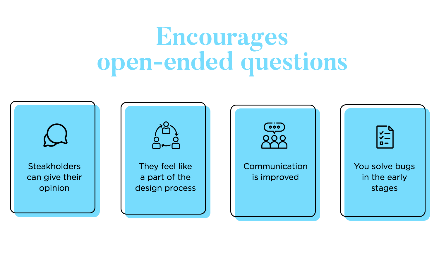
If your audience isn’t design-savvy then there’s a good chance they’ll refrain from participating at first because of how foreign all the concepts at play are. It falls on you to create an environment where they feel comfortable commenting on your wireframe, giving you their true opinion about the work.
By creating room for non-designers to give input, you’re helping them be a part of the design process. This will help you in the long run as you continue through the stages of the design, improving general communication and making sure everyone is on the same page.
In the run-up to a wireframe presentation, you’ll undoubtedly have created a lot of information that’s pertinent to the wireframe: user personas, journeys, research, etc. Add these supporting materials to your deck. These documents might indeed be a strange sight to some people in your audience, but they provide insight into the bigger picture — by contextualizing the website wireframes.
If you have to provide the presentation to stakeholders afterward, make sure it’s organized properly and the information flows in the right way. This means that your presentation needs to be easy to understand without you there to explain the details.
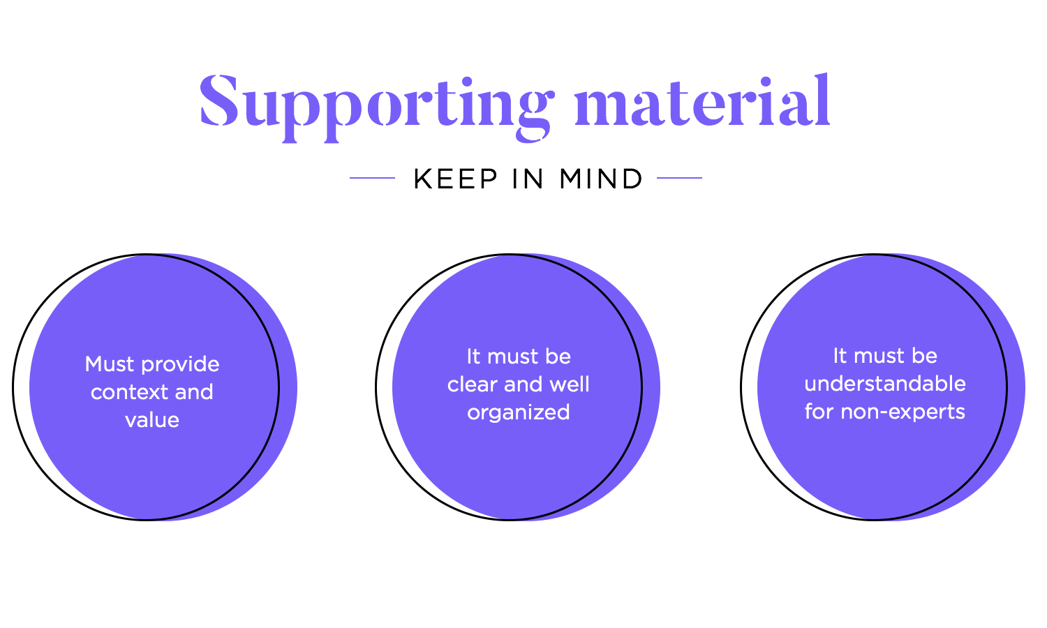
You might want to create the deck in various file types too: PDF, PowerPoint, and Google Slides. Not everyone uses the same pieces of software, so it’s best to cover all bases when it comes to a presentation deck. Regardless of the format you choose, the important thing is to deliver the material in an organized manner so the stakeholders can make sense of it on their own.
There are two primary methods for sharing website wireframes created in Justinmind:
This method is ideal for sharing wireframes with colleagues or clients for feedback and collaboration. Here’s how to do it:
- Access the sharing options: Open the Justinmind project containing the wireframe you want to share. Go to the top right corner and click on the user image to share with reviewers and developers.
- Choose sharing permissions: In the “Share with editors and viewers” dialog, select “Can view” from the permission dropdown. This allows recipients to view the wireframe but not edit it.
- Invite reviewers: Enter the email addresses of the people you want to share the wireframe with. You can also select reviewers from your existing Justinmind contacts list.
- View in my account: Once the invitees accept your invitation, the wireframe will be accessible to them in their “My Projects” section on Justinmind.com.
- Remove viewers: You can remove viewers at any time by clicking the three dot menu to the right of each user and selecting “Remove”.

This method is useful for sharing website wireframes with a wider audience or for embedding them in presentations or documents. Here’s how to do it:
- Access the link generation option: Right-click on the project containing the wireframe you want to share and select “Get link” from the context menu.
- Choose sharing scope: In the “Get link” dialog, select either “Only people with access can view” or “Anyone with the link can view” depending on your desired sharing scope.
- Copy the shareable link: The unique shareable link will be displayed in the dialog. Copy this link and share it with others as needed.
Design free website wireframes with Justinmind
Justinmind empowers you to create both static and interactive wireframes for your websites. For static wireframes, imagine your website as a house. Just like using building blocks, Justinmind’s drag-and-drop interface lets you easily assemble the essential elements of your web pages. Headers, navigation menus, content areas, and footers — all these foundational components are at your fingertips, allowing you to quickly sketch out the overall structure and user journey of your website.
But Justinmind goes beyond static snapshots. With interactive features, you can transform your flat design into a dynamic experience. Imagine a button that, when clicked in your wireframe, smoothly transitions to another page. Create clickable hotspots to showcase interactive elements or define clear navigation paths. This interactive approach allows you to refine the user flow of your website before any coding begins, saving you valuable time and resources down the line.

A UI kit is basically a group of interface elements that are ready for you to use in your wireframe design. The kit can be narrow and deal with a specific kind of element, such as buttons, or be broad and work as a one-stop shop for any of your initial website wireframes.
A UI kit can save you hours and hours of time in the long run. Remember the last time you moved to a new place? Go back to the first time you went to your new supermarket.
A visit to a brand new market will be much longer than to your usual market, given that you will need to search for every single item as opposed to just getting it and moving on. That familiar supermarket that you’ve been a loyal client of for the past few years is your favorite wireframing UI kit.

A UI kit will help you use real elements in your wireframe from the start, making it easier to develop on them as the project evolves. With pre-designed blocks, placeholders and icons, your UI kit will act as a base for the website wireframe, allowing you to design any screen in a quick fashion.
Another reason why you should invest in a quality UI kit is that it will work as your ally in making sure you have a consistent design — assuming you don’t work with design systems that will already have a pre-selected UI kit for the project.
It’s the perfect starter pack for getting your UI website wireframe off the ground. Armed with over 500 different components, you’re bound to find an element fit for your every need.
The kit includes everything from your regular buttons, social media sharing buttons, pricing tables to pre-arranged ways to display content. It’s all at your fingertips!
The main reason this wireframing UI kit is likely a great ally is that it’s so versatile, even if you plan on changing the style later on in your design process. We’ve mentioned before that your UI website wireframe isn’t the stage to worry about styles of buttons or focus on the color scheme of the product.

You want to keep a close eye on the structure and functionality of the product at every level, and you don’t necessarily need a fancy UI kit for that – you do need, however, a complete one!
Spare yourself the trouble of looking for individual components and speed up the creation process by having a single library that offers every component you’ll ever need for your wireframe design.
Check out Justinmind’s Wireframing UI kit – it’s completely free.
Wireframe design is a crucial step in your product. It has the power to make you see potential flaws in your design, and pave the way for a future prototype that has a solid base, with a sound structure.
They can help you communicate with other designers, and lessen the margin of error in the design within large teams. Ignoring the need for a wireframe leaves you open to the possibility of finding nasty surprises further down the road, bringing in extra expenses and frustration. Sounds awful, eh?
Don’t worry, even if you don’t have the time to put together your own wireframe, take a moment to choose a template and build from there! You’ll be glad you did it in the end, trust us.