US Web Design Standards UI kit: for accessible government websites

Introducing Justinmind’s US Web Design Standards UI kit - the best free UI kit to design accessible US government websites with ease
If you’re designing a website for a US government agency or publicly funded organization, you need to make sure that it’s efficient and instills trust in American users.
You can do this by following the US Web Design System (USWDS). The USWDS is a design repository and set of standards created by the US federal government to ensure consistency and usability across all their digital services and websites.
You can easily design a website to USWDS standards by using Justinmind’s free US Web Design Standards UI kit. Our kit makes it quick and easy to design a usable website for an American audience that toes the line with nationwide federal website design.
In this post, we’ll walk you through our comprehensive list of USWDS elements and components available to you in our US Web Design Standards UI kit. Furthermore, we’ll discuss what exactly USWDS is along with how it can make life easier for you and your users!
The Justinmind US Web Design Standards UI kit is based on USWDS. In 2015, a group of designers from 18F and the US Digital Service set about creating USWDS to:
- Build a recognizable digital brand for the US government
- Provide a better user experience for Americans who access its services
As a result, USWDS consists of a visual style guide, along with a set of common UI components, elements, patterns and design principles.

USWDS’s visual style guide contains a set of instructions and recommendations to design websites with a high degree of readability and impact on the user.
Furthermore, the style guide stresses the importance of accessibility, which is why typography and color recommendations are based around section 508 compliance.
To be truly accessible to everyone, websites also need to be responsive. This is why designers who use USWDS typically work with a 12 column grid, in similar fashion to the Bootstrap design system.
Anyone familiar with the Bootstrap system will know the 12 column grid is excellent for designing responsive, mobile-first websites.

The USWDS has two main goals:
- To streamline government web design for designers and developers across the country
- To improve the collective American user experience
The first place the US government design team looked to create a better user experience was their own website. The website is aimed at designers and developers, who also happen to be users.
Therefore, the team carried out plenty of interviews and usability tests with these groups of professionals to get the design system they have now.
“...a distinctly American flavor with adaptability baked in.”
They also looked to the private sector for inspiration, collaborating with external agencies and gathering feedback. This in turn allowed the US government to create a unified design system that agencies can adapt to their own programs and styles.

Like many design systems, USWDS is a never-ending project that keeps evolving over the years. It continues to expand but always maintains that unique US government feel to instill trust in the user.
As USWDS sum up on their website: their design system has “a distinctly American flavor with adaptability baked in.”
USWDS base their design process on iterative creation informed by public user research. As a result, everything from color schemes, right down to the simplest of elements, is inspired by in-depth empirical user research gathered within the US government and externally.
Hence each element and component in our US Web Design Standards UI kit reflects this extensive research.
Our US Web Design Standards UI kit provides you with an exhaustive list of up-to-date UI elements, components and page templates based exclusively on USWDS. Moreover, each element and component already includes built-in interactions where necessary.
Furthermore, the UI elements and templates in US Web Design Standards UI kit come with tips on where they should go and what they should be used for, in addition to which part of the website hierarchy they should form.
All you need to do is download the US Web Design Standards UI kit widget library from our UI kits page, import it into Justinmind and you’re good to go.
Once you’ve downloaded the US Web Design Standards UI kit, you can choose elements and components from the following categories to use in your responsive web design:
The typography category of our US Web Design Standards UI kit contains the two main default fonts that are typical of the USWDS: Source Sans Pro and Merriweather. These fonts are excellent for everything from marketing copy to content-heavy web pages.
You can use Source Sans Pro for creating clear, legible bodies of text and headers. It’s characterized by open, slender letters and runs particularly well on Windows.
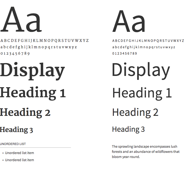
Merriweather, on the other hand, is designed for on-screen reading and more content-heavy pages with large blocks of text. It provides excellent readability across a wide range of device screens.
In this category, you can also find headers, section fonts and text alignments, organized to help you structure your website hierarchy.
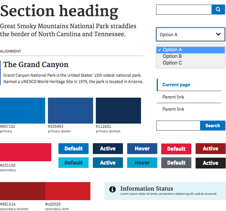
Using official government color schemes can help you create a kosher, authentic looking website that your users will trust.
This Colors and Accessibility category of our US Web Design Standards UI kit also groups gradients of various colors together to help you create contrast in your web designs, in addition to templates for text-to-colored-background combinations and vice versa. All you have to do is copy the color scheme style for background or text color.

The grids and tables category in our US Web Design Standards UI kit comes with grids along with bordered and borderless tables. They help give you an idea of how to structure the information on your USWDS website.
These components can be particularly useful if you want to present local or historic information, sites and points of interest or financial information.
The buttons and labels category provides you with a set of USWDS style buttons with pre-set background and text colors.
We’ve also built-in some basic interactions, such as highlight on hover and on click, meaning you can just link them up and you’re good to go. You’re also free to edit these buttons in our US Web Design Standards UI kit as you wish.
Any alert, success, warning, informative or error message you could need are available to you in the Alerts and Accordions category of our US Web Design Standards UI kit.
Each component already has a pre-set color, recommended size and Open Sans font, along with relevant icons for each situation. As with the buttons, you are free to edit them in any way you wish.
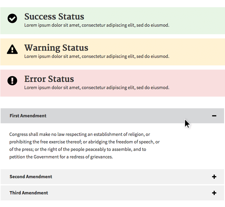
Next are the accordions. They come in both border and borderless format in our US Web Design Standards UI kit, with captions and text paragraphs already added.
The really awesome part is that the interactions are already added, meaning you just have to click on the plus and minus icons in a simulation and the accordion will open up the relevant section. All that’s left for you to do is fill in the content.
To get the relevant data and facts out of your users, good form design is paramount. Designing forms can be less straightforward than you might think. This is because a poorly designed form can leave your users worked up, frustrated or just plain bored.
In our US Web Design Standards UI kit you’ll find clear form components and elements that were designed with good usability in mind. The great thing about these components is you can test them out in your design immediately as we have already built in the relevant text editing and button interactions built in.
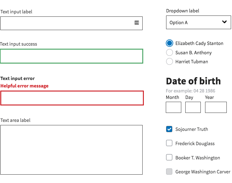
Our US Web Design Standards UI kit contains text input forms, checkboxes, drop down labels, date inputs in US format, sign in and password entry forms and many more.
The Search Bar and Side Navigation category equips you with everything you need to build a structured navigational system into your US government website. There are small, medium and big search bars, with the relevant text entry and button interactions built in.
You’ll also be able to take advantage of side navigation components. The great thing about these is that the hierarchical system has already been arranged so you just have to prioritize the order of your content.
Based on USWDS standards, we’ve organized side navigation hierarchy in our US Web Design Standards UI kit as follows: Grandparent links, Parent links and child links.
In the Headers and Footers category you’ll be able to dispose of pre-designed headers and footers, designed to give any web page an official, US government feel.

In our US Web Design Standards UI kit you’ll find basic headers, extended headers, headers with mega menus, in addition to medium and large footers.
These headers and footers are designed with clear navigation in mind. They contain links that change color on hover and on click in addition to editable text boxes and breadcrumb navigation elements that open out onto wider menus.
We designed the page templates section for busy designers to take the hassle out of page planning. In this part of the US Web Design Standards UI kit, you can find a landing page and a documentary page.
Each page has the typical content associated with pages of their type, such as a hero section with a call to action button, taglines, content paragraphs, breadcrumb navigation, graphic headings, footers and many more.
Designing accessible websites with the US Web Design Standards UI kit is a piece of apple pie! All you have to do is follow these simple steps:
- Download the Justinmind prototyping tool
- Download Office Fabric from our UI kits page
- Open Justinmind and create a new web prototype
- Import the UI kit into Justinmind
- Have fun designing Microsoft Office Fabric apps!
Designing a Government agency website based on the USWDS is a walk in the park. Using Justinmind’s US Web Design Standards UI kit, you can design a website that reflects its local government and agency program, with a style that also represents the US government’s nationwide digital brand.
The result will also be that your users will be more likely to recognize your website as belonging to the US government and will be more likely to trust the source of its content. Likeways, they may have come across websites designed with USWDS before. This in turn will improve your site’s usability.
Let us show you how you can easily use the design patterns of the USWDS such as fonts, colors and UI elements by deploying Justinmind’s US Web Design Standards UI kit.

Once you’ve imported the UI kit into Justinmind, simply start a new prototype. Then head over to the Widgets panel on the left and choose the US Web Design Standards kit.
To design your US government agency website, just drag and drop elements and components from the kit onto the canvas and edit as needed.
In our example above, we designed a simple homepage. For the footer, we’ve dragged an extended header component over with breadcrumb navigation over to the canvas. We can later add interactions to the breadcrumb buttons to link to subsequent pages, or to navigate to a parent website.
Next, for the main content of the page. In our example, we’ve gone with Sans Source Pro as the homepage content will be slightly less dense.
Instead of dragging over multiple Sans Source Pro elements, we merely chose the Typesetting Spacing Typography component complete with headers and page paragraphs. This eliminates the need to worry about the structure of our homepage’s content. All we have to do is add the content.
Lastly, we dragged over a Two levels Side Navigation component with parent and child links from the UI kit. This will show our website’s information hierarchy. All that’s required is to link these up to other pages in your website later, when the UI design is done.
All of the above steps took a matter of seconds for us to achieve our US government website outline with the US Web Design Standards UI kit.
Dan Williams from the General Services Administration gave a presentation on Youtube where he discussed the steps of using the USWDS color scheme and mastering its font system.
He emphasises the main points of USWDS’s quantum visual design building blocks as being color, typeface and type scale and spacing.
USWDS’s color scheme is based on a wheel that’s divided into 22 sets of colors with 9 different grades ranging from 0-90, with some having quite vivid variants.

The designers of USWDS normalized each color grade to a very specific luminance range, in an effort to make meaningful color contrasts. In his video, Dan walks us through how to take advantage of this color scale to achieve optimum contrast on a website:
- Choosing two colors with a 40 point difference between will help you achieve what they call an AA contrast
- Choosing colors with a distance of 50 points or more between leads to an AA+ color contrast which helps aids colorblindness
- 70 or above helps you to get a AAA contrast for optimum visual acuity.
- Avoid using pure black text against a white background to help those with dyslexia, autism and light sensitivity
Dan emphasizes the importance of using this number system if you plan on deploying colored font against a black background, because the main focus of USWDS is luminance with regard to color.
When it comes to font points out that USWDS supports all fonts above its original typeface defaults. However, when it comes to size, he doesn’t recommend using anything under font size 4 for long reading on mobile devices.
Sticking to USWDS when designing any governmental website or publicly funded website is a great idea for a number of reasons.
In doing so, you create a design that is consistent across the country. In turn, you increase the usability of your websites and mobile apps, as American users will be more familiar with the design. You also are using a design system that’s been based on empirical research and usability testing.
Lastly, designing any website with Justinmid is dead simple. Using our US Web Design Standards UI kit, full of tips and explanations on how to perfectly imitate the USWDS style, while maintaining your own brand is probably the easiest and fastest way to design a USWDS website. All that’s left is to test it on your users.