
Looking for a quick start in a new project? Discover these practical app templates made by the Justinmind team just for you.
Sometimes, a template is just what you need when looking to get a new project off the ground. Look no further than these free awesome templates that cover everything from music players and travel booking all the way to dog sitting and online shopping.
Make your favorite templates interactive with Justinmind

Simply download the template and open it using Justinmind’s UI design tool. And just like that, you’re ready to add as many details, change as many things about the template as you desire, and make it interactive so it behaves just right.
Didn’t find what you were looking for? Check out our design templates page for many more designs.
Looking to enter the new-wave of second-hand marketplace apps? This template is the perfect marketplace whatever your product is. Whether users want to buy or sell used goods, this design is easy to navigate and comes with 15 ready to use mobile screens including filtered searches, a favorites screen as well as a messaging feature and 6 featured product screens. It has been designed so you can quickly customize it to your brand’s look and feel, give it a try!

For those interested in the booming world of digital currency, this complete cryptocurrency mobile app template includes a couple intro screens for onboarding, and 8 more screens with product and trading features that you can easily adapt to your own product and brand identity. With a convenient quick access navigation bar at the bottom and preference analysis screens for the most common cryptocurrencies transactions, it stands out that this design has been created with usability in mind. This functional app template is all about crypto, but can easily be turned into any trading product app.
Moving on to e-commerce, this app template comes with many screens, making it the perfect starting point for any e-commerce app where items are sold. And it doesn’t just come with the basic visuals either – the entire app enjoys basic interaction design too. Buttons can be clicked, input fields can be typed on and navigation buttons can be used.
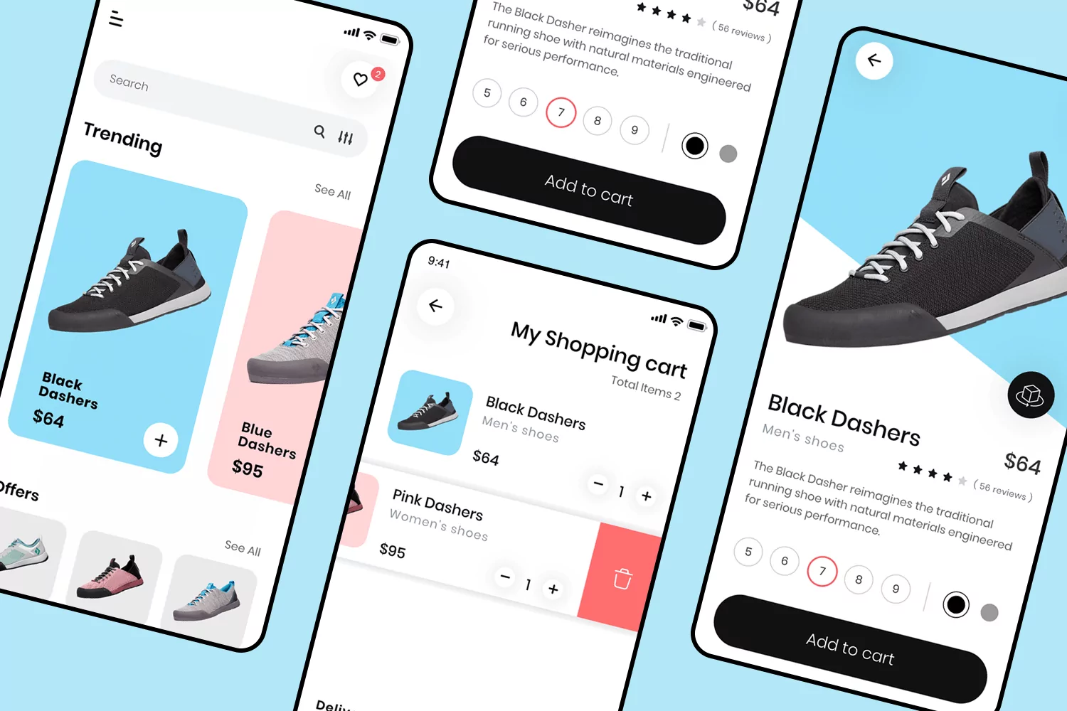
Featuring a young and pastel-themed design, this shoe e-commerce app template brings you a total of 4 screens. From the homepage and items page to the shopping cart. This design offers great layout planning with pastels and a young feel. This is a wonderful example of a simple but effective e-commerce app.
If you’re looking for a sleek and modern design, this app comes with a beautiful homepage design, which displays products with a card system while also offering filtering options to users. Both the item page and the review page prioritize a featured image of the product, making for a great balance in the visual hierarchy of the app.

With 3 screens, this app template is all about making the most of the space and allowing things to breathe. The homepage brings not only a horizontal card system, but also filtering options as well as category buttons for further exploration of experiences. The Detail screen comes with a beautiful split screen style, allowing for a thorough description of the item.
Using a tab system, this homepage design allows users to flip through the types of item based on what they’re looking for. Aside from the smart navigation design, we also find that products are listed in individually arranged areas as opposed to simple cards, allowing each item to shine bright.

The Fitness Flow app template is all about using white space to provide a good layout. The dashboard offers a snapshot at key health and fitness metrics, such as distance ran or hours slept. There is also a couple of different activity charts, allowing users more than one way to look at their data.

With 3 screens, this app template is all about offering relaxing visuals and a clear hierarchy of elements. In the home screen, we have a card system with a search bar as well as filtering options. The Activity screen brings a different card system, with small cards and more options on display. There is also a progress bar.

Perfect for any content-heavy product design, this editorial app template makes the most of displaying articles and allowing words to shine. The homepage allows both a featured article as well as listing of other content, using a classic hamburger menu and navigation bar for the navigation.

Although this app template comes with only 3 screens, it offers great value to designers creating any product with a scheduling feature. The layout allows for a display of both days and a more detailed vision of the day’s appointments with a floating action button. There is also an onboarding screen as well as a video call screen.

This app template comes with a total of 5 screens, including the homepage, courses screen as well as login and profile screens. The homepage comes with a search bar, an accordion system to organize the current courses as well as a filtering option. The course page acts as a listing screen, with a featured course above, followed by individual cards below.

This design captures a classic music player, complete with homepage, player screen and a song list screen. Made with modern and minimalist layout design, this can be easily adapted to reflect your style while saving a whole lot of time.

The Smart Home App template works well as a base to any dashboard style of design. Made with a graphical background and a card system, the profile screen acts as a type of home page. The Rooms screen maintains the card system, but also offers a tab navigation where users can flip through the rooms in their homes and see the listed devices in each one.

This app template is one of the most complete examples we have, with no fewer than 7 screens. Made with a bright look and young feel, you can expect beautifully made forms, card systems and creative filtering options.

You’ll find everything you need for a complete fitness app in this template. From keeping up with sport performance, seeing usual running routes and even tracking one’s eating habits. This app has plenty of information condensed into a few powerful screens.

Despite being a single screen, this app template brings you the full interaction needed for a functioning carousel. The design also comes with filtering options, a hamburger menu as well as a notification icon. In short, everything you need for a dramatic but effective home screen design!

This basic app template includes all the components and screens you need to design an efficient ecommerce app. The design comes with a hamburger menu as well as a shopping cart icon and search field in the Home page. It also includes essential screens such as a sample product page, checkout and cart screens!

This easy app template brings you a dashboard with different screens ready to show simple metric reports. This app features graphs and includes metrics for subscriptions rate, steps, miles and calories. You can easily customize it to your own data.

Checkout pages have a major impact in converting your app visitors into buyers. This template will help you design the perfect checkout flow, with uncomplicated screens that include the most popular credit card options as well as a shipping page and new info forms.

This app store template offers a layout for an existing customer with a profile avatar, and starts with a visually appealing home page, followed by a product screen that is listed by categories in a horizontal card grid. Also included in this design are cart and payment screens, as well as a detailed product sample that comes with a title, a short description and a call-to-action button. In short, the perfect base to get your ecommerce app design started.

This app template offers you an attractive and well organized grid layout with a sleek navigation bar at the bottom. The design also comes with a cart icon and a complete product detail page, including reviews. In short, everything you need for a complete and effective design that you can customize to your own product needs!

This beautifully designed template offers you a design based on the best health and fitness apps. It offers an eye-pleasing and intuitive home, and onboarding screens to collect user information and get them started right away.

Boost your onboarding engagement with this in-app sequence template. This onboarding experience guides the user through one key action, and highlights the product’s best features. Each step screen comes with the option to skip the steps and offers a progress tracker that shows the user’s current location as well as the steps remaining.

This user friendly login flow template is all about optimizing white space and making it easy to complete the login process. The password input field includes a ‘view’ icon to show password and avoid any login errors. There is a second screen to complete the process along with a contact link in case the user has any questions.

Perfect for all Twitter users, this template includes a collection of different twitter content screens, as well as profile and follow suggestions cards. The different layouts show the most common types of content displays you’ll find in the Twitter app. It includes from the classic single tweet post to the most detailed Tweet including icons for mentions, images, retweets, and like and comment counts.

This template comes complete with 8 screens to help designers with any productivity or time management app. The different displays allow you to visualize the schedule one day at a time, by month or even the events during a given year. There are also create events and search events screens as well as an expanded calendar view.

This amazing online food ordering template offers both a sign in screen for existing users and a sign up screen for new users. In the home screen, we have featured top restaurants in a card grid, and a search bar at the top which includes filtering options as well as a handy category search. This design also includes other frequently used screens such as restaurant page, menu, order and checkout screens for you to take full advantage of.

Apps with gradients seem to be trending, and in this minimalist template the background color gradient is key to the design. This layout is simple yet effective, and it outlines all the key features you’d expect in a video streaming app including a perfect grid layout for an optimal viewing experience.

With modern and stylish screens, this template is all about visuals. The home screen showcases vivid images in a basic image grid that acts as a ‘featured categories’ section, while also including a hamburger menu and expandable search bar. Additional screens include split screen styled cards with images and their description. This template can be easily customized to your special requirements.

Don’t underestimate the power of this single screen dashboard template. This design includes all the key data needed for tracking a person’s health journey. This split screen includes the user’s personal information and an objectives summary. The layout is clean and without distractions for simplified and easy to interpret data.
This 10-screen template is the perfect design to create a community hub. It includes easy, highly customizable Welcome, Signup and Profile screens as well as a Feed and News screens thoughtfully organized for any visual or written content. Bonus screens are available to further personalize this app, including a music and a wallet feature screen. You’ll also find your favorite icons and navigation controls for users to feel at home right away.

This single screen app template comes with basic built-in interactions to test key functionalities. In this digital bookstore and reading app you’ll find a clickable featured book selection with scrollable images and titles as well as an interactive search bar at the top. This screen includes a classic navigation toolbar at the bottom with Bookstore, Library and Reading now icons.

This app template example captures the classic photo sharing app principles in a user friendly minimalistic design. The first screen we see is a basic welcome page with an interactive sign in form. The Home and Favorites screens include all the activity icons (like, comment, description) you would expect for an intuitive experience and also included is a User profile page with basic interactions. Also, you can navigate all screens in this design with the bottom navigation bar.

This online marketplace template is interactive and includes 15 screens to create a complete shopping app design. From a getting started splash screen to a smart product scanner feature, these screens create a cohesive look and feel that takes into consideration key features and smart navigation.

The mobile app store template is everything you need to create your design. This set of pre-built screens includes a quick onboarding, sign in and sign up login options. Components include a grid view of products, search bar, hamburger menu, category filters, etc. In this design the Profile screen has been enhanced with a sliding side menu and multiple payment gateways in the Payment screen.

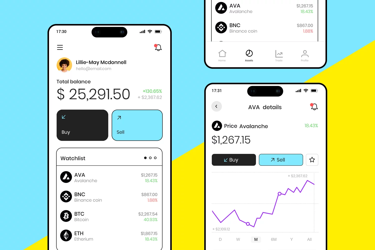
With online trading becoming accessible to everyone, trading apps are on the rise. This design covers the most critical components to create a successful trade app. With these screens users will be able to easily sign up, check their balance, and track their transactions. You’ll also find a set of graphs for overall data analytics and a simple yet visually appealing onboarding set of screens.

This magazine app template makes your online content look great. It’s simple and organized, with sections for all kinds of topics such as culture, science, and news. The “Featured for you” part shows off the best articles with cool pictures and titles. Easy-to-use menus and search help readers find what they want. Perfect for any online magazine or news site that wants to look awesome.

Perfect for video streaming on tablets, this streaming tablet app template features a simple and modern design. The main screen shows a highlighted series with options to play or add to your list. Below, you can see a row of recommended shows.
The bottom has a navigation bar with icons for home, search, favorites, and downloads, making it easy to use. This template is great for creating a user-friendly streaming app.

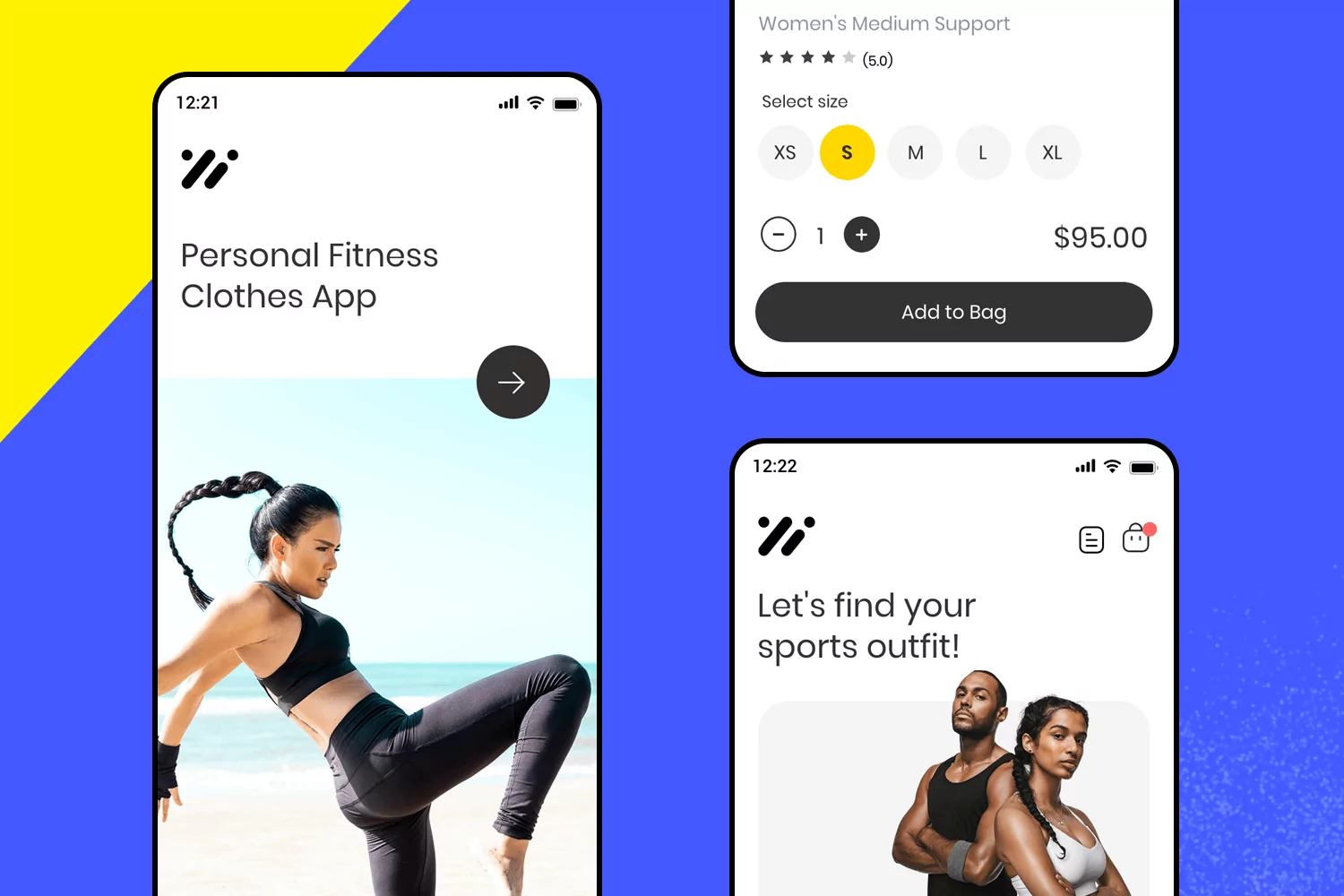
This free app design template offers a sleek and minimalist design to showcase products, focusing on footwear. Each product is presented with large images and detailed descriptions.
The template includes interactive elements such as like, view, and share buttons, enhancing user engagement. Ideal for any brand aiming to create a stylish and user-friendly app to display their products beautifully.

For booking flights easily, this app design template is designed for efficient travel planning. Users can search for flights with options for round trip or one-way, select departure and destination cities, and choose travel dates.
It also includes passenger details and class selection. The intuitive layout features a prominent “Search flights” button and a bottom navigation bar with quick access to search, boarding pass, check-in, and more. Perfect for any travel service aiming to provide a seamless booking experience.

Get inspired in the kitchen with this engaging cooking app template. Perfect for discovering new recipes and culinary challenges, it offers a clean and attractive design.
The template includes features like weekly menus, new challenges, and a favorites section, which users can access through an intuitive layout. Ideal for any food and recipe platform aiming to create an interactive and delightful user experience.

Show off your custom bikes with this easy-to-use app design template. Users can explore different bike models, check out detailed specs, and watch videos.
The layout includes sections for bikes, delivery, and contact info, making it simple and easy to navigate. Perfect for any bike shop or brand wanting a stylish and effective app.

With an easy navigation design, this bookshelf app template lets you track your reading, set challenges, and discover new books. This free app template includes a personal shelf for current, completed, and to-read books, complete with ratings and reviews.
It’s perfect for book lovers and reading apps, offering an engaging and user-friendly experience.

Designed for an easy and engaging user experience, this free app design template features a clean layout where users can browse collections like bouquets, plants, and planters.
The template includes sections for notifications, calendar, and support, all accessible through a simple side menu.
Perfect for any online shop, this mobile app design template offers a seamless shopping experience.

This form template for events registration makes setting up events quick and easy. Follow the easy steps to enter your details, add the number of guests, and pick a theme like birthday, graduation, or party.
The clean and intuitive design ensures you won’t miss a thing. Perfect for anyone looking to organize events smoothly and efficiently.

With this messaging app template, it’s very easy to stay connected effortlessly. The login screen is straightforward with fields for your username and password, and a clean chat interface, that includes profile pictures and status updates, making it easy to know who’s available.
Perfect for staying connected with friends and family.

This store app template makes online shopping super easy. It has a clean design where you can browse products, see details, and add items to your cart with just a click. Each product is shown with a clear image and price, along with an “Add to Cart” button.
Great for any online store wanting to give shoppers a smooth and enjoyable experience.

This Apple Watch fitness app template is perfect for users who want to keep their fitness routine on point. Easily track workouts like walking, running, and cycling with a user-friendly design.
The app shows key stats such as time, pace, heart rate, and distance, making it easy to stay motivated and achieve your fitness goals. Ideal for anyone looking to stay healthy and active with their smartwatch.

Make your app easier to use with this mobile app design template. Quickly get to your dashboard, check out what’s new, read comments, and view your schedule. It’s easy to understand and it looks great.
The menu has a special spot for your profile, so everything you need is right there. This menu is perfect for any app that wants to be simple and easy to navigate.

Guide users through your app step-by-step with this product walkthrough template. Each screen provides a clean design allowing users to select ingredients, view instructions, and learn about features easily.
Each screen provides clear guidance and information, making the onboarding process smooth and engaging. Ideal for any app looking to improve its user experience by providing a helpful and interactive introduction.

Welcome new users to your app with this friendly and simple design. The clean layout makes it a breeze to create an account and jump right in. Ideal for any app that wants to make a great first impression and ensure a smooth onboarding experience.

Keep your app secure with this simple iOS passcode screen template. Users can quickly sign in with their email and password.
The clean and straightforward design makes entering credentials easy and fast, ensuring a smooth login experience. This app design template is great for any app that needs a reliable and user-friendly login screen.

Make chatting easy with this app design template. The clean design makes it easy to follow conversations, with messages clearly shown next to profile pictures.
It’s easy to send and receive messages with the user-friendly layout. This template is perfect for any app that wants to offer a great chat experience.

For double-checking important actions, like deleting contacts, this clear and simple pop-up template is fantastic. It has easy-to-see “Cancel” and “Delete” buttons to help you avoid mistakes.
The clean design makes sure you know what you’re doing before you do it. This template is perfect for any app that needs to double-check your choices.

With this mobile app template, users can easily compare changes to their photos. The design includes a brightness adjustment slider to improve images, showing the difference between the original and edited versions.
Perfect for any photo editing app, this template helps users see the impact of their adjustments quickly and intuitively.

Make your app more engaging with this zoom and pan map template. Users can easily zoom in for details and pan across maps smoothly.
Perfect for travel, geography, or any app needing an interactive map feature. Download this template to help your users explore maps effortlessly.

This manual countdown template is perfect for developers looking to add a customizable timer feature to their apps. Users can enter the time they need and start the countdown with a simple tap. Its clean, straightforward design makes it ideal for any app requiring a timer, whether for workouts, cooking, or other activities.
Improve your app’s functionality and provide a smooth user experience with this easy-to-use template.

Create an engaging shopping experience with this product carousel template. Perfect for developers looking to add a feature to showcase items in a stylish, scrollable format.
Users can easily navigate through products with arrows, and view key details like titles and prices. Ideal for any e-commerce app aiming to display products attractively and conveniently.

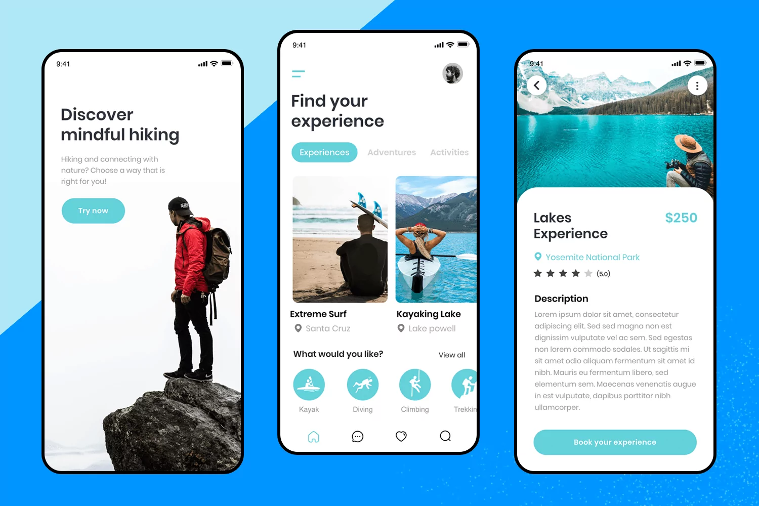
Easily create an event booking app with this free app design template. Users can explore various activities, view detailed descriptions, and book tickets seamlessly. The design includes a welcoming start screen, a search and explore interface, and detailed event pages.
Perfect for adventure seekers and event organizers looking to offer a smooth and engaging booking experience.

Looking to build a mobile shopping app that’s easy to use and looks great? This template is perfect for you! It makes creating an online store simple, allowing your customers to browse products, explore categories, and make purchases effortlessly.
The intuitive design lets them save their favorite items and checkout with ease. This template will help you create a seamless shopping experience that keeps customers coming back for more.

With this last example of mobile app design, you can create a user-friendly trading app. Perfect for letting users track investments, view analytics, and manage accounts seamlessly.
The clean and intuitive design makes it easy for beginners to start investing and provides advanced features for more experienced traders.

Using design templates is a sure way to not only save time, but also to rely on common patterns that have been tested and approved by countless other designers out there. With these templates made for you by the Justinmind team, you can scale your design and worry about the truly important aspects of the product!
PROTOTYPE · COMMUNICATE · VALIDATE
ALL-IN-ONE PROTOTYPING TOOL FOR WEB AND MOBILE APPS
Related Content
 Learn how to design web and mobile app prototypes, how to test them and what to look for in a prototyping tool in this complete guide.15 min Read
 Fonts play a larger role in app usability off the bat than it seems. Furthermore, your choice of font can make or break your app. This post introduces you to the best available and explores how to choose the best one for the job.10 min Read
 A mobile usability test may be similar to testing a website - but mobile devices have an impact on how you go about testing an app. Discover the best practices in this practical guide!13 min Read


