
Need a cool way to display testimonials on your website? First, you need to learn the basics. Get inspired by these 25 awesome testimonial examples!
What’s so great about your company? What makes you unique? You could probably provide brilliant elaborate answers or quick one-liners on your website as to why your company is the best in the world.
Design awesome testimonials today with Justinmind.

Great start. But that alone probably won’t cut the mustard. Why? Because consumers have an infinite source of options online for their every need. And as such, wooing their attention isn’t that simple. Especially not when every Tom, Dick and Harry claims to be offering the best service in town.
For a potential user or consumer to choose your service, a great deal of trust comes into play. Testimonials can play a big part in helping you earn that trust. This is where a focused approach to UX design becomes critical.
That’s why we’ve collected some of the best testimonial examples from around the internet to crank the inspiration meter to full. We’ve also provided some pointers on how to get started today!
You’re considering dining at a new restaurant. You could read their menu, but what truly convinces you? It’s hearing from someone who’s already dined there, raving about the delicious food and excellent service, basically, a verbal testimonial.
Essentially, it’s a genuine statement from a happy customer, sharing their positive experience with a product or service. It’s like a friend giving you a personal recommendation, and in the world of marketing, that’s incredibly valuable.
Why do businesses use testimonials? Well, they’re not just nice to have—they’re essential for building trust. Think of them as social proof. When potential customers see that others have had great experiences, they’re more likely to feel confident in their own decision. Testimonials show that your product or service delivers on its promises, turning hesitant browsers into enthusiastic buyers. They’re a form of digital word-of-mouth, spreading positive vibes and influencing choices.

But not all testimonials are created equal. A generic “Great product!” doesn’t carry much weight. To truly resonate, testimonials need to be well-designed. This means ensuring they’re authentic, with specific details that paint a vivid picture of the customer’s experience. If you can include a photo or video, even better!
Visuals add a layer of credibility that text alone can’t achieve. Ultimately, well-crafted testimonials boost conversions by addressing potential customers’ concerns and building confidence. When people see that others have benefited from your offering, they’re far more likely to take the leap themselves. It’s about letting your happy customers do the talking, and letting their experiences speak for themselves.
A truly compelling testimonial isn’t just a generic “this is great!” It’s a story told by your customers. To make this happen, we need to guide them through the process. Imagine a form where they can share their experience. We’ll start by asking them to describe their initial challenge: “What problem were you trying to solve?”
Then, we’ll prompt them to clearly explain how your product or service provided the solution, focusing on the specific features and benefits that made a real difference: “How did our product/service help you solve your problem? Be specific about the features and benefits that stood out.”
We’ll also ask, “What made our solution stand out from the competition?” and, most importantly, “Overall, was your experience positive? Please explain.” This way, you’ll gather rich, narrative-driven testimonials that resonate with potential customers and show them how your service can solve their problems.
Nothing undermines a testimonial like a whiff of inauthenticity. Avoid fabricated testimonials at all costs; they’re easily spotted and destroy trust. Instead, focus on capturing genuine customer voices. Video interviews are incredibly powerful, allowing viewers to see and hear the customer’s enthusiasm.
You can encourage detailed responses with open-ended questions, moving beyond generic praise to capture specific experiences and insights. The goal is to let the customer’s true voice shine through, creating a connection with your audience.
A testimonial’s impact is directly tied to its relevance. Tailor your testimonials to specific customer segments, highlighting how your product or service addresses their unique pain points and provides tailored solutions. Choose the testimonial format that best suits your product or service and your audience’s preferences. By aligning your testimonials with your audience’s needs and interests, you ensure they’re not just heard, but truly felt.
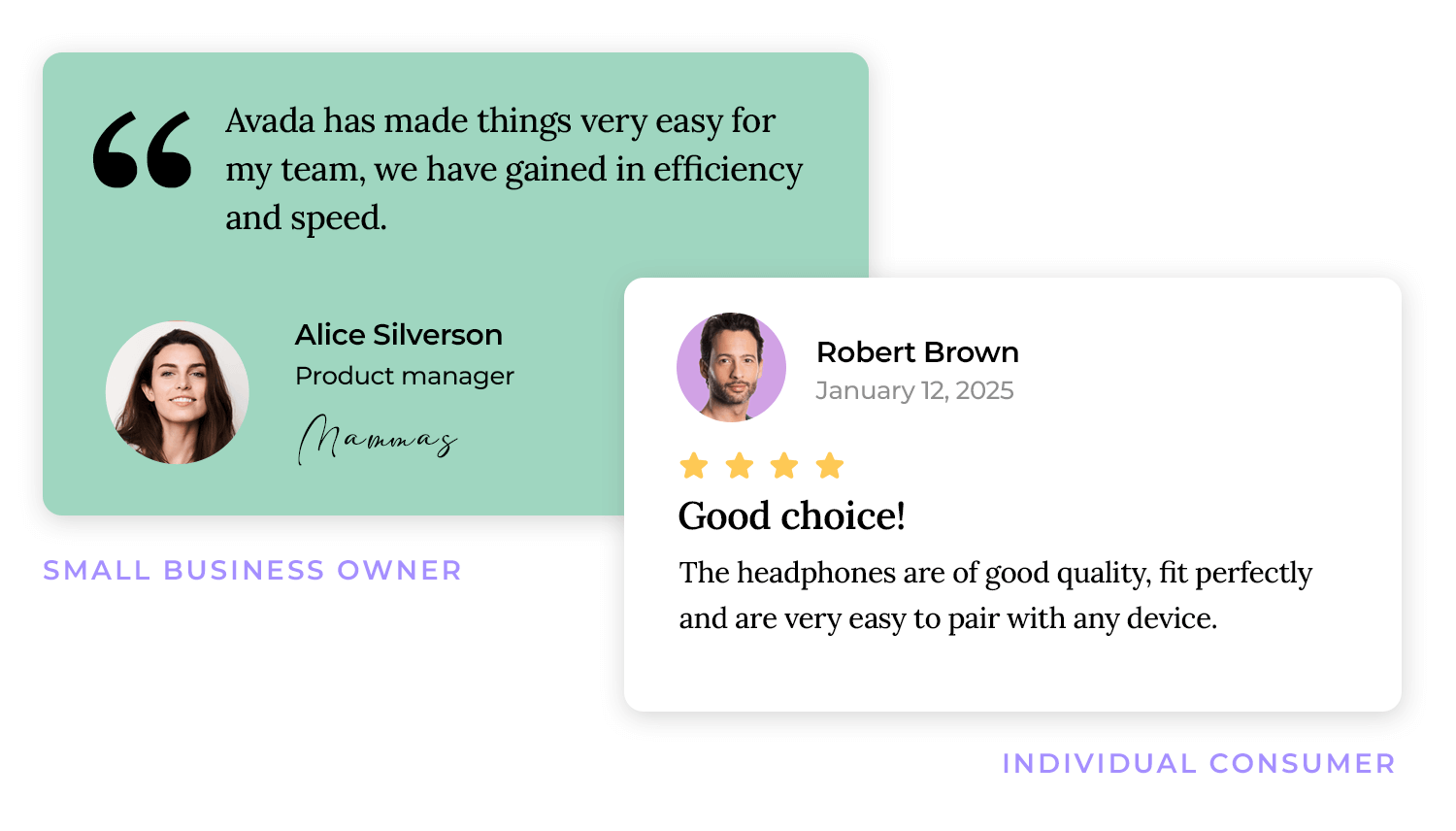
Credibility is the cornerstone of effective testimonials. Include customer identifying information, such as their name, title, company, and, if possible, an image. This adds a human element and reinforces authenticity. Whenever possible, quantify results with data and metrics, demonstrating the tangible impact of your product or service.
Leverage endorsements and reviews from reputable sources, further bolstering your credibility. People trust what they can verify, so make sure your testimonials are backed by solid evidence.

To maximize the impact of customer testimonials, keep them clear, concise, and easy to digest. Short, focused statements are more likely to be remembered and shared. When designing the testimonial form or prompts, encourage users to use clear, compelling language that resonates with your target audience. Avoid jargon and technical terms unless they’re absolutely essential for conveying the benefit.
Think of it as a conversation, not a transaction. Tailor your request to the individual customer and their specific experience. Refer to their purchase, the specific problem they solved, or a positive interaction they had with your team.
This shows you value their unique journey and aren’t just sending a mass email. For example, instead of “Please leave a testimonial,” you could say, “We were so thrilled to hear how our [product] helped you achieve [specific result]! Would you be willing to share that experience with others?”
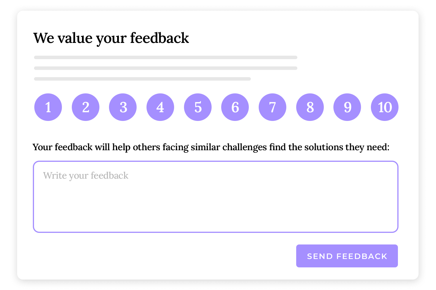
People are more likely to help if they understand how their contribution will make a difference. Explain how their testimonial will help other potential customers make informed decisions. Emphasize that their experience can guide and inspire others, showcasing the real-world impact of your product or service. You could say, “Your feedback will help others facing similar challenges find the solutions they need.”
Be clear about what type of testimonial you’re looking for. Do you want a written quote, a video interview, or a detailed case study? Specifying your expectations will help your customer understand what’s required and make it easier for them to provide the feedback you need. For example, “We’d love a short video testimonial, about 30-60 seconds, sharing your experience with [product].”
Sometimes, people need a little inspiration. Sharing examples of effective testimonials can help them understand what you’re looking for and give them a starting point.
Provide a few short, well-written testimonials or video clips that showcase the type of feedback you’re hoping to receive. This gives them a clear picture of what makes a great testimonial and encourages them to contribute their own story.
The first step is identifying your happiest customers. This involves analyzing a range of data points. Start by reviewing customer feedback and reviews, paying close attention to those who have expressed strong satisfaction or enthusiasm. Look at purchase history: repeat customers or those who have upgraded or purchased premium products are often strong candidates.
Consider customer interactions with your support team; those who have received exceptional service and resolved issues successfully are likely to be appreciative and willing to share their positive experiences. By analyzing these various data points, you can pinpoint the customers who are most likely to provide valuable testimonials.
Once you’ve identified satisfied customers, take it a step further by segmenting them. Different customer segments have different needs and experiences, and tailoring your testimonial requests accordingly can significantly increase their effectiveness.
For example, if you’re targeting small business owners, focus on testimonials that highlight how your product or service helped them improve efficiency or increase revenue. If you’re targeting individual consumers, focus on testimonials that emphasize ease of use or personal benefits.
Strike while the iron is hot! Requesting feedback shortly after a positive experience is crucial. When a customer has just experienced the benefits of your product or service, their enthusiasm is at its peak. This is the perfect time to ask for a testimonial. For example, if a customer has just completed a successful project using your software, or received a product that exceeded their expectations, send a friendly request for feedback within a few days.
This ensures their positive experience is fresh in their mind, making it more likely they’ll provide a detailed and enthusiastic testimonial. You can automate these requests after key milestones, like a purchase, a successful support interaction, or a completed onboarding process.
Design awesome testimonials today with Justinmind.
Leverage the relationships you’ve already built with your customers. If you’ve developed a strong rapport with a particular customer over time, or if they’ve consistently provided positive feedback, don’t hesitate to reach out. These customers are more likely to be receptive to your request and provide a thoughtful testimonial.
Consider timing your request around key milestones in your customer relationship, such as an anniversary of their purchase, or after they’ve referred new customers to your business. This shows you value their ongoing support and strengthens your relationship further. By building strong customer relationships and timing your requests strategically, you can gather a collection of powerful testimonials that drive conversions and build trust.
Offering small, thoughtful incentives can show your appreciation for your customers’ time and effort. Discounts and promotions are a popular choice, providing a small reward for their participation. Gift cards or other relevant rewards can also be effective.
Public recognition, such as featuring customer testimonials on your website or social media, can also be a powerful motivator, providing a sense of validation and appreciation. Remember, the goal is to show appreciation, not to bribe for positive reviews.
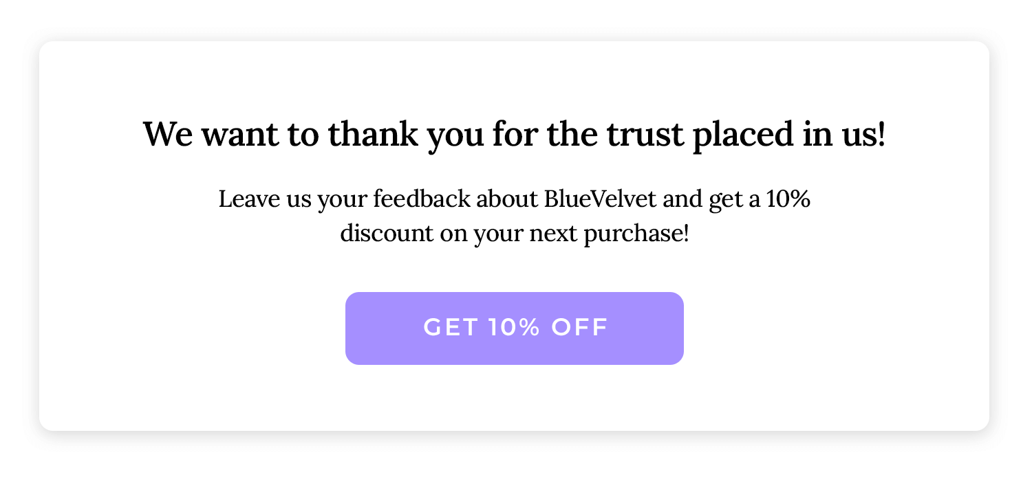
It’s crucial to be transparent about any incentives you offer. Clearly disclose if a testimonial is incentivized. This builds trust and ensures that your audience understands the context of the feedback. A simple statement like, “This customer received a discount for providing their honest feedback,” can maintain transparency and credibility.
The most important aspect of any testimonial is its authenticity. Ensure that your customers understand that honest feedback is valued, regardless of any incentives offered. Make it clear that you’re interested in their genuine experiences, both positive and negative.
Emphasize that their feedback will help you improve your products or services, and that you value their insights. By prioritizing authenticity and transparency, you can gather valuable testimonials that build trust and drive conversions, without compromising your ethical standards.
Surveys and questionnaires are a great way to gather structured feedback from a large number of customers. Using a combination of open-ended and closed-ended questions allows you to gather both quantitative and qualitative data. Structured questions ensure you get the specific information you need, while open-ended questions allow customers to share their unique experiences in their own words.
Utilize easy-to-use platforms like Google Forms, SurveyMonkey, or Typeform, which are user-friendly for both your business and your customers. These platforms often provide templates and analytics to help you create effective surveys and analyze the results.
For richer and more detailed feedback, consider conducting phone or video interviews. Interviews allow you to delve deeper into the customer’s experience and gather nuanced insights that may not be captured in a survey.
Prepare a list of questions beforehand to guide the conversation and ensure you cover all the key points. Video interviews are particularly powerful, as they allow you to capture the customer’s enthusiasm and build trust with potential customers.

Video testimonials are incredibly effective for building trust and demonstrating the impact of your product or service. Encourage customers to record their own video testimonials, providing them with clear instructions and examples. This method is cost-effective and allows for authentic, unscripted feedback.
For high-quality testimonials, consider investing in professional video production. This allows you to create polished and engaging videos that showcase your product or service in the best possible light.
Written submissions are a convenient way for customers to provide feedback at their own pace. Provide a dedicated email address for customers to submit their written testimonials, or use online forms to collect feedback.
Online forms can be customized to gather specific information and ensure consistency in the format of the submissions. This method is particularly useful for gathering detailed feedback on complex products or services.
First, let’s talk about where to keep these gems. If you’re just starting out, a simple spreadsheet, like Google Sheets or Excel, is your friendly neighborhood filing cabinet. You can easily list customer names, their testimonials, dates, and any little notes you want to add.
But as your treasure trove grows, you might want something a bit more sophisticated. Imagine your CRM (Customer Relationship Management) as a super-organized library. You can link testimonials directly to customer profiles, making it easy to see the whole story of their experience.
And if you’re swimming in testimonials, there are even dedicated platforms designed just for that! They’re like having a professional librarian who knows exactly where every nugget is.

Now, how do you keep things tidy? Think of it like sorting your favorite candies: by type! Categorize your testimonials by format—text, video, audio—so you can quickly grab the right one. Then, tag them by product or service, like labeling your spice jars. This way, you can easily find testimonials that highlight specific features.
And don’t forget your audience! Imagine you’re throwing different parties. You wouldn’t play the same music for everyone, right? Segment your testimonials based on your target audiences. This lets you show the most relevant stories to the right people.
What’s the point of a treasure chest if you can’t find anything? Make sure you have a good search function—think of it as your trusty map! You should be able to quickly find testimonials by keywords, customer names, or product tags.
And of course, security is key! You wouldn’t leave your treasure lying around, would you? Make sure your testimonials are stored securely, with regular backups. Cloud storage is like a vault in the sky, keeping your precious testimonials safe and sound.
Think of your website as a stage, and your testimonials as the headliners. You want to place them where they’ll have the biggest impact. High-visibility locations are key: your homepage, landing pages, product pages, and even the checkout page are prime real estate.
But it’s not just about visibility; it’s about context. Place testimonials near related content or calls to action. For example, if a testimonial raves about a specific feature, put it right next to that feature’s description. It’s like having a spotlight on your best moments. And don’t forget A/B testing! Experiment with different placements to see what drives the most conversions. It’s like trying out different stage setups to see what gets the biggest applause.
Your testimonials need to look professional and trustworthy. High-quality imagery is a must. Use professional headshots or videos of the testimonial provider. Blurry or unprofessional images can detract from credibility, like a poorly lit stage.
Use design elements like quote marks, background colors, contrasting fonts, and whitespace to make your testimonials stand out. Think of them as the stage lighting, drawing attention to the stars. But avoid overly cluttered designs—you want them to be the center of attention, not lost in a sea of distractions.

Format variety is your friend! Use carousels, sliders, or grids to showcase multiple testimonials in an engaging way. It’s like having a variety show, keeping your audience entertained. And of course, make sure everything looks great on mobile! Your stage needs to be set up for everyone, no matter what device they’re using.
Your testimonials should feel like a natural part of your website’s design, not like an afterthought. Seamless integration is key—weave them into the fabric of your site, avoiding jarring or disruptive presentations.
Provide context by briefly describing the customer’s situation or challenge before the testimonial. It’s like setting the scene before the performance. This helps your audience understand the relevance and connect with the story.
And always maintain brand consistency. Your testimonials should reflect your overall brand aesthetic, creating a cohesive and professional look. It’s like having a consistent theme throughout your show, tying everything together beautifully.
Design awesome testimonials today with Justinmind.
We shamelessly add Justinmind to this list of testimonial design examples. Displayed in a yellow carousel, it is like a burst of sunshine! The bright colors and playful design instantly catch your eye and make you feel happy. It’s like they’re saying, “Hey, come check this out! See how JustinMind made Kacie’s day!” And then you see her friendly face and read about her positive experience, and you can’t help but feel good about the platform.

Neon‘s testimonial design is super straightforward and easy on the eyes! They highlight a powerful quote about how Neon helps manage tons of databases, making it clear what they’re all about. They also showcase other happy customers with familiar logos and short, snappy descriptions. It’s a clean, modern look that fits their tech-savvy audience.

Buy Me a Coffee‘s testimonial design is all about showing off the love from their community! They highlight shoutouts from popular platforms like TikTok, X (Twitter), and YouTube, making it feel like a friendly conversation. They even encourage users to join the fun by sharing their own experiences with a special hashtag. It’s a simple but effective way to build trust and show how much people enjoy using the platform.

Tailscale‘s testimonial design uses a clean, grid-based layout featuring customer logos, creating a visual showcase of their user base. They also highlight specific case studies with clear headlines and company logos, offering deeper dives into customer success stories. It’s a professional and straightforward approach that emphasizes the breadth and credibility of their clientele.

Stacker‘s testimonial design is like a friendly “look who we’ve helped!” page. They show off a bunch of familiar names, like FedEx and Amazon, to build trust right away. They also give you quick peeks into how different companies use Stacker with short and snappy descriptions. Plus, they’re not afraid to brag a little with numbers, showing how much Stacker has helped these businesses grow. It’s a simple and approachable way to highlight their success stories!

Nova‘s testimonial design is centered around building trust and highlighting positive experiences. They emphasize that “People leaders love the Nova experience,” showcasing logos of well-known companies like HomeLane, Snapdeal, MyGate, and Clear. They feature a quote from a Zuddl employee, emphasizing empathy and compassion, and another from an unnamed source praising the Nova team’s delivery.

Relume‘s testimonial design is very community-focused, emphasizing user-generated content and social media mentions. They showcase tweets and forum posts from users, displaying their usernames and profile pictures, creating a sense of authenticity.

Dribbble‘s testimonial page, aptly titled “Our Wall of Love,” takes a friendly and personal approach. It’s designed to feel like a collection of heartfelt notes from their community. They use a clean layout with simple, card-like blocks for each testimonial, focusing on the text and the speaker’s name. The inclusion of profile photos adds a human touch, making it feel more like hearing from real people.

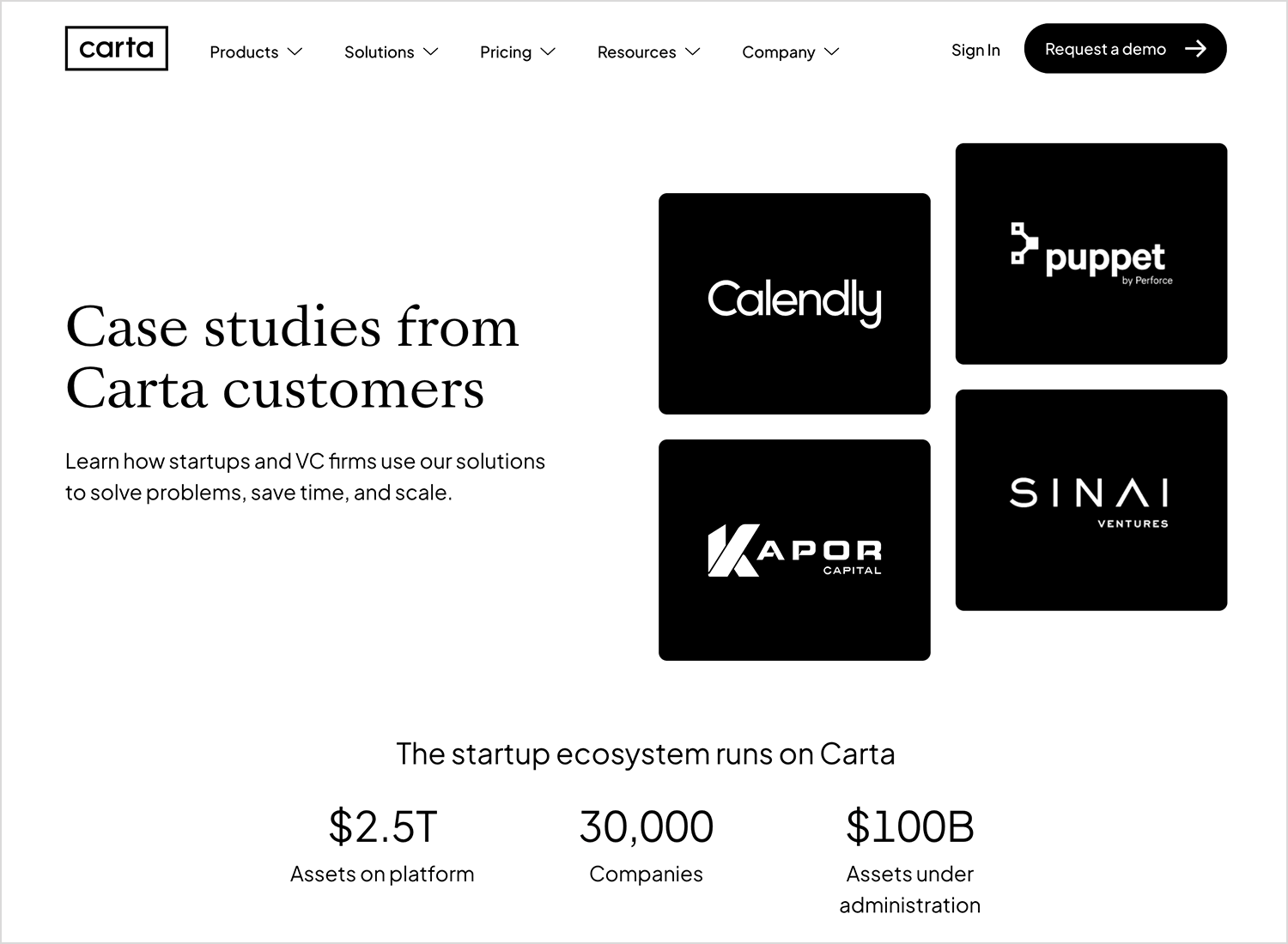
Carta‘s testimonial page takes a data-driven and logo-centric approach, emphasizing its credibility and scale. They prominently feature well-known customer logos like Calendly and Puppet, immediately establishing trust. The page also highlights impressive statistics, such as “$2.5T Assets on platform” and “30,000 Companies,” demonstrating their market dominance.
Frame.io‘s testimonial design is visually driven and emphasizes the real-world impact of their platform on diverse creative workflows. They use a combination of customer logos (like Princess Cruises and VMware) and compelling imagery to immediately capture attention. Each customer story is presented as a distinct section with a headline outlining the key benefit, such as “Princess Cruises sails through complex productions.”

Zapier‘s testimonial design is structured like a grid of success stories, emphasizing the diverse ways their platform empowers businesses and organizations. Each testimonial is presented as a card with a clear headline summarizing the key benefit, such as “How an AI-powered chatbot prevents missed sales leads.” They use a mix of company logos and eye-catching visuals to draw attention.

Slack is a great example of how simplicity can sometimes be the most effective route in demonstrating your social worth. They use video testimonials directly from their clients, followed by data signaling the level of satisfaction and connection their users feel when using their service.

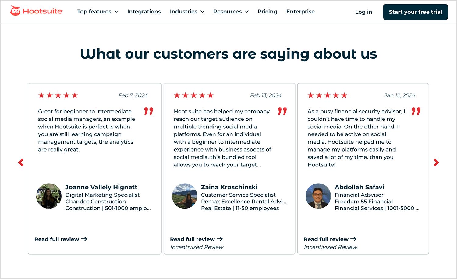
Here’s why we love Hootsuite as a testimonial example: its design dissected the testimonial page into three different sections – brands that use their service, written testimonials, and client case studies.
Basecamp likes to play around a bit and challenge the status quo when it comes to testimonial design rules. Often, it’s considered best practice to use an image, a video or other media asset to adorn the testimonial. Yet this Basecamp testimonial example flies in the face of that rule in a very noticeable way.

Kissmetrics made it onto this list because they’re a great example of the types of testimonials you often see on many modern web page designs, especially in the tech industry, which is a combination of text and images on cards in a slider widget. The slider helps grab the users’ attention, and lets them explore further testimonials if they wish, without taking up the rest of the page with a grid.

Bizzabo knows that great design speaks volumes. This testimonial example shows how your creativity can place even more importance on the testimonials themselves. It keeps you engaged with all its attractive colors and organized sections while providing all the info you might need to help you with your decision-making process!

Proactiv were proactive when taking advantage of the real social proof that testimonials can offer a company in their particular niche. What better proof do you need, both socially and visually that a skincare treatment works, than photos of the customer/patient?

In this testimonial example, there are before and after images of the different stages of a client’s skincare treatment.Next to this happy-go-lucky imagery is a quote from the person in the photo saying how the treatment made them feel.
Content marketing agency, Brafton, have opted to display their testimonials as large clickable squares that display the company’s logo and takes you to their respective case studies.

styleSeatstories is a testimonial page design by Megumi Tanaka on Dribbble that showcases an interesting approach to layout. In this case, she uses photos of the client, along with their name and company, with speech bubbles for their testimonials.

All of the testimonials are arranged in grid format and mixed in a visually appealing collage, with the quotes of varying lengths providing a medley of different shapes and sizes on the page, drawing the user in further.
Letting company, Bungalow, makes it onto this list with their clean and colorful testimonial design. Smooth pastel colors, coupled with large images of happy, smiling clients make the user feel at ease. The testimonials are arranged in a grid format along with their relevant star ratings.

This is a great example of how you can leverage testimonials and social proof to show off your UI design skills!
Design awesome testimonials today with Justinmind.
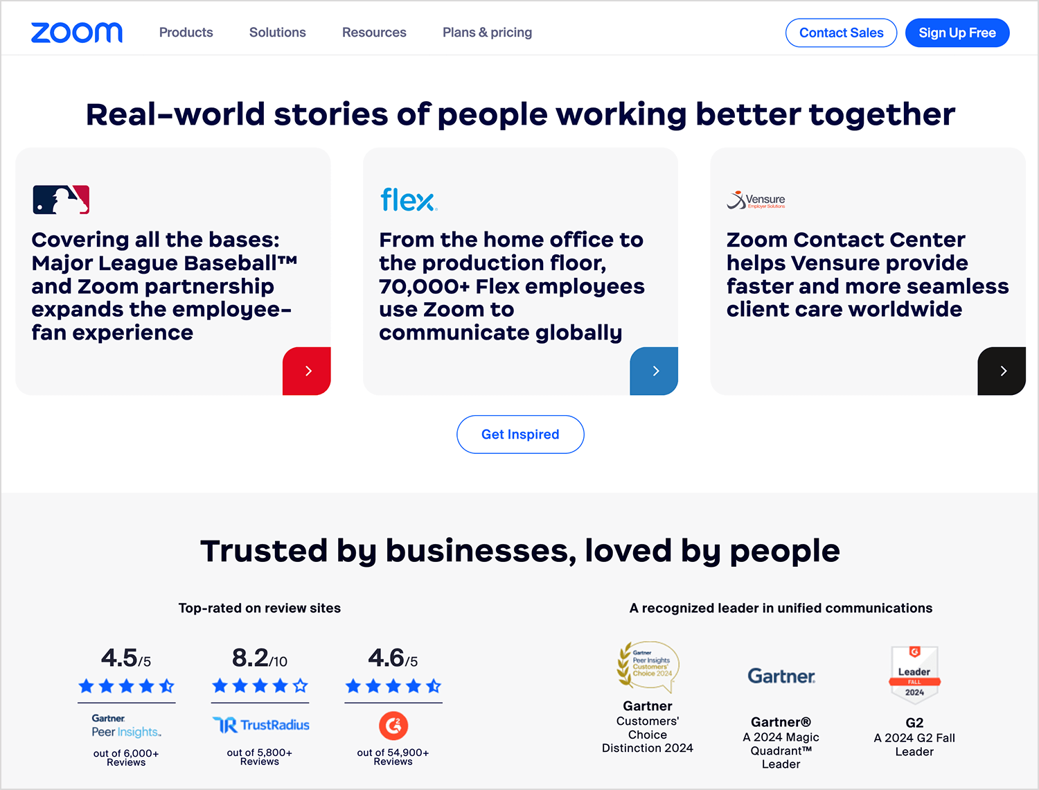
Zoom is a great example of how to grab a user’s attention immediately with a testimonial. They use cards with client case studies, review site ratings, and quality certifications.
Shopify effectively uses visual hierarchy and information chunking to showcase diverse success stories, creating relatability and an emotional connection with potential users. High-quality images and concise descriptions convey a sense of aspiration. The text is displayed in white font against a dark background which emphasizes the Shopify brand.

In a banner that changes among five testimonials from different customers, Hotjar’s video testimonials are a lesson in testimonial presentation and general design.
With a touch of creativity in the presentation of the client’s picture, we can all appreciate the brand identity shining through this simple design. The brief testimonial is already enough to catch the eye, but those who are intrigued or curious are free to follow the small button to watch a full interview with the client that works as a case study.

People are placing more importance on video testimonials as they are an easy way to add emotionality to your testimonial as opposed to a few lines listed on your webpage. Note that all the testimonial videos are short – not one of them surpasses the two-minute mark. Even with a video that brings the visitor into the story, lingering too long will lead to loss of interest.
Here’s why we love Codecademy and included it in our list of testimonial examples. When you first get to the page, you see testimonials gathered from their alumni presented as articles in cards, but in a style that is very similar to notebook sketches, a gentle nod to the purpose of the service itself – eduction. Each student goes into why they needed to learn code, and how Codecademy was able to help them reach their goals.

The video makes it easy to convey emotion and all that comes with it. This enables visitors to identify with the ex-students in their search of success or happiness, and make a connection with the service the company offers. The initial video is slightly longer than average – reaching about two minutes and a half.
This Enable testimonial carousel effectively uses UX principles to showcase social proof. It manages multiple testimonials without overwhelming users, encourages engagement through interactivity, maintains focus by presenting one story at a time, and adheres to progressive disclosure.

These testimonial examples go to show you that they can vary in their impact depending on how you present them. You want a testimonial page that will allow the visitor to identify themselves with your customers, showing them that you’ve dealt with the same issues they face today during your career.
You also want a testimonial display that allows for emotion and brand personality – make it yours by adding your own touch to the layout. Your testimonials can be large in the form of case studies or brief in tweets – the important thing is that they are genuine and paint a picture of what you’re like as a professional.
PROTOTYPE · COMMUNICATE · VALIDATE
ALL-IN-ONE PROTOTYPING TOOL FOR WEB AND MOBILE APPS
Related Content
 A fun look at different data table designs, from basic lists to smart, interactive ones, based on how complex the data is and what users need.18 min Read
 Single page design v multi-page design – everything you need to help you choose the right design for your site’s content18 min Read
 Website backgrounds can be a powerful tool in creating an experience. But what kind of experience can you convey and how? We got the full run-through for you!14 min Read


