
Swiss Style rejects decoration, pursues objectivity and favors clear communication. How can we apply this to web design?
Simplicity, objectivity and readability. Those were the main ideas behind the Swiss Style movement.
Start designing your websites and web apps. It's free!

It’s been almost 70 years since Swiss Style took the world of graphic design by storm. But are the principles relevant to today? And can we use them when designing websites and interfaces with your favorite prototyping tool?
Let’s find out.
Swiss Style, or International Style, refers to a movement that originated in Russia, the Netherlands and Germany during the 1920s and 30s. Designers then spearheaded the movement in the 1950s in Switzerland.

Swiss Style is modernist. It is a culmination of Russian constructivism, arts and crafts, photography, De Stijl, and the Bauhaus. You can identify Swiss Style by its bold headlines, stark composition, and minimalist approach.
Richard Hollis, the author of Swiss Graphic Design, notes the skills associated with Swiss industry, namely pharmaceuticals and mechanical engineering, were matched with graphic designers who would produce advertising and technical literature.
The pioneers of Swiss Style saw design as part of industrial production and desperately searched for objective visual communication.
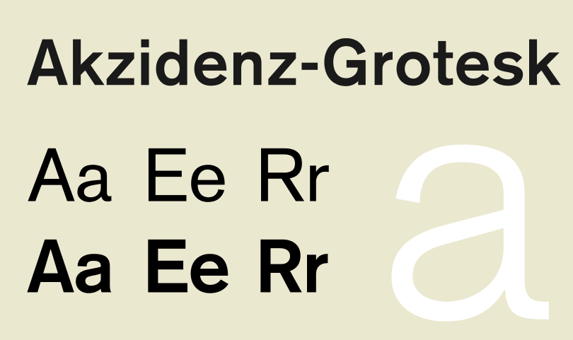
Their typography choices, in particular, were industrial. 19th Century font Akzidenz-Grotesk influenced Swiss Style greatly.
As a typeface, it’s unadorned, general-purpose, and functional – everything a modernist would love in a font. It also inspired the famous typeface Helvetica.
It was designed as a text font. That means it’s readable and why it was used on the New York subway signage in the seventies before Helvetica took its place.
The font was used in scientific publications for its clean look which translates well on the web.
Renowned blogger Jeremiah Shoaf, the man behind Typewolf, said of Akzidenz-Grotesk (This link will also show you other fonts you can pair with Akzidenz.):
“I’m always happy to see Akzidenz Grotesk used on the web in place of Helvetica because it immediately gives the design a much more distinctive feel.”
Aside from graphic design and typography, Swiss Style also found influences in architecture, painting and sculpture.
The Barcelona Pavillion is an example. It was built in 1929 and exemplified a modernist approach.
So, what characterizes Swiss Style?
Swiss Style is made up of various components but notably, Swiss Style design includes:
- Grids
- Asymmetric layouts
- Sans-serif typography
- Precision
- Geometric abstraction
- Simplicity
- Objectivity
- Photography
As the Bauhaus mantra goes: form follows function. That makes Swiss Style pragmatic and considered.
This approach is not concerned with beauty either. The beauty is found within the functionality of the design. It’s intentionally minimal and bare. The idea was that the design should be invisible and the designer’s subjectivity should be suppressed to let the content speak for itself.
UX designers have to take a similar approach when designing. The design isn’t for you so don’t get invested. This applies to all aspects. UX writers can’t become attached to their words just as designers can’t become attached to their interfaces.
Start designing your websites and web apps. It's free!
Swiss Style isn’t only found in posters and other graphic designs. It can be used in web design and UX design. All of the characteristics in the list above can be easily applied to websites.
Diogo Terror writes in Smashing Magazine that Swiss Style is in line with creating user-friendly interfaces.
He goes on to say that “this style of graphic design was born in the institutional context. The majority of pieces from this movement are in the form of posters, stamps, institutional typographical identity, street signs, etc. In this sense, these artists are leveraging much more than just top-down communication, they’re creating user-friendly interfaces.”
But where do we start?
The visual characteristics of Swiss Style involve placing elements on a mathematically-constructed grid to create a unified composition. The grid gives the design a structure in which to ‘confine’ your UI elements.
This grid should present textual and visual information in a clear way. It doesn’t matter if it’s a poster or an interface; a grid provides order. The font choice should be sans-serif and aligned to the left. The end result should be an asymmetrical design.
Josef Muller-Brockmann, one of the pioneers of Swiss Style and author of the book Grid Systems in Graphic design, said of the grid:
“The grid system is an aid, not a guarantee. It permits a number of possible uses and each designer can look for a solution appropriate to his personal style. But one must learn how to use the grid; it is an art that requires practice.”
It’s vital a tool that designers can manipulate to their advantage when creating coherent, usable and crucially accessible user interfaces.
What other ways can designers bring the Swiss Style flair to web design?
Swiss design is characterized by functional elements on a page. Each element is there for a reason. This philosophy is reminiscent of minimalism.
But why should your design be minimal? When you reduce your website design to the only elements that really need to be there, you’re creating clarity in your design.

Above is a Swiss Style inspired website template. There is large text with a clear message. Our attention doesn’t jump around because there are only a few colors: white, blue, and black. And because of the limited number of UI elements, it’s clear what the website stands for. A busy design, in contrast, will cause confusion. It will create tension.
Design is an attempt to deliver a message and if that message can’t be heard over the noise of other competing elements then the user is going to have a less than enjoyable experience.
You owe it to your users to give them the information they’re seeking in a way that doesn’t hurt them.
Product designer Joshua Porter writes that clarity is job number one in interface design. Joshua goes on to say that to be effective, people must recognize what it is, care about why they would use it, and understand what the interface is helping them interact with.
In essence, clarity inspires confidence and leads to further use.
Start designing your websites and web apps. It's free!
Your font choice is critical when it comes to Swiss Style web design. Swiss Style is also known as International Typographic Style. As such, the style respect type.
Type is the primary design element in Swiss Style. Look at any poster from the period and you’ll see big, bold fonts taking up much of the space. Take a look at these must-read typography books for designers.
If you want your web design to embody the Swiss Style then it’s time to throw out your Times New Romans, Garamonds, and Caslons. No serif fonts are allowed.

Let’s look at the website above. The goal is clear: become a member. There are two reasons why our focus is drawn to this. One is the size. The font is large and the message is clear. There are no other conflicting messages.
The other is because of the negative space. There’s a lot of it. This allows the website to breathe, convey the message better, and gives the user one thing to focus on.
Another Swiss Style characteristic is flush left and ragged right formation. That means that the text is aligned to the left of the page but not justified. Like this:

Fonts to consider for Swiss Style: Montserrat, Open Sans, Lato, and Helvetica. Why not find out how typography can enhance brand identity?
A lot of Swiss Style is getting the font and layout right. This involves creating a typographic hierarchy.
A typographic hierarchy is a way to structure your website’s content by prioritizing information in a coherent way. That means important stuff first, less important stuff later.
To achieve a visual hierarchy, you’ll have to play around with:
- Size
- Color
- Weight
- Position
- Contrast
- Kerning
If you want a lesson in the visual hierarchy, look at the front page of a newspaper.
The headline, subheading, and body copy are ways to create a visual hierarchy. With a newspaper the headline grabs attention (the most important thing) and the subheadings give extra information (less important) and then you have the body copy (least important). Both the headline and the subheadings are used to entice the reader to continue on to the body copy.
Let’s take a look at these two pieces of text below. One has a hierarchy, one doesn’t. It’s clear to see the impact of typographic hierarchy:

Image credit: Janie Kliever at Canva.
It’s worth pointing out how people read on the internet
For the most part, people read in an F pattern, particularly if there is a lot of copy. For sites with less copy, people tend to read in a Z pattern. This is because they’re scanning the page for the information relevant to them.
These are the natural eye movement patterns. With this in mind, you can start to create a typographic hierarchy. If you know people read left to right and in a Z pattern then you can organize your content to grab the user’s attention by placing the content in the right order.
Organizing your content in this way will give it structure. By playing with the sizes of the fonts, you can make information more important to the reader or less important. It makes reading your content much more efficient for the reader.
Start designing your websites and web apps. It's free!
Illustrations are going through a boom in web design. Companies of all kinds use bespoke illustration to add charm and personality to a brand.
But for Swiss Style, it’s all about photography. Why? In the minds of the designers at the time, photography was a way to represent reality. It is a more objective medium (remember, these guys love objectivity) than drawing or illustration.
The combination of typography and photography is central to Swiss Style as a means of visual communication, as exemplified in this image below:
As we can see, they work together. Both enhance one another.
When we look back at the movements that shaped the world and try to recreate our own designs, the end result can be pastiche.
As designers, it’s better to find out which elements of a movement worked, which principles stand the test of time and apply those to your design.
In trying to recreate Swiss Style the end result will only pale in comparison because we’re no longer of that time. But there are characteristics like choosing your UI elements carefully or paying close attention to the type that will always benefit your design.
PROTOTYPE · COMMUNICATE · VALIDATE
ALL-IN-ONE PROTOTYPING TOOL FOR WEB AND MOBILE APPS
Related Content
 A fun look at different data table designs, from basic lists to smart, interactive ones, based on how complex the data is and what users need.18 min Read
 Single page design v multi-page design – everything you need to help you choose the right design for your site’s content18 min Read
 Website backgrounds can be a powerful tool in creating an experience. But what kind of experience can you convey and how? We got the full run-through for you!14 min Read


