
Low-fidelity prototype or high-fidelity prototypes? Which one should you choose and when? All the answers plus awesome examples!
Create low and high-fidelity prototypes with Justinmind. It's free!

Nonetheless, there are some design teams that only design low-fidelity prototypes and some that jump straight into high-fidelity prototypes when they get started on a product’s design. However, at Justinmind, we don’t believe in skipping any of the steps in the design process if you want a product to be successful.
In this post, we’ll run through all of the major differences between low and high-fidelity prototypes, when exactly you should use each one in your prototyping tool and we’ll also look at some awesome examples of each type.
Low-fidelity prototypes can range from paper sketches, otherwise known as paper prototypes, to digital outlines of the finished product. Low-fidelity prototypes aim to pin down the fundamental screens involved the most important user flows the product will have.

Before starting with the low-fidelity prototype, you will have finished gathering requirements for it, along with your user research. Now is the time to start thinking about the functionality of that product.
At this early stage of the design process, you don’t want to start getting bogged down in details such as typography, images and gradients. What you need to demonstrate is core functionality, information architecture (IA) and the user flow between screens. You’ll need to outline some basic screen designs that allow the user to complete their primary goals and help satisfy the basic requirement for each feature.
In addition to flows and IA, a low-fidelity prototype will help you roughly define the basic layout of the product’s UI. That means determining the sizing, spacing and positioning of the screen’s elements and widgets. There’ll be other factors to consider at this stage such as how much white space you’re going to use and where.

At such an early stage in a product’s design, it’s quite common for design teams to use Lorem Ipsum text for paragraphs that don’t necessarily affect the navigation of the product between the basic screens of the core features. It’s also common to use placeholders for images.
Create low and high-fidelity prototypes with Justinmind. It's free!
High-fidelity prototypes, as the name suggests, go into a much greater level of detail than do their low-fidelity cousins. In fact, high-fidelity prototypes are as close as you can get to the final product.
They typically feature the same screen flows and IA that the low-fidelity version had, but with extra detail and perhaps even more screens. However, among the most notable differences are much more advanced UI design, along with a high degree of functionality and interaction.
High-fidelity prototypes aim more towards being pixel-perfect imitations of the final product without code. We’re talking colors, gradients, shadows, real images, and graphics, along with typography — basically everything you’ll see in the final product.

What do we mean by advanced interaction? Actions like scrolling, parallax scrolling, accordion menus, dropdown lists, drag and drop, basically anything that’s more advanced than a mere click-through prototype.
A high-fidelity prototype might also contain moving graphics and animations on the page, or elements that the user can manipulate. It will also contain details like error messages and inline validation for form design, as well as tables, grids or UI lists that can be filtered and sorted by users. It may also have the ability to store and reproduce data across various other screens.
Low-fidelity prototypes are excellent for quick brainstorming and demonstrating design ideas to the client, to developers and to project stakeholders. However, that’s not the only thing you can use low-fidelity prototypes for.

They’re also great for integrating some early user testing into your product’s design. Here’s how each collaborator can benefit from seeing a prototype in its early stages:
Developers will be able to tell you from the start whether or not something is technically feasible before you start wasting time designing a feature in elaborate detail only to be told when it comes to design handoff that it’s not going to be possible.
When we draw pictures as children, often we don’t want people to see them until we’re finished. Likewise, when a team designs a low-fidelity prototype, they might be worried about showing it to users, though they shouldn’t be.
Your product is for your users, so it makes sense to test it on them in these early stages of the design process. Here’s why: as you move towards the higher fidelity range of the spectrum, you’re going to be adding in a lot of extra detail and secondary features. This means getting a lot of dense Sketch and Photoshop files from your UI designer.
But what if, by then, it turns out there’s a major usability flaw in one of your core features that you overlooked in the early stages? Or that simply the users would have preferred a slightly different flow? It’s much easier to undo changes and pivot designs at the low-fidelity prototyping stage.
Showing a low-fidelity prototype to your users can help you crack the crucial minimum functionality needed before any advanced design work starts. You’ll have a chance to better define user flows IA, as well as ascertain the intuitiveness of your UI layouts.
Then you also have the clients. Keeping them in an information vacuum while you hurtle straight into fleshing out a high-fidelity prototype is to brew up a pot of trouble for later. Imagine they decide they didn’t want that dropdown menu, or they expected the app to be able to make lunch instead of order food (crude example, but you get it). That’s a lot of hard work undone in an instant.
The best way to get their buy-in is through demonstration, rather than simply talking about it or saying what you’ll do. Presenting clients with a low-fidelity prototype helps avoid frustrating reworks down the line.

Low-fidelity prototypes don’t just help you brainstorm design ideas, they help keep your clients in the loop and, if tested on users, can also help direct the flow of more detailed design work.
Create low and high-fidelity prototypes with Justinmind. It's free!
You might ask the question, why is a high-fidelity prototype necessary? Why not just whack out a low-fidelity rendition, get that validated, then skip to the code?
With the saturation of digital products on the market today, the answer is obvious: Your product needs to provide the best user experience possible. Making a high-fidelity prototype helps you ensure that everyone, from the UX designers to the product manager, to the client, has full control over the product’s direction.
If you want to design a good product that’s successful on the market, then there are no shortcuts. Sure, you could jump from low-fidelity prototype straight into coding but you’d be making a mistake. You’ll be missing out on testing each and every interaction, implementing accessibility testing , and enhancing user delight.
Once you have established the user flow and screens needed to satisfy the basic goals of your users, at least in respect to the core feature requirements, then you can say that basic functionality has been achieved.

Now that you know which screens from your low-fidelity prototype will be needed and you have an outline of the UI layout of each screen, you can start to begin more advanced design work.
You should use a high-fidelity prototype when you want to start designing and testing more complex interactions and functionality such as data visualization. You’ll need to ensure that most of the interactions in your prototype are intuitive, add value, and even delight the user. If not, they shouldn’t make their way into the final product and high-fidelity prototypes are a great way of refining interactions.
Lastly, having high-fidelity prototypes with advanced UI design will make it much easier for your developers to code into a real product and will leave little to the imagination.
Your developers will know what the functional requirements are in terms of backend features and interaction. They’ll also have access to the crucial UI design assets that your graphic/UI designers will have worked so hard to create.
This all reduces time spent on coding, in addition to reducing errors and reworks, thus reducing the time taken to get your product to the market.
Justinmind’s webshop low-fidelity prototype example is a blank canvas brimming with potential. This minimalist approach allows designers to focus on the core functionality and navigation, ensuring a solid foundation for future growth. Ready to bring your online store to life? Start with Justinmind’s prototype and let your creativity soar!
This blank slate invites innovation, allowing you to design intuitive flows that guide customers seamlessly through the buying process, infuse your unique brand style and personality into every element, and build a scalable framework that can accommodate expanding product lines and evolving customer needs.

JustinMind’s dashboard template prototype isn’t just a tool; it’s a strategic partner. With its clean, intuitive design, this dashboard offers a clear and concise overview of key performance indicators (KPIs), empowering users to make informed decisions and drive growth.
At a glance, users can identify trends, pinpoint areas for improvement, and celebrate milestones. The dashboard’s focus on essential metrics, such as total customers, members, and active users, provides a snapshot of the business’s health and vitality.

This make up shop low-fidelity prototype offers a glimpse into a makeup shop that’s both visually appealing and easy to navigatel. The homepage’s placeholder design hints at a visually striking and engaging shopping experience.
The clear navigation elements and thoughtfully curated product cards promise a smooth and enjoyable shopping journey. The consistent design aesthetic and intuitive layout demonstrate the potential for a well-organized and user-friendly interface.

This landing page prototype, designed by our team, is a solid foundation for a high-converting website. The clean, minimalist aesthetic guides the user’s eye toward the key conversion points, such as the prominent headline and the call-to-action button
The hero image placeholder provides a prime location for a visually striking image or video, while the featured logos and taglines add social proof and credibility. The footer section, with its essential information and navigation links, ensures a seamless user experience and reinforces the brand’s identity.

Justinmind’s low-fidelity prototype for a mobile store app offers a glimpse into a future of effortless mobile shopping. The app’s sleek and intuitive design makes it a joy to navigate, featuring a clear navigation bar and a visually appealing product carousel.
The user-friendly interface and intuitive category tabs allow users to effortlessly discover the latest trends and find their perfect match. Product cards provide essential information at a glance, inspiring users to explore and make informed decisions.

This photo mobile app low-fidelity prototype example, also by our designers at Justinmind, offers a glimpse into a future where organizing and managing photos is a breeze. The app’s clean and intuitive interface makes it easy to navigate and use.
Users can effortlessly organize photos with customizable folders and albums, keep favorites close at hand, archive old photos, and securely lock sensitive images. The prototype prioritizes the user experience, focusing on what matters most: your photos.

In this low-fidelity prototype example, we can see the outline for a web-based app that features a dashboard with various cards and widgets. The web-based app appears to be based around a SaaS platform.

Image source: HubSpot
There is some sparing use of color just to highlight basic functionality, such as the menu option selected, the completeness of the user profile, the number of connections online and so forth. The rest of it is featured in grey-scale so that you can forget the details and just focus on the main functionality the product will have.
Low-fidelity prototypes can sometimes be used to focus on certain core features in slightly more detail, while leaving the rest in mere grey-scale or black and white, while using simple placeholders, element outlines and Lorem Ipsum.

This can be done when you want to draw attention to the key functionalities of a core feature, in this case, the location of businesses on the map, while leaving the extraneous but contextually significant details in mere outlines.
Low-fidelity is a spectrum and ranges from paper prototypes, to outlines, to more medium fidelity prototypes like the one seen in this example.

Image source: HubSpot
Here we can see that the spacing and positioning of elements and sizing has all been more eloquently defined than in the typical sketch-style prototype usually considered the norm in the low-fidelity spectrum.
This example would be what your low-fidelity prototype might start to look like just before moving on to a higher fidelity iteration.
There’s no reason why a bit of basic branding or color can’t be integrated at the lower end of the spectrum, as long as it doesn’t distract from essential details. There are no hard and fast rules, afterall, when it comes to digital product design.

Image source: Addictionary
For example, a spark of color can actually start to represent a low-fidelity branded version of the product. But it can also have a functional purpose. A flash of color can shed clarity on the different sections and elements of the prototype. For example, in this low-fidelity prototype example, the colors clearly separate the interactive elements and help differentiate the background from the foreground elements.
For best practices, and to help minimize distraction, we recommend not using more than one color; you can always use different shades of the same color. Think monochrome painting, not Jackson Pollock.
Create low and high-fidelity prototypes with Justinmind. It's free!
This corporate high-fidelity prototype for a design summit website is a professional solution for making a lasting first impression. A stunning hero image immediately captures attention, while the responsive design ensures a consistent look across all devices.
Strategic placement of call-to-action buttons guides visitors towards desired actions, such as contacting you or exploring your services. The service sections, with their clear icons and concise descriptions, make information easy to digest. Customer testimonials add credibility, making this template a versatile choice for startups and established businesses alike.

This design example for a furniture web shop prioritizes user experience, offering a clean and intuitive interface. Whether navigating menus or tapping icons, the design ensures a smooth and enjoyable experience across all devices.
The home screen highlights key features, allowing users to quickly get started. Smooth transitions and interactive elements enhance the app’s overall appeal. This template is ideal for any app aiming to keep users engaged and satisfied.

This online florist prototype is a fast track to building a stunning online store. The responsive design ensures a consistent and visually appealing experience across all devices.
Clear product listings, detailed descriptions, and strategic call-to-action buttons make it easy for customers to explore your offerings. A user-friendly search bar and filters streamline the shopping experience, ensuring customers find what they need with ease.

This trip planning high-fidelity prototype example offers a user-friendly experience. The welcoming homepage allows users to quickly search for destinations, flights, hotels, and bookings.
The clean and intuitive design makes it easy to find the best travel options. With just a few clicks, users can start planning their perfect trip. The “Let’s explore” button invites users to embark on their adventure, making the overall travel planning process smooth and enjoyable.

This free beauty products online store high-fidelity prototype example by Justinmind offers a simple and inviting user experience. The homepage immediately captures attention with a stunning image and clear messaging.
Easy-to-navigate menus and a prominent “Get Started” button guide users through the website. The design effectively showcases popular brands in a professional and friendly manner.

Taking cues from our previous design, the Mars Explorer high-fidelity prototype example embodies the spirit of innovation. A visually stunning image showcases the cutting-edge technology at its core. The clean, intuitive navigation enhances the user experience, making it as smooth as a spacecraft launch. Its adaptable layout guarantees a consistent journey across various devices.

This is an example of a high-fidelity mobile app prototype we made using our tool, Justinmind. It features advanced UI design and interaction where a user can choose a city, select a date, add passengers, and more.

There’s also advanced UI design thrown into the mix. The main point is that this example demonstrates how closely a high-fidelity prototype should represent the final product before handing it off to developers.
Another one taken from our examples page, this high-fidelity tablet prototype looks just like the real McCoy. It features a carousel that lets the user go back and forth to view the range of products on offer.

It also features other interactions like an expandable hamburger menu in addition to CTAs that stand out and call the user’s attention. Lower fidelity prototypes normally wouldn’t go into this much detail and would merely feature just basic clickability.
This high-fidelity prototype of an Apple Watch app created with our tool shows not just the extent of realness possible with high-fidelity prototyping, but also that prototyping doesn’t have to be limited to smartphone or tablet apps and websites.

In this high fidelity prototype example, we’ve gone all out to represent the Apple Watch in real detail. In fact, this is a great template to start from if you want to begin work on a high fidelity prototype for the Apple Watch.
High-fidelity often means color and we think this example of a Nike website prototype captures that notion perfectly.

Image source: Behance
It has all of the intense bold colors, shadowing and gradients that the final version of the website would have, complete with interactions, real text, prices and real images of the products. All of the graphic design has been finalized to the last detail and is ready to hand off to the developer.
Create low and high-fidelity prototypes with Justinmind. It's free!
The real difference between low-fidelity and high-fidelity prototypes is merely the degree of detail involved. Instead of focusing on how much detail a prototype should have to be high or low fidelity, it’s more helpful, and practical, to think about what goals need to be satisfied at each stage of the design process.
In web and app design, you need to pin down basic functionality and screen, user flows and screen layouts before you move on to more advanced UI design and interaction. So rather than choosing between low-fidelity or high-fidelity, it’s more helpful to simply see them as different stages of the design process. Much like in writing, where you begin with the first draft, then start to refine it through subsequent revisions.
PROTOTYPE · COMMUNICATE · VALIDATE
ALL-IN-ONE PROTOTYPING TOOL FOR WEB AND MOBILE APPS
Related Content
 Learn how to design better e-learning platforms with user-centered UX principles, real examples, and high-fidelity prototyping tips to boost engagement and learning outcomes.13 min Read
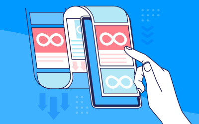
 Infinite scroll keeps users engaged, but it’s not always the best choice. This guide breaks down when to use it, when to avoid it, and how to design it right.14 min Read
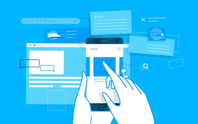 Learn how to design web and mobile app prototypes, how to test them and what to look for in a prototyping tool in this complete guide.15 min Read


