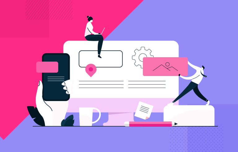
Responsive web design helps create seamless user experiences across all platforms and devices. Here are the best practices and 50 responsive website examples.
Responsive design should be standard practice for UX designers. Designing great user experiences for your users means that you must provide a seamless experience that meets their needs – and those needs can change depending on the device they’re using.
Design and prototype responsive websites. It’s free!

That’s why getting your head around all things responsive web design can inspire you to create better designs for the people who matter most: your users.
We’re going to run through 40 awesome responsive website design examples so that you can get inspired to start making your own prototypes. We’ll also go over some good-to-know best practices when designing them with your prototyping tool.
Responsive design is a response (pardon the pun) to the proliferation of screens and devices that we’re increasingly reliant upon in the 21st century. Responsive design aims, at least, to answer the problem of multiple screen sizes and create a unified system across all types of device, whether it’s a traditional desktop or a tiny smartphone.
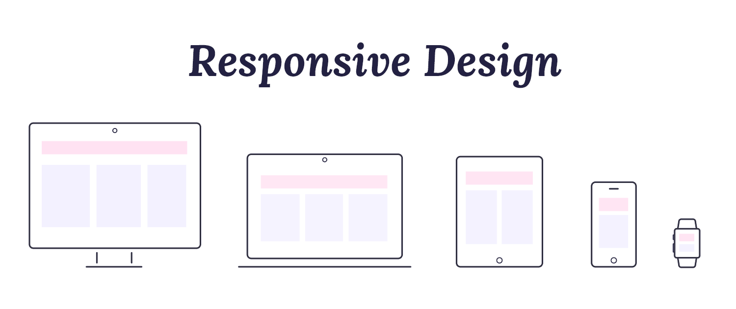
What this means is having a consistent user experience regardless of what you’re using to view it. Whether you’re firing up a website on your iPhone or your laptop, you should be able to access the content you want, suited to your needs in that moment.
It’s UX designers who have to deal with these constraints so that they’re able to design appropriately – neglecting this can really hinder the user experience of your website or mobile app.
Imagine using your phone to browse your favorite website only for elements to be scattered all over the screen, calls to action in the wrong place or typography that’s way too big. Not fun, right? Responsive design is the solution to these common problems.
In a nutshell, responsive design means that your web page should look good, be easy to use and work on any device at any resolution.
Design and prototype responsive websites. It’s free!
The rise of responsive design has to do, in many ways, with the rise of mobile devices. People now switch from a laptop’s large screen to a smartphone’s small screen without a second thought. With over 3 billion smartphones in use worldwide, it’s clear that designers must prioritize mobile-friendly websites.
Google plays a big role here too. No matter where you are, you probably use Google to find things online. For most websites, Google is how people discover products. That’s why it’s crucial for designers to focus on mobile-friendly design – Google’s mobile-first indexing means your site’s mobile version is key to its search ranking.
In short, a responsive website isn’t just nice to have; it’s necessary for reaching users and ranking well on Google.
Right. Now we know what makes responsive design so important, let’s go over some characteristics that define responsive products.
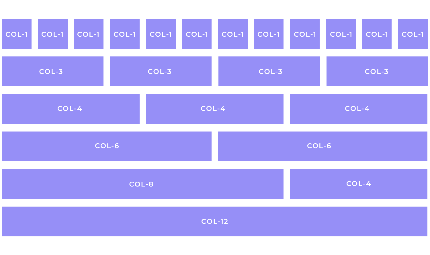
Fluid grids are a fundamental concept in responsive web design, enabling layouts to adjust seamlessly to different screen sizes and resolutions. The key to creating fluid layouts lies in the use of relative units (e.g., percentages) instead of fixed units (e.g., pixels).

Relative units like percentages allow for fluid, responsive layouts that adapt to different screen sizes. By defining element widths as percentages of their parent containers, layouts can expand or contract proportionally, ensuring optimal readability and visual appeal.
This approach also future-proofs designs, as they automatically adjust to emerging devices and resolutions. Ultimately, relative units enhance user experience by providing seamless transitions, improved navigation, and optimal readability across various screen sizes.
CSS Grid Layout is a game-changer for web designers, offering unparalleled control over layout complexity. You can precisely position and size grid items within cells by defining a grid container and its lines.
This powerful tool surpasses traditional methods like floats and tables, allowing for flexible and responsive designs.
Flexbox is an incredible tool that helps you arrange elements on a page. It’s like a flexible container that can hold your navigation items. You can tell Flexbox to arrange these items in a row or a column, and you can even control how much space is between them.
You can also make sure they all have the same size or that they take up as much space as possible. It’s a versatile tool that gives you a lot of control over how your elements are displayed on the page.
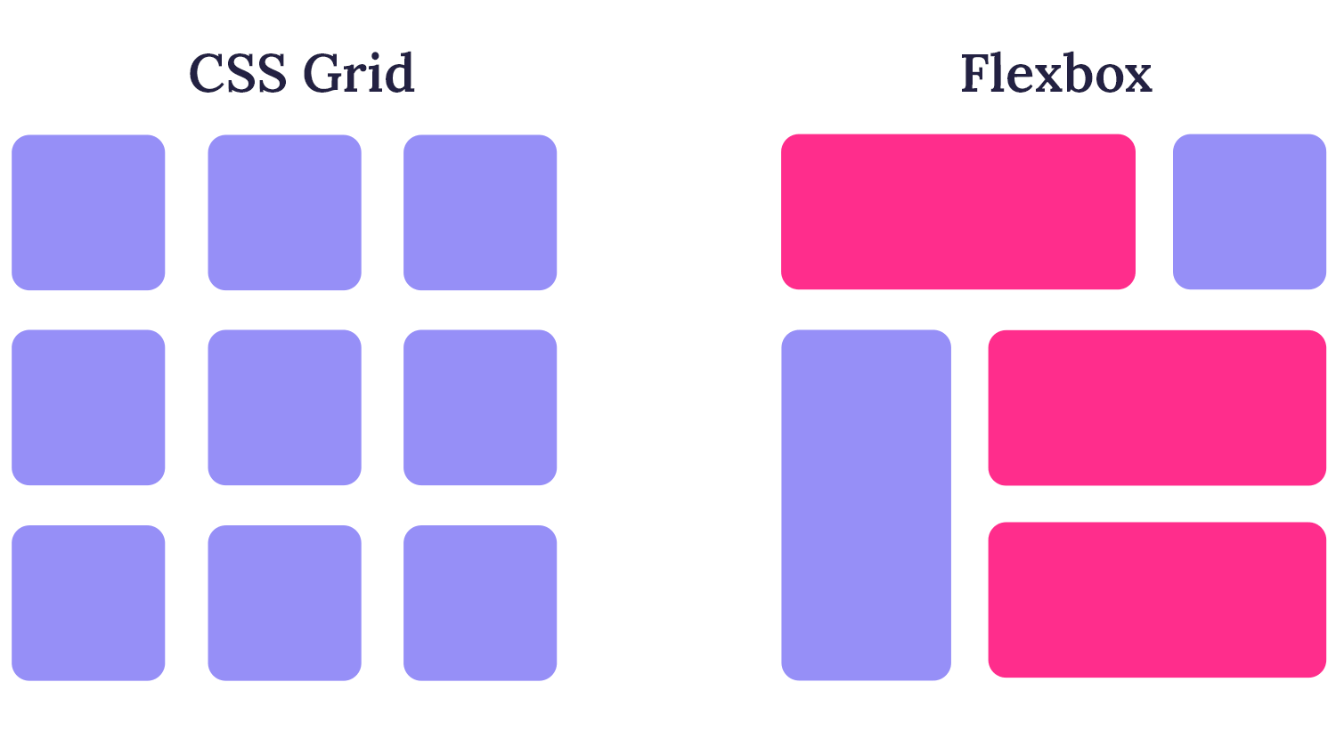
When choosing a tool to structure your website, consider the complexity of your design. For simple layouts, CSS Grid or Flexbox are powerful tools that give you direct control.
For more complex designs, frameworks like Bootstrap or Foundation can be helpful. They offer pre-built components and styles that can speed up development.
If you need a highly customized design, you might want to create your own CSS grid system or use a framework that offers extensive customization options.
Remember to consider the performance impact of your chosen tool. Some frameworks can add extra weight to your website, so it’s important to choose wisely.
Finally, think about the learning curve. Some tools are easier to learn than others. Choose a tool that fits your team’s skill level and the project’s timeline.
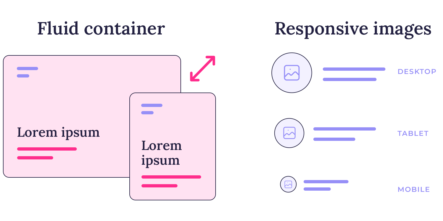
One important technique is using fluid containers. Think of a container as a box that holds the content of your website. A fluid container is a box that can change its size depending on the screen. So, if you’re on a small phone, the container will be smaller, and on a big computer screen, it will be larger.
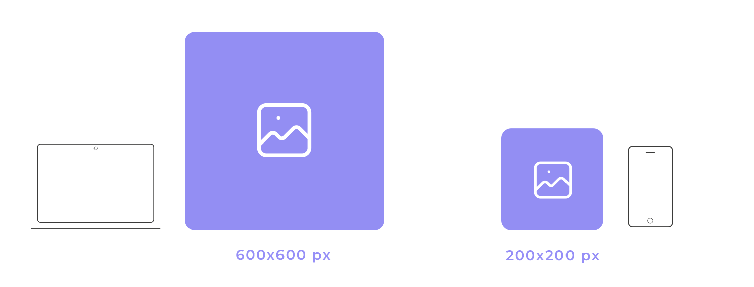
Another technique is using responsive images. This means using different image sizes for different screens. For example, a smaller image for a phone and a larger image for a computer. This helps the website load faster and look better on each device.
Finally, responsive typography ensures that the text on the website is easy to read on any screen size. The font size and line length adjust automatically, making the content comfortable to read, whether you’re on a phone or a tablet.
To further illustrate the concept of fluid containers, imagine a website with a main content area and a sidebar. Using percentages for the width of these elements ensures that they adjust proportionally to the screen size. On a larger screen, the content area might take up 70% of the width, while the sidebar takes up 30%. On a smaller screen, the content area might shrink to 80% and the sidebar to 20%. This flexibility ensures that the layout remains balanced and readable, regardless of the device.
Imagine you’re designing a website with a main content area and a sidebar. You want to create a layout where the content area and sidebar are side-by-side on larger screens, but stack on top of each other on smaller screens.
CSS Grid is the perfect tool for this. You can create a grid with two columns: one for the content area and one for the sidebar. On larger screens, you can specify that the content area spans two rows, while the sidebar spans one row. On smaller screens, you can adjust the grid to stack the content area and sidebar vertically.
Flexbox can also be used for this type of layout. You can create a flex container and place the content area and sidebar as flex items. By using the “flex-direction” property, you can switch between a row layout and a column layout based on the screen size.
Media Queries are essential for controlling the layout based on screen size. You can use media queries to apply different CSS styles to different screen sizes. For example, you can use a media query to switch between the grid and flexbox layouts, or to adjust the width and height of the elements.
Imagine you’re designing a website with a hero section that contains a large heading and a button. You want the heading and button to be centered on the page and have some space between them.
Relative Units: You can use em units to set the font size of the heading relative to the base font size. This ensures that the heading size scales proportionally with the overall font size of the page.
Viewport Units: You can use vh units to set the height of the hero section relative to the viewport height. This ensures that the hero section takes up a consistent amount of screen space, regardless of the screen size.
CSS Grid and Flexbox: You can use CSS Grid to create a simple two-column layout for the hero section. The heading can span both columns, while the button can be placed in the second column. Flexbox can be used within the button container to center the button text and icon.
Flexible images and media are essential to ensure a seamless viewing experience across diverse devices. By employing techniques like srcset and picture elements, designers can provide multiple image resolutions, optimizing performance and visual quality.
You can provide multiple image versions with different resolutions using the “srcset” element: like a small version for phones and a larger version for desktops. The browser will automatically select the appropriate version based on the screen size.
You can go a step further and use the “picture” element to define different image sources for specific media conditions. For example, you could specify a high-resolution image for devices with high pixel density and a low-resolution image for devices with lower pixel density. This ensures that the image loads quickly and looks great on all devices.
The background-size property offers precise control over how background images are displayed within a container. You can choose from several values to achieve different visual effects:
cover: This value scales the image to cover the entire container, cropping the image if necessary to maintain its aspect ratio.
contain: This value scales the image to fit within the container, maintaining its aspect ratio and potentially leaving empty space around the image.
initial: This value sets the background-size property to its default value.
inherit: This value inherits the background-size value from the parent element.
A specific length or percentage: You can specify a fixed width and height for the background image.
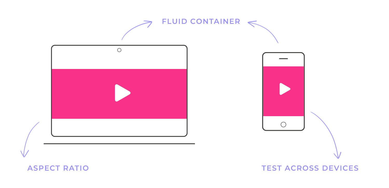
To ensure your videos look great on any device, you’ll want to make them responsive. This means they should adjust their size and shape to fit the screen they’re being viewed on.
For videos you host directly on your website, use the <video> tag. You can set the width and height attributes to specific pixel values, but it’s often better to use percentages. This way, the video will scale proportionally with its container.
For videos from platforms like YouTube or Vimeo, you can use an <iframe> to embed them. These platforms often provide embed codes that are already optimized for responsive design. Simply paste the code into your HTML, and the video will automatically adjust to the screen size. Here are some tips for responsive videos:
- Aspect ratio: Maintain the original aspect ratio of the video to avoid distortion.
- Fluid containers: Use fluid containers for your videos to ensure they scale properly.
- Test across devices: Test your videos on different devices and screen sizes to ensure optimal playback.
Media queries are a powerful tool in a web designer’s toolkit. They allow you to create websites that adapt to different screen sizes, ensuring a consistent and optimal user experience across all devices.
You can think of media queries as conditional statements in CSS. They allow you to apply specific styles to your website based on certain conditions, such as the screen width or device orientation, tailoring styles to specific screen sizes and device characteristics. Media queries enable you to:
- Improve page load times: By serving only the necessary styles for each device, you can reduce the amount of CSS that needs to be downloaded and parsed, leading to faster page load times.
- Enhance user experience: By adapting the layout and content to different screen sizes, you can provide a more comfortable and engaging user experience.
- Maintain consistent branding: Media queries allow you to maintain a consistent brand identity across different devices, even as the layout adapts.
CSS
@media (min-width: 768px) {
/* Styles for screens wider than 768px */
body {
font-size: 18px;
}
.container {
width: 80%;
margin: 0 auto;
}
}
In this example, the styles within the media query will only be applied to screens that are 768 pixels wide or wider. Common media queries include:
- min-width: Targets devices with a minimum screen width.
- max-width: Targets devices with a maximum screen width.
- orientation: Targets specific orientations (e.g., “landscape, portrait”).
To implement media queries in your CSS, you’ll use the “@media” rule followed by a specific media type and condition. For instance, “@media (min-width: 768px)” targets screens with a minimum width of 768 pixels. Within the curly braces, you can define CSS styles that will be applied to devices matching the specified criteria.
CSS
@media (min-width: 768px) {
/* Styles for screens wider than 768px */
body {
font-size: 18px;
}
.container {
width: 80%;
margin: 0 auto;
}
}
In this example, the styles within the media query will only be applied to screens that are 768 pixels wide or wider.
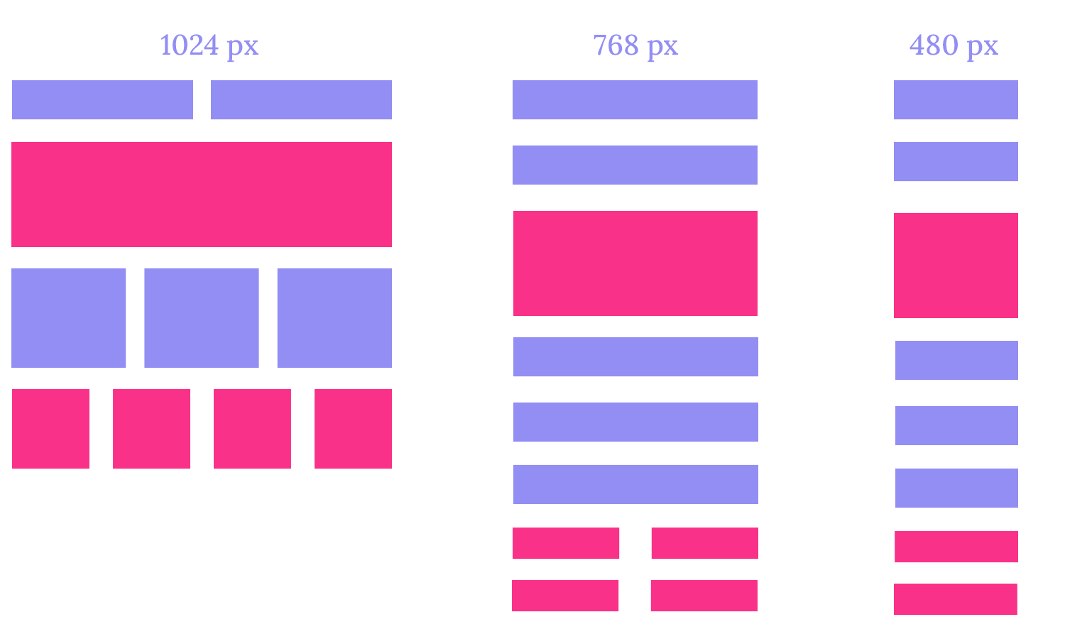
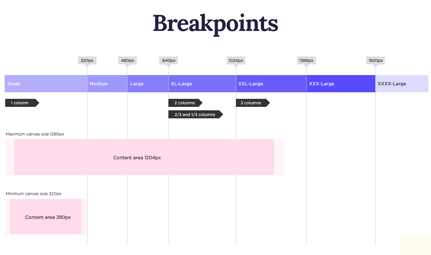
Breakpoints are specific screen widths at which you apply different styles. To ensure your media queries are well-organized and easy to maintain, adopt a clear naming convention. Group related queries together and use meaningful names that reflect their purpose. This approach enhances readability and makes it easier to understand the logic behind your responsive design. Here are some common breakpoints:
- Small screens (mobile phones): 480px
- Medium screens (tablets): 768px
- Large screens (laptops): 1024px
- Extra-large screens (desktop monitors): 1280px
CSS
@media (min-width: 768px) and (orientation: landscape) {
/* Styles for landscape orientation on tablets and larger screens */
}
To ensure your media queries are well-organized and easy to maintain, adopt a clear naming convention. Group related queries together and use meaningful names that reflect their purpose. This approach enhances readability and makes it easier to understand the logic behind your responsive design.
Break down your media queries into smaller, more focused rules, creating a modular structure. This modular approach promotes better organization, making it easier to manage and update your styles. By separating concerns and targeting specific breakpoints, you can maintain a clean and efficient codebase.
Thorough testing is crucial to guarantee that your media queries function as intended across various devices and screen sizes. Simulate different screen resolutions and orientations to identify and address any potential issues.
Additionally, leveraging CSS preprocessors like Sass or Less can streamline your workflow and improve the efficiency of your media queries. By adhering to these best practices, you can create responsive websites that deliver exceptional user experiences on any device.
Hamburger menus are a popular design pattern for compact navigation on mobile devices and smaller screens. They typically consist of three horizontal lines that, when tapped, reveal a full navigation menu. This approach conserves screen space while maintaining accessibility to key navigation elements.

Off-canvas navigation is a common technique for displaying the full navigation menu in a hamburger menu. When the user taps the hamburger icon, the menu slides in from the side of the screen, often overlaying the main content. This approach provides a clean and efficient way to reveal additional navigation options without cluttering the main screen.
To create effective hamburger menus, consider the following tips:
- Clear Iconography: Ensure the hamburger icon is easily recognizable.
- Intuitive Navigation: The menu should be easy to navigate, with clear labels and a logical structure.
- Fast Performance: The menu should open and close quickly, without causing delays or interruptions.
- Accessibility: Make sure the menu is accessible to users with disabilities, such as those who rely on screen readers.
For websites with complex navigation structures, dropdowns and toggle menus offer elegant solutions. Dropdowns, triggered by hovering or clicking on a menu item, reveal submenus. Toggle menus, often in an accordion style, allow users to expand and collapse sections, providing a concise and organized navigation experience.
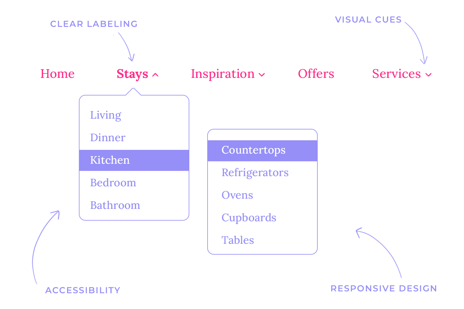
Key considerations for effective implementation:
- Clear labeling: Use clear and concise labels for menu items and submenus.
- Visual cues: Employ visual cues like arrows or icons to indicate expandable sections.
- Responsive design: Ensure that dropdowns and toggle menus function correctly on different screen sizes.
- Accessibility: Make sure the navigation is accessible to users with disabilities, including those who rely on screen readers.
Sticky and floating menus are powerful tools for enhancing user experience. Sticky menus remain fixed at the top of the screen as the user scrolls, ensuring easy access to navigation options. Floating menus, on the other hand, gradually appear as the user scrolls down the page, offering a more subtle navigation experience.
When implementing sticky and floating menus, it’s crucial to consider visual clarity, performance impact, and mobile responsiveness.
To ensure optimal user experience across different devices, consider the following responsive design principles:
- Prioritize content: The most important navigation items should be easily accessible on all screen sizes.
- Clear visual hierarchy: Use typography, color, and spacing to create a clear visual hierarchy within the navigation menu.
- Touch-friendly design: For mobile devices, ensure that menu items are large enough to be easily tapped.
- Testing and iteration: Continuously test your navigation design on different devices and screen sizes to identify and fix any issues.
Etsy offers a great example of adaptive design. While the tablet and desktop versions share a similar layout, the mobile version prioritizes a streamlined experience. The navigation bar disappears, reducing clutter and focusing on the core user action: product browsing. The prominent search bar caters to users who often have a specific item in mind.

To emulate Etsy’s approach, prioritize your key benefits and user goals for smaller screens. If navigation isn’t the primary interaction, consider replacing the hamburger menu with a prominent search bar. This shift can significantly improve the mobile user experience, ensuring a fast and efficient browsing experience.
VMV Studio, a creative haven for designers, filmmakers, and visionaries, embodies its innovative spirit through a dynamic and visually striking website. The site bursts with life, featuring animations, bold graphics, and captivating videos that showcase the studio’s creativity and technical prowess. Subtle design touches, such as a frosted glass footer and text that fills as you scroll, add a unique and engaging element to the overall experience.

Even on smaller screens, VMV Studio’s website maintains its vibrant design and high-quality content. The mobile version seamlessly adapts, preserving the high-quality videos, scroll effects, and full range of content found on larger screens. The portfolio grid transitions from a spacious desktop layout to a streamlined single-item-per-row format on mobile, ensuring a smooth and user-friendly scrolling experience.
Klientboost is a great example of how to create a seamless user experience across different devices. Their website loads quickly, even on slower connections, and maintains a consistent look and feel.

A key aspect of their responsive design is the adaptive navigation. On desktop and tablet devices, the full navigation menu is visible, including a “Get Proposal” call-to-action and a “We’re Hiring!” message. However, on mobile devices, the navigation is simplified to a hamburger menu icon, prioritizing the most important actions like contacting the company. This approach demonstrates a deep understanding of user behavior on different devices.
Treehouse provides a prime example of responsive design, prioritizing a seamless user experience across devices. Their navigation adapts gracefully to different screen sizes, transitioning from a detailed four-item menu on desktops to a simplified one-item menu with a hamburger icon on mobile. This approach ensures clarity and focuses user attention on the most important actions.

Similarly, their form fields adapt to the screen size. On desktop and laptop screens, they’re presented in a two-column layout for efficiency. However, on smaller screens, the form fields are reorganized into a single-column layout to optimize the user experience.
WillowTree provides an excellent example of a well-executed responsive design. They’ve implemented a static navigation bar at the top of their mobile site, offering a consistent user experience. This approach ensures that key navigation elements are always accessible, even on smaller screens.

Additionally, WillowTree has effectively adapted its grid layout to different screen sizes. The number of columns in the logo section and the layout of the hero section adjust seamlessly to fit the available space. This ensures optimal readability and visual appeal across devices.
The New York Times website successfully translates its iconic print format into a responsive digital experience. On desktop, the site maintains a classic newspaper layout with flexible grids, a prominent subscription call-to-action, and a comprehensive footer.

When viewed on mobile devices, the site adapts to a more compact design with a pop-up subscription prompt, simplified navigation, and a 1×1 grid layout for streamlined storytelling. The mobile version also incorporates interactive elements like game links, creating a user-friendly experience that captures the essence of the print edition while optimizing for digital consumption.
Ten by Twenty showcases a unique approach to responsive design, prioritizing flexibility and simplicity. Instead of relying on rigid breakpoints, the website adapts gracefully to various screen sizes by utilizing fluid grids and flexible elements.

On larger screens, the content is organized into well-defined columns, creating a clear and visually appealing layout. As the screen size decreases, the layout seamlessly adjusts, prioritizing the most important content and reorganizing elements to maintain a clean and user-friendly experience.
Grammarly‘s website is a testament to the power of responsive design, particularly for content-heavy websites. It seamlessly adapts to various screen sizes, ensuring a consistent and user-friendly experience across devices.

On larger screens, the website offers a spacious layout with ample room for content. However, as the screen size decreases, the layout intelligently adjusts. The form elements and navigation menu gracefully adapt to fit the smaller screen, prioritizing essential features and maintaining a clean interface. This ensures that users can easily access the core functionalities of the website, regardless of the device they are using.
Spotify‘s website is a prime example of responsive design, showcasing how a complex platform can adapt seamlessly to different screen sizes. The platform’s clean and intuitive interface remains consistent across devices, ensuring a familiar user experience.

The navigation menu is a key element that adapts dynamically. On larger screens, it provides a full range of options, while on smaller screens, it condenses into a more simplified menu, often with a hamburger menu icon. This prioritization of essential features ensures a smooth and efficient user experience on mobile devices.
Additionally, the music player itself is responsive, adjusting its layout and controls to fit the available screen space. This allows users to enjoy their music seamlessly, regardless of the device they are using.
Airbnb‘s website is a testament to the power of responsive design. It effortlessly adapts to different screen sizes, from large desktop monitors to small smartphone screens, while maintaining a consistent user experience.

On larger screens, the website offers a spacious layout with detailed information and multiple booking options. As the screen size decreases, the layout intelligently simplifies, prioritizing essential features like search and booking. This ensures that users can easily find and book accommodations, regardless of the device they are using.
Esperia Advocacy’s website is a perfect example of responsive design done right. On a desktop, you’ll see a polished, professional layout that effectively highlights their services and expertise.

Switch to a mobile device, and the site transitions effortlessly. The simple hamburger menu keeps navigation easy, and the visuals and text stay sharp and readable. No matter which device you’re on, browsing this website is smooth and straightforward.
New York City Ballet makes use of video on all its platforms which gives users a taste of what to expect from going to one of their shows.
The tablet and desktop website share many similarities which help create a consistent user experience across all of their websites and the mobile experience isn’t hindered either.

The navigation bar stays the same throughout but the show information is removed for the mobile experience, maintaining only the call to action.
Paper Tiger is a design agency based in New Jersey and its website goes to show how when the type of images and typography used is considered in respect to space, the same style can be maintained.

What you get with this website is clean, adaptable typography with optimal use of line spacing along with bold visuals and dynamic animations that can be seen across all platforms, creating a fun and whimsical experience no matter the device you’re using.
Wired prioritizes content on all platforms, ensuring that users get to the information and articles they want quickly.
A good example of this would be if we compare the mobile version with the desktop and tablet. The former is drastically simplified so as not to dazzle the user and takes advantage of the constrained space to present the “Top Stories” before anything else.

In general, the smooth navigation and easy to find social buttons make sharing articles by Wired a breeze.
Design and prototype responsive websites. It’s free!
The V&A museum of art and design combines eye-grabbing imagery, typography and color schemes which not only complement each other, but also work well across different platforms.
It whips out the infamous hamburger menu on its mobile device.

To counter the menu’s infamy, V&A have opted to couple it with clear copy, letting users know where they can find the navigation options.
The mobile version also prioritizes vital information, namely the opening hours and this can be seen with a point size.
Popular Science gives you a great user experience no matter which device you’re using.
Content takes center stage, as you’d expect, and with responsive imagery and clean typography, Popular Science successfully creates a responsive website that’s easy to read and use.

The information on this website is presented in such a way that all of its content can be easily scaled down across a broad range of devices.
The airline Swiss Air maintains its bold call to actions on all platforms, so users can get their hands on the best flights and deals regardless of the device.
The mobile and tablet version of the website resize appropriately to the size and resolution of the screen without losing any important content and is very usable, easy to navigate and practical.

Changing the grid on the main website and tablet version to rows on the mobile version was also a sensible choice.
Spigot Design offers web design and development with a fully-personalized service. Its website boasts a captivating hero video with an on-trend semi-transparent color layer over the top. It works perfectly, irrespective of which device you happen to be viewing it on.
Furthermore it’s a website that brings the user a simple and intuitive experience which is not sacrificed on smaller platforms with vertical scrolling panels.

Consideration has also gone into the use of easily visible buttons on smaller devices; the two CTAs buttons are still the first things the user sees, and the hamburger menu button conveniently moves down to the bottom horizontal row so that it can be easily tapped with a thumb.
Fashion brand MGSM specializes in the latest trends in its market but it’s also on top of its game in terms of web design.
They make great use of the background hero photo, something that’s generally make or break. It’s high definition, bold and loud, like the fashion it’s trying to convey and works perfectly when scaled down to a smaller resolution.

Content wise, the most important thing for its users to see are obviously the product ranges, which are still viewable on smaller platforms where the menu options have been collapsed – a smart move to avoid overloading the user.
Design and prototype responsive websites. It’s free!
German design website DMIG 5 boasts striking sketch imagery with a color scheme that contrasts perfectly along with an aesthetically appealing Sans Serif typeface.
This imagery and typography both gel into a perfectly synchronous parallax scrolling experience for the user and manages to maintain this effect when scaled down to smaller versions.

The website title is interestingly reduced from “DMIG 5” to just “5” when resized or viewed on a mobile device meaning that the designers really thought about the amount of detail in smaller resolutions and how that would impact the user experience.
Visual Identity’s website is a great example of how responsive design can improve user experience. When you visit the site on a desktop, you’re greeted with a sleek, modern layout that showcases their work beautifully.

Switching to a mobile device? No problem! The site adjusts perfectly, with a simple hamburger menu for easy navigation. The visuals stay sharp, and the text remains clear and readable, ensuring that browsing their services is a smooth and enjoyable experience no matter what device you’re using.
Design website Smashing Magazine screams out loudly in red – it’s a minestrone of fun, clickable elements and content.
The richness of content, however, doesn’t stop the user from getting a clear view of everything and the site is easy to navigate, even when its size is reduced.

This is achieved through adequate use of spacing and typography; the typeface size and position of the content was clearly developed with an awareness of the page size.
The “Topics” button changes to a “Menu” button as a solution to condensing the breadcrumb elements and kills two birds by leading into the “Topics” section.
When you visit the website of a music festival, the first thing you want to see is the line-up. Who’s playing?
Flow Festival, which takes place in Finland, has a website which does exactly that, combining a minimalist design with large text against a white background and large photos to advertise exactly what matters to the user – the artists.

The sections of the site are divided using a visually pleasing dynamic moving text, bringing back the kitsch Marquee design of the 90s. On the small-screen version, this is taken down a notch so as not to overcrowd the screen.
Magic Leap One is all about creating augmented and virtual reality for its users and the website is all about showing that off. And it does it remarkably well with a unique, highly interactive experience that is maintained across all platforms.
The user is treated to a rich and detailed graphical display when scrolling up and down through the website, with a design technique that feels similar to parallax scrolling but with an extra dimension.

Aside from impressive graphics, the website’s design also takes into account the smaller but equally important details, such as the “scroll down” text which exists on the larger desktop resolution to guide the user, but is omitted from the mobile screen where scrolling would come more naturally.
Design and prototype your web and mobile apps. It’s free!
Dropbox has done an excellent job of tailoring down its website to suit smaller devices. The desktop version boasts a sleek aesthetic with grid and image colors that complement each other.
What’s more is that the first image rotates on the the mobile version to fit the tighter space. On top of this, some of the grid colors also change for the mobile version, prompting a change of font color so that the page remains readable.

A further solution to the lack of space on the mobile version is that instead of having the signup form pop up on the right side of the screen, it is hidden behind a CTA.
GitHub demonstrates what’s important to show the user when it comes to business and conversion goals. For example, when you land on their desktop and tablet versions, among the first things you notice is a description of what GitHub offers.
Beside the description is a form where the user can sign up to GitHub, even though there is another signup call to action on the menu bar. This provides the user ample opportunity to complete the action if they are slightly more distracted with the extra content and elements on display on larger resolutions.

However, when scaled down to the mobile resolution, the signup form is removed. More than likely because the signup button is more visible on the top bar, where it sits next to a hamburger menu icon which wraps up all the different menu options to make the UI more compact and neat.
On the Shopify menu bar, we can see two groups of options. They group the main menu options to the left which revolve around the fundamental operation and navigation of Shopify. To the right is another group that has less to do with navigation and functionality within the site, such as logging in, signing up and learning about pricing and a CTA for starting a free trial.
However, at the tablet and mobile resolutions, we see that these options are stowed away under a hamburger menu icon to declutter the screen. What’s interesting is the fact they still managed to highlight that the menu options form two distinct cognitive groups by separating them with a dividing line.

Interestingly enough, they also include a third group which comprises the navigation options at the footer, in case users are less likely to scroll down to see them on a mobile device.
Design community, Dribbble hides its menu options behind a hamburger menu on the left. There seems to be a lot of divided opinion in the design community about the side of the screen where the hamburger menu should go. According to Android Material design, hamburgers should go on the left, while many designers argue it should go on the right because it suits the thumb zone of the majority of users who are right-handed.

However, the hamburger being fixed to the left of the screen does make sense, in Dribbble’s case. Consider that most users, when they land on Dribbble, tend to search for specific design categories. It now makes a lot of sense to reserve the right hand side for the filter bar!
We also think that dribbble is a great example of transitioning from multiple columns down to just one for the mobile versions.
Slack also groups its menu options into a hamburger menu for the tablet and mobile versions of its website. And what we see is also a reduction of the number of CTAs to “Try for Free”. Instead of two CTAs above the fold, in the mobile and tablet views these are replaced by one large button that nearly takes up the full width of the screen.

Their webpage content is compressed into one column on mobile, with text paragraphs following images and even the line of company logos that use their services gets compressed to form three lines.
Design and prototype your web and mobile apps. It’s free!
What we find interesting about CSS Tricks is that, for their popular monthly content, they use a carousel for both the desktop and responsive versions of their website.
Oddly enough, on the mobile version, this carousel actually provides a more comfortable experience. On the desktop you’re required to use a scrollbar to swipe the content, something which most UX-UI designers are trying to avoid today.

In this case, there could be better options out there than the carousel to display the postcards. On top of an awkward UX when it comes to web users, carousels have been known to cause problems ranking in Google’s SERPs.
However, the fact that they chose not to display ads at all in the mobile version is a nice touch. After all, the content that is necessary on the mobile version takes up most of the screen real estate.
Normally, having moving elements on the mobile versions of a website tends to be less frequent and static elements often prevail. This makes sense given there is much less screen real estate to play around with, and moving elements on a smaller screen can be too distracting and jarring.
However, Web design agency, Deux Huit Huit, are a great example of how you can still retain subtle movement in scaled-down versions of your website while providing the same user experience.

The text on the hero image still moves and their GIFs are still GIFs. However, when scaled down, they hide their menu options literally behind the word “Menu” which functions as a button. Including tappable text in mobile versions can be a bit counterintuitive to mobile users, but still, we appreciate the initiative.
Another aspect we’re not keen on is that, on the mobile version, they chose to banish the “Hire Us” CTA in the menu as a mere option near the bottom which doesn’t do it any justice. This example shows that it’s important to take content hierarchy and business goals into account when designing your responsive website.
Rally Interactive is an example of a responsive website that attempts to provide the user with the ultimate seamless experience between the mobile and desktop versions of their website. The hamburger menu is the exact same on the desktop version as it is on mobile. The images are the same and pretty much all of the content – including the back to top button – is the same. The only thing that changes on the mobile version is that the two-column text shifts to one column.

Could a desktop user have the same experience on a mobile device? The answer is yes. Is having exactly the same experience a good thing? The jury is out on that one. Hiding the menu options behind a hamburger on the desktop version doesn’t always make sense, depending on your website’s business and usability goals. Many UXers maintain that the extra screen real estate should be used to display these options, which leads to improved discoverability.
VML Digital Marketing and Advertising Agency’s responsive website goes from a three-column layout to a single column once it gets scaled down to smaller resolutions. However, most of the content stays the same. Even the hamburger menu remains the same as the desktop version, like in the example above with Rally Interactive.

However, while everything works well in the mobile version, we would consider an overhaul of the button design in the mobile version. Even though everything scales down nicely, the button design is a little too minimal and doesn’t look clickable. On the desktop version, there is a highlight transition effect when the mouse hovers over them. On the mobile version, however, the effect is not seen until the user taps.
Forefathers Group is a design studio that obviously puts a lot of thought and effort into the desktop design of their website. The first thing the user is greeted with when they land on the desktop version is a silent hero video of some puppet designers hashing out their daily lives in the studio.
However, all this is lost when the website is scaled down to mobile resolutions, with the hero video being replaced instead by the logo, which doesn’t quite do justice to the hard work that they put into their puppetry. Although it’s hard to capture the delight of a puppet’s movements in a static image, we can’t help but think that even that might have been a more visually appealing solution.

Having said that, their scaled-down design is clean and works from a functional point of view, making it a great responsive website example. The only problem with functionality is that the social buttons completely disappear on the phone and tablet versions of their website. A bold move that has us on the fence.
Design and prototype your web and mobile apps. It’s free!
Often parallax scrolling tends to be the reserve of web design, mainly because it’s very difficult to get right on mobile. This is often due to lack of screen real estate; having too many moving layers in the UI can distract or confuse the user and render the navigation unclear. As a result, many websites normally become static once scaled down to their mobile versions.
However, Naomi Atkinson’s website is a great example of how to make parallax scrolling work on mobile devices. When scaled down to cell phone resolution, the parallax scrolling that shows off their projects provides exactly the same pleasant experience as the web version. The buttons move in unison with the content as the user scrolls the page, so they are easy to click on.

However, if we had one gripe about this responsive website example, it would be the use of the + icon to store menu options instead of a hamburger menu. Generally, using icons that agree with most users’ mental models takes preference over style. That’s not to say you can’t innovate on the design of a hamburger icon. Nonetheless, using a + icon to open a menu is a no-go for us when that icon is used for so many other actions, such as increasing volume, brightness, or contrast or adding items to lists.
Kristina Horan’s website is a perfect example of responsive web design in action. It seamlessly transitions from desktop to mobile, making sure the user experience across all devices is consistent and enjoyable.

The site’s design looks fantastic showcasing her work beautifully. It’s a great example for other designers to learn from and be inspired by.
BeDance School is a responsive website template from Muffin Group. It’s colorful, it’s eye-catching, and ticks most of the boxes when it comes to a captivating UI design. And it’s mostly responsive too: each element, image and text paragraph scales down nicely according to its place within the predetermined content hierarchy.

However, one thing that is amiss is that the call to action buttons for “About Us” and “Our Offer’ don’t resize adequately when scaled down to cell phone and tablet view. Remember, the average fingertip span measures about 44×44 pixels! But it’s not just that these buttons are difficult to click on the mobile version, but the CTAs are also near-impossible to read!
Starbucks is a great responsive website example – simple, eye-catching responsive design done right. There’s no fancy parallax, but it gets the job done equally well with static but colorful imagery of their seasonal product line. One dilemma they might have had though is that their product “menu”, which also happens to be a menu option, is bundled up into a hamburger menu when the design is scaled down.
Why might this be a problem? You guessed it! Because many users don’t expect to see an option for “Menu” when they open up the hamburger menu. However, Starbucks obviously knew their users well enough to realize that they would “get it” that in this case, they are obviously talking about its product menu and not the website menu!

Another noteworthy aspect is their approach to content hierarchy when scaling down their content for smaller resolutions. For example, a paragraph describing their Rewards Visa Card appears to the left of an image of the card on the desktop version. Normally, when two columns are scaled-down, the content on the right tends to go below that on the left. However, in this case, the image shifts position to above the description. This setup lets them show off the card before the text.
You’ll be blown away by this one. Trent Walton, a jack-of-two-trades designer, and programmer actually created a website whose layout barely changes at all. The only differences seen are multiple to single column shifts on the info and search pages.

And even those changes are merely about shifting text columns below images. Many designers wish their design projects were that easy! However, if the content and the design approach allow, like in this case, then providing a cloned experience on mobile and tablet versions might well be the easiest and most cost-effective solution. The most important thing is that your responsive design provides the same great UX across all devices.
Design and prototype responsive websites. It’s free!
Hotels often have fancy, regal or prestigious UI designs in an attempt to convince users of the luxuries that await if they make a reservation. The Scott Resort creates a seamless experience that sees everything, once scaled-down, work the same way as when it is viewed on the desktop version.
One impressive aspect of this responsive website example is that it shows how even the most intricate design patterns, when paired with attention to detail can work when designing for mobile-first. For example, the header text the user sees (Find yourself here) and the CTA button to watch the video overlap the hero video, and the button is transparent.

When scaled down to smaller resolutions, the text and button maintain the same style but shift below the video, showing that the designers took priority when it comes to space and usability. However, the button design should ideally look more clickable.
Nixon is another example of a great responsive web design. Great on any device, whether you’re on a big screen or your phone, their watches and accessories are always front and center.

When scaled down to mobile devices, the site uses a hamburger menu for easy navigation, and key product details are right there, making browsing smooth and enjoyable.
Red Edition, the stylish Parisian furniture brand, really nails responsive web design. Their website looks great on any device. On your phone, it switches to a handy hamburger menu, keeping all the important product info easy to find.

The clean layout with quality images and great typography makes everything look neat and readable. The smooth slider on the homepage and the spacious design make browsing a joy.
Ceremony Coffee‘s website is a fantastic example of responsive web design. No matter if you’re on a laptop or your phone, the site looks awesome. On mobile, it shifts to a simple hamburger menu, keeping everything easy to navigate. The site features beautiful images and clean, readable text, making it a pleasure to browse and learn about their amazing coffee.

Ethical Essence’s website is a fantastic example of responsive web design. When you’re on your phone, it smartly switches to a straightforward hamburger menu, making it super easy to navigate. The site features beautiful images and clean, readable text, making it enjoyable to explore their ethical products.

Following the clean design of Ethical Essence, here’s another good example of a responsive website. Velocity X offers a dynamic and modern feel with cool hover effects and horizontal scrolling to create movement in the background. With its vibrant purple, orange, and turquoise colors, and a helpful FAQ section at the bottom, it maintains a cohesive look.

When viewed on mobile, Velocity X keeps its sleek style but makes navigation easier. Elements resize perfectly, and horizontal scrolling is just a swipe away. The card menus turn into a simple list, ensuring the site remains user-friendly and stylish.
Design and prototype responsive websites. It’s free!
Suso Digital’s website continues the trend of great responsive design. Whether you’re on a desktop or mobile, the site adapts beautifully. On mobile, it uses a handy hamburger menu to keep navigation simple.

The clean layout, sharp images, and clear text make it easy and enjoyable to explore their digital marketing services.
Aura Studios’ website is a great example of responsive web design. It’s fresh, interactive, and shows off their creativity. When you switch to a smaller screen, the site stays user-friendly and easy to navigate. On mobile, it shifts to a hamburger menu, making it simple to get around.
Browsing their stunning portfolio is always a pleasure in both, desktop and mobile.

Product Hiring House’s website makes job hunting a breeze, no matter what device you’re using. On a desktop, it has a clean and professional layout that’s easy to navigate.
When you switch to your phone, the site adapts perfectly with a simple hamburger menu. The clear design and easy-to-read text make finding job opportunities straightforward and stress-free.

The Boat House Agency is a great responsive web design example. On a computer, it’s clean and easy to see their cool work. On your phone, the site changes perfectly to fit the smaller screen. There’s a handy menu button (those three lines!) to get around easily. The pictures are clear and the words are big enough to read, no matter what you’re using to visit the site.

Wrapping up our list, Scope Theory’s website is a prime example of responsive design done right. On your desktop, you get a sleek, modern layout that showcases their innovative projects beautifully.

When you switch to your phone, the site doesn’t miss a beat. It seamlessly transitions to a handy hamburger menu, keeping everything easy to find. The sharp visuals and clear text make browsing a breeze, whether you’re at home or on the go.
Prototype a responsive website with Justinmind. Here’s how you can do it:
Start a new project: open Justinmind and begin your new prototyping project. This gets you started on your responsive design journey.
Set up breakpoints: setting breakpoints is essential for responsive design. They allow your website to change its layout based on the screen size. In Justinmind, you can set them to make sure your site looks great on all devices, from mobile phones to tablets and desktops.
Use fluid layouts: with Justinmind, you can create layouts that automatically adjust to different screen sizes. This means your site will stretch or shrink to fit any device, providing a seamless experience for users.
Add responsive widgets: Justinmind offers widgets that are already optimized to be responsive, like text fields, checkboxes, and buttons. Using these makes sure that all elements work well on any device.
Preview and test: Justinmind lets you preview your design on various devices. This helps you see exactly how your website will look and function across different screen sizes, making sure everything works smoothly and looks great.
Share your design: when your design is ready, share it with your team directly through Justinmind. This makes it easy to collaborate and get feedback. Sharing your prototype helps everyone stay on the same page and improve the design before it goes live.
Design and prototype responsive websites. It’s free!
Responsive design is a really versatile approach to designing. There are plenty of ways to display content and part of the fun of UX design is figuring out how to deliver that content in a way that doesn’t discriminate depending on the device it’s displayed on. At first, you may feel trapped by the constraints but responsive design is about making magic within those constraints.
PROTOTYPE · COMMUNICATE · VALIDATE
ALL-IN-ONE PROTOTYPING TOOL FOR WEB AND MOBILE APPS
Related Content
 A fun look at different data table designs, from basic lists to smart, interactive ones, based on how complex the data is and what users need.18 min Read
 Single page design v multi-page design – everything you need to help you choose the right design for your site’s content18 min Read
 Website backgrounds can be a powerful tool in creating an experience. But what kind of experience can you convey and how? We got the full run-through for you!14 min Read


