E-commerce website designs have evolved so much, it can be hard to keep up. These websites didn't just keep up though - they are the ones pushing the boundaries!
E-commerce. It’s grown to be such a big presence all around the internet, and in all of our lives. More and more, stores are investing a great deal of resources into moving their business online, with the promise of reaching a bigger audience. But what makes good one?
We got together a list of 20 great e-commerce website designs that managed to tick all the right boxes – which is no easy task. These platforms are proof that designers can let their creativity run wild while still delivering a space that makes users want to shop.
But before we get right into why these websites are great , let’s take a look at some of the business that goes hand in hand with design.
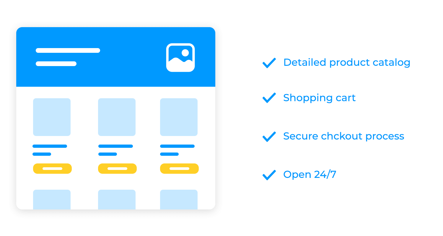
E-commerce websites are like a digital storefront, or a virtual marketplace, where customers can explore, select, and purchase products or services with just a few clicks. It’s like having a 24/7, global store open for business, ready to serve customers anytime, anywhere.
With features like a detailed product catalog, a convenient shopping cart, and a secure checkout process, your e-commerce website can be the preferred shopping experience. Your customers can feel more valued with features like order tracking and customer support, meaning they would likely come back for more!
Before diving into the design and development of your e-commerce website, it’s essential to lay a solid groundwork. This involves understanding your target audience, defining your business goals, and conducting a thorough competitor analysis.
These elements will guide the entire development process and ensure that your website meets the needs of your customers and aligns with your business objectives. We get into all that with more detail below. Get your pens out and start taking notes!
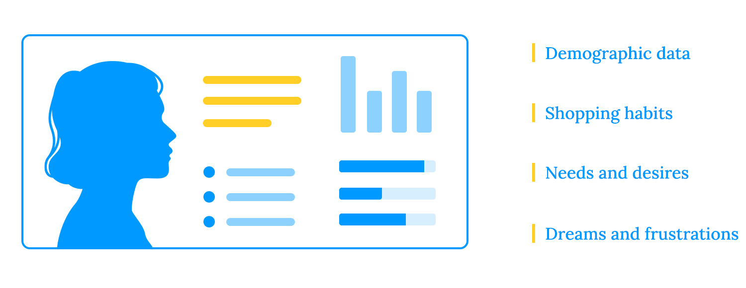
To build a successful e-commerce website, it’s crucial to understand your target audience inside and out. Who are they? What do they like? How do they shop online? By knowing their demographics, shopping habits, and preferences, you can tailor your website to meet their specific needs and desires. This will help you create a more engaging and effective shopping experience that drives sales and customer loyalty.
One way of better understanding your target audience is by creating a user persona. User personas are like blueprints of your ideal customers. They’re not just data points; they’re real people with stories, dreams, and frustrations.
Think of your e-commerce website as a high-performance race car. To win the race, you need a clear destination and a roadmap to get there. That’s where business goals come in. They’re the compass that guides your online store toward success. Here are some key metrics to keep an eye on:
- Conversion rate: The higher your conversion rate, the more visitors are turning into dollars. For example, if your goal is to increase your conversion rate from 2% to 5%, you might focus on offering more compelling promotions.
- Average order value: To increase your average order value, you could consider offering bundle deals, upselling premium products, or providing free shipping for orders over a certain amount.
- Customer lifetime value: The higher your customer lifetime value, the more revenue you generate from each customer over time. Focus on building strong relationships, providing excellent customer service, and offering loyalty programs in order to increase customer lifetime value.
- Return on investment (ROI): This is like the overall performance of your car. ROI measures the profitability of your e-commerce venture. To improve your ROI, you might need to optimize your marketing efforts, reduce costs, or increase your sales.
In the fast-paced world of e-commerce, staying ahead of the competition is crucial. A thorough competitor analysis is a strategic tool that can provide invaluable insights.
Start by identifying both direct and indirect competitors. Direct competitors sell similar products or services to the same target audience, while indirect competitors offer alternative solutions to the same problem or need.
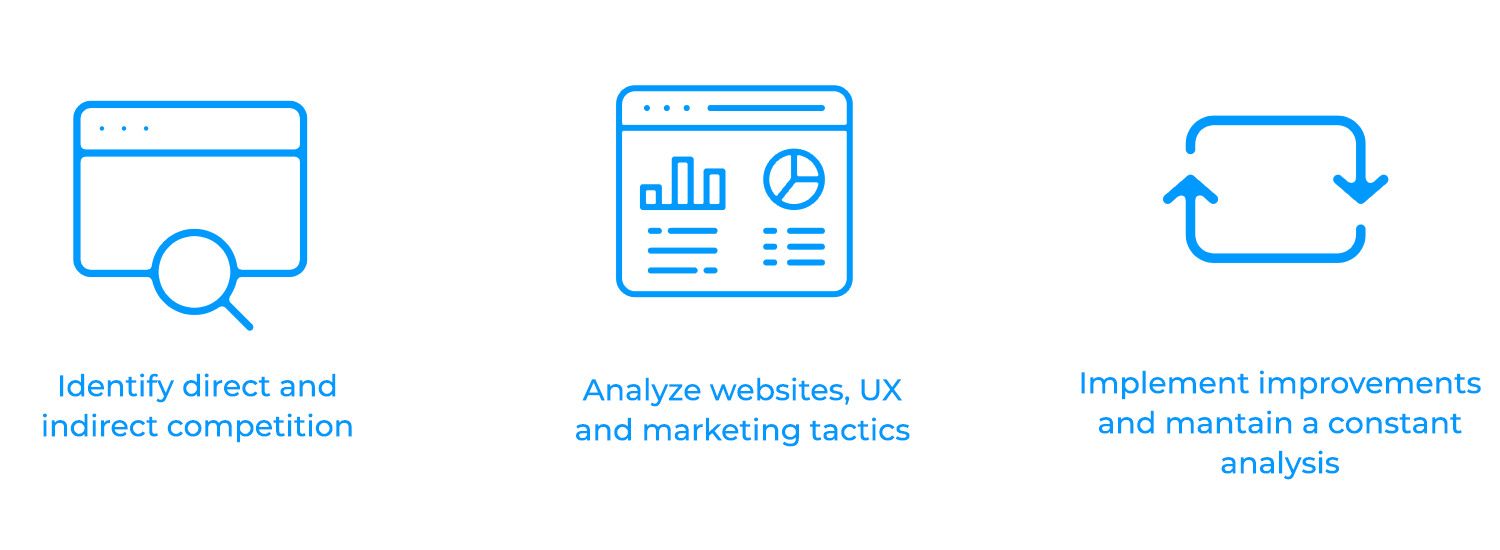
Once you’ve identified your competitors, delve into their websites, evaluating factors like user experience, product offerings, pricing strategies, and marketing tactics. While analyzing their strengths and weaknesses, you can also identify areas where your own website can improve.
For example, if a competitor has a particularly effective email marketing campaign, you might consider implementing a similar strategy. But, remember, competitor analysis is an ongoing process. It’s important to revisit your analysis regularly to stay up-to-date on industry trends and competitor strategies.
Visitors, anywhere in the world, would quickly become lost and frustrated without clear signs, and maps to help them move around in a new space. A well-structured website is like a clear roadmap, guiding customers through your online store with ease.
Clear and concise labels for menus, buttons, and links are essential. Don’t overwhelm customers with excessive options, or they might just get too confused and decide to go with your competition!
Breadcrumbs, those little links that show your current location on the website, are like GPS for online shoppers. They help customers track their progress and easily navigate back if they get lost, just like in Hansel and Gretal, except better. No pesky birds to make them disappear!
A powerful search functionality is like a search engine within your website. It allows customers to quickly find specific products or information, saving them time and effort. You can use autocomplete and related search suggestions to enhance the search experience.
A well-designed e-commerce website is more than just aesthetically pleasing; it’s a strategic tool for driving sales and building customer loyalty. In this section, we’ll explore the essential design principles that underpin successful online stores.
We have all heard it at least once in our lifetimes, customer is king. That’s why, translating that to e-commerce websites, a user-centered design is a fundamental principle that can make or break your website.
Consider an e-commerce website for a gardening store. After conducting some research you might discover that your customers are primarily interested in finding plants suitable for their specific climate and gardening experience level.
Based on this insight, you could design a website that allows customers to filter products by climate and gardening level, making it easier for them to find the perfect plants.
However, you must keep in mind that design is not a one-time process. Continuously gather feedback, analyze user data, and make improvements to your website based on real-world insights. This approach ensures that your website remains relevant and user-friendly over time.
In today’s digital age, consumers are increasingly using their smartphones and tablets to shop online. That’s why responsive design is no longer an option; it’s a necessity.
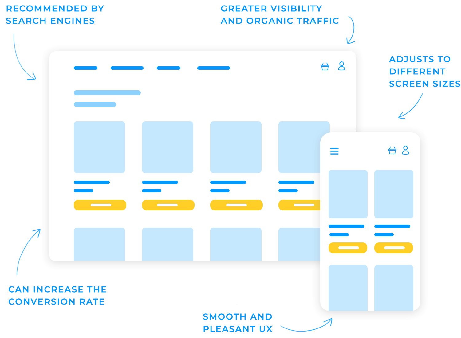
A responsive website automatically adjusts its layout and content to fit different screen sizes, ensuring a seamless and enjoyable experience for all users regardless of their device.
But responsive website design isn’t just about user experience. Search engines like Google also reward websites that are mobile-friendly. A responsive design can help your e-commerce website rank higher in search results, increasing your visibility and attracting more organic traffic. Basically, a responsive design can boost your conversion rate and drive sales, even if your target audience is primarily desktop users.
Plus, managing a single responsive website that adapts to any device is also easier than maintaining separate mobile and desktop versions. This saves time and resources, allowing you to focus on other important aspects of your business.
You want the spotlight to shine on the most important elements of your e-commerce website design, drawing your audience’s attention where you want it. That’s where visual hierarchy comes in.
Visual hierarchy is the art of arranging elements on a page in a way that guides the user’s eye. You can highlight key components such as calls to action, product images, and navigation menus by using techniques like size, color, and placement.
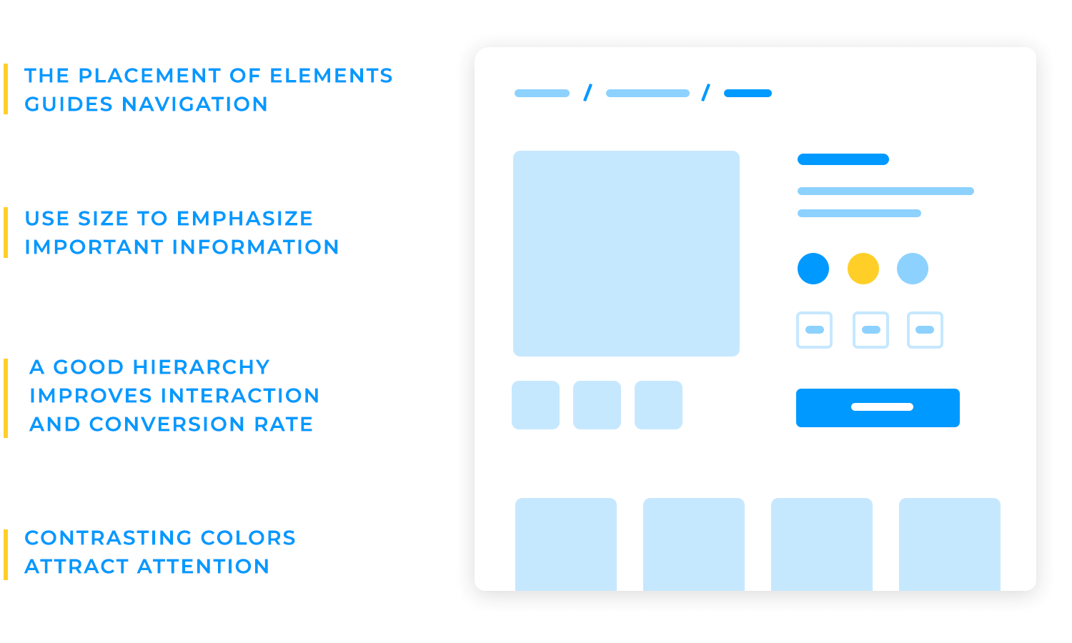
Think of it like a director staging a play; you want to ensure that the audience’s focus is drawn to the most important actors and scenes.
Size, color, and placement are powerful tools for creating visual hierarchy. Larger elements are naturally more prominent, so use size to emphasize the most important information. Contrasting colors can draw attention, so use them to differentiate between primary and secondary elements. Finally, consider the placement of elements on the page. Elements placed at the top left are often seen first, so use this to your advantage.
A well-designed visual hierarchy offers numerous benefits. It makes it easier for users to find what they’re looking for, improves engagement, and can even increase conversion rates. When users can quickly identify important elements, they’re more likely to take the desired action, such as making a purchase or signing up for a newsletter.
To illustrate, on an e-commerce product page, the product image might be the largest element, followed by the product name and price. Reviews and related products could be smaller and placed below the main product information. This visual hierarchy guides the user’s attention towards the most important elements and makes it easy to find the information they need.
Consistency is key to building a recognizable and memorable brand. If you maintain uniformity in design elements, typography, and colors throughout your website, you create a cohesive experience that helps users recognize your brand — and trust it with their money.
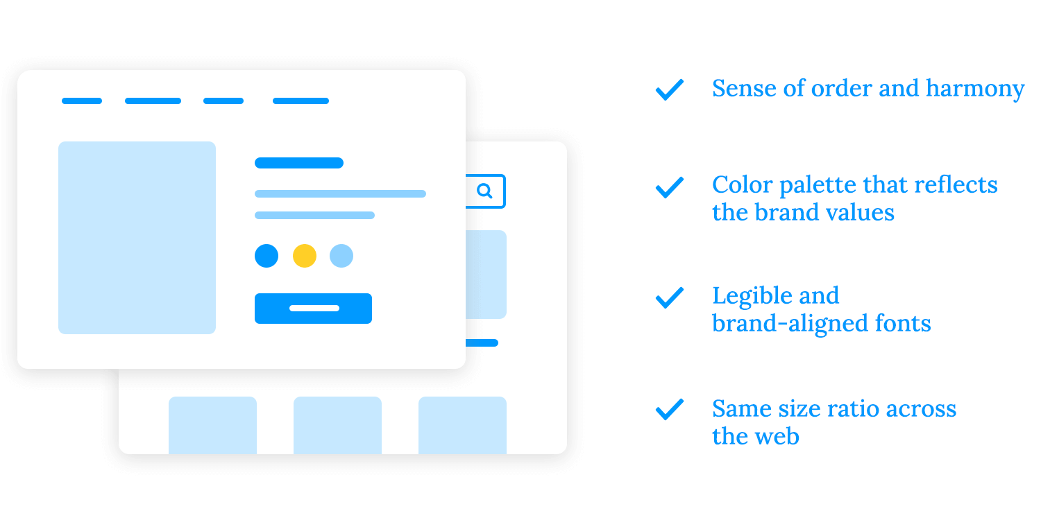
Imagine visiting a store where everything from the signage to the packaging to the employee uniforms is mismatched. It would be confusing and disorienting, right? The same goes for your e-commerce website design. A consistent brand identity creates a sense of order and harmony, making it easier for customers to navigate and understand your offerings. Here are some ways you can pull this off:
- Choose a limited palette of colors that reflect your brand’s personality and values. Use these colors consistently throughout your website, from your logo to your product pages. Select fonts that are easy to read and align with your brand’s personality. Use consistent fonts and font sizes throughout your website to create a cohesive and professional look.
- Beyond colors and typography, create a set of design elements, such as icons, buttons, and graphics, that are unique to your brand. Use these elements consistently across your website to reinforce your brand identity.
- Finally, ensure that your messaging is consistent with the brand’s values and tone of voice. Use clear and concise language that is easy to understand.
Your homepage is like a storefront for your online business. It’s the first thing visitors see, so it’s crucial to make a strong and positive impression right away. A well-designed homepage can entice visitors to stay on your site, explore your products, and ultimately make a purchase.
This is the prime real estate on your homepage, so make it count. Use eye-catching visuals, strong headlines, and a clear call to action to grab visitors’ attention and encourage them to explore further. A compelling hero section should convey your brand’s value proposition and set the tone for the rest of your website.
Start with a clear and compelling hero image that immediately grabs attention and conveys your brand’s message. Pair this with a strong headline that concisely states your value proposition. A clear and prominent call to action (CTA), such as “Shop Now” or “Learn More,” should encourage visitors to take the desired action.
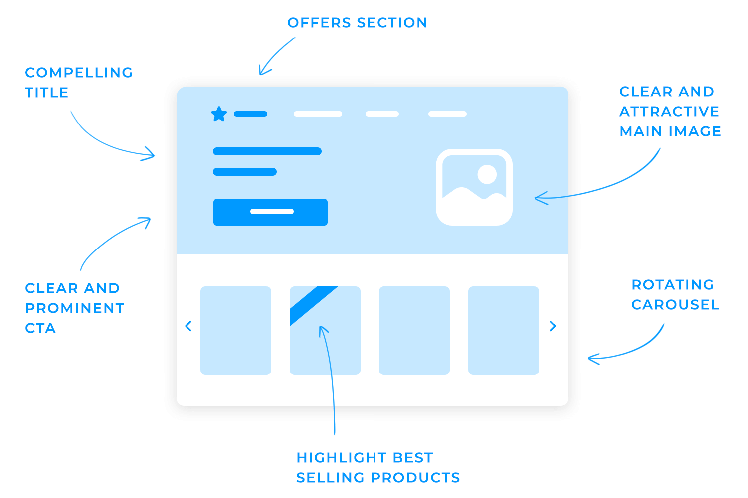
Highlight your most popular or unique offerings. This can entice visitors to browse your catalog and make a purchase. You can demonstrate your expertise, build trust, and encourage impulse buys by showcasing your best-selling or featured products. You can do this if you:
- Use carousel sliders: Display a rotating carousel of featured products on your homepage or product category pages.
- Create dedicated sections: Dedicate specific sections of your website to highlight best-selling or featured products.
- Include badges or labels: Use badges or labels to indicate popular or featured products, such as “Bestseller” or “Editor’s Choice.”
Trust indicators, such as customer reviews, certifications, and logos of trusted partners, can significantly boost your credibility and reassure potential customers.
Think about it: When you’re considering making a purchase online, don’t you often look for reviews or recommendations from other customers? Positive customer reviews can be powerful social proof that your business is reliable and offers quality products or services.
Certifications and industry awards demonstrate your expertise and commitment to quality. Imagine seeing a seal of approval from a respected organization on a product page. It instantly conveys that the product meets certain standards and is worth considering.
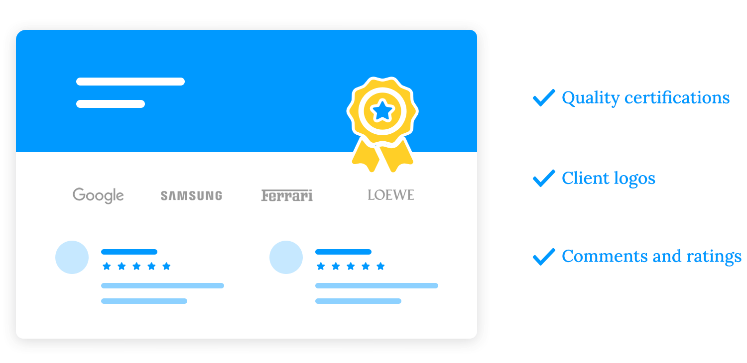
Partnering with reputable companies can also enhance your credibility. Displaying the logos of trusted partners signals that your business is associated with other reputable organizations, building confidence in your brand.
Trust indicators can alleviate doubts and concerns that potential customers may have, encouraging them to take the next step, such as making a purchase. When customers see that others have had positive experiences with your business and that you’re associated with reputable organizations, they’re more likely to trust you and feel confident in their decision.
To effectively use trust indicators, prominently display customer reviews on your website, highlight certifications and awards, feature logos of trusted partners, and encourage customers to leave reviews.
Ideally, you want an e-commerce website design that gets users moving around, so they see as many different items as possible. You want them to explore the website, which is the digital equivalent to a stroll around the store. But for that, the navigation design needs to be clever.
Here are some basic guidelines you can apply to the navigation of your e-commerce website design:
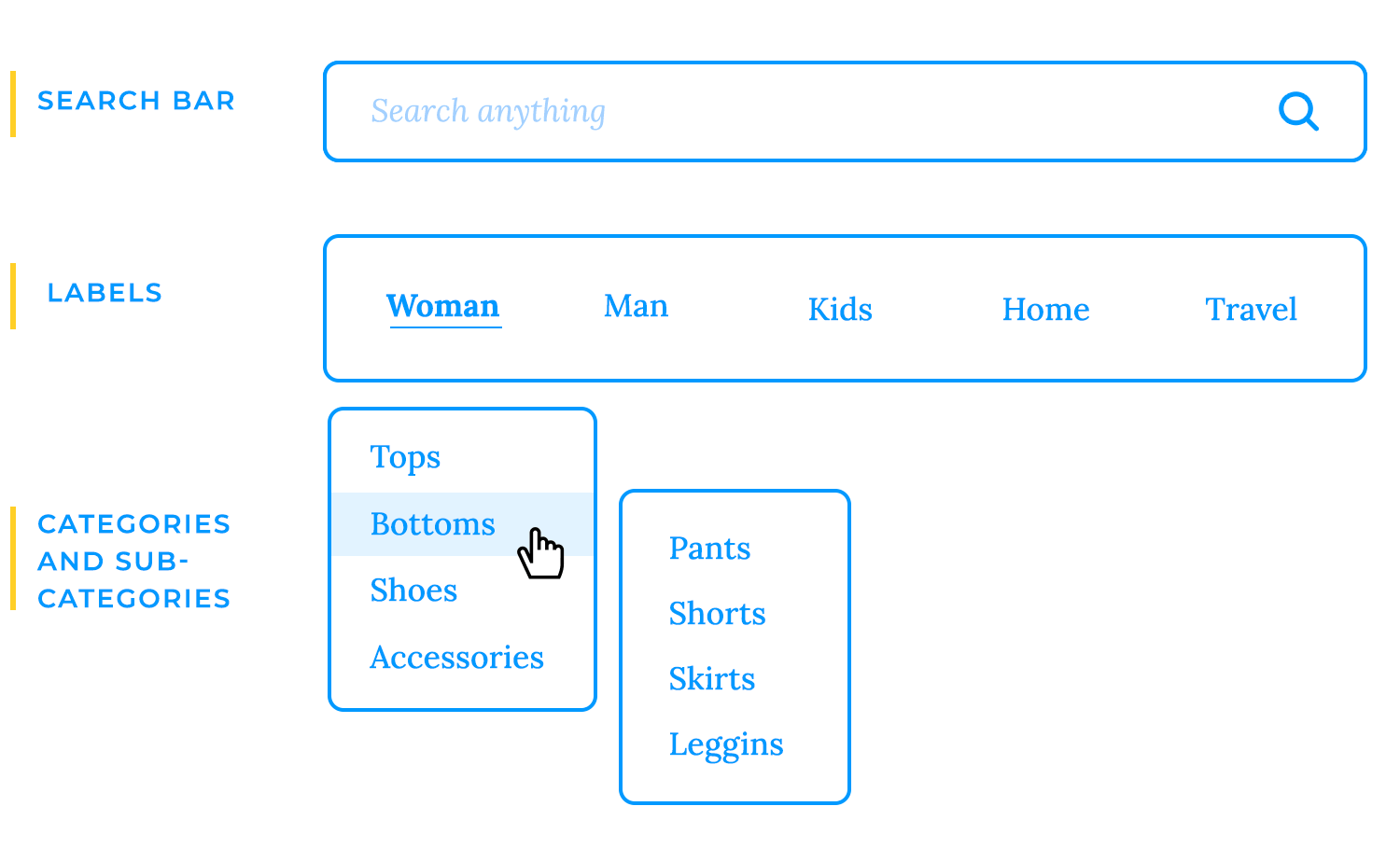
Labels are important. When designing the navigation bar based on labels, it’s crucial the labels are representative and descriptive.
Subcategories are just as important. Remember to re-list them as needed, as some subcategories could belong to more than one category, and users could logically reach that subcategory through one way or the other.
Make top level categories clickable – many users expect that to be a working link and can experience a slight hint of confusion if it isn’t.
Invest time and effort into a good search bar that gets people to specific types of items faster.
The simple reason why the navigation is so important is that users can’t buy what they can’t find. They need the ability to explore and find items they could possibly purchase. With good navigation design, users are more likely to find multiple items before they carry on with the checkout.
Calls to action (CTAs) are the driving force behind conversions on your e-commerce website. They are the prompts that encourage visitors to take the desired action, whether it’s shopping now, viewing products, or signing up for a newsletter.

Key elements of effective CTAs:
- Clarity and conciseness: Use clear and concise language that directly tells users what to do. Avoid vague or confusing messages.
- Visual appeal: Design CTAs that stand out from the rest of your website. Use contrasting colors, bold fonts, and a clear call-to-action text.
- Placement: Place CTAs strategically on your website, where they are easily visible and accessible.
- Urgency: Create a sense of urgency by using limited-time offers or scarcity messaging.
- Specificity: Tailor your CTAs to the specific action you want users to take. For example, instead of a generic “Learn More” button, use a more specific CTA like “Shop Now” or “View Collection.”
In the world of e-commerce website design, where customers can’t physically touch or examine products, high-quality visuals play a crucial role in driving sales. Product images and videos allow customers to visualize and appreciate your products, making them feel more confident in their purchase decisions.
Imagine walking into a store and seeing a product displayed on a shelf. You can examine it, touch it, and even try it on. Online shopping doesn’t offer the same physical experience, but high-quality visuals surely come close.
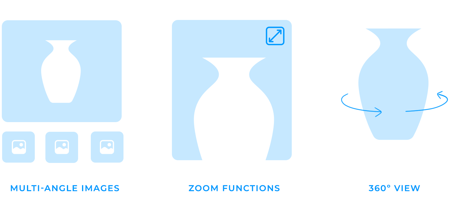
Moreover, product videos can bring your products to life. Show them in action, highlight their features, and demonstrate their benefits. This can be particularly effective for products that are difficult to describe with words alone.
When designing your e-commerce website and it’s time to write in the copy, think that your product descriptions should mimic a salesperson. They need to be persuasive, informative, and engaging to convince customers to add products to their carts.
Product descriptions should go beyond simply listing features and highlighting the benefits of your products. Here are some key elements of effective product descriptions on e-commerce websites:
- Clear and concise language: Use simple, easy-to-understand language that avoids jargon.
- Highlight benefits, not just features: Instead of simply listing features, focus on how those features benefit the customer. For example, instead of saying “This product is waterproof,” say “Stay dry and comfortable in any weather.”
- Use strong action verbs: Use vivid verbs to paint a picture of the product in the customer’s mind.
- Tell a story: Create a narrative around your product, explaining how it solves a customer’s problem or fulfills a desire.
- Use bullet points: Break up your product description into bullet points for easy readability.
- Include keywords: Optimize your product descriptions for SEO by including relevant keywords.
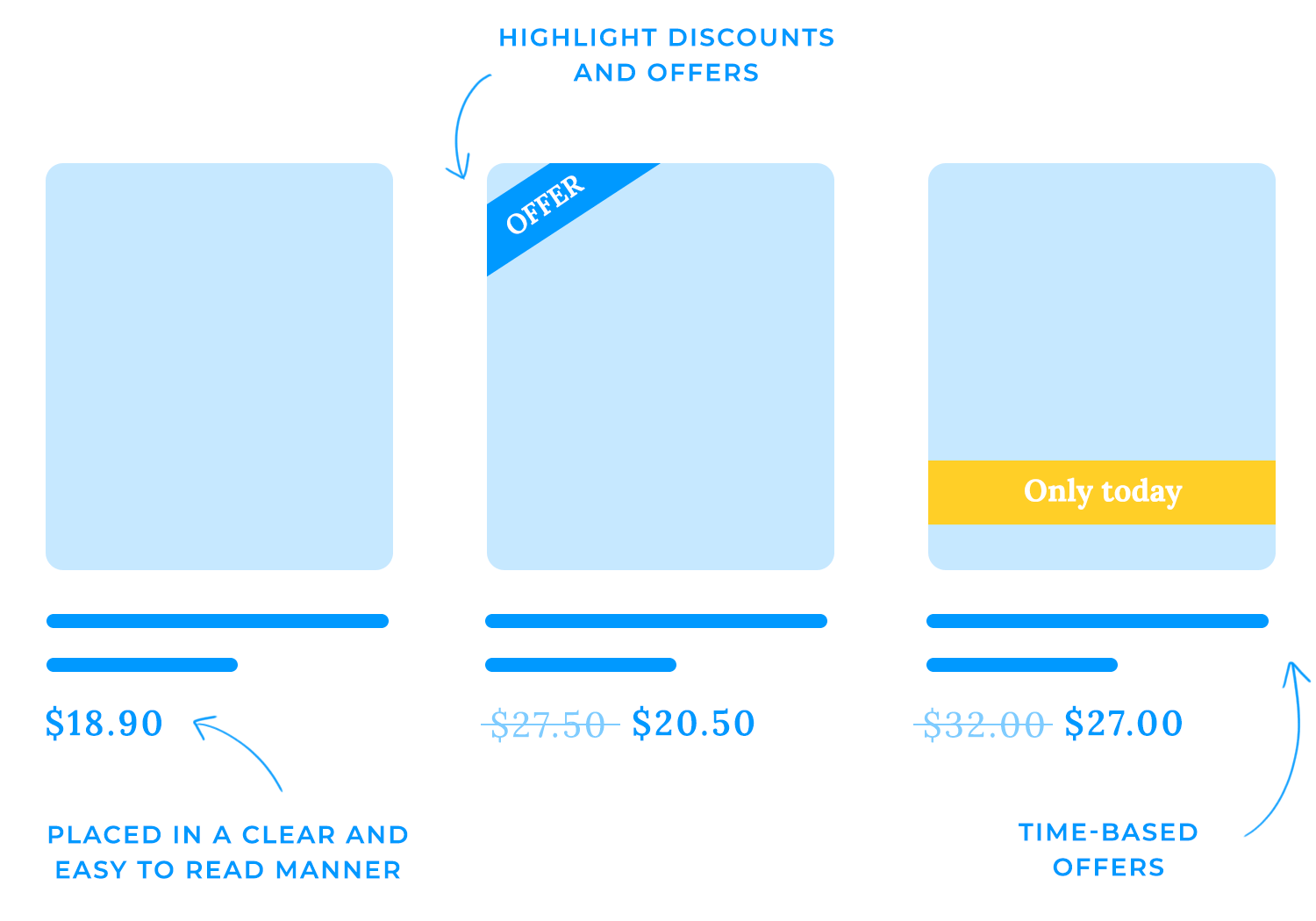
When it comes to pricing and promotions, clarity and prominence are key. Ensure that prices are clearly displayed and easy to read, using a consistent format. Highlight discounts and special offers with visually appealing elements, such as strategically placed badges or banners.
You can also create a sense of urgency through using limited-time offers or countdown timers or even experiment with pricing strategies like odd pricing or bundle pricing to increase perceived value.
Word-of-mouth has become more powerful than ever. Customer reviews and ratings can significantly impact your e-commerce business’s success. Imagine walking into a store and seeing a product with a glowing review from a previous customer. It’s reassuring, isn’t it?
Similarly, online reviews provide social proof that your products or services are worth considering. When potential customers see that others have had positive experiences, they’re more likely to trust your brand and make a purchase.
Beyond building trust, customer reviews can also help customers make informed decisions. They provide insights into product quality, performance, and customer satisfaction. Customers can get a sense of what to expect from your products and whether they align with their needs.

Moreover, positive reviews can improve your website’s search engine rankings. Search engines like Google often consider customer reviews as a ranking factor. The more positive reviews you have, the higher your website may appear in search results!
A good salesperson or even bartender understands that every sale counts. To boost your e-commerce revenue elevate the customer’s experience. Consider offering premium versions or complementary products. For instance, suggest upgrading a basic laptop to a model with more storage or recommending a protective case for a new smartphone.
Also, keep the shopping cart clean and uncluttered by displaying total costs clearly, offering guest checkout, providing clear progress indicators, and ensuring secure payment options. Effective strategies for implementing related products and upselling include:
- Use AI-powered recommendations: Leverage artificial intelligence to suggest products based on the customer’s browsing history and purchase behavior.
- Create dedicated sections: Highlight related products or upsell options in dedicated sections on your product pages or homepage.
- Offer bundles: Create bundles of complementary products at a discounted price to encourage customers to purchase multiple items.
You’re at a store about to pay and the phone is ringing, it’s your kid asking you to run yet another errand. The checkout line is long, the cashier is slow, and there are unexpected fees. Frustrated, you most likely will just say to heck with it, abandon your purchase, and leave.
The same can happen online. A poorly designed e-commerce checkout process can stop customers from completing their purchases, which is bad for your client since it leads to lost sales.
Some e-commerce website design techniques can help with minimizing cart abandonment. Allowing guest checkout, using exit intent pop-ups to offer discounts or promotions, and optimizing for mobile devices are just some ways your designs can help increase sales.
A cluttered or confusing shopping cart can be a major distraction for customers, leading them to abandon their purchase. To create a seamless and user-friendly experience, it’s essential to keep the shopping cart and checkout process clean and uncluttered.
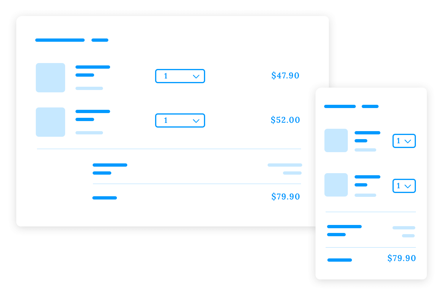
- Minimize distractions: Remove unnecessary elements that might draw the customer’s attention away from the primary goal of completing their purchase. A cluttered shopping cart can be overwhelming, so focus on the essential information and keep the design clean and uncluttered.
- Use a clear and consistent layout: Organize the shopping cart and checkout process in a logical and intuitive way. Use a consistent layout and design elements throughout the process to create a cohesive experience.
- Optimize for mobile: In today’s mobile-first world, it’s crucial that your shopping cart and checkout process are easy to use on mobile devices. Ensure that the layout and elements are optimized for smaller screens, and test your website on various devices to identify and address any issues.
One of the most common reasons for cart abandonment is unexpected fees or charges. To avoid this, it’s crucial to be transparent about pricing from the beginning.
- Display total costs clearly: Show the total cost of the order, including shipping, taxes, and any additional fees, upfront. This avoids surprises that might discourage customers from completing their purchases.
- Use a consistent pricing format: Use a consistent format for displaying prices (e.g., $19.99) to avoid confusion and make it easier for customers to compare prices.
- Be transparent about shipping costs: Clearly indicate shipping costs and any conditions for free shipping. If shipping costs are high, consider offering free shipping for orders over a certain amount to incentivize customers to spend more.
The choice between a single-step or multi-step checkout process depends on the complexity of your products and your customers’ preferences.
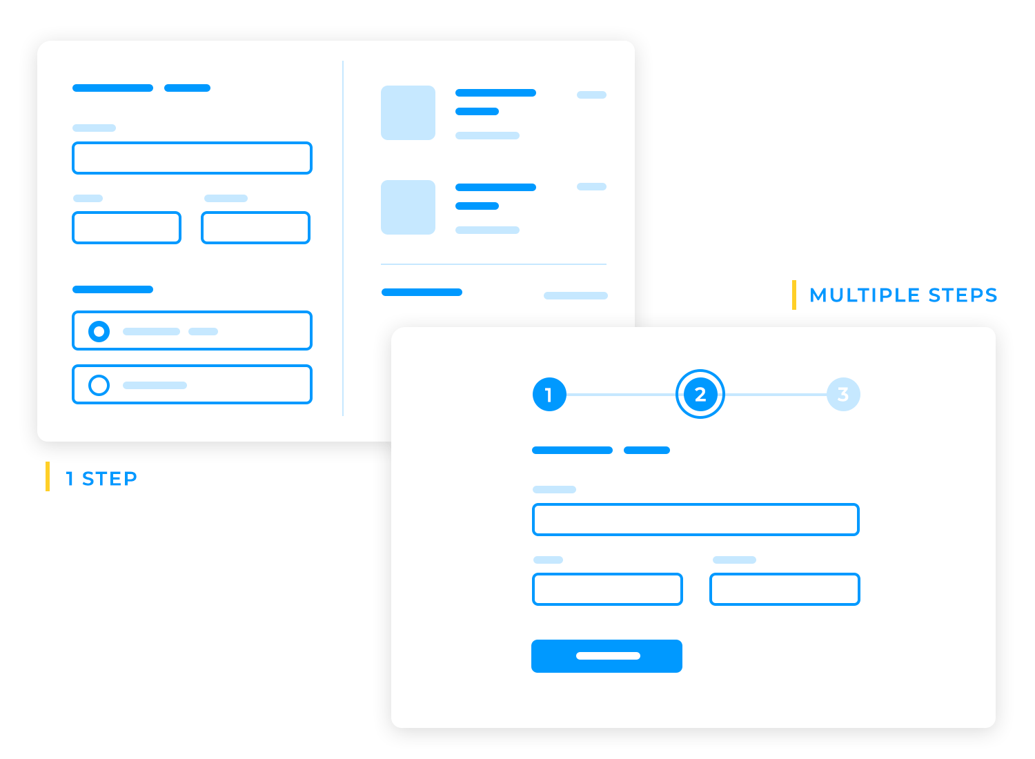
Single-step checkout is like a one-stop shop for your customers. Imagine filling out a single form to complete your purchase. No need to navigate through multiple pages or worry about losing your place. It’s a streamlined experience that appeals to those who value efficiency and convenience. This approach works particularly well for simple products with minimal customization options, such as a plain t-shirt or a standard book.
Multi-step checkout is more like a guided tour through the purchasing process. Each step focuses on a specific aspect of the transaction, allowing customers to review their choices and make adjustments before moving forward. This approach is ideal for complex products with various options, such as custom-built computers or personalized jewelry. It also provides a sense of control and security for customers who prefer a more deliberate purchasing experience.
Offering a guest checkout option allows customers to make purchases without creating an account, reducing friction and encouraging impulse buys. However, consider the trade-offs in terms of customer data collection and future marketing opportunities.
Use clear progress indicators to guide customers through the checkout process and provide a sense of control. This can be achieved through:
Step-by-step progress bars guide your users through the checkout process with visual cues. As they move from one step to the next, the progress bar fills up, providing a sense of accomplishment and showing how close they are to completing their purchase.
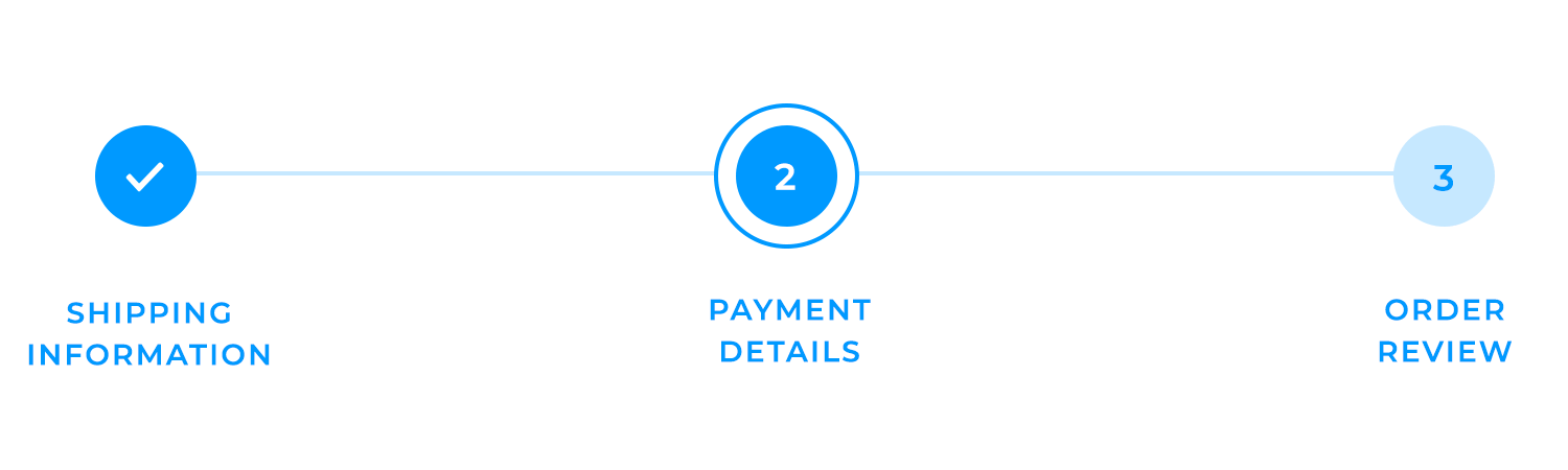
Descriptive labels play a crucial role in keeping customers informed and engaged. Clear and concise labels for each step, such as “Shipping Information,” “Payment Details,” and “Order Review,” help customers understand what to expect at each stage. This reduces confusion and helps them navigate the process with ease.
Real-time updates are essential for maintaining customer trust and confidence. Providing real-time information about their progress and any changes in the order total demonstrates transparency and ensures that customers feel in control of their purchase. This can help to reduce abandoned carts and increase conversions.
Offering a variety of secure payment options is essential for providing a convenient and trustworthy shopping experience. Include popular options such as:
- Credit cards: Visa, Mastercard, American Express, Discover
- Digital wallets: PayPal, Apple Pay, Google Pay
- Alternative payment methods: Bank transfers, cash on delivery (where applicable), gift cards
Protecting customer data is a top priority. Ensure your payment gateway is PCI compliant to meet the highest security standards and prevent data breaches. Look for payment gateways that offer:
- Data encryption: Protect customer data using advanced encryption techniques.
- Regular security audits: Undergo regular security audits to identify and address potential vulnerabilities.
- Tokenization: Store only encrypted tokens instead of sensitive card data.
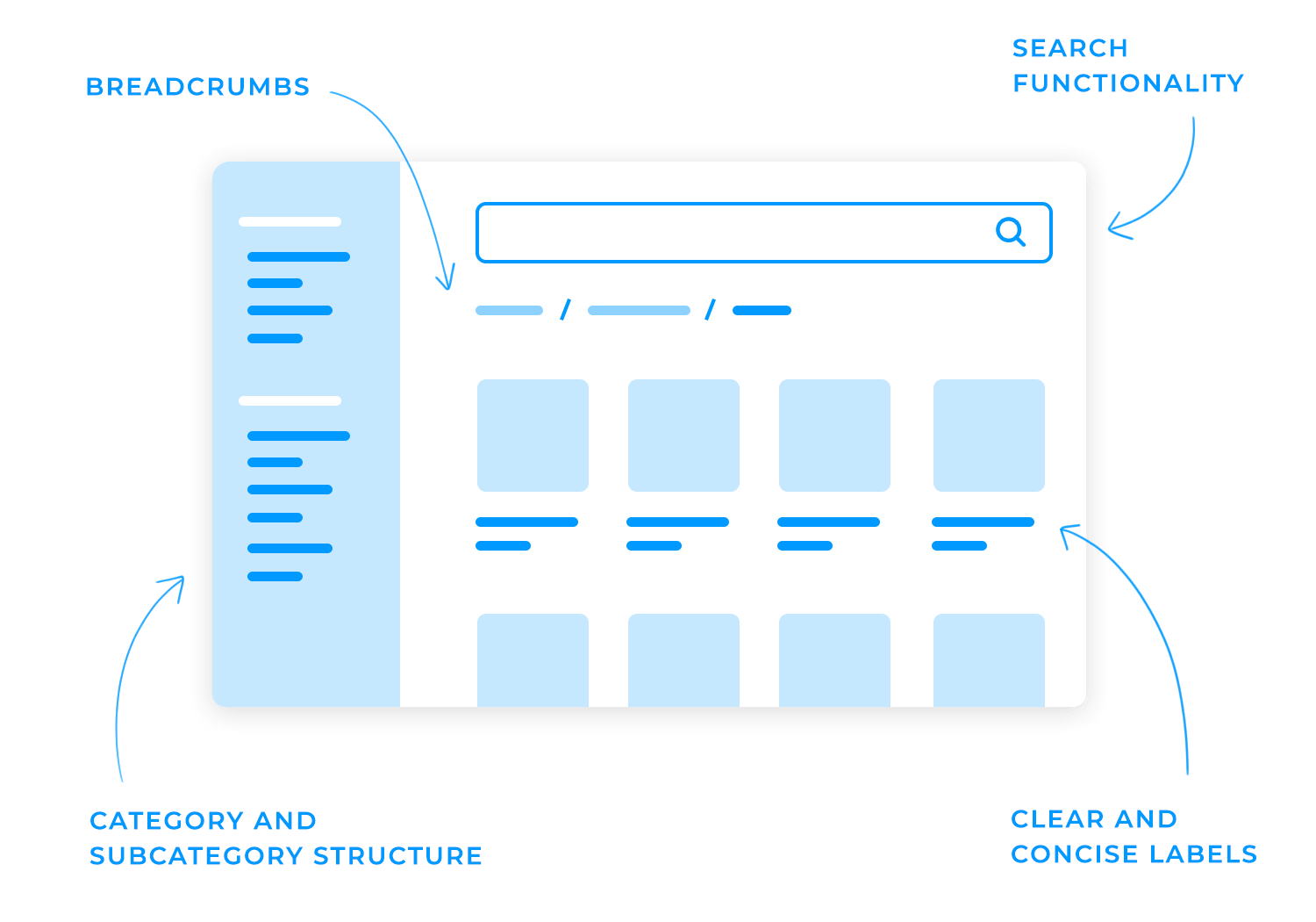
A well-organized and intuitive navigation system is crucial for guiding customers through your online store and helping them find the products they’re looking for. In this section, we’ll discuss the importance of search functionality, filters and sorting options, breadcrumbs, and category pages in creating a seamless and enjoyable e-commerce website design.
Predictive search, also known as autocomplete, suggests relevant search terms as the user types. This can significantly improve the search experience and help users find what they’re looking for more quickly.
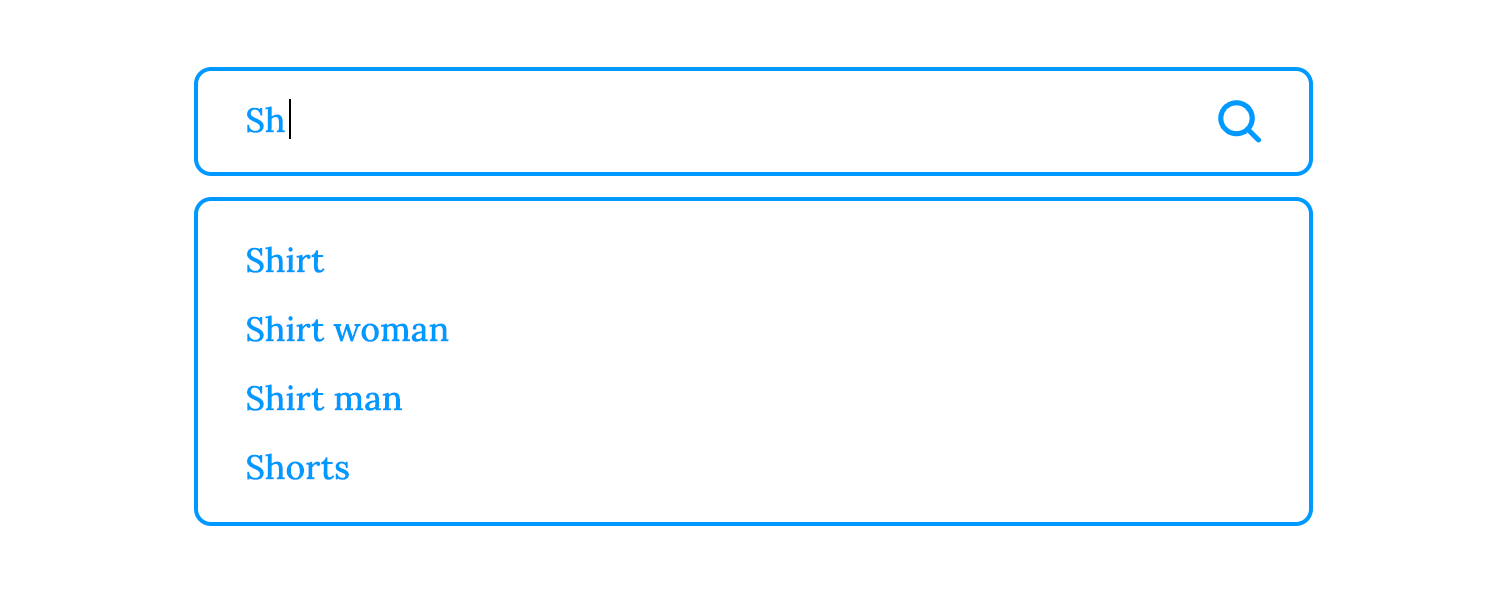
Providing users with the ability to filter and sort search results is like giving them a powerful tool to navigate your online store. Offering filters for price, categories, attributes, ratings, and newest products empowers customers to find exactly what they’re looking for, quickly and efficiently.
Imagine walking into Zara. Wouldn’t you appreciate the ability to filter products by size, color, or price? The same goes for your online store!
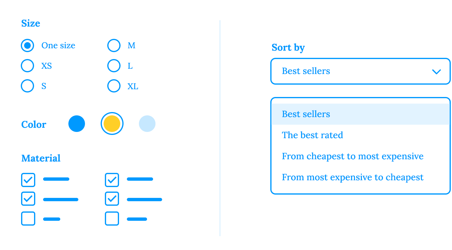
Additionally, sorting options like “Most Popular” or “Newest” can help customers discover your best-selling or latest products. This can be particularly useful for showcasing new arrivals or highlighting trending items.
Breadcrumbs provide a clear and intuitive way to navigate back through the site. They show users their current location within the website’s hierarchy, which can significantly reduce frustration and improve the overall user experience.
Moreover, breadcrumbs can enhance your website’s search engine optimization (SEO). Search engines use breadcrumbs as signals to understand your website’s structure and content.
When you provide clear breadcrumbs, you help search engines index your pages more effectively, which leads to higher rankings in search results. Check out these tips for breadcrumb best practices:
- Clear and concise labels: Use clear and concise labels for each breadcrumb link to indicate the current page or category.
- Consistent placement: Place breadcrumbs consistently on your website, either at the top or bottom of the page.
- Hierarchy: Ensure that breadcrumbs reflect the correct hierarchical structure of your website.
- Home link: Always include a link to the homepage as the first breadcrumb.
If a user is on a product page for a blue shirt, the breadcrumbs might look like this:

A well-organized category structure is essential for helping customers navigate your website and find the products they’re looking for.
That’s why it’s essential to use descriptive labels to maintain a logical hierarchy and incorporate visual cues. Clear and concise labels for categories and subcategories help customers quickly understand the product offerings. Organizing these categories in a logical hierarchy that reflects the product structure ensures a seamless navigation experience.
Additionally, visual cues, such as icons or images, provide instant visual recognition, making it easier for customers to find the products they’re looking for.
To provide a flexible and customizable shopping experience, offer customers the option to choose between a grid or list view. A grid view is like a visual feast, showcasing products as thumbnails so customers can quickly compare options and make informed decisions.
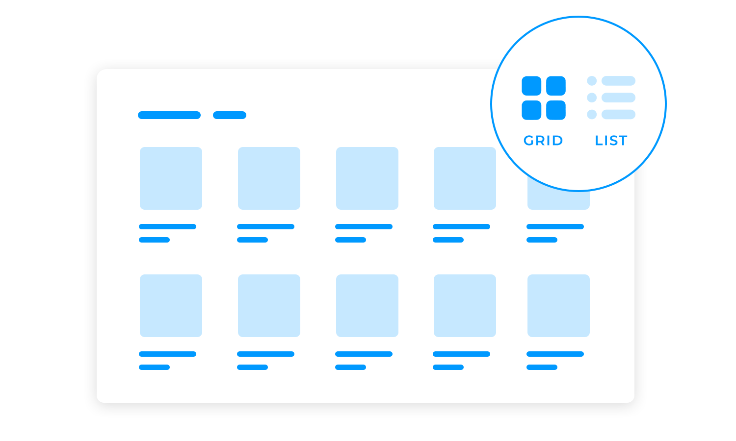
A list view is more like a detailed menu, providing in-depth information about each product for those who prefer a more text-based approach. By offering both options, you cater to different browsing preferences and ensure that every customer can find their perfect match.
Here we get into the key factors contributing to a positive shopping experience, including site speed and performance, mobile optimization, and personalization. Keep that notebook out for just a little bit longer, it’ll be worth it!
In the fast-paced world of online shopping, speed is everything. Slow load times can frustrate customers and drive them away from your website. Studies have shown that a delay of just one second can lead to a significant decrease in conversions. A fast-loading website not only improves user experience but also boosts your search engine rankings, making it more likely for potential customers to find your store.
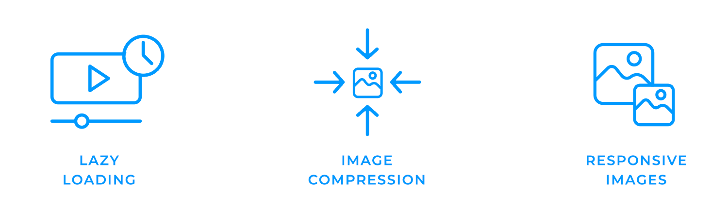
Lazy loading is a technique that helps improve website performance by delaying the loading of non-essential elements, such as images or videos, until they are actually needed by the user. This means that only the most important content is loaded initially, reducing initial load times and providing a smoother user experience.
Image optimization is another crucial aspect of website performance. Images can be one of the biggest culprits when it comes to slow load times. Compressing images without compromising quality significantly reduces their file size and improves page load speed.
Additionally, using responsive images that adjust to different screen sizes can further optimize performance and ensure that your website looks great on all devices.
In today’s fast-paced world, where more people are accessing the internet on their smartphones than ever before, your e-commerce website must be fully optimized for mobile devices. A seamless shopping experience on mobile can significantly impact your sales and customer satisfaction.
To ensure an awesome mobile shopping experience, consider incorporating mobile-specific features like Tap to Call and Quick Pay.
With Tap to Call, customers can easily contact your business with a simple tap, making it easier for them to get the help they need. Quick Pay options, such as Apple Pay or Google Pay, streamline the checkout process, reducing cart abandonment and increasing conversions.

Personalization is the key to creating a truly engaging and effective e-commerce experience. You can deliver highly relevant product recommendations that increase customer satisfaction and drive sales by leveraging user data and behavior.
Imagine a customer browsing your online store, looking for a new pair of shoes. A personalized recommendation would be useful as they probably have a lot of styles and models to go through. However, by analyzing browsing history, purchase history, and interactions with your website, you can recommend shoes that align with their preferences and interests!
For instance, if a customer has recently purchased a running shoe, you might suggest complementary products like running socks or a sports drink.
Beyond the power of personalized product recommendations, user data can be a goldmine for enhancing the overall shopping experience. Imagine receiving targeted email campaigns that highlight products you’re most likely to love, based on your past purchases and browsing habits.
Or picture product pages that seem to anticipate your needs, displaying relevant content and recommendations tailored to your interests. When you apply user data in these ways, you create a shopping experience that feels like a personal stylist, anticipating your every wish and making every visit a delight. And let’s not forget about the thrill of receiving personalized promotions and discounts that make you feel valued and cared for!
Ready to level up your e-commerce game? Let’s dive into the world of online retail and discover what makes the top players tick. From industry giants to innovative startups, we’ll dissect their strategies, uncover their secrets, and learn how you can apply their lessons to your own online store. Get ready to be inspired by the best and armed with the knowledge to build a thriving e-commerce empire!
The Justinmind e-commerce design for a furniture store feels like browsing a stylish showroom from home. With a clean layout and quality images, the product pages show each item in detail, inviting you to explore. Handy features like a checkout progress bar and social sharing make the shopping experience seamless and engaging.

The online florist e-commerce website design example is a visual treat. With its clean, minimalist style and beautiful floral displays, it feels like stepping into an online botanical garden. The homepage draws you in with its curated bouquet collection, full of color and texture. Easy navigation helps you find the perfect arrangement, while high-quality images and detailed descriptions make the flowers feel almost tangible. That’s the charm of effective e-commerce design!

The Acme online shoe shop is a minimalist’s dream. Its clean layout and high-quality images make it easy to browse and find the perfect pair. The Men’s Tree Dashers product page highlights the sleek design, comfort features, and details on materials, sizes, and colors. The simple design and user-friendly interface make adding items to your cart and checking out smooth and hassle-free. Whether you’re a frequent shopper or visiting for the first time, Acme ensures an efficient and enjoyable experience.

Imagine a sleek, minimalist makeup shop where every product is showcased like a work of art. The Justinmind wireframe captures that vision perfectly. The clean layout and bold headline draw you in, while the product grid invites you to explore and discover your new favorite shade or formula. It’s like having a personal beauty consultant at your fingertips, helping you navigate the world of makeup with ease.

This fashion e-commerce site feels fresh and straightforward. The homepage grabs your attention with bold visuals and well-organized sections that make exploring easy. Each product has clear images and short descriptions, so you can browse quickly. With easy-to-find sections this example makes shopping an effortless and enjoyable experience.

Ruby Lane is mostly known for being a platform for the sale and purchase of second hand goods – mainly antiques and jewelry. While the general design of the website isn’t too colorful or filled with navigation menus, they do have something they got absolutely right: their search bar.

Users are welcome to explore the e-commerce website looking for anything they need – and antique collectors couldn’t be any happier. The way the search bar is designed is powerful because it also allows users to specify where they want that search to be made
Remember, the little things can have a huge impact on the final outcome of your e-commerce website design!
Welly‘s vibrant website perfectly captures its fun and playful brand identity. The colorful design, catchy copy, and clear “Shop Now” CTA create an inviting atmosphere that appeals to both kids and parents.

The homepage is a bold and dynamic canvas that showcases the brand’s unique aesthetic without overwhelming visitors. It’s a testament to the power of a well-executed website in bringing a brand’s vision to life. One of the best e-commerce websites out there!
Verve Coffee Roasters‘ e-commerce website is a sensory delight. Leveraging customer reviews to build trust, the online retailer weaves a narrative of quality and satisfaction. Evocative language paired with stylish photography invites customers into a world of flavor, promising “classic and delicious” experiences.
Lively descriptions, like “the sweetness of golden marmalade,” tantalize the taste buds and keep customers lingering on the page, eager to savor their next cup.

Chubbies‘ witty copy is a key element of their brand identity. From their product descriptions to their homepage, Chubbies uses humor and irreverence to connect with their target audience. Their playful language, humorous anecdotes, and self-deprecating humor make their product descriptions engaging and memorable.

On their homepage, catchy headlines, an irreverent tone, and persuasive calls to action encourage customers to explore their products and make a purchase. This unique approach helps Chubbies stand out from competitors and create a memorable shopping experience. If you’re searching for e-commerce websites with a bit of character, take notes from Chubbies!
You can tell branding was a priority in skin care brand Satya Organic’s e-commerce website design. Once you land on the homepage, you’re met with earthy tones and signals that say, “If you’re looking for plant-based goods, you’re in the right place.”

The website’s menu navigation bar is thoughtfully designed, providing easy access to different sections of the site without overwhelming the user. Despite its extensive catalog, KITH’s product categories are thoughtfully presented, making it easy to navigate and find what you’re seeking. It’s a testament to the power of a well-designed website in creating a memorable shopping experience.
Allbirds put sustainability front and center. From their use of natural materials to their B Corporation certification and “Sustainability” section, they show eco-conscious shoppers they mean business. The lifestyle photos make their clothing feel relatable and stylish, not just green.

Their menu is easy to use, with clear sections like “Men,” “Women,” “Kids,” and “Shoes,” plus a special nod to sustainability that shows it’s more than just a buzzword for them. It’s a smart, thoughtful design that really sets them apart in the world of sustainable fashion. This is officially one of our favorite e-commerce websites on this list!
Who doesn’t love comfortable underwear? MeUndies has made quite a name for itself over the quality of its clothing – but their website ain’t bad either. In what could be considered a rather classic approach designing e-commerce websites, their web is all about navigation.
When users explore the web, they are faced with a big navigation bar on the top of the screen that expands into a full menu. On top of that, they can also jump straight into the style of underwear they are after, with a second slim bar that gives them filtering options based on the cut.
Even better? There is yet another bar on the left side, with a whole variety of filters that users can apply to their search.

It gives users full power while not overwhelming them by filling the screen with buttons. The design follows a style and it flows in a way that helps users instead of bombarding them. We all know that giving the world of choices to users while still maintaining a good visual style is difficult – but this website proves it can be done.
Regardless of how one feels about the Kardashian family, there is no denying that what Kylie Jenner did with her makeup brand is impressive. Of all the e-commerce websites on this list, Kylie Cosmetics may be the most straightforward one yet.

Kylie Jenner doesn’t need to create all that content or even have to account for that content on her e-commerce website design. The simple reason? It is basically an add on to her social media profiles, where she really promotes all her products to millions of people for free.
The website itself is several screens of products: be they in a list, grid or alone on the product page. It has little else. And that is, in part, the beauty of it all: no time and effort into things we don’t need. That is business thinking beautifully applied to website design: we leave the selling to the web and marketing to Instagram. How smart!
ASOS could be considered the exact opposite to Kylie Jenner’s approach to e-commerce website design. Instead of keeping it simple and small, they went for big and complex.
The website has everything one would expect from such a large platform, including a big navigation menu at the top that will take the user to any corner of the website. It has well planned categories and subcategories, including different ranges of clothes such as maternity wear.

With it’s group of social media influencers, ASOS invests a great deal of resources into promoting its items. Its website is designed to showcase not just the products, but also the content. This works well with ASOS business strategy of not only being a clothing outlet, but also being involved in setting trends and influencing the market.
The truly great thing about the ASOS e-commerce website design is that it minds all the little details. Social sign in, breadcrumbs in the checkout process, good copy on buttons and links. ASOS was very detail-oriented when it came to the design of their online store, and the result speaks for itself. Remember, the more details the better on e-commerce websites.
Grovemade is a special brand that sells hand-made office accessories, with wood being their star material. The cool thing about the Grovemade e-commerce website design is that it is simple and doesn’t overwhelm users at any point in time.
The best part about the website is that we can feel the same personality oozing out of each screen, as they build an image of the brand in the user’s head. You can appreciate not only beautiful pictures of their products, but also all of their items together. It’s almost like you’re touring a modern and efficient office. It feels close and personal, like a small brand should.

Adding to the charm is that the website puts the user into contact with the process of how these items came into existence, and the people responsible for getting it there. After navigating the Grovemade website for a few moments, one can almost feel as if you’ve known them for a long time. That feeling of familiarity can be a powerful thing when it comes to inspiring trust.
We also love their collapsible navigation menu, which does a perfect job when it comes to labels. Take notice of how the top labels are well planned, and how some of the subcategories can be found on more than one column.
KITH‘s homepage is a visual feast that invites you to explore. Its clean yet captivating design sparks curiosity, drawing you in with links to treats, lookbooks, films, and journals. Despite its extensive catalog, KITH’s product categories are thoughtfully presented, making it easy to navigate and find what you’re seeking. It’s a testament to the power of a well-designed website in creating a memorable shopping experience.

Creating an e-commerce website design can be a complex endeavor. It involves a lot of different factors, which touch on both design and business. It needs excellent navigation and a true understanding of the products, in order to showcase it the best way possible.
The good news is that there are quite a few great e-commerce website designs out there that can inspire us all going into our next project. Hopefully, this list has one or two websites that will get you thinking about ways you can really push the bar with your next online store. Remember, these websites are about selling – but they are also about helping the user.
PROTOTYPE · COMMUNICATE · VALIDATE
ALL-IN-ONE PROTOTYPING TOOL FOR E-COMMERCE WEBSITES
Related Content
 A fun look at different data table designs, from basic lists to smart, interactive ones, based on how complex the data is and what users need.18 min Read
 Single page design v multi-page design – everything you need to help you choose the right design for your site’s content18 min Read
 Website backgrounds can be a powerful tool in creating an experience. But what kind of experience can you convey and how? We got the full run-through for you!14 min Read


