
Calendar app design can be simple or complex. In this post, we show you 25 of our favorites and how you can make a start on your own
Isn’t there something satisfying about setting plans and adding them to your calendar? That quick moment of typing in an event and watching the days count down builds a little excitement—whether it’s a meeting, a trip, or just dinner with friends.
It’s clear that time dictates much of our lives. Whether it’s a tight work deadline, a countdown until a warranty expires, your mother’s birthday or simply when your next vacation is, we need somewhere to put all of these appointments.
Time gives us structure and a sense of place. And what better place than a calendar to put all that information, for easy viewing? Some have gone as far as saying calendars are more effective than the almighty to-do list. We’ll leave that up to you to decide.
Design and prototype your Calendar App with Justinmind

Now, let’s take a look at 10 of the best calendar app designs and how you can start making your own in our prototyping tool. No need to save the date, let’s start today.
Calendar apps have become essential tools for organizing our days and keeping life on track. Whether it’s juggling work deadlines, remembering a family birthday, or planning a long-overdue vacation, these apps give us a sense of control over our schedules. They’re not just about dates and times – they’re about creating balance and clarity in the chaos of daily life.
Designing a calendar app isn’t only about functionality anymore. Today’s users expect something more: an intuitive experience that’s visually appealing and packed with features that adapt to their needs. Minimalist layouts, cross-platform syncing, and thoughtful touches like smart reminders or collaborative options are no longer extras – they’re the baseline. From individuals to teams, users are looking for apps that not only keep them organized but also feel effortless to use.
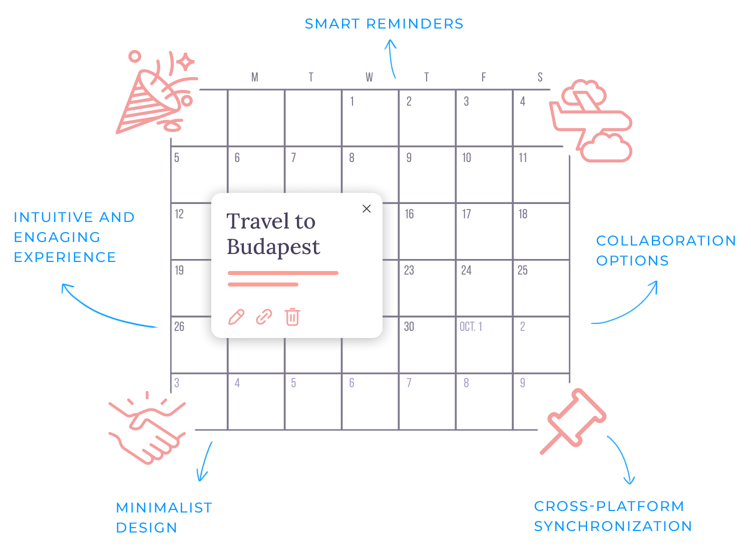
At the heart of a well-designed calendar app is simplicity. The goal isn’t to add complexity but to reduce it, making it easier for users to focus on what matters most. Whether it’s through seamless navigation, reducing mental effort, or supporting different workflows, a great design feels like a personal assistant, quietly working in the background. The best apps don’t just manage time but empower users to make the most of it.
Designing a calendar app is more than just dates on a screen. It’s about creating an experience that feels intuitive and adapts to diverse scheduling needs. Here’s a closer look at the must-have features that make a calendar app effective, along with a few extras that make the user experience better.
As everyone organizes their time differently, having flexible views is all important. Some people like to plan their day hour by hour, while others prefer a big-picture view of the month or a list-style agenda. A great app then will let you switch easily between day, week, month, and agenda views to match your workflow.
Adding an event shouldn’t feel like work, so the best apps make it simple, whether through natural language input, or handy templates for recurring events like weekly meetings.
We know how awful it might be to forget a meeting or miss an important appointment, but we also know that reminders sometimes become annoying, that’s why making them customizable is key to help you keep on track without becoming disturbing.
A calendar app becomes even more powerful when it connects with your other productivity tools. Syncing with email, task managers, or team collaboration platforms means you can manage everything in one place.
For teams or families, shared calendars are a lifesaver, so features like team scheduling and co-managing events make it easy to coordinate plans without endless back-and-forth messages.
You know that feeling when your calendar is overflowing, and you’re desperately trying to find one specific event or task? It can be so frustrating. That’s where advanced search and filtering come in. They make it easy to cut through the chaos and find exactly what you need in no time.
Then there are the features that make a calendar app stand out – things you don’t realize you want until you have them.
- Smart suggestions: imagine your calendar suggesting the best time for a meeting based on everyone’s availability. AI-driven scheduling makes this possible, saving time and reducing headaches.
- Tasks and to-dos in one place: why juggle a separate to-do list? Integrating task management into the calendar makes it easy to track what you need to do alongside when you need to do it.
- Handling time zones with ease: if you’re working with people across the globe or traveling frequently, time zone support makes sure your meetings are always at the right time – no mental math required.
- Voice command support: for those moments when typing isn’t an option, voice commands let you create events, check your schedule, or even search your calendar hands-free.
- Templates for repeated events: recurring events don’t need to be recreated from scratch. Predefined templates save time and make your routine planning smoother.
- Offline access: life doesn’t always happen online. A calendar app that works offline will let you check or update your schedule anywhere, even without an internet connection.
These features, when thoughtfully combined, create a calendar app that feels less like a tool and more like an assistant. It’s not just about organizing time, it’s about making time work better for you.
Design and prototype your Calendar App with Justinmind
Let’s jump into a mix of practical and inspiring calendar app designs that highlight just how versatile calendar app design can be. Whether it’s tools we use every day or creative concepts that push boundaries, this list is packed with ideas for functionality, aesthetics, and everything in between. First, we’ll look at real-world apps that are widely used, followed by design concepts that offer a fresh perspective on calendar UI design.
Google Calendar is one of the most popular calendar apps out there, and it’s easy to see why. Its design is straightforward and functional, with just the right amount of visual appeal to keep it user-friendly. The app provides a clean interface with classic monthly views, alongside detailed individual day screens, making it simple to switch between high-level planning and a more focused schedule.
What sets Google Calendar apart is its emphasis on practicality. The use of clean lines and intuitive layouts ensures schedules are easy to understand and manage. While it may not win awards for groundbreaking aesthetics, it meets the needs of most users, from individuals to teams.

Pros:
- Minimalist design that’s clear and easy to navigate.
- Excellent integration with other Google services like Gmail and Google Meet.
- Cross-platform syncing ensures you can access your calendar anywhere.
- Free for personal users, with advanced features available for Google Workspace subscribers.
Cons:
- Customization options are limited, which might frustrate users who want more control over the appearance.
- Can feel overly basic compared to some more feature-rich alternatives.
Google Calendar’s combination of simplicity, functionality, and seamless integration makes it a dependable choice for managing both personal and professional schedules.
Fantastical is all about giving you plenty of information in one place. Its split-screen design makes it easy to see a monthly overview on one side and your upcoming events on the other. You don’t have to jump around the app – everything you need is right there, ready to go.
For those who like having all the details at a glance, this setup works beautifully. It’s perfect for staying on top of your schedule without feeling lost. But if you prefer a simpler, more minimal look, Fantastical might feel a bit busy at times. It’s really about what works best for how you plan your day.

Pros:
- Shows both a monthly view and event details side by side.
- Quick event creation with natural language input.
- Works well with other tools like task managers and video conferencing apps.
Cons:
- The layout can feel a little crowded for fans of simpler designs.
- Requires a subscription for some of its best features.
Fantastical is a great choice for people who like having all their plans and details in one place. It’s functional, organized, and perfect for those who like a detailed, no-guesswork approach to scheduling.
If you’re already using Apple devices, Apple Calendar feels like a natural extension of your routine. Its clean, no-frills design makes scheduling simple, and the seamless syncing across iPhone, iPad, and Mac ensures you’re always on top of your plans. Everything works quietly in the background, letting you focus on your day without interruptions.
For those who love customization or want more advanced features, it might feel a little too basic. But if you prefer reliability over complexity, it’s hard to go wrong with this calendar design.

Pros:
- Effortless syncing within the Apple ecosystem.
- Intuitive, clutter-free interface.
- Completely free for Apple users.
Cons:
- Limited options for customization.
- Missing advanced features like integrated task management or smart suggestions.
Apple Calendar is perfect for anyone who values simplicity and ease of use. It’s not flashy, but it gets the job done with minimal effort.
Microsoft Outlook Calendar is a dependable option for managing both personal and work schedules. Its seamless integration with Microsoft 365 makes it easy to handle meetings, deadlines, and events alongside your emails and tasks. The calendar app design is clean and functional, with multiple customizable views to suit different planning styles.
It’s also a top pick as a best shared calendar app, offering great collaboration tools for scheduling and sharing events with teams. While it’s ideal for professional use, casual users might find it a bit too focused on workplace needs.

Pros:
- Smooth integration with Microsoft 365 tools like Teams and OneDrive.
- Strong collaboration features for shared schedules.
- Intuitive calendar UI design with flexible views.
Cons:
- Geared more toward professional use than personal.
- Advanced features require a subscription.
Outlook Calendar is a great choice for productivity, especially for teams and professionals who need a reliable way to stay organized.
If you love combining tasks and schedules in one place, Todoist with calendar integration is a game-changer. While it’s primarily known as a task manager, its calendar app design makes it easy to plan your day around what needs to get done. By syncing with your favorite calendars, like Google Calendar or Outlook, it bridges the gap between to-dos and time management.
The calendar UI design keeps things simple yet effective, allowing you to visualize deadlines and appointments side by side. This is especially helpful for users who rely on UX ideation methods or need a clear workflow for balancing tasks and meetings. For shared projects, it works beautifully as a best shared calendar app, letting you coordinate tasks and schedules with others effortlessly.
Todoist’s integration is flexible, but if you’re looking for a full-featured standalone calendar, this might not be the perfect fit. However, for task-focused users, it’s hard to beat.

Pros:
- Smooth integration with popular calendar apps.
- Combines task management with time planning in a cohesive way.
- Great for shared projects and collaborative workflows.
Cons:
- Lacks some advanced features of dedicated calendar apps.
- Works better for task management than for pure scheduling.
Todoist’s calendar integration is ideal for anyone looking to merge tasks and events into one clear system. It’s not just about dates – it’s about designing your time around what truly matters.
Calendar.com is built for people who want a smarter, more efficient way to manage their schedules. Its calendar app design focuses on simplicity, but it doesn’t stop there – it adds a layer of intelligence with features like analytics and smart scheduling. This makes it stand out from more traditional apps, especially for professionals looking to optimize their time.
One of its highlights is the ability to generate insights about how you spend your day, helping you identify where your time goes. Combined with its sleek calendar UI design, it’s a tool that feels intuitive but also powerful. For teams, it shines as a best shared calendar app, offering smooth scheduling, event sharing, and collaborative features.
While Calendar.com is packed with functionality, its advanced tools are mostly geared toward professional users, so casual planners might find it more than they need.

Pros:
- Smart scheduling tools that make planning faster and easier.
- Time analytics to track productivity.
- Great for team collaboration and shared scheduling.
Cons:
- Might feel too feature-heavy for personal or casual use.
- Advanced features require a subscription.
Calendar.com brings a thoughtful blend of simplicity and intelligence to scheduling, making it a strong choice for anyone looking to streamline their workflow.
Imagine having a calendar that’s built specifically for collaboration – that’s exactly what Teamup Calendar delivers. Whether you’re coordinating a team project, managing shared resources, or simply keeping everyone on the same page, its calendar app design is all about making teamwork easier.
One of the standout features is how customizable it is. You can create multiple sub-calendars, assign different access levels, and color-code events to keep everything organized at a glance. This flexibility makes it a strong contender for the best shared calendar app, especially for small teams or organizations. The calendar UI design keeps things straightforward while offering plenty of options to fit your specific needs.
While it excels at collaboration, Teamup may feel a bit overkill for individual users who don’t need shared schedules or multiple calendars.

Pros:
- Excellent for managing shared calendars and team projects.
- Highly customizable with sub-calendars and color-coded events.
- Simple, intuitive calendar UI design that scales for different needs.
Cons:
- Features are heavily geared toward group use, which may not suit individuals.
- Free version has limitations that might require upgrading for full functionality.
Teamup is perfect for anyone juggling group schedules or projects. Its focus on collaboration and flexibility makes it a standout choice for teams needing a reliable, shared calendar app design.
TimeTree is all about keeping schedules connected. Whether you’re organizing family plans, coordinating with friends, or managing a team’s timeline, its calendar app design makes collaboration feel seamless. It’s built for shared use, with features like real-time updates and easy event editing that ensure everyone stays on the same page.
The calendar UI design is clean and intuitive, with color-coded events and built-in communication tools like comments, so discussions happen right where they’re needed. This focus on collaboration earns it a spot as one of the best shared calendar apps, blending functionality with a friendly interface.
While TimeTree is great for groups, solo users might find it more collaborative than necessary. That said, its flexibility still makes it useful for personal scheduling.

Pros:
- Real-time event sharing with easy editing.
- Intuitive interface with color-coded schedules.
- Ideal for families, teams, and friend groups.
Cons:
- Focused heavily on group use, which may not suit individual needs.
- Limited advanced integrations compared to some other apps.
TimeTree makes scheduling feel personal and connected, perfect for those who value collaboration as much as organization. Its thoughtful calendar app design brings people together in a way that feels simple yet effective.
Zoho Calendar is a practical choice for people who want everything in one place. It connects seamlessly with Zoho’s productivity tools, like email and tasks, making it easy to keep your schedule and work organized. The calendar app design feels straightforward, focusing on functionality rather than frills.
One thing it does really well is managing shared calendars. Whether you’re planning meetings or coordinating a project, it has all the features you’d expect from a best shared calendar app, like event invitations and group scheduling. The calendar UI design keeps things clear, with options to color-code events or customize your view to match how you like to plan.
It’s a solid pick for professionals and teams, but for personal use, it might feel a little too business-oriented. If you’re already using Zoho tools, though, it fits right in like a missing puzzle piece.

Pros:
- Easy integration with other Zoho apps for a connected workspace.
- Strong shared calendar features for collaboration.
- Clean, customizable layout that’s easy to navigate.
Cons:
- Leans heavily toward professional use, which might not suit everyone.
- Some advanced features are only available with Zoho subscriptions.
Zoho Calendar feels like a practical, no-nonsense option for those who value productivity and collaboration. It’s not flashy, but it’s dependable and does exactly what you need it to do.
Business Calendar 2 is the go-to app for those who want their scheduling tool to be as flexible as their needs. Its calendar app design offers a high level of customization, allowing you to organize events and tasks exactly how you like. Whether you prefer a simple monthly overview or a detailed agenda, this app adapts to your planning style effortlessly.
One of the standout features is its color-coded events and adjustable views, which make navigating a busy schedule much easier. The calendar UI design combines functionality with a clean look, helping users manage both personal and professional commitments without feeling overwhelmed. It’s perfect for individuals who need a robust planner and small teams looking for something versatile.
However, with so many options, the app might feel a bit complex for someone seeking a simple, no-frills calendar.

Pros:
- Highly customizable with options to tailor views and layouts.
- Color-coding and detailed settings make it easy to organize.
- Blends well for personal and work-related scheduling.
Cons:
- Can feel a bit overwhelming with its extensive features.
- Most advanced tools are locked behind the paid version.
Business Calendar 2 is ideal for anyone who needs more than just the basics. It’s detailed, adaptable, and gives you the freedom to plan in a way that works best for you.
This calendar app design is all about strong colors and clean lines. We love the modular nature of Moleskine Timepage, making the calendar maintain its beauty and functionality across different screens. It’s true that there isn’t that much context or general information aside from what the user writes, but that isn’t necessarily bad.
While to some this calendar app design may seem a bit empty, it may help others to focus only on the pending tasks for the current week.

This calendar app from Arnas Goldberg goes to show that there is a certain margin when it comes to types of calendars. In this case, we have a feminine calendar to help users keep track of their cycles. Yes, it’s a very personal kind of app but it is also done respectfully. Keeping the general design clear and free of clutter, we feel feminine but also elegant vibes from the calendar design.

We like that despite the presence of empty space around the calendar, there’s a well-designed hierarchy of elements and all the crucial information is there for users. We get to see how events would appear on the app, with a subtle design that also safeguards the general usability of the calendar. Great stuff!
Design and prototype your Calendar App with Justinmind
With this calendar design, we step away from the purely functional and see how a more visual design can still deliver functionality. Kyle Blackman went for a modern feel, with smooth lines and graphic backgrounds.

We love the color palette but also the way that information is given to users. There’s a lot of information available to the user right off the bat, but it’s so well-organized and spaced that it’s not overwhelming or distracting. This goes to show that a beautiful and efficient calendar design can take on many forms!
Let’s talk about a design that feels as welcoming as it is practical. This Meeting Scheduler App uses vibrant colors and a clean layout to make organizing meetings less of a chore. From the friendly “Welcome” screen to the categorized meeting cards, everything is designed to keep you focused without being overwhelming.
What really works here is how intuitive it feels. Meetings are grouped by date and color-coded by type – design, business, or product – making it easy to prioritize at a glance. The “Create New Meeting” screen is just as straightforward, with a sleek form that keeps all your inputs in one place.
This app design proves that functionality doesn’t have to come at the cost of personality. It’s approachable, easy to use, and turns scheduling into something you actually enjoy.

This calendar design by Tauhid Sajib feels bright and modern, with clean lines and plenty of empty space. We like that the minimalist style still delivers a great and functional calendar, with information being tucked away rather than listed out. It’s simple, easy to understand and offers a wonderful visual design.

Ah, Tubik. Their work is always wonderful both in terms of usability and beauty. This calendar design is no exception. It offers us a dark background, which is already a great difference from other calendars on this list. The bold use of color makes the whole thing feel casual, fun while still getting things done.

Perhaps the greatest thing about this calendar design is the small details. Details such as the faint difference of shadows and highlights, which act as rules in the calendar for speed reading. We also love the separation of the screen so that more information can be found at the bottom while the top of the screen gives an overview of the month.
This design might lean more toward managing memories and connections than schedules, but it’s too stunning not to include. What makes it stand out is the way it blends vibrant colors with bold typography to create a playful yet structured interface. The categories feel intentional, almost as if the app is encouraging you to organize life in a way that makes sense to you.
Even though it’s not a traditional calendar app design, there’s something inspiring about how seamlessly it organizes information. The layout feels fresh and inviting, proving that even apps outside the calendar world can offer ideas for calendar UI design with a focus on clarity and creativity. It’s a fun, functional design that’s worth appreciating.

This calendar design by Sajon makes staying organized feel effortless. The large, bold date grabs your attention immediately, while the task cards are arranged in a way that feels natural and easy to navigate. Each section is thoughtfully spaced, so nothing feels overwhelming.

The soft, pastel color palette gives it a calm and polished look, helping users distinguish between different sections at a glance. Whether you’re viewing a single day or the entire month, the transitions are smooth and visually consistent. This calendar app design is all about balancing function with a modern, inviting aesthetic.
Here’s a design that feels like it’s built for people who love structure. The layout is clean and spacious, with every detail thoughtfully placed to create a sense of order. The calendar dashboard doesn’t just show dates – it brings them to life with clear event markers, making it easy to scan through your schedule at a glance.

What stands out is the clever use of white space and muted colors, giving the interface a modern and professional feel. Each event block is neatly styled, ensuring information is clear without overwhelming the screen. It’s the kind of calendar app design that makes managing a busy schedule feel effortless, blending functionality with a sleek, contemporary look.
Who said calendars have to feel boring? This Smart Calendar invites you in with its soft gradient colors and rounded edges, making planning your day feel anything but overwhelming. There’s a sense of calm here, like the app was designed to make organizing your schedule a little more enjoyable.
One of the standout features is the use of visual data, like the colorful progress bubbles for tasks and events. It’s such a smart way to track productivity without crowding the screen. The clean layout keeps everything you need – like maps, tasks, and stats – within reach, all while looking effortlessly modern.

This is a calendar app design that shows how functionality and beauty can work hand in hand, creating a tool you’ll actually look forward to using.
This Calendar Concept feels like the future of scheduling. From the moment you open it, the seamless integration of AI features, like time optimization tips, grabs your attention. The interface is clean but rich with details, offering everything from event summaries to productivity stats in a way that feels intuitive rather than overwhelming.
What’s really exciting here is how the design balances visuals and functionality. The gradient backgrounds give it a sleek, modern look, while every interaction – whether joining a Zoom call or reviewing your weekly focus time – feels effortless. It’s a bold take on a calendar app design, showing how AI can make scheduling smarter without adding complexity.

This is more than just a tool, it’s a companion for managing not only your schedule but your time itself. It’s proof that the right calendar UI design can make even the busiest days feel manageable.
Another colorful calendar design. The Calendar and Task Management by Yi Li uses a bold orange color in the background, while the bottom part of the screen enjoys a white background. This choice may feel a bit dangerous from a usability point-of-view, but the real text and information will be found at the bottom as opposed to inside the calendar itself. This means that users won’t need to read white text against an orange background, making the background a safe choice.

With this calendar app design, we circle back to calendars that are more serious and focus their strength on function rather than looks. Busycal, with a white background and a large calendar that holds all the appointments and information, we get a calendar that gets the job done in a similar style to Google Calendar.

We like that each appointment or event can be expanded so that it can actually hold a lot of details without cluttering the calendar itself.
Karenda calendar feels like the perfect companion for a busy day. It doesn’t overwhelm you with options or flashy elements – it just works, and it looks great doing it. The soft, calming colors bring a sense of ease, while the clean layout ensures every meeting, task, and detail is exactly where you need it.

What really stands out is how intuitive it feels. Tap on an event, and all the important details – like attendees, notes, or reminders – are right there, laid out in a way that makes sense. It’s functional without ever feeling complicated, and that’s not something every calendar app design can pull off.
The attention to detail in this calendar app design shows that organizing your time doesn’t have to feel like a chore – it can actually feel polished and effortless.
Let’s end the list with another design by Izmahsa, a design that knows how to make a statement. This calendar isn’t just functional – it’s bold, confident, and a little dramatic, in the best way possible. The oversized typography grabs your attention immediately, letting you know exactly what’s on the agenda. You have 5 meetings? This app makes sure you don’t miss a single one.

The warm gradient background feels fresh and energizing, creating a perfect contrast to the sharp, clean layout. But what really makes it stand out is how it blends personality with usability. You’ve got attendee profiles, confirmation buttons, and even customized notifications – all wrapped in a sleek, modern package.
This calendar app design is as much about making an impression as it is about keeping you organized. It’s bold, stylish, and a perfect finale for a list of standout calendar designs. After all, why settle for ordinary when your schedule can look this good?
Have you noticed how some calendar designs just feel effortless to use? It’s not just about looking good – it’s about functionality meeting ease. Designing a calendar app that people love starts with a few key principles that bring everything together.
Take layout and navigation, for instance. People interact with their calendars daily, so every tap or swipe should feel intuitive. Switching between day, week, month, or agenda views needs to happen seamlessly, with no mental hurdles along the way. And whether you’re designing for mobile or web, nailing navigation design plays a huge role in keeping things simple. When the layout just makes sense, people can focus on what matters – their schedules – not figuring out how to use the app.
And then there’s the magic of color coding and labels. Assigning colors to different event categories instantly helps users prioritize and organize. Soft, complementary tones make all the difference – clarity over chaos, always. Add descriptive tags, and suddenly, finding what you need becomes second nature.
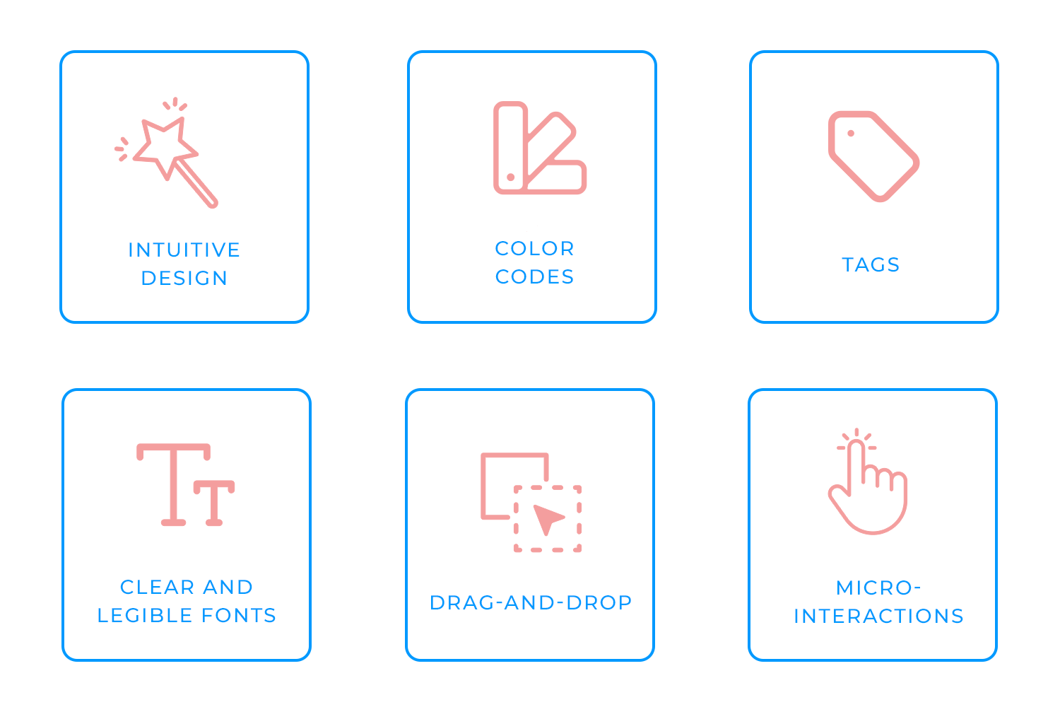
Even something as subtle as typography can shape the user experience, whether it’s on a mobile app or a web interface. Think about it: you glance at your calendar to check meeting times or event details. Fonts that are clear, legible, and thoughtfully styled make those glances quick and painless. On the web, choosing the best Google fonts for websites can improve readability and aesthetics, while for mobile, selecting the best fonts for mobile apps ensures clarity and usability on smaller screens. Typography is like the unsung hero of any great calendar design – quietly working in the background to keep everything readable and polished.
The real fun begins with interactive features. Drag-and-drop capabilities transform rescheduling from a hassle to a smooth, almost enjoyable experience. Swipe gestures for quick actions, like marking tasks complete or deleting events, feel natural and modern. It’s these small but meaningful interactions that make the app come alive.
Lastly, micro-interactions add that extra spark of personality. Whether it’s an interactive animation when creating an event or a subtle bounce effect after deleting one, these moments make the experience feel refined. They’re tiny details, sure, but they leave a big impression, giving the app a polished, human touch.
When you bring all these elements together, you’re not just creating a calendar, you’re designing a tool that helps users take control of their time and actually enjoy the process.
Design and prototype your Calendar App with Justinmind
Calendars do more than just keep track of dates, they help us stay organized, on time, and in control of our lives. Their simplicity makes them an indispensable tool, but also surprisingly easy to create. If you’ve been searching for the perfect calendar app and still haven’t found what you need, why not take matters into your own hands? With Justinmind, you can design and prototype a calendar app that’s tailored exactly to your needs. It’s your chance to turn your ideas into something that works for you.
PROTOTYPE · COMMUNICATE · VALIDATE
ALL-IN-ONE PROTOTYPING TOOL FOR WEB AND MOBILE APPS
Related Content
 Learn how to design better e-learning platforms with user-centered UX principles, real examples, and high-fidelity prototyping tips to boost engagement and learning outcomes.13 min Read
 Infinite scroll keeps users engaged, but it’s not always the best choice. This guide breaks down when to use it, when to avoid it, and how to design it right.14 min Read
 Learn how to design web and mobile app prototypes, how to test them and what to look for in a prototyping tool in this complete guide.15 min Read


