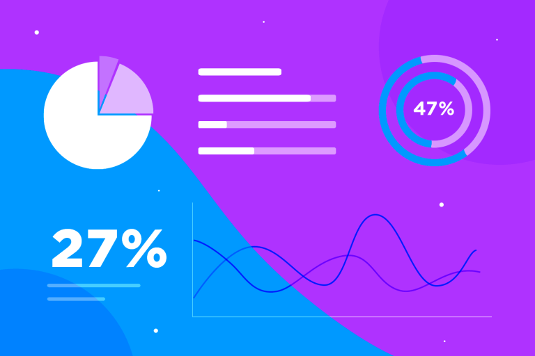
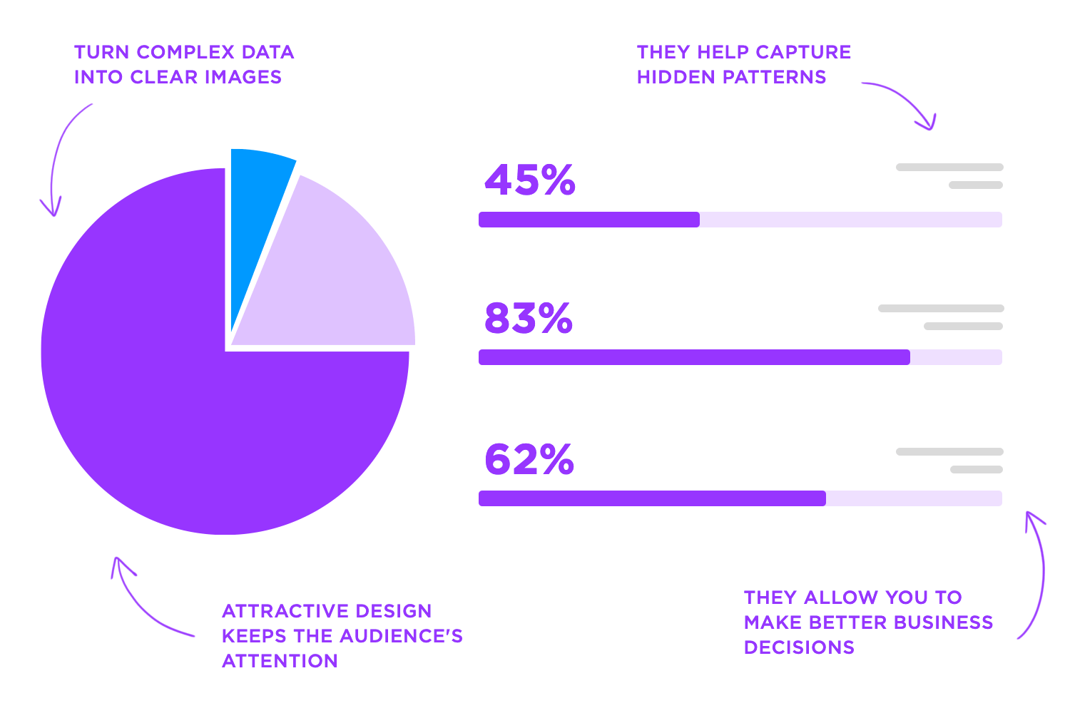
Data visualization combines design, business goals, and data analysis to create a tool that helps people make better decisions and improve their work. By translating data into representations, we gain the ability to uncover hidden patterns, trends and insights within the data, allowing us to unravel complexities and present information in a clear format for others.
In comparison to methods of data analysis, visual representations significantly improve our capacity to understand and communicate insights. Processing information through means is not only faster but also more comprehensible.
Bring your data to life with Justinmind's free prototyping tool.

This guide explores the principles of data visualization alongside industry best practices, diverse visual formats, practical examples from real world scenarios as well as leading software solutions.
Let’s take a closer look at the fundamentals of data visualization and see how we can transform data into compelling visuals.
Data visualization is the graphical representation of information and data. Data visualization tools use visual components, making it easier for individuals to identify trends, outliers, and patterns within seconds. The goal is to allow anyone to extract easily digestible and actionable insights from data.
These visual elements are extremely useful for simplifying complex data making it accessible to a larger audience. For example, a simple bar chart may compare different categories, but a line graph can show trends over time. Using a wireframe tool early in the design process can help structure these visual elements effectively before finalizing them.
Data comes in two main types.
Quantitative data: This is all about quantities, the things you can count or measure. Think sales numbers, temperatures, or how many points someone scored in a game. This kind of data often shows up in charts with exact numbers, like bar charts, line charts, and scatter plots.
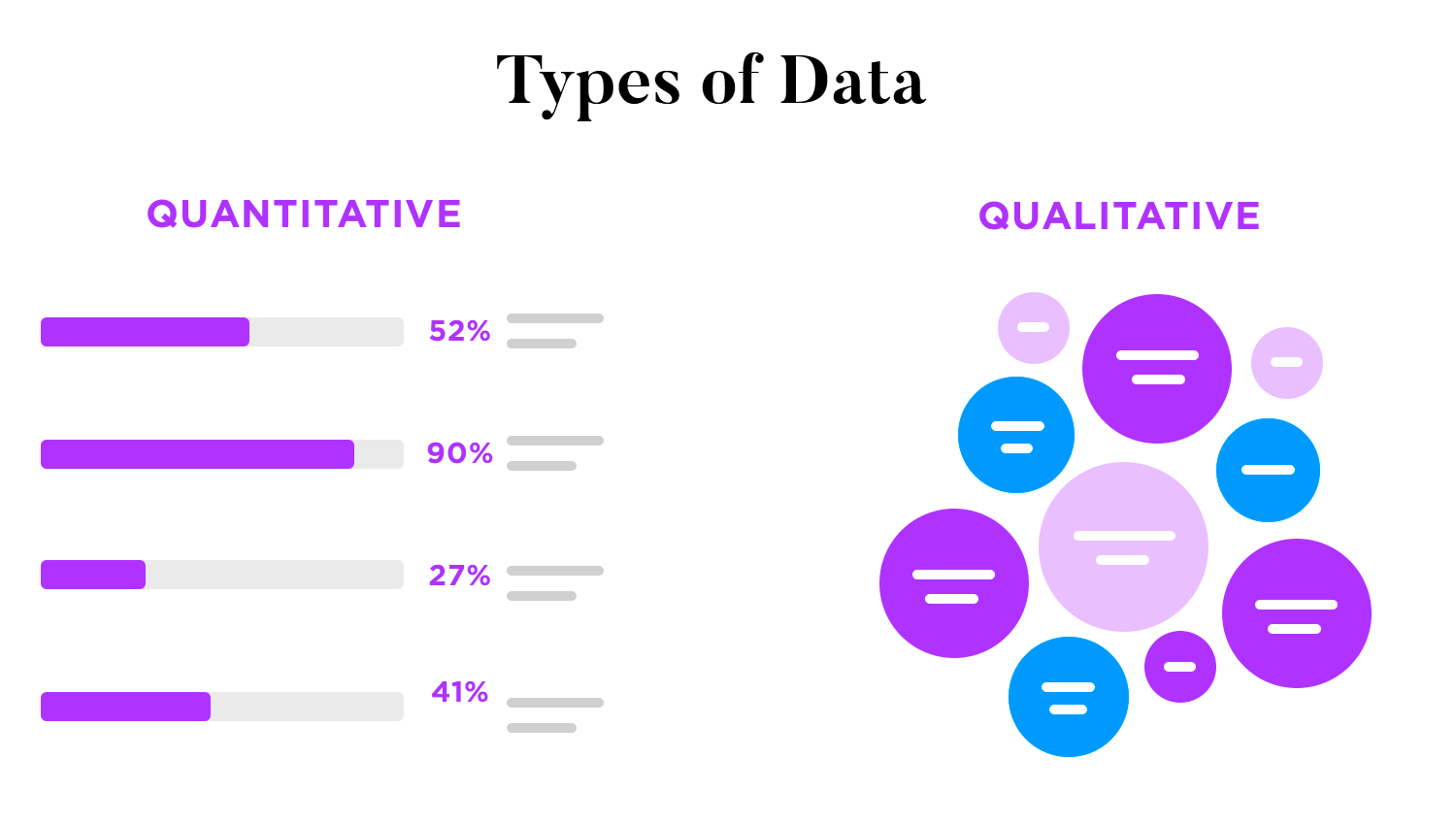
Qualitative data: This is about qualities, the words that describe things like customer reviews, interview quotes, or product descriptions. This data is often visualized in word clouds or bar charts that group words into categories.
Data is everywhere, and knowing where to look is key to making effective data visualization.
Internal sources: This is data your own company or team has gathered. Think sales reports, notes about how your employees are doing, and any surveys you’ve run. This data is usually right on target for what you need.
External sources: In this case, you get the information from other places, like public databases, research reports, or other companies. Imagine things like market studies, social media trends, or government stats. This kind of data helps you see how your own numbers compare and gives you a wider view.
Before visualizing data, it’s essential to prepare it properly. This means cleaning it up and organizing it to make sure it’s accurate and you can trust it.
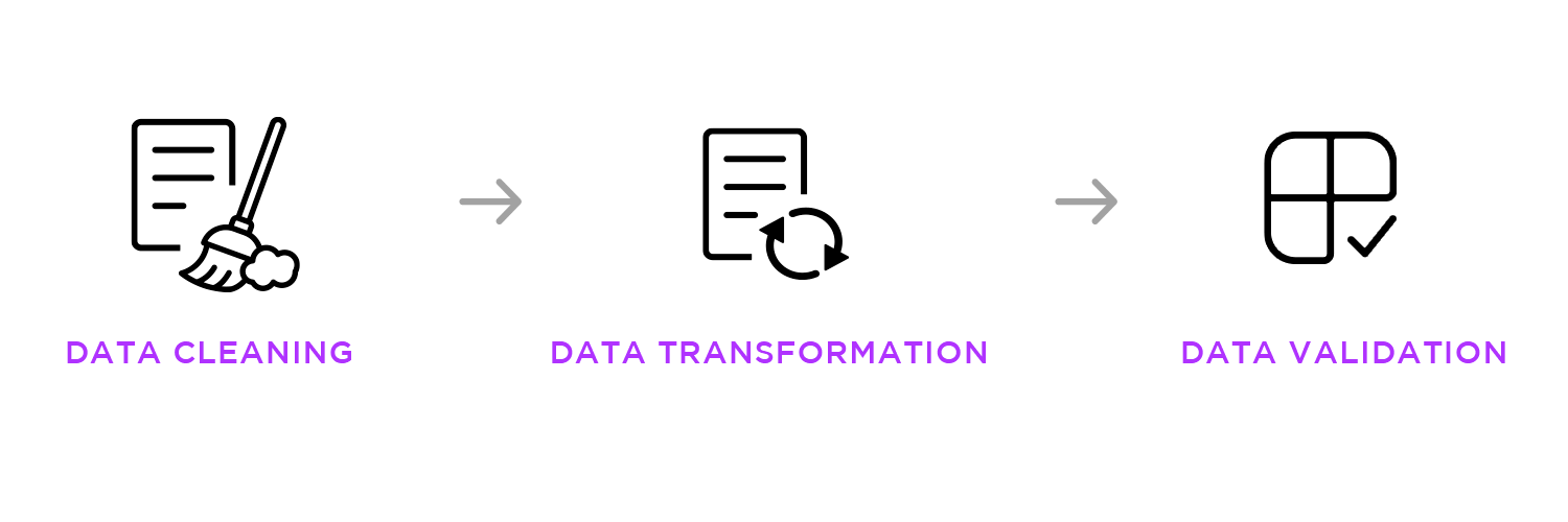
Data cleaning: This step is like tidying up. You’re finding and fixing errors in your data, like missing info, doubles, or things that don’t make sense. Tools like Excel, Python, or special software can help you do this faster.
Data transformation: Once your data is clean, you might need to change it into a format that’s easier to work with. This could mean making all the numbers similar, making new calculations from your data, or changing the way the data is written.
Data validation: The last step is like a double-check. You’re making sure the data is a true reflection of reality. This means finding any unusual numbers, comparing your data to known standards, and making sure everything in the data set is consistent.
When deciding how to effectively show your data, it’s important to first understand your numbers. Are you dealing with quantities or qualities? What story are you trying to tell with them? For example, if your data is time-related, a line chart might be best, while a scatter plot could showcase the relationship between two sets of values.
Next, think about your goal. What message do you want your audience to take away from this visualization? If you’re showing parts of a whole, a pie chart is a good choice, but if you’re comparing groups, a bar chart might be more effective.
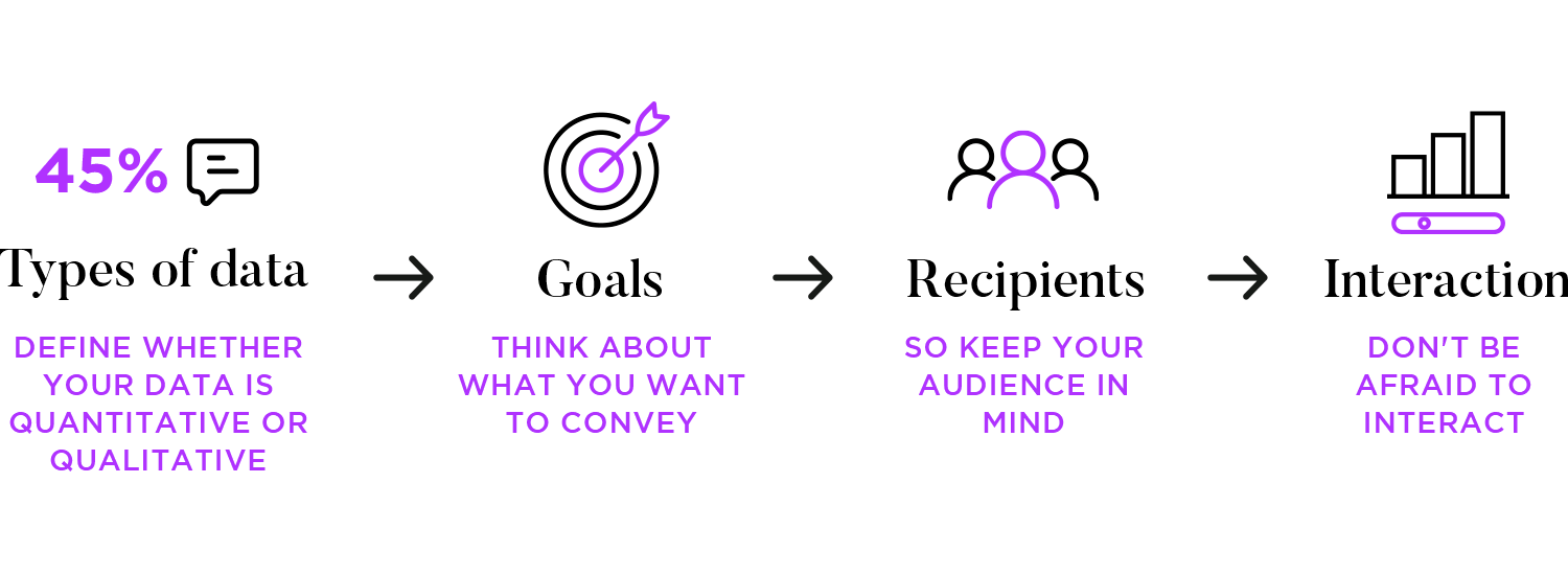
Also, keep your audience in mind. Technical people can handle more complex visualizations, while executives might prefer something simpler. No matter who your audience is, strive for clarity and make sure every element on the chart has a purpose.
Finally, if you’re dealing with larger datasets, don’t be afraid to get interactive! Tools like Tableau or Power BI can allow users to explore your data more deeply.
Bar charts are versatile tools for visualizing data, each variation serving a specific purpose. Here’s a quick breakdown of the main types
- Vertical bar charts: Compare categories with upright bars.
- Horizontal bar charts: Compare categories with sideways bars.
- Grouped bar charts: Compare multiple groups within categories.
- Stacked bar charts: Show parts of a whole within each category.

Line charts reveal trends and changes over time, offering a clear visual narrative:
- Basic line charts: Connect data points to illustrate trends, like stock prices or temperature changes.
- Multiple line charts: Compare trends of different variables on the same graph, showing their relationships.
- Area charts: Emphasize the cumulative total of a value over time by filling the space below the line.

Pie charts effectively display parts of a whole, offering a clear visual of proportions:
- Standard pie charts: Divide a circle into segments, each representing a proportion of the whole, ideal for a small number of categories.
- Donut charts: A variation with a center hole, allowing for additional information or a stylish presentation.

Scatter plots help reveal relationships between variables, acting as visual data detectives:
- Basic scatter plots: Plot data points to show the correlation between two variables.
- Bubble charts: Extend scatter plots by using the size of each point to represent a third variable.

Heat maps use color to visually represent data intensity and patterns:
- Geographical heat maps: Overlay color gradients on maps to show variable intensity across regions.
- Matrix heat maps: Use color grids to represent data in matrix form, highlighting correlations and patterns.

Tree maps are your organizers for hierarchical data, showing part-to-whole relationships in a visually appealing way. A basic tree map uses nested rectangles, where the size of each rectangle corresponds to the magnitude of the data. They are excellent for displaying complex hierarchical structures in a clear and concise way.

Data visualization simplifies complex information. Graphs, charts, and maps help people quickly understand large amounts of data. For example, a bar chart showing sales figures makes it easy to compare products at a glance, leading to quicker and more accurate insights.
Visualizing data also reveals the story behind the numbers, making it easier to spot trends and patterns, leading to smarter decisions. Tools like Tableau and Power BI enable decision-makers to explore data interactively, diving into specifics to uncover insights. This leads to more informed and timely decisions, which is crucial in today’s fast-paced environment.
Showing data visually is more effective than just showing plain numbers. For example, a pie chart can quickly show the market share of different companies, clearly indicating the leader. This method is especially helpful in presentations and reports, where clear communication is essential for gaining support and driving action.
Visuals can reveal trends and patterns hidden in plain numbers. Dot graphs reveal relationships between two data sets, while line graphs display changes over time. These tools help analysts and decision-makers better understand the data and make more informed and smarter choices.
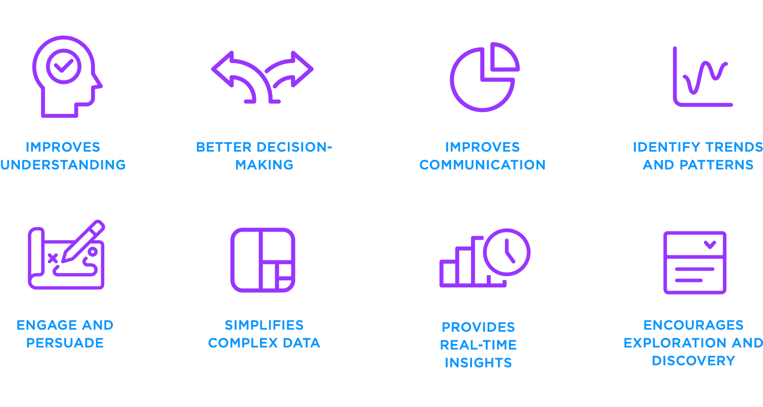
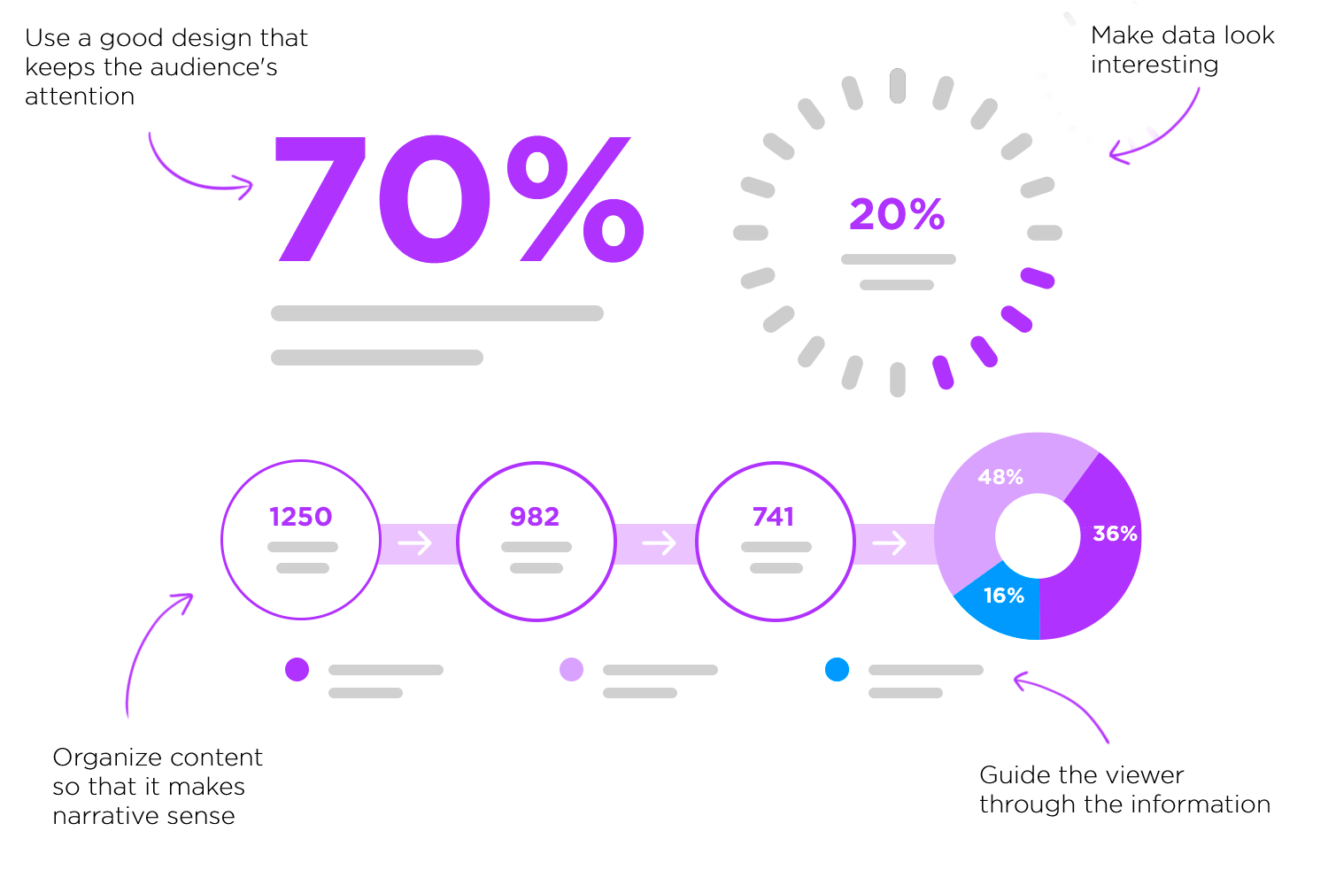
What makes a good data visualization? It’s the ability to capture attention. Have you ever found yourself drawn to an interactive visual that lets you dive into the details? These kinds of visuals make information clearer and more convincing. That’s why they’re so important because they can can boost customer understanding and lead to more sales.
If you struggle with large datasets, visualizations can help by turning complicated information into something simple and manageable. For example, have you ever seen a tree map? It breaks down hierarchical data into clear sections, making relationships easy to see at a glance. This way, what once seemed overwhelming becomes straightforward and understandable.
Modern data tools act like live TV for your business. Dashboards combine info from various sources, showing real-time updates. This is great for monitoring important metrics and reacting quickly to market changes or business needs.
Last but not least, interactive visualizations let users explore data on their own. They can filter information, zoom in on details, and explore different perspectives. This interactive approach often reveals new insights that might be overlooked in standard reports, making the data even more valuable.
Bring your data to life with Justinmind's free prototyping tool.
As we have seen, the importance of data visualization lies in its ability to transform complex data into clear, actionable insights. To achieve this effectively, let’s delve into the key principles of effective data visualization.
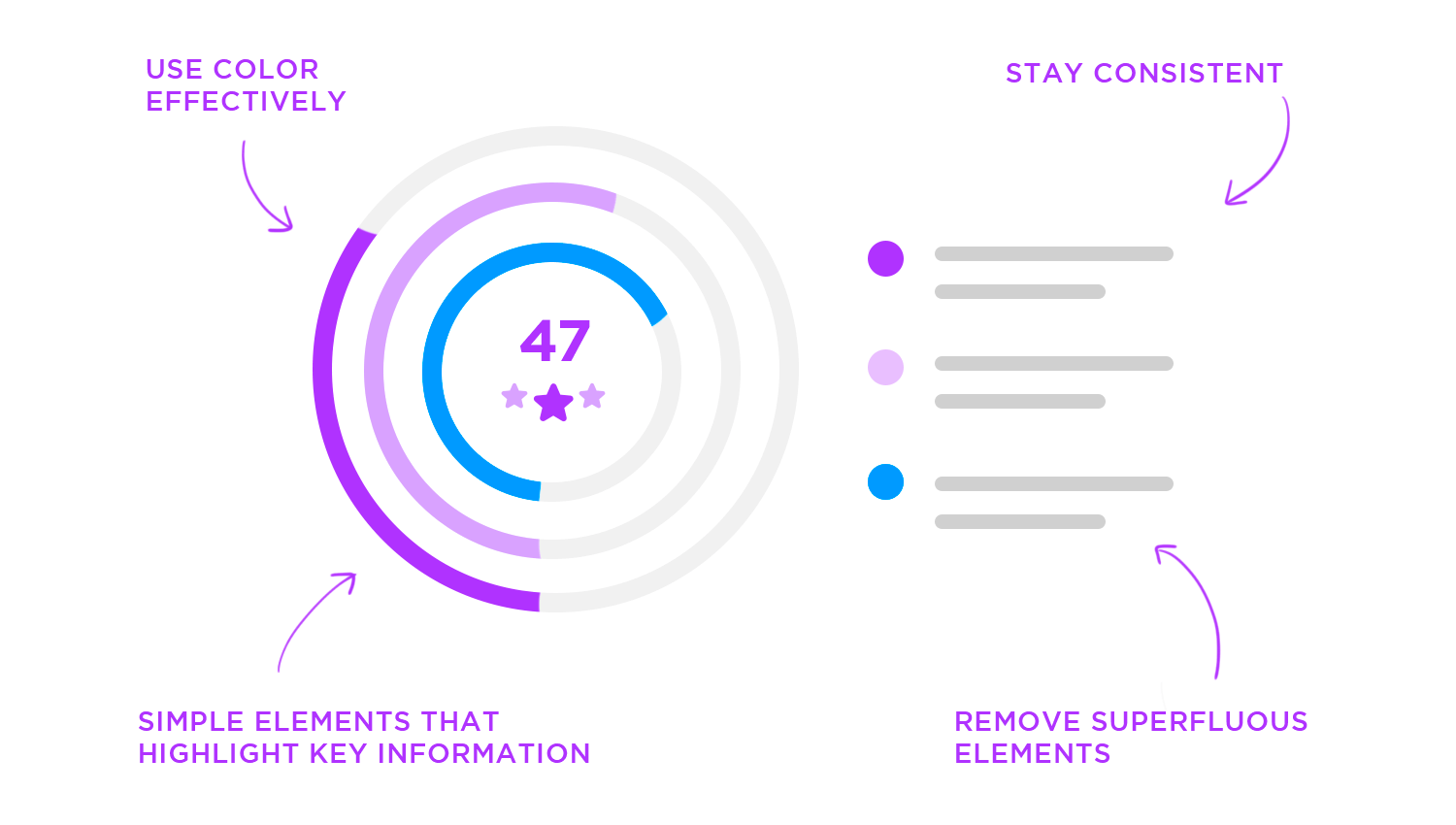
Imagine your data visualization as a well-organized room: less is more, so focus on the essential message and remove any distracting clutter. Guide your viewer’s eye like directing a play, using a clear visual hierarchy with size, color, and contrast to emphasize key points.
Think of labels and titles as friendly road signs, using concise language to avoid jargon and ensure easy understanding. Finally, each visualization should tell a clear story with a single focus, avoiding the confusion of cramming too much information into one chart, making your message impactful and memorable.
Think of your data visualization as a trustworthy witness: truthful representation is paramount, so present data accurately and honestly, avoiding any manipulation. Just as a map needs a correct scale, use appropriate scales and axes to avoid distortion, clearly labeling all units.
Like citing sources in research, provide source citations for transparency and credibility. And as with a consistent recipe, ensure consistent data handling to prevent bias and errors from affecting your visualization, upholding the integrity and reliability of your insights.
Elevate your data from mere numbers to captivating stories by prioritizing visual appeal, using color, typography, and layout to draw viewers in like a piece of art. Maintain consistent styling across all visualizations, creating a cohesive and professional look, much like a well-furnished room.
Use color purposefully, like a spotlight, to highlight key insights without overwhelming the audience, keeping colorblindness in mind. Finally, select the appropriate chart type as you would choose the right tool for a job, ensuring your data is presented clearly and effectively, transforming information into a memorable and impactful experience.
Choose the right chart: As mentioned earlier in the types of data visualization, picking the best type of chart for your data is crucial. Whether it’s bar charts for comparisons or line charts for trends, using the right visual will make a difference.
Strive to make your data visualizations universally accessible by considering colorblindness, using friendly palettes or alternative distinctions, ensuring everyone can perceive the information. Create inclusive experiences with screen reader compatibility, providing descriptive alt-text so visually impaired users grasp the data’s essence.
Ensure readability for all by using sufficient contrast between text and backgrounds. If your visualization is interactive, provide keyboard navigation, allowing users with motor impairments or those preferring keyboard controls to fully engage, thereby making your insights truly accessible to everyone.
Transform your data into a compelling experience by providing context, explaining the “why” behind your data so your audience understands its significance. Craft a narrative by telling a story with your visualization, guiding viewers through key insights with visual cues and annotations.
If your visualization intends to inspire action, include a clear call to action, giving your audience a clear direction for their next steps, turning your data from a passive display into an active tool for engagement and change.
Transform your data into an engaging experience by enabling exploration, allowing users to freely navigate and discover hidden insights, much like exploring an interactive map. Equip your audience with tools for focused analysis by providing filtering and sorting, enabling them to sift through data like a well-organized library.
Enhance understanding and provide context with tooltips and hover effects, offering informative labels that enrich the user’s exploration, turning passive data into an interactive and insightful experience.
Avoid overwhelming your audience with too much data. Overcrowded visuals can be hard to interpret and obscure the main message. Focus on the most relevant points and use visual hierarchy to highlight key information.
Make sure the scales on your graphs and charts are correct. Messing with scales to make things look bigger or smaller than they really are be confusing and lead to wrong conclusions. Always use scales that show the information truthfully.
Before you even think about creating visuals, make sure your data is clean and well-prepared. Raw data often has errors, missing pieces, and inconsistencies that can throw off your results. Think of it as tidying up before guests arrive – you want everything in order. Proper preparation means cleaning, formatting, and verifying your data so it’s accurate and reliable.
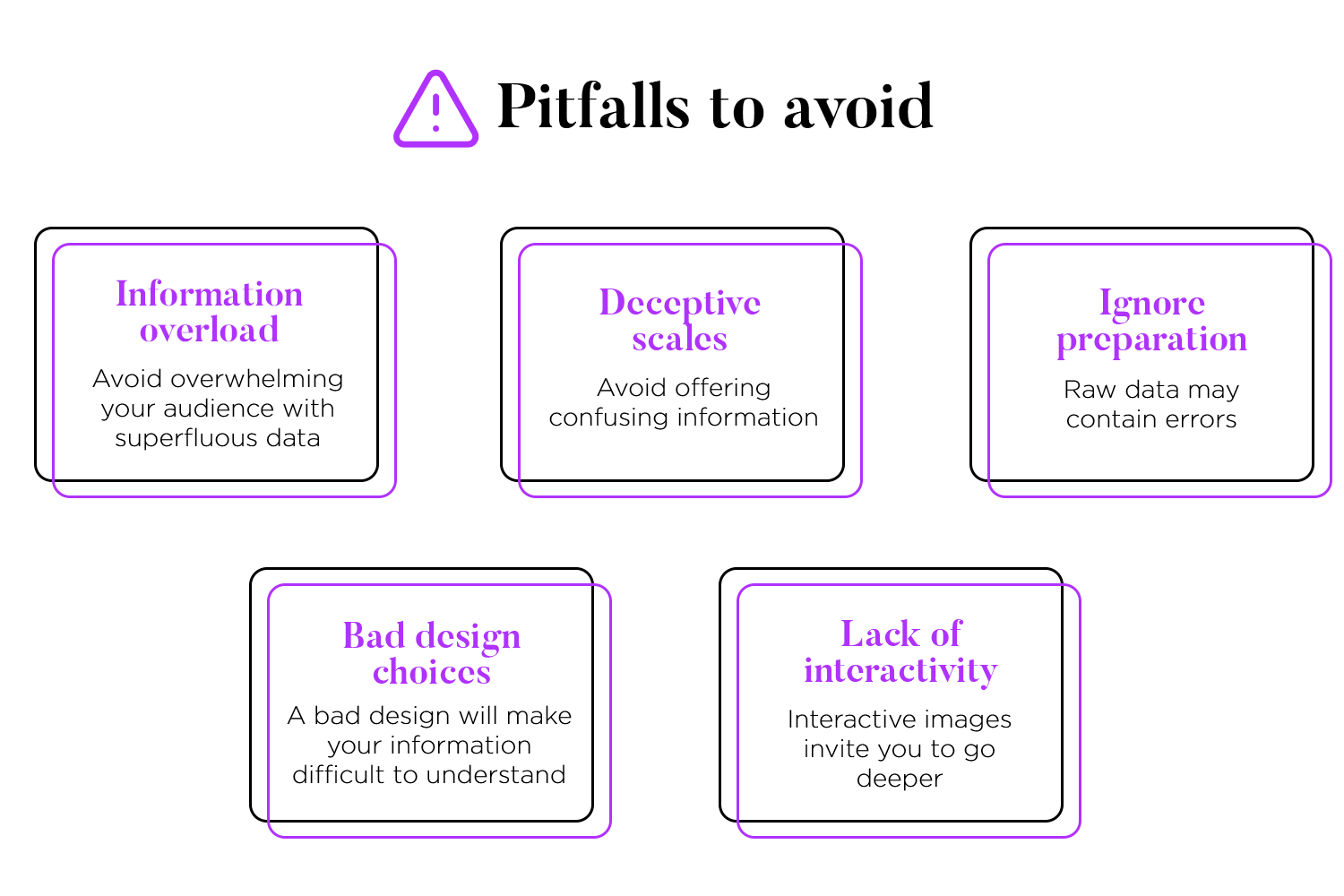
Once your data is ready, the next step is choosing the right visuals. It’s not just about picking any chart or color scheme. The wrong choices can make your information confusing or even misleading. Imagine trying to read a cluttered map – it’s frustrating and unhelpful. Use visuals that clearly and accurately convey your data, making it easy for your audience to grasp the key points.
Finally, don’t forget the power of interactivity. Static visuals can be informative, but interactive ones take it to the next level. They allow users to explore the data, filter information, and zoom in on details they find interesting. It’s like turning a static picture into a dynamic experience. This interactive approach not only makes the data more engaging but also leads to deeper insights.
We’ve talked about how powerful data visualization can be in turning complex data into clear and engaging stories. Now, let’s see it in action! Here are 20 fantastic examples of data visualizations from different areas. These examples show various ways to visualize data and use different tools, giving you practical ideas for your own data presentations.
Explore how data visualization can empower users in the realm of digital finance with Justinmind’s cryptocurrency app dashboard. This design emphasizes a personalized user experience by focusing on portfolio visualization, placing users in control of their data. Essential features, such as dynamic price charts and clear buy/sell indicators, demonstrate how effective visualization can provide a comprehensive and actionable overview for cryptocurrency investors.

Justinmind’s fitness app dashboard exemplifies how data visualization examples can motivate and track progress. This design goes beyond basic tracking, integrating health and wellness data like sleep and blood oxygen monitoring for a holistic user experience. The focus on personalized goal tracking demonstrates the power of visualization to engage users and encourage consistent interaction.

See how data visualization examples empower on-the-go decision-making with Justinmind’s analytics dashboard app. This mobile-friendly design provides a clear, concise overview of key business metrics. The clean interface and easy-to-read charts make data accessible and actionable, proving that effective visualization can fit in the palm of your hand.

Discover data visualization examples that transform learning into a visual journey with Justinmind’s e-learning website template. This dashboard uses a clean layout and color to make educational data engaging. Personalized progress overviews, course calendars, and performance tracking showcase how visualization enhances the learning experience.

Justinmind’s dashboard wireframe template offers a foundational structure for crafting diverse data visualization charts. This adaptable template provides a blank canvas, allowing for easy customization to meet specific project needs. The inclusion of various widget options, such as bar charts, pie charts, and line graphs, facilitates the optimal visual representation of your data.

Explore data visualization examples that simplify task management with Justinmind’s dashboard. Its left sidebar navigation and clear task status views enhance workflow efficiency. Filtering and sorting features allow users to focus on specific tasks, while collaboration tools like comments and attachments keep teams aligned.

Examine data visualization examples focused on sales with Justinmind’s vertical navigation dashboard. Its clean, intuitive layout and strategic use of color and hierarchy enhance data comprehension. The vertical sidebar provides easy access to different sales metrics, and visually appealing widgets offer concise overviews of key performance indicators.

Justinmind’s MUI CRM dashboard provides a robust and adaptable framework, offering a practical example of effective data visualization for project development. Key features, such as customizable widgets, enable users to personalize the dashboard to their specific requirements by highlighting the data most crucial to their sales process. This adaptability showcases how visualization can be tailored to individual needs.

Gain a bird’s-eye view of sales performance with Justinmind’s horizontal navigation dashboard, a prime example of effective data visualization. The horizontal navigation bar ensures easy access to different sections, while widgets provide quick overviews of key metrics. This dashboard offers a comprehensive view of business performance, from sales trends to inventory levels.

Justinmind’s personal finance dashboard example offers a valuable reference for creating effective data visualization examples in the realm of personal finance projects. It provides a clear illustration of how to organize and present financial information, serving as a guide for your own design endeavors.

This example of data visualization uses a colorful pie chart brimming with images of food to visually represent different food categories and their consumption percentages. Each slice clearly shows the percentage it represents, while additional information is provided in infographics alongside the chart for a more detailed look.

The bright colors and realistic images make the chart eye-catching, helping people not only understand the information better but also remember it longer. This type of visual is perfect for educational tools and marketing materials where grabbing attention is key.
Here’s an engaging example of data visualization using a network graph to showcase connections and interactions. Circles of various sizes and colors represent different data points, connected by lines to illustrate relationships.

This interactive design allows users to explore relationships and dive into specifics with ease. Ideal for business analytics, this visualization makes complex data simple and captivating.
This striking data visualization example from the AMS Data Visualization System uses bold infographic panels to present various data points clearly and engagingly. Each panel features large, easy-to-read text and visuals such as percentages, line graphs, and circular charts to convey information quickly.

The bright colors and strong contrasts help the data pop, making sure important insights are easy to see right away. This design is ideal for company reports, presentations, and dashboards, where it’s essential to make complex data simple and eye-catching.
We chose this example of data visualization for its clear and engaging design. The top section features a colorful circular gauge displaying the event value score, with segments for answer quality, question efficiency, and answer efficiency.
A bubble chart shows changes in these metrics over the year. The guest behavior section uses flow charts and pie charts to illustrate attendee actions like browsing, searching, and submitting questions.

This user-friendly design makes complex data easy to understand, ideal for event management and performance analysis.
This is a great data visualization example for its simple and effective presentation of statistics. The left side of the design displays key percentages like 85% for feedback accuracy and 30% for employee satisfaction improvement, using horizontal bars to illustrate the data.
On the right, a photo of a team working together adds a human touch. This layout makes the data easy to understand and visually appealing.

Ideal for reports and presentations, this design highlights important numbers clearly and engagingly.
This example of data visualization is a fun and creative presentation of the 100 biggest LEGO sets. The design features a colorful tower made of LEGO bricks, each representing different sets. Below, a circular chart provides detailed information about each set, including public ratings, pricing, and build time.

This engaging and visually appealing layout makes the data easy to understand and enjoyable to explore. Perfect for presentations and reports, this design highlights data in a playful yet informative way.
Here’s a compelling example of data visualization that presents important information on trauma and media use among tweens and teens. On the left, it shows statistics about trauma, including the likelihood of PTSD and various causes of trauma, illustrated with a tree diagram.
On the right, it displays media usage, showing screen time differences based on socioeconomic status and a line chart of smartphone ownership over time. This design makes complex data easy to understand and visually appealing, perfect for educational and healthcare use.

We love this example of data visualization for its engaging and colorful design that explains data maturity. Each section of the chart, in vibrant colors, represents different areas like data management, technology, usage, and governance, all scored out of 5.
This visual makes it easy to spot strengths and areas for improvement at a glance. The overall data maturity score is clearly displayed at the bottom. This eye-catching design helps quickly make sense of complex information, perfect for business analysis.

Take a look at this example of data visualization that features a dynamic dashboard with various data widgets. Each widget provides insights into different metrics like page views, goal completions, active users, and income. The combination of charts, gauges, and lists makes it easy to grasp important information quickly.

With its clean and modern design, this type of data visualization is perfect for tracking business performance and supporting data-driven decision-making.
Bring your data to life with Justinmind's free prototyping tool.
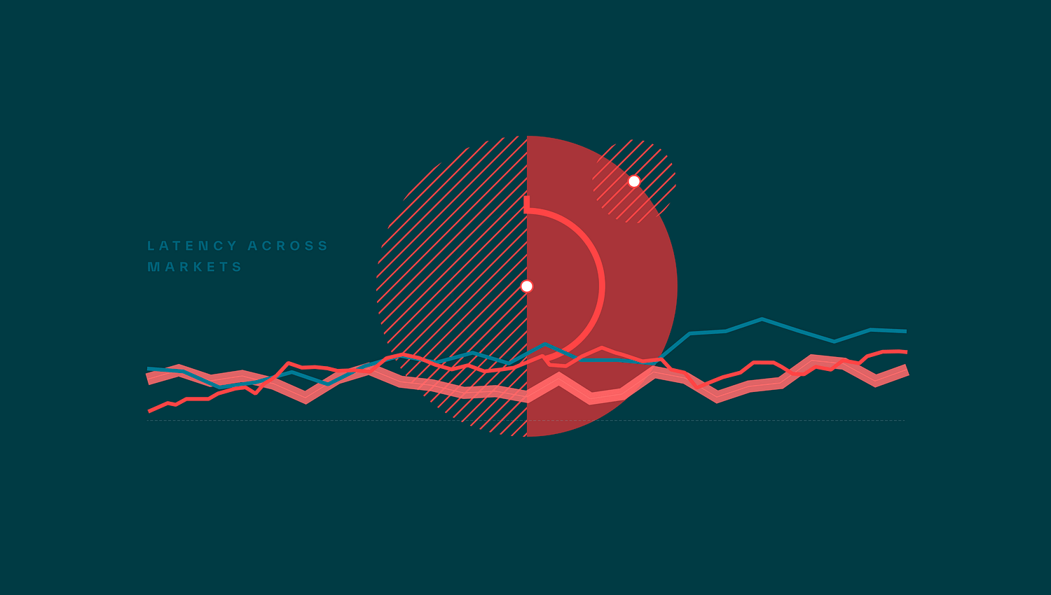
Check out this cool example of data visualization showing market latency. It uses red and blue lines to track changes over time, with circles adding extra details. The simple design and strong colors make the data easy to read and understand, highlighting important patterns.
This clean and modern look is perfect for presenting market performance data in an engaging way.
This engaging data visualization example is designed for mobile devices. Each screen features interactive charts and graphs, including bar charts, line graphs, and circular indicators. The vibrant and dynamic visuals make it easy to track changes and understand key metrics quickly.

This mobile-friendly design is perfect for real-time data monitoring, providing a clear and engaging way to access complex information on the go.
Moving from our last example, this engaging visualization uses an interactive map to show arrival data in Georgia. Alongside the map, there’s a pie chart and a colorful list of campaigns with their statistics.
Hovering over places like Detroit, MI, reveals detailed information, such as exposure numbers and trends. The bright colors and clear design make complex data easy to understand and visually interesting. This type of visualization is great for tracking regional data and performance metrics.

Even complex data can be made clear and engaging with the right design. This crime rate comparison visualization uses a circular chart to show crime trends in different neighborhoods. Each segment represents a neighborhood, with colors indicating recent changes in crime rates.

The chart makes it easy to compare crime trends across various areas, with clear labels and color codes to highlight increases and decreases in crime. This type of visualization is perfect for presenting detailed data in a way that is both informative and visually appealing.
Diving into global trends, this example uses a mix of pie charts, line graphs, and area charts to present various data points. The visualizations cover themes like COVID-19, energy use, and international relations.

Each pie chart breaks down different themes by percentage, while the line and area charts show trends over time, making it easy to see how these issues evolve. The colorful and well-organized design helps viewers quickly understand complex information.
Here’s an easy-to-understand example of global data comparison. Each column represents a different country, showing positive, neutral, and negative data outcomes in clear bubbles. Below, a circular chart adds more details, making the information comprehensive and easy to grasp.
The pastel colors and clean design help viewers quickly compare and understand complex data. This type of data visualization is perfect for comparing international trends and presenting global data in a straightforward way.

Here’s a versatile example of data visualization components. The main graphic shows a central data point with flows to various subpoints, making it easy to track connections. Below, different types of charts are displayed, including pie charts, line graphs, and a unique squid chart.
The use of vibrant colors and clean design helps make complex data easy to understand. Perfect for presenting diverse data in a clear and engaging way.

This is a futuristic example of data visualization that uses sleek graphics and glowing neon colors to create an engaging and modern look. It features a combination of circular graphs, bar charts, and line graphs, all with a high-tech 3D effect.

The layout is clean and stylish, making complex data easy to read and understand. This type of visualization can transform dull data into something visually striking and captivating, perfect for grabbing attention and making data analysis more interesting.
This data visualization technique shows energy usage in a sleek, modern design. The dark background with green and white details looks clean and professional. The dashboard uses bar charts, line graphs, and numbers to display daily and weekly energy use.
The clear labels and simple graphics make it easy to understand the data quickly. This design helps users track their energy consumption and make informed decisions.

Tracking multiple metrics is easy with this type of data visualization. It uses a dark background and bright colors to show activity, code, and community reactions. The top section has line graphs for notifications and security.
A stacked bar chart shows pull requests over time, and circular charts with emojis at the bottom display community reactions. This design is visually appealing and easy to understand.

As our last example, we chose this abstract design data visualization for its unique and artistic style. The circular pattern with bright colors makes the data look both interesting and informative. On the left side, important metrics like total deals and idle times are shown with simple graphs. This design makes complex information engaging and easy to understand.

Picking the right tools to show your numbers is really important. There are lots of choices out there, some cost money, some don’t. Each one is good at different things, so think about what you need.
Tableu Public is free and liked by many users. You can make great pictures with your numbers that move around, and then share them online. It’s easy to use, like building with blocks. It can do lots of different pictures, so it’s good for many things.

Looker Studio also free and works well with other Google tools you might use. It can make pictures that move too, and you can make reports that look just how you want. It’s good if you have a team working on stuff together.

If you’re just dipping your toes into the world of data visualization, the free version of Microsoft Power BI is a fantastic place to start. Its easy drag-and-drop interface provides a user-friendly experience by letting you connect to many data sources and create dynamic dashboards.

If you’re a developer looking for something with a little more freedom, Chart.org might be your new best friend. This free and open-source library gives you the power to craft dynamic and responsive data visualizations that truly stand out.

It’s the advanced version of Tableau, used by many businesses to better understand their data. It lets you make detailed charts and graphs, even with very large amounts of information. It has lots of tools to help you find patterns and make smart choices. If you need more than the free version of Tableau, this is a good upgrade.

This is the paid subscription of Power Bi that gives businesses more powerful tools for visualizing and analyzing data, like collaboration, sharing, and increased data capacity.

Domo is a business intelligence tool that lets you connect to different data sources, see real-time insights, and create custom interactive dashboards for your specific needs. It’s great for visualizing data to make informed business decisions.

Qlik Sense is a paid tool known for its powerful data exploration and visualization model that is easy to use for both technical and non-technical users. Its unique associative data model allows you to uncover hidden connections in your data.

First, make sure the tool works with your existing data. Google Data Studio and Microsoft Power BI are great for this. If your team isn’t tech-savvy, choose an easy-to-use tool like Tableau Public or Google Data Studio. For more customization, Chart.js is a good option. Consider your budget, as free tools like Google Data Studio and Tableau Public are excellent, but paid options like Domo or Microsoft Power BI Pro might be worth it for extra features. For collaboration, tools like Google Data Studio or Microsoft Power BI Pro are ideal.

Creating data visualizations involves not just designing visuals but also making sure they work well in real-world scenarios. Justinmind is a great prototyping tool for this because it makes prototyping easy and dynamic.

With Justinmind, data visualization design and prototypes look and act like real applications. This helps you test and improve your designs before they are fully developed. The tool supports interactive data visualization, meaning you can add realistic data interactions. This helps stakeholders understand the final product better and gives a more accurate user experience.
One of Justinmind’s best features is Data Masters. Data Masters make your prototypes come to life with live, editable data. Unlike other tools that use static data, Data Masters let you easily add, edit, or remove data in your prototypes, making them more dynamic and realistic.
Imagine you’re creating a prototype for an application to manage clients in your company. Since your company has many clients, you’ll need some way to display them in bulk, possibly in the form of cards or tables. You’ll also need a way to edit or delete individual clients from the list and have those changes maintained across different screens in your prototype.
While a regular text table might work, it’s not very dynamic, and it’s hard to maintain if your data changes over time. How would you prototype this? With Data Masters, you can easily manage and update client data, making your prototype more functional and realistic.

For example, you can use Data Masters to create data grids and lists that update dynamically. This is very useful for prototyping data dashboards where users need to see real-time data updates. Live data makes it easier to test different scenarios and get feedback, leading to a better final product.
If you need to show lots of information in your design, Justinmind’s data grids and lists are here to help. Data grids are like tables, perfect for organizing numbers and facts, while lists are great for displaying items in a row or column.
The best part is you can easily adjust them to fit right into your project, making your prototypes look polished and professional.
Bring your data to life with Justinmind's free prototyping tool.
Data visualization is about turning complex data into clear, engaging stories. Using tools like the ones we mentioned, you can create visuals that highlight trends, reveal patterns, and support smart decisions.
Key principles include knowing your audience, telling a clear story, choosing the right charts, keeping designs simple, using colors wisely, providing context, and ensuring accuracy. Clean and organize your data before visualizing it.
Good examples of visualization show how design can make data easy to understand. Tools like Justinmind help bring these designs to life with interactive, real-time prototypes. Mixing visuals with storytelling makes your data more compelling and easier to grasp. Effective data visualization blends art and science, turning raw data into insights that inform and inspire.