
Most users wouldn't be able to define exactly what makes a good form. However, we all recognize bad form design when we see it.
Today, we are all used to forms – whether to login on social media, checkout of our favorite online store or to look for a cheap flight for that upcoming vacation. Precisely because online forms are so commonly found online, there is quite a bit of debate surrounding what makes good form design.
Design awesome forms that users will want to fill out.

Is it how short the form is? Is it the visual elements and how they are organized? Is it how long users take to complete it?
Like “good UX design”, form design depends on many variables in terms of usability and quality. Most users wouldn’t be able to pinpoint exactly what makes a form good, with each person placing more or less importance on different elements of the design. But here’s the thing: we all know a bad form when we see one. In this post, we’ll give you tips on how to create a high-converting form in your wireframe tool.
Think about how many times you fill out forms online – logging into Facebook, booking a flight, even subscribing to a newsletter. We may not always stop to think about what makes a form easy to use, but we definitely notice when one is frustrating.
Let’s explore why well-designed forms matter and how they can make a big difference in user satisfaction and getting people to complete the desired action.
A well-designed form greatly enhances the user experience. Forms should be intuitive and straightforward, asking for only the necessary information without overwhelming users. Clear labels and instructions help users understand what they need to do, reducing confusion and frustration.
When forms are efficient and user-friendly, more people complete them. Efficiency matters; shorter, streamlined forms keep users engaged and motivated to finish. This leads to more sign-ups, purchases, or whatever goal your form has. Trust is also important.
A professional, user-friendly form builds trust. When users feel their information is safe and handled well, they’re more likely to complete the form and feel good about it.
Good form design makes sure you get accurate data. Features like real-time validation help users fix mistakes as they go, leading to cleaner, more accurate information. Contextual help, such as inline messages and clear placeholders, guides users on what information is needed, reducing errors.
Accessibility means everyone can use your forms. Inclusive design includes features like keyboard navigation, screen reader compatibility, and clear color contrast for readability. Responsive design ensures forms work well on any device, from desktops to smartphones, providing a smooth experience everywhere.
Finally, well-designed forms keep users engaged. Using interactive elements like progress bars or subtle animations will show users their progress and make the process feel interactive, keeping them motivated to complete the form.
Design awesome forms that users will want to fill out.
Given the variety of forms out there, in the digital world, designers have some creative freedom to craft forms that are both functional and memorable. Even though form design follows strict usability standards, there’s still plenty of room for creativity.
However, no matter how creative you get with your form design, there are some basic principles that always need to be followed to ensure it’s user-friendly and provides a great experience.
Collecting data is a primary goal of forms, but it can be tricky. To get the information you need, you must clearly understand the problem or issue you’re addressing.
Purpose-driven questions: every question should have a clear purpose. Irrelevant questions waste time and frustrate users.
Clarity in questions: avoid questions that can be misunderstood. Use clear questions to make sure your data is accurate.
Data integrity: it’s crucial to collect consistent and reliable data.
Forms are used to gather information, but their effectiveness depends on conversion rates. The conversion rate shows how many users finish the form compared to how many start it.
Measure and improve: keep an eye on how many users start and finish your form. If a lot of people are dropping out before completing it, there are issues that need fixing.
A/B testing: run A/B tests to figure out what’s turning users away. Create two versions of your form with just one difference to see which one performs better.

Users make a snap judgment about your form within seconds. If it looks too complicated or long, they’ll probably abandon it.

Streamlined design: break your form into manageable sections to make it feel less overwhelming.
First impressions: keep the initial view simple and inviting to encourage users to start filling it out.
Filling out forms takes mental and physical effort. If you reduce this effort, more people are likely to complete your form. High interaction costs can frustrate users and make them abandon the form. Common issues include:
- Searching for information
- Excessive typing and scrolling
- Waiting for pages to load
- Re-entering information due to mistakes
You can lower the interaction cost by making sure there are no confusing or overly complex questions, breaking the form into smaller sections, and adding progress bars.
Here are some tips:
- Guide users: make the form easy to follow by guiding users through each step.
- Small groups: break questions into small, manageable groups instead of long lists.
- Clear questions: ensure each question is straightforward so users don’t waste time figuring out what you mean.
Designing forms is all about making them user-friendly and efficient. Let’s check the best practices that will guide you in designing forms that are easy to complete and leave a positive impression.
Design awesome forms that users will want to fill out.
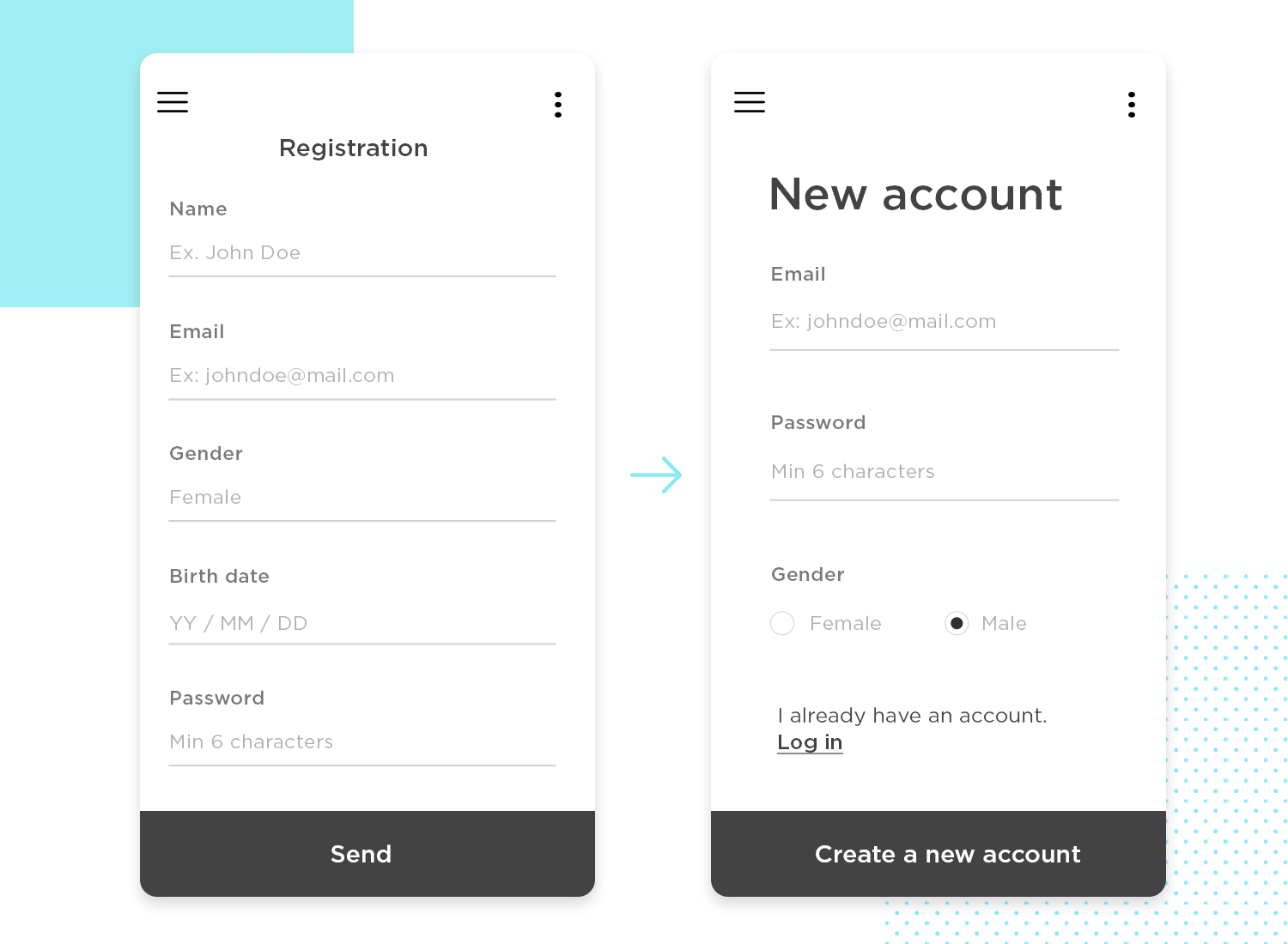
Firstly, take into account that longer forms typically have lower conversion rates. Every additional question increases the chance that users will abandon the form before completing it. People today don’t want to wait or put in a lot of effort, so your form design needs to be brief and to the point. Stick to what is absolutely necessary and let go of the rest. For longer forms, break them up into manageable sections.
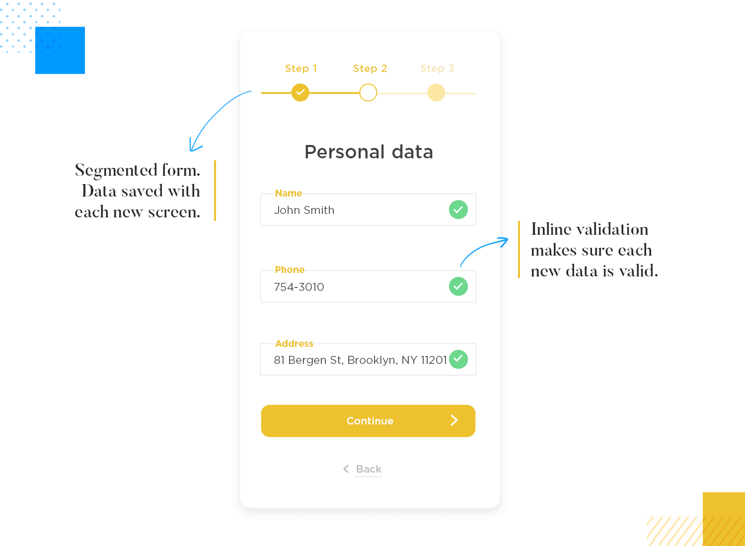
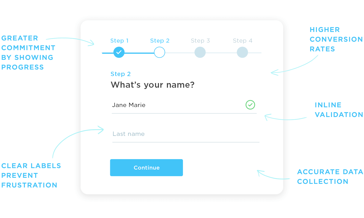
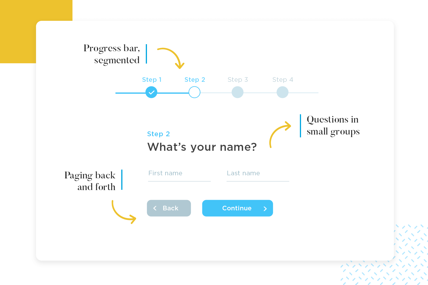
Making forms short isn’t always possible, especially for more complex data collection. Breaking up the form into multiple screens can help reduce the perception of complexity. Divide the form into sections and use progress bars to show users how much they’ve completed and how much is left. This gives users a sense of accomplishment and a clear view of their progress.
A well-designed form feels like a natural back-and-forth. Start with easy questions to get users comfortable, then smoothly transition to more complex ones as needed. Kick things off with easy-to-answer questions like name and email to ease users in. Group related questions together to keep things clear and organized.

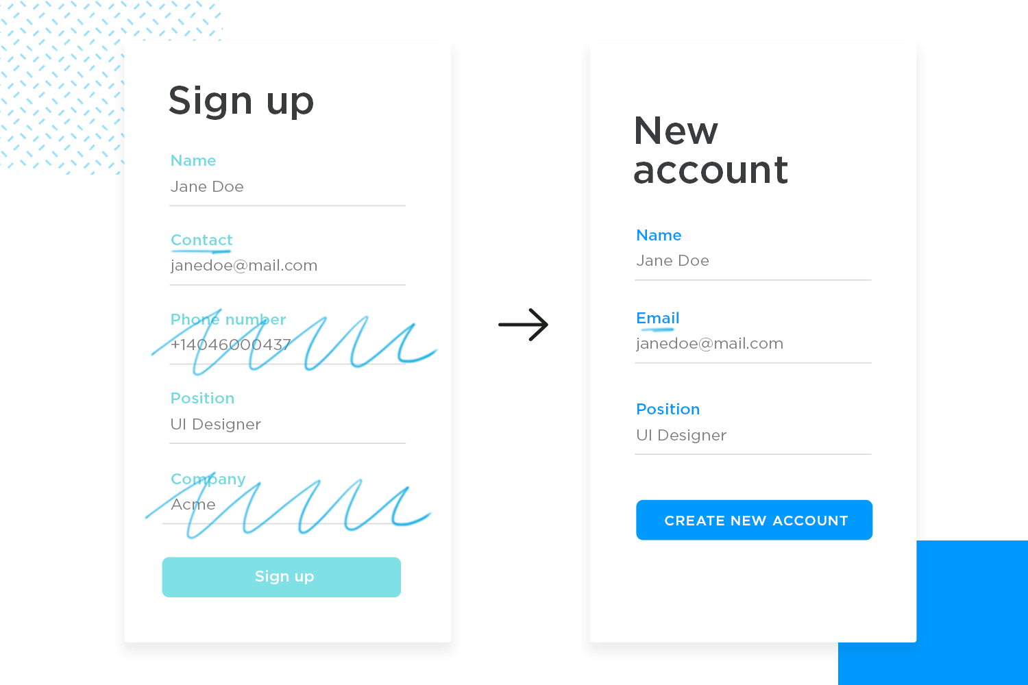
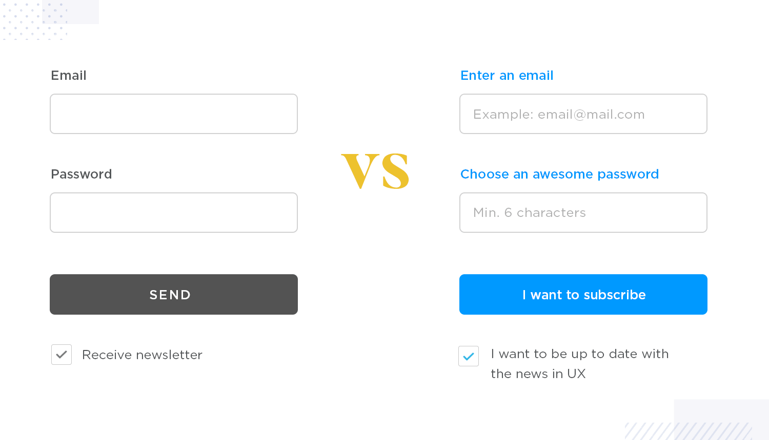
Another key aspect in form design is clear communication. Since users can’t ask questions like in a face-to-face conversation, your form needs to provide all necessary information upfront. Use clear labels, placeholders, and masks to guide users. Labels should be short and to the point. Placeholders should show examples, and masks should help with formatting data like dates or credit card numbers.

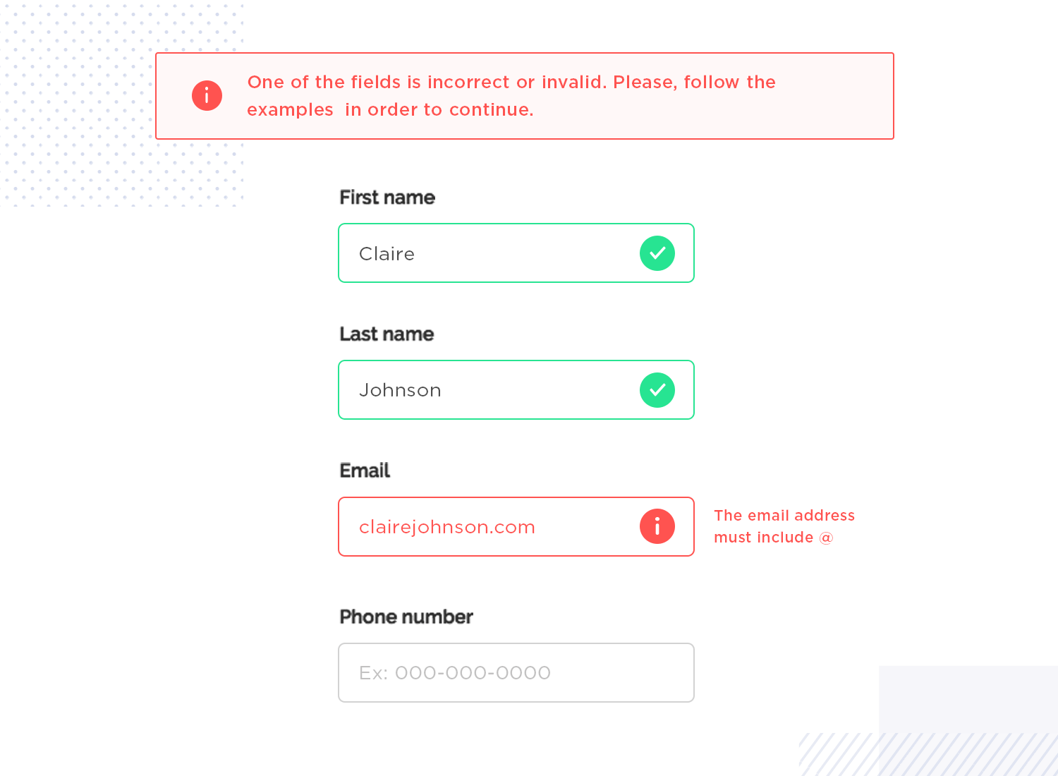
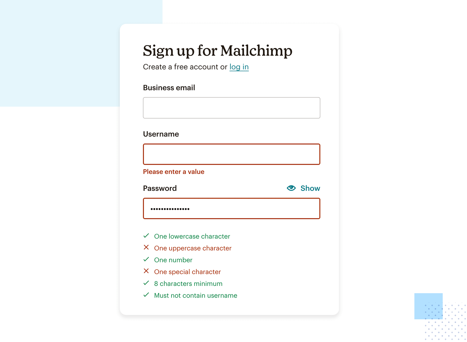
There’s nothing more frustrating than filling out a form only to get a vague error message at the end. Inline validation lets users fix mistakes as they go, reducing frustration and improving completion rates. Implement real-time validation with clear feedback. Use icons or color changes to show errors, and provide helpful messages explaining what went wrong and how to fix it.
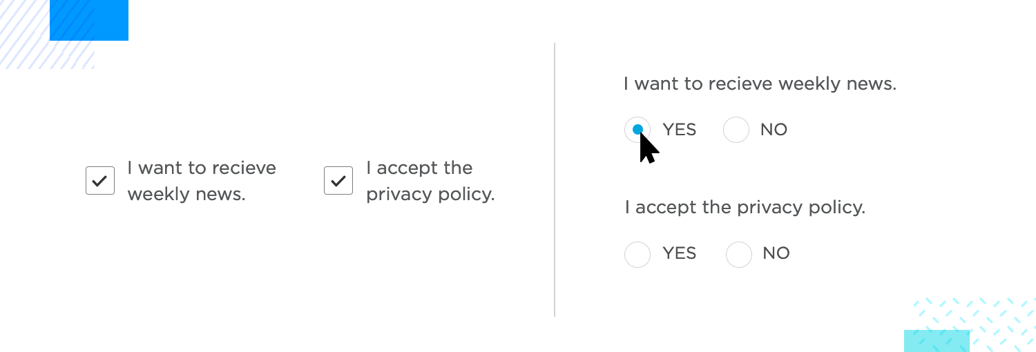
Input controls are how users interact with your form. Choosing the right controls can prevent data entry errors and ensure data integrity. Avoid pre-checked boxes for consent or preferences, as they can lead to ambiguous data. Use the right input types (e.g., email, number) to bring up the correct keyboard on mobile devices.
Autofill can save users time and reduce the effort needed to complete your form. Use autofill to pull in saved information from the user’s browser or device. This makes the process easier and increases conversion rates.
Error messages should help users understand and fix their mistakes without causing frustration. Display clear error messages with helpful text and icons to show what’s wrong and how to fix it. This ensures everyone, including users with visual impairments, can understand the error and correct it quickly.
Buttons are essential for your form’s user interface, so they should be easy to find and understand. Use simple and clear text on buttons, and ensure primary and secondary buttons look different. Add small animations to show the system is working. Only activate the main button once all fields are filled out. Change the button’s color when it’s ready to be clicked to catch the user’s eye.

The text in your form, whether it’s labels or error messages, is key to guiding users. Keep your text clear, concise, and descriptive. Avoid generic labels like “Submit.” Instead, use text that tells users exactly what will happen next, like “Create Account” or “Sign Up.”
Now that we’ve covered general best practices, let’s look at some recommendations and specifics that are particularly effective for website forms.
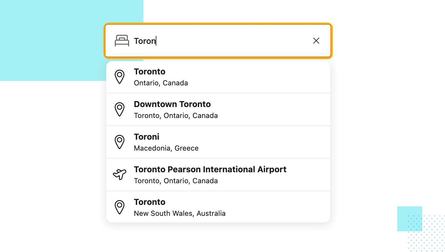
Autocomplete search fields: start by using autocomplete for search bars. This will help users find information quickly, especially for large products catalog.
Modal windows for forms: next, think about displaying forms in modal windows to keep users on the current page. This is ideal for login, signup, or quick survey forms.
Hover effects: add some hover effects to highlight interactive elements or provide additional information. For example, change the color or show a tooltip when a user hovers over a form field.
Expandable sections: finally, expandable sections can keep your forms concise and so users can click to expand sections for additional details, such as billing and shipping information.
Design awesome forms that users will want to fill out.
Let’s move on to the ones for mobile form design.
Easy-to-tap dropdowns: first, make sure your dropdown menus are easy to use on small screens. Keep the options large enough so users can tap them without any trouble.
Swipeable options: think also about adding swipe gestures for selecting options. This makes the process quicker and feels more natural on mobile devices.
Quick checkboxes and switches: for quick choices, like turning on notifications or agreeing to terms, use checkboxes and toggle switches.
Voice input: finally, take advantage of voice input for fields like search bars or comments. This gives users a hands-free option, making it even easier to interact with your app.

After learning how to build great forms, let’s now avoid some common mistakes that can make them frustrating. This will keep your forms easy and enjoyable to use.
One of the biggest mistakes in form UI design is asking for too much information. Long forms with too many fields can overwhelm users, making them less likely to complete them.
Unclear form labels can confuse users, leading to mistakes or abandoned forms. Use simple, descriptive labels that explain what information is needed. For example, instead of just “Name,” use “Full Name.”
Misaligned fields can make your form look messy and unprofessional, making it harder for users to follow the form’s flow. Make sure all your fields are neatly aligned, either vertically or horizontally, so you keep a clean and organized appearance.
Imagine you’re filling out a form and hit submit… silence. Did it go through? Did you mess something up? This lack of feedback can be really frustrating!
To avoid confusing users, make sure your form provides feedback. Use clear messages to show them if they’ve made a mistake (like forgetting their email address) and how to fix it right away.
Once they submit everything, a quick confirmation message lets them know their information is received loud and clear.
We all use our phones for everything these days so make sure your form is responsive.That means having clear, sizable fields for easy tapping, ditching those tricky little dropdowns (pop-ups work great!), and ensuring everything adjusts to any screen size. This keeps things smooth and keeps users happy.
Not testing your forms is a common mistake in form UI design. Before going live, test your form on different devices and browsers to ensure it works correctly. Get feedback from real users to identify any issues you might have missed.
As everyone should be able to use your forms, including people with disabilities, use high-contrast colors, large fonts, and clear labels to help visually impaired users. Also, make sure your form can be navigated with a keyboard for those who can’t use a mouse.
For longer forms, users need to know how much is left. Without progress indicators, they might feel lost or overwhelmed. Use progress bars or step indicators to show users where they are in the process and how much is left.
Finally, let’s talk about captchas. While it’s important to prevent spam, using complex captchas can frustrate users. Opt for simple, user-friendly captchas like image selection or simple math problems. This keeps your form secure without turning away users.
If we avoid these common mistakes, we can create forms that are easy and enjoyable for everyone to use, whether it’s on a website, mobile app, or any other platform. Keep things clear and simple, and always focus on the user experience to create great form designs.
Design awesome forms that users will want to fill out.
Justinmind offers several UI kits to make your form design process smooth from start to finish. Our UI kits include components with inline validation, ensuring your forms are functional and user-friendly. Here’s a quick look at what we offer:
Perfect for designing and prototyping web forms. This kit helps you create clean, organized layouts that are easy to navigate for a great user experience on any web platform.

With specific components for iOS platforms to ensure your forms look and work perfectly on any iOS device.

This one comes with components for Android platforms specifically to provide a seamless experience on Android devices.

Designed specifically for mobile form design, this kit ensures your forms are responsive and user-friendly on any mobile device.

Leverage the efficiency and cost-effectiveness of Bootstrap to create visually appealing prototypes effortlessly.

Based on the latest MUI framework, this UI kit is your go-to tool for quickly and easily designing awesome screens and prototypes for any kind of app.

Following Google’s Material Design guidelines, our Angular Material UI kit offers a comprehensive set of components for creating beautiful and intuitive Angular applications.

Combine the flexibility of Vue.js with a robust component library and build dynamic and visually appealing web applications with our Vuetify UI kit.

Save valuable time and effort when building JavaServer Faces projects, or even working with other frameworks by using this Primefaces component library.

This kit includes over 50 customizable components, forms, and surveys, simplifying the form design process and saving you time. Modify them to suit your specific needs or use them as-is.

Use this Sketching UI kit if you need a quick sketch to help you visualize interactive user interfaces better and prototype faster.

Prototype and validate Salesforce Lightning Design System interfaces, while fostering creativity and adhering to the platform’s principles and design language.

Designing rich Office UI Fabric experiences for Microsoft Office apps. This UI Kit is a coding-free solution aligned with the complete Office UI Fabric user interface kit.

This UI kit enables you to craft interactive web and mobile wireframes with a native-like feel, seamlessly aligned with the Kendo framework’s design aesthetic.
Design content-centric websites and mobile apps and incorporate the essential UI components from Zurb’s Foundation responsive front-end framework.

Creating formulaires can be tricky. Even though they can give off an illusion of simplicity, that is hardly ever the case. Like so many other products within UX design, forms have quite a bit of theory behind their designing – and many different factors that need to be taken into account.
Hopefully, this guide will have shined a light on all the different sides of creating a form. Feel free to check out a list of great form designs to get you inspired on chapter 5 of this guide!