
Dashboards are used to display the most important and useful information in your app. Read on to see our tips for perfect dashboard design.
Dashboards are present in many of the web and mobile apps we use daily, from photo-sharing apps to business intelligence suites. In this article, we take a look at dashboard design, pick out some best practices to apply and show you some ways that Justinmind’s UI design tool can help you with dashboard design for your prototypes.
Depending on their intended use, dashboard designs can vary widely. But all dashboards are made of cards. Depending on the type of dashboard, each card might contain profile info, notifications, quick links or a navigation design element, key data, graphs and data tables. Make sure you use the correct type of card for each component.
Start designing your dashboards with Justinmind. It's Free!
- What is a dashboard?
- Choose a dashboard design type
- What are the most common dashboard components?
- Dashboard design best practices
- Mastering dashboard layout and structure
- Data Visualization: The visual powerhouse of dashboards
- Awesome dashboard examples for inspiration
- Dashboard design made easy with Justinmind
At its simplest, a dashboard is a screen in your application that displays information. Normally, a dashboard provides the user a global overview, with access to the most important data, functions and controls. In reality, a dashboard often becomes a sort of homepage, especially for power users.
We call them dashboards because, just like in a car, they’re meant to show us critical, pertinent data at a glance. But how do we establish what’s relevant enough to show in a dashboard? Think about how it’s done in a car. The car’s dashboard is used to show the driver information relevant to the task of driving the car – speed, distance covered, engine revs, remaining fuel and warnings when something isn’t working properly.
We don’t expect a car dashboard to display information about the news, local places of interest or upcoming appointments because however interesting this information is, it’s not relevant.

Deciding the relevant information to display in your application can be tricky in terms of UI design. Firstly, it’s all important! Of course it is. If you haven’t already done so, develop user personas and map out user stories so you can understand the expectations that users have in your app.
For most application dashboards, users will expect to see information about their current status, as well as any urgent information, warnings or alerts that they need to deal with.
A great rule of thumb for data disclosure in dashboards is that you should always start with a high-level overview and provide easy paths for your users to increase the level of granularity.
Operational dashboards are used to show your user their current status in your app. Use operational dashboards to display critical information that’s time relevant. For example, in a web analytics application, the operational dashboard could include information like: active users on site, top social referrals and pageviews per minute.
A classic example is the Google Analytics Real-time dashboard.
You’ve probably read that there are 3 main types of dashboard design. In fact, this is only true when looking at Business Intelligence dashboards. The three main types of BI dashboard are:
- Operational dashboards – these dashboards help the user see what’s happening right now
- Analytical dashboards – these dashboards give the user a clear view of performance trends and potential problems
- Strategic dashboards – this type of dashboard lets the user track their main strategic goals via KPIs
Here are the main advantages of the different BI dashboard types, and when to use them.

Operational dashboards are great because they let your user check their status at a glance. You should structure them so that the most important data is visible at top left (for left-right reading languages), helping your user get a snapshot as soon as they open the dashboard. They can contain a few graphs but shouldn’t reflect detailed data views.
Analytical dashboards are used to present key data sets to the user, always reflected against previous performance. They should be data-centric, and show as many relevant data views as is feasible.
Analytical dashboards should lead with key account data front and center, and should minimize graphical elements. They serve as a barometer of the user’s status in your application, and make it easier for a user to spot problems. Check out this nice example from Manson Yarnell:

Strategic dashboards are used to indicate performance against a set of key performance indicators (KPIs). As seen in this great dashboard example, a strategic dashboard should reflect how your user is performing against their strategic goals… and not much else.

Outside of the business intelligence realm, dashboards can come in all sorts of shapes and sizes, depending on your application type. Schedules, profile pages, your movie library… if it’s a single page with the most important information or actions the user might want to access, it’s a dashboard.
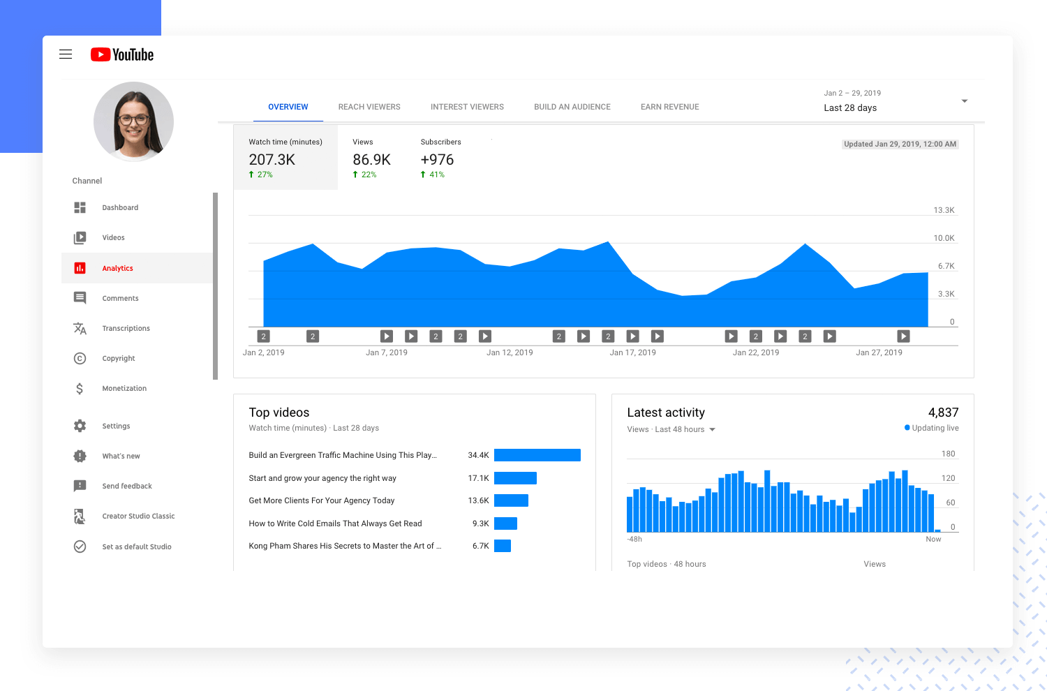
Platform dashboards are used to give a user access to controls, tools and analytics related to their account on a social platform. The YouTube Studio Dashboard is a good example. A simple initial view shows the user’s latest videos, with some stats for each.
There are also cards for channel analytics, comments and news and tips. In the sidebar, the user can access a large number of tools and account controls, including the video manager, channel status and more. YouTube keeps things simple, while giving the user complete control.
A popular new trend in mobile apps is to give the user information about how much time they’re spending in each app. If you’re working on a new social app, you’ll want to include this kind of dashboard. The idea is to help users to see if they’re spending too much time on their device.
Instagram’s Your activity dashboard is fairly typical. It’s very basic, leading with the user’s average daily time in the app, with a bar chart showing how daily time in app has changed over the last week. Finally, the dashboard includes two control options that allow users to reduce their daily time in Instagram.
Depending on their intended use, dashboard designs can vary widely. But all dashboards are made of cards. Depending on the type of dashboard, each card might contain profile info, notifications, quick links or a navigation element, key data, graphs and data tables. Make sure you use the correct type of card for each component.
Every dashboard, no matter its purpose, is built from essential building blocks that work together to deliver insights at a glance. These components, just like the information they display, come in various shapes and sizes. Let’s dive into the key players on your dashboard:
These are the visual storytellers of your data. They use bars, lines, and other shapes to reveal trends, patterns, and comparisons. Bar charts are great for highlighting categories, while line graphs excel at showing changes over time. Choose the right chart type to make your data sing!

Sometimes, there’s no substitute for raw data. Tables offer a clear and organized way to present detailed information, perfect for breakdowns or comparisons across multiple variables. Use them when you need users to see the exact numbers behind the visuals.
These are the cornerstones of any dashboard. KPIs (Key Performance Indicators) are the most critical measurements of success for your goals. Metrics provide context and additional details around those KPIs. Think of KPIs as your headlines and metrics as the supporting details that paint the whole picture.
Empower your users! Let them interact with your dashboard by providing filters and controls. This allows them to focus on specific areas of interest, customize their view, and delve deeper into the data.
A well-organized dashboard is a joy to navigate. Make sure users can find the information they need quickly and intuitively. Use clear labels, consistent layouts, and logical groupings to create a smooth user experience.
Start designing your dashboards with Justinmind. It's Free!
The first step is to know your audience. Once you thoroughly understand your user personas, you should be able to answer the key question: What will my users expect from this dashboard?
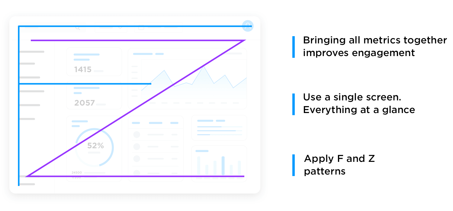
Think about the 5 takeaways your users will want to see in your dashboard. Then apply the F and Z reading pattern, and structure your page accordingly.
It’s important that the dashboard does its job while sticking to a single screen. Dashboards are meant to provide an at-a-glance view. If you have too much information on your dashboard it can overwhelm (and potentially bore) the user who has to access this data.
By grouping all the metrics onto a classic one-pager, you’re more likely to achieve better engagement with the dashboard because users won’t have to sort through multiple pages. Balance the metrics with suitable white space to create breathing room for the data.
Adding a responsive design to a dashboard allows the user to decide which data they want to focus on. The key to a good responsive design is a clear, easily understood UI which allows the user to control exactly which data needs to be front and center in the dashboard.
This is a smart move on the designer’s part, because data visualization can be overwhelming. Sometimes certain data visualization elements create more work for a user, as many feel is the case with pie charts. In the end, you may spend a long time narrowing down on the data for the dashboard design – and users may still feel they are missing things. Giving the user control is a great solution!

Check out this responsive dashboard by Cuberto, with a cool slider interface which allows the user to focus on the main data window or the drilldown data in the right-hand sidebar. The way the level of detail in the graphs changes as more focus is added is really beautiful.
We love dashboards that cut out the bunk and lead with big, bold numbers. A dashboard like this communicates confidence and decisiveness. For example, take a look at this social influencer profile dashboard.

The styling is on-trend with a modern, clean design. There’s lots of white space and clear, bold takeaway data. Presenting data like this helps the user see what’s important in an instant, doing what a dashboard should always do: save the user time. The following checklist highlights the different ways you can achieve a winning dashboard design:
- Think Big, Bold Numbers: These aren’t the time for subtle details. Font size and placement are crucial. Make those numbers jump off the screen, demanding attention.
- Cut the Bunk: Ditch the unnecessary decorations and text. Let the data speak for itself. Use clear and concise labels, but avoid lengthy explanations.
- Embrace White Space: Don’t crowd the user. Plenty of white space allows the key data points to breathe and become the stars of the show.
- The Time-Saving Advantage: In today’s fast-paced world, time is a precious commodity. Dashboards that lead with key data empower users to make quick decisions and take informed actions. They eliminate the need to sift through mountains of information, saving valuable time and boosting efficiency.
When you design your dashboard, consider the principles of information architecture and hierarchy when you decide which cards to show and in which positions.
Remember the F and Z patterns that reflect how a user’s eye scans a page? Apply that logic to the structure and order of elements on your dashboard. Lead with the absolute top must-have takeaway, and let your dashboard flow from there.
All the elements are important, but some cards are more important than others. This cryptocurrency dashboard leads with account balance. It’s the bottom line that counts, after all.

We like dashboards that use different views to keep the main view as simple as possible. Take a look at this dashboard for a restaurant management web-app.
Note how the user can filter data by date, switch between restaurants, and access information about reservations, outgoing payments, employees, shifts and external providers, all while maintaining a clean and simple look. Imagine trying to include all that info in one screen.

Just because dashboards often include data views, that doesn’t mean they can’t look drop dead gorgeous. By keeping things light and airy, with prudent use of color, this publisher dashboard delivers clear visibility, simple navigation and striking good looks.
Start designing your dashboards with Justinmind. It's Free!

A well-designed dashboard isn’t just about the data it displays; it’s about how that data is presented. Just like a captivating story, a dashboard needs a clear structure and logical flow to truly resonate with users. Here’s how to craft a layout that makes your data stand out:
Think of a grid system as the invisible scaffolding that holds everything together. It provides a structured framework to organize your content in a clean and visually appealing way. Imagine a grid of squares, each housing a specific piece of information – a chart, a table, a KPI. This grid ensures a consistent visual rhythm and prevents the dashboard from looking cluttered or chaotic.

Even the most meticulously organized grid can be overwhelming if everything is crammed together. Break down your dashboard into digestible sections using panels. These sections, like chapters in a book, should group related information thematically.
For example, dedicate a section to sales performance metrics, another to customer engagement, and so on. Clear and concise labels for each section become your chapter titles, guiding users through the data narrative.
Recognize that some information is inherently more important than others. Use the layout to establish a clear hierarchy, prioritizing the most critical KPIs and insights. Here’s where prominent placement and visual emphasis come into play. The most crucial data points should occupy prime real estate at the top of the dashboard or within prominent sections. As you move down the layout, less critical details and supplementary information can find their place.

By mastering these layout principles, you transform your dashboard from a jumbled mess of data into a user-friendly information hub. A well-structured dashboard becomes intuitive to navigate, allowing users to find the information they need quickly and efficiently. This not only saves them time but also ensures they can focus on the insights that truly matter.
Start designing your dashboards with Justinmind. It's Free!
Data visualization transcends mere decoration in dashboards; it’s the design powerhouse that propels clear communication and user engagement. Imagine a sea of numbers – the human brain struggles to find meaning in this chaos. Data visualization steps in, transforming this data into a visual language we can all understand.
The choice of chart type, color palette, and layout all play a crucial role in how effectively your dashboard communicates. By prioritizing clarity, pattern recognition, impactful communication, and user engagement through design, you can transform your dashboard into a visual powerhouse that unlocks the true potential of your data.
Here’s a breakdown of how data visualization elevates your dashboard design:
Replace dense data tables with clear and concise charts and graphs. Let bars speak volumes about comparisons, lines reveal trends over time, and pie charts showcase compositional breakdowns. Users can grasp the information at a glance, without getting lost in a labyrinth of numbers.
The human eye excels at recognizing patterns. Data visualization leverages this strength by presenting data in a way that highlights trends and relationships. A well-designed line graph can expose a hidden growth curve, while a heat map can uncover unexpected correlations between variables. These patterns become the visual breadcrumbs that lead users to deeper insights.

Dashboards are all about targeted communication. Data visualization allows you to strategically choose the visuals that best emphasize your key metrics. Imagine prominent bar charts showcasing sales figures or KPI dials tracking performance goals. By prioritizing these visuals in your design, you ensure users see the most critical information first and foremost.
Let’s face it, text-heavy dashboards are a snoozefest. Data visualization injects vibrancy and life into your design. Carefully chosen colors, well-balanced layouts, and interactive elements like hover effects all contribute to a more engaging user experience. People are naturally drawn to visuals, and a well-designed dashboard leverages this to keep users interested and actively exploring the data.
Even with something that requires as much planning as a dashboard – sometimes, the hardest part is to just get started. When it comes to deciding what metrics and data to include, how to reflect the information architecture and maintain a visual hierarchy – perhaps it’s best to start by getting inspiration.
We went around the internet and found 20 different dashboard examples that all have something to teach us. Be it about getting a message across, putting certain things in the spotlight or just making sure things don’t get confusing – these dashboard designs make it look easy. Check them out!
The Justinmind vertical navigation sales dashboard is a prime example of how effective design can enhance data visualization. Its clean, intuitive layout and its use of color and hierarchy make it a joy to interact with.

The vertical sidebar provides a straightforward way to access different sections of the dashboard, ensuring a smooth user experience. The dashboard’s widgets are visually appealing and offer a concise overview of key sales metrics, making it easy to identify trends and insights.
Not to mention, the judicious use of color helps to differentiate between different data points, making the dashboard more visually engaging and easier to understand.
A good e-learning dashboard should not only function as a tool, but also as a personalized learning hub that guides you on your educational journey. Justinmind’s e-learning website template dashboard does just that.

With a clean layout, and a splash of color, this dashboard makes learning a visual delight. From the moment you log in, you’re greeted with a personalized overview of your progress, including completed courses, upcoming assignments, and overall performance. It’s like having a personal learning coach at your fingertips.
But the real magic happens when you go in deeper, for example, the dashboard’s calendar keeps you organized and helps you stay on top of the game, while the personalized course progress feature gives you a clear picture of how you’re doing in each class.
Justinmind‘s horizontal navigation sales dashboard basically gives you a bird’s-eye view of your sales performance, all in one go.

The horizontal navigation bar at the top makes it a super simple to navigate between different sections, so you’re always in control. The dashboard’s widgets are like mini-reports, providing a quick and easy overview of key sales metrics.
And if that wasn’t enough, this dashboard gives you a comprehensive view of your business, from total sales to advertising expenses. You can track sales trends, identify top-selling products, and even monitor inventory levels. It’s like having a personal business analyst at your fingertips!
No matter where you might be in your professional journey, Justinmind’s horizontal navigation sales dashboard is your go-to tool for making data-driven decisions and taking your business to higher skies.
Ever wished you could have your business analytics at your fingertips, literally? Justinmind’s analytics dashboard app makes that wish a reality. This sleek app provides a clear and concise overview of your business’s performance, all in the palm of your hand. From sales figures to customer engagement metrics, you can track key indicators and stay on top of your business’s health.

The dashboard’s clean interface and easy-to-read charts make it incredibly easy to navigate. With Justinmind’s analytics dashboard app, you can make data-driven decisions and stay ahead of the competition, no matter where you are. It’s your pocket-sized business insight!
Want to create a smart home interface that’s both, functional and visually appealing? Look no further than Justinmind’s smart home dashboard example.

The dashboard’s clean, uncluttered layout and intuitive navigation make it a joy to use. The clear labeling of controls and visual cues ensures that users can easily understand and interact with the interface. For UX designers, Justinmind’s smart home dashboard is a valuable example to get inspired by and use!
No more juggling of multiple to-do lists and feeling overwhelmed! Justinmind’s task management dashboard example lets you prioritize, track, and manage your workload with ease.

The left sidebar provides a straightforward way to navigate between different sections, while the main dashboard area gives you a clear view of your tasks and their status. You can also filter tasks by status, priority, or due date to get a more focused view of your workload.
But that’s not all. It also includes features like task comments and attachments, making it easy to collaborate with team members and keep everyone on the same page!
Justinmind’s home banking dashboard offers a wealth of inspiration for those of you who feel that pesky creative block creeping up again.

The dashboard’s layout, clear labeling, and intuitive navigation provide a blueprint for designing effective financial interfaces. Color-coded account balances, for example, help make the information more accessible, and dare we say, engaging!
A winning dashboard design creates a sense of welcome and control. We are confident that you will feel all those things and more with this awesome home banking dashboard example in your hands.
This fitness app dashboard by Justinmind does what it should do. It tracks progress but also inspires users to stay motivated. The dashboard’s focus on personalization, such as tracking individual goals and progress, demonstrates how effective design can make the user want to engage more with the platform.

Additionally, the dashboard’s integration of health and wellness features, such as sleep tracking and blood oxygen monitoring, showcases a more comprehensive and holistic user experience. Something we value here at Justinmind!
Imagine having a personalized health coach that tracks your progress, provides insights, and keeps you motivated. Justinmind’s weight-tracking app dashboard is just that. From your weight and body fat percentage to your muscle mass and water content, the dashboard gives you a comprehensive picture of your health.
Progress bars and charts make it easy to track progress over time and see how efforts are paying off. Users can also set personalized goals and track their progress toward them, keeping them even more concentrated on getting fit!
It also provides valuable insights into their health, such as users’ body age and ideal weight. It’s like your personal health coach, in the palm of your hands.
Justinmind’s Bootstrap helpdesk template dashboard is your secret weapon for building an awesome support interface. Built on the powerful Bootstrap framework, this template provides a solid foundation for UX designers to create interfaces that are highly responsive and easy to navigate and use.

With Bootstrap’s pre-built components and responsive grid system, you can design interfaces that look great on any device, without sacrificing functionality. The template’s flexibility allows you to customize it to match your brand and specific needs, ensuring a personalized user experience.
Justinmind’s cryptocurrency app dashboard is a UX designer’s dream. The dashboard’s personalized approach focuses on the user’s portfolio, meaning the user is in control. Essential features like price charts and buy/sell buttons provide a comprehensive experience for cryptocurrency investors.

If you’re designing a cryptocurrency app, this dashboard offers valuable resources that empower users to make informed investment decisions.
Justinmind’s personal finance dashboard example is your North Star to completing that project you’ve been working on.

Its effective use of charts and graphs makes complex financial data easy to understand and interpret, even for those who aren’t financial experts. Plus, its personalized approach helps users feel in control of their finances, something every well-designed dashboard should provide.
With this dashboard example, designers can create a financial compass, guiding users toward a brighter financial future!
Justinmind’s project management dashboard is your blueprint for designing a project management tool that helps teams stay organized, efficient, and successful. The “Last Product” section is a standout feature that provides a quick overview of your projects, to help users stay on top of their workload.

By downloading this dashboard design example, UX designers can create an incredibly eye-catching and user-friendly project management dashboard in no time and focus on delivering a standout product that will keep those clients coming for more.
Justinmind’s MUI CRM dashboard offers a comprehensive and customizable solution that can serve as a blueprint for your projects. Some of its key features include customizable widgets that allow users to tailor the dashboard to their specific needs by displaying the data that’s most relevant to the sales process.

You can also dive deeper into your data with interactive charts that allow you to uncover hidden insights and understand your sales performance with clear and concise metrics like total revenue, conversion rates, and average deal size.
Justinmind’s smart home app dashboard design example is a powerful tool that provides a personalized and intuitive experience for managing your users’ smart homes. The user is greeted with a personalized message, making them feel welcome and connected to their devices.

A clear overview of the number of devices connected to the system is provided, allowing users to see exactly how many devices are under their control. Additionally, the dashboard makes it simple to add new devices to the system, expanding the capabilities of the smart home setup.
To provide valuable insights into energy consumption, a line chart is used to visualize the activity of specific devices, such as lights. The well-organized information architecture, combined with the use of color and visual cues, ensures that the dashboard is both, visually engaging, and easy to navigate.
Justinmind’s Angular HR web template is a visually appealing and user-friendly tool that provides a centralized view of your users’ HR operations. It features a wide range of metrics, including total customers, active users, and opportunity stage.

The dashboard’s customizable widgets allow users to display the data that is most relevant to their HR needs, and the use of color-coded cards ensures that the dashboard is both aesthetically pleasing and functional.
Justinmind’s dashboard wireframe template is your blank canvas. With its flexible structure, you can easily customize the dashboard to fit your project’s unique requirements. The variety of widgets, including bar charts, pie charts, and line graphs, allows you to visualize your data most effectively.

Plus, with responsive design, your dashboard will look great and function effortlessly on any device. Don’t think of this template as your starting point, think of it as the map to success!
Orizon UI/UX Design Agency Socooil, the first of our dashboard examples, is a comprehensive illustration of social media analytics dashboard. This tool allows users to track activities, stats, reactions, and more, offering a holistic view of social media performance. The dashboard is visually engaging with a clean design that highlights essential data points effectively.

One standout feature is the detailed tracking of user interactions, including activities, stats, and reactions. This feature provides users with a comprehensive understanding of their social media performance, enabling them to make data-driven decisions to enhance their online presence.
Budiarti R. for Orely has designed a heart rate & activity tracking dashboard example featuring both light and dark themes. This dashboard stands out in our examples for its theme-switching capability, allowing users to toggle between light and dark modes seamlessly.

This feature enhances user experience by providing visual comfort in different lighting conditions, making the dashboard adaptable to various user preferences.
The SellesLab Sales Dashboard concept by Fireart Studio is a sleek, modern design tailored for monitoring sales performance. It features a clean interface with various charts and graphs to track sales metrics, including revenue trends, regional performance, and product sales distribution.

The dashboard opts for a light color palette, ensuring data remains effortlessly legible. With its intuitive layout, businesses can swiftly analyze real-time data and make informed decisions with ease.
The weather dashboard example designed by Yev Ledenov for Ledo features a modern, intuitive interface for viewing real-time weather forecasts. It includes detailed weather statistics, a map for geographic insights, and a clean layout that enhances user experience.

The dashboard employs a sleek design with icons representing various weather conditions, ensuring users can easily interpret the information. This design prioritizes usability and visual appeal, making it a practical tool for tracking weather updates.
The kanban board designed by Brightscout is a polished and efficient project management tool. It features a clean and intuitive interface for organizing tasks within a comprehensive project management app. Experience a productivity boost like never before as you effortlessly manage multiple projects with style and ease.

The design highlights columns for different stages of task completion, making it easy for users to track progress and prioritize work. Th user-friendly layout and sleek aesthetic ensure an enhanced productivity experience for teams managing multiple projects.
With features to prioritize and track tickets, analyze support data, and streamline customer service operations, this web app dashboard is a game-changer. Its clean and user-friendly design is all about enhancing customer satisfaction through effective support management.

From integrating various tools to assisting teams in responding to and resolving customer inquiries swiftly, this dashboard is here to elevate your customer support game.
The e-learning dashboard example by Yev Ledenov for Ledo presents a contemporary design tailored for online education. It features a clean, intuitive interface that allows users to manage courses, track progress, and access educational resources easily.

Designed to meet the growing demand for digital education platforms, this dashboard offers an effective and aesthetically pleasing tool for learners of all levels.
With this dashboard example’s versatile and user-friendly interface, managing SEO tasks and planning content using the SEO audit & content planner dashboard by Fireart Studio has never been easier.

Featuring customizable widgets, this dashboard lets you personalize your experience to match your exact needs. And with its focus on clean, informative visuals, you’ll gain comprehensive insights that enhance the efficiency of your SEO audits and content strategy planning. A winner in our eyes!
Designed to bring joy to managing and analyzing sales data, this platform offers an interface that’s as friendly as it is powerful. Customizable widgets mean you can craft your dashboard to fit your unique requirements like a glove.

And with its clean visuals and detailed insights, tracking sales performance and making informed decisions has never been smoother.Say hello to a sales analytics experience that’s both delightful and efficient.
Designed with simplicity and functionality in mind, this dashboard offers a comprehensive overview of your email marketing efforts. From open rates to click-through rates, you’ll have all the essential metrics at your fingertips.

But that’s not all – this dashboard also features customizable widgets, allowing you to personalize your experience and focus on the metrics that matter most to you. Whether you’re tracking the performance of a specific campaign or analyzing your overall email strategy, this dashboard makes it easy to stay informed and make data-driven decisions.
Outcrowd created this beautiful and light dashboard for a Mac app that helps you manage the memory and usage of your computer. We love that the dashboard has a simple background with pops of color that attract the eye to certain key pieces of data.

We particularly like that the dashboard design enjoys a vertical navigation bar, which helps users see different aspects of their computer and helps separate the information logically. The information architecture helps us make sense of all the data, while making sure the user isn’t overwhelmed. Wonderful!
Max Panchyk at Toglas Studio designed this dashboard with the aim to help emergency rooms run faster and more efficiently. The idea itself is great – an additional help that all staff can rely on for key information on the department. The design that brings this idea to life didn’t disappoint!

What we love the most about this dashboard design is that while users can dive deeper using the navigation bar to the left, this particular screen is a snapshot of the E.R. at that moment in time. It gives a global overview of the people in care, as well as key information on the resources of the department.
It’s true that only someone who works at an E.R. could tell us if this dashboard has the right information to help staff. But functionality aside, the information architecture and presentation of data do a great job at helping us understand the information it gives us. For dashboards, that’s a major win!
Kostia Varhatiuk at Fireart Studio created this dashboard in a dark and rather unusual color scheme. It’s interesting that the dark background contrasts with the lighter color of some key data such as the total number of sessions.

We like that even though this dashboard example doesn’t give users as much pieces of information as some of the other examples on this post, the data doesn’t leave any room for confused users. The information is presented either in clear graphs or we are given a delta of the change in metrics. We love that this dashboard puts data into perspective for users!
Valery Pevnev at Insoft created a dashboard example meant to help users manage their podcasts. The general look and feel of the dashboard might ring bells to those of you who deal with social media management. The overview does a perfect job at telling the user exactly how everything is regarding the podcast – a perfect snapshot.

We love everything from the vertical navigation bar to the way the blocks separate information, creating a sound visual hierarchy that respects the Gestalt Principle in Design. The dashboard checks all the main boxes when it comes to the podcast management, from subscribers to the average watch time per episode.
The use of a dark background creates a cool contrast between certain components, with the audience graph taking the center stage.
Vladimir Gruev created an interesting dashboard design that doesn’t give us a simple snapshot – it dives into the specific area of reporting data in product analysis. One of the strongest points in this dashboard is that it gives the user so much power to change it.
Its responsiveness tells us that regardless of what you’re looking for, you could find it in one of the tabs of this dashboard.

The designer also made great use of more visual ways to pass on information, using graphs, pie charts and maps. We always love seeing visual ways of presenting data, as that makes it not just easier for us to understand the key message but also to compare it to either other metrics or past points of that same metric.
Not all dashboards have to be filled to the brim with metrics and data points. Saepul Roman designed a wonderful example of a simple dashboard that gets the job done – a scheduling dashboard!

The dashboard itself is minimalist, giving all elements plenty of room to breathe. Users are given the classics for scheduling such as a big calendar – but they are also given control to change the calendar. We love that so many little details of this dashboard design give users the power to change what they see!
Another great win for this dashboard is that it helps users collaborate with other users. We see possibilities of sharing calendars with users, separating different kinds of appointments, sharing and even chatting to other users.
Financial services and trade is a prime area for great dashboard design. There tends to be a lot of fluctuating numbers, placed orders and overall variables that users need to keep in mind. The challenge arises in presenting all those variables in a way that is logical and clear to users.

Toglas Studio managed to create a dashboard example page that gives users a clear snapshot of where the market is at that point in time. It gives users the power to change the scoop of that snapshot, so that it shows different periods of time for example.
The vertical navigation bar shows that the tool itself would offer a whole array of features, such as another dashboard that overviews the user’s digital wallet.
Start designing your dashboards with Justinmind. It's Free!
Another wonderful financial dashboard example that helps users get things done. This dashboard design is all about keeping track of invoices – a widespread source of headache for the people who manage them. Vlad Ermakov gives users the highlights at the top, giving us a glimpse of the key metrics such as number of invoices sent.

The style and use of colors work well to highlight pieces of data without overwhelming the user. Another great aspect of this dashboard example is that the blocks divide the information into groups that make sense together, making it easy for users to understand and draw conclusions.
This is a more technological example of a dashboard design. Vladimir Gruev at Heartbeat Agency created this dashboard for Keyhub, a tool that aims to help PKI administrators make sure everything is running smoothly. The tool focuses on certificates, with the general objective of helping users manage them.

We love that the widgets in the screen are exchangeable, giving users full power to create their own version of the dashboard according to their needs. We like everything from the use of color to draw the eye, the visual hierarchy to the navigation bar to the left that shows the current inventory. A job well done!
Our last dashboard example was created for HR managers and recruiters. Bhavna Kashyap brings us a dashboard that is packed with information, going from the number of jobs posted to statistics of active applicants. It checks all the right boxes of what recruiters would need in order to immediately understand how the acquisition process is going.

It makes for a colorful and enjoyable page, with a young feel to it. Users would be able to grasp the state of things with a simple glance, and dive deeper into other aspects of recruiting, such as scheduling, if they need to. For us, that’s a well designed dashboard page!
It’s easy to create beautiful, UX-friendly dashboards in Justinmind. Here’s how to get started:
- Keep it simple: Only include the most relevant information and for your users, at least in the initial screen. Where suitable, allow your user to drill down into more complex data and options.
- Group related or relevant data: When you have datasets that are easier to understand when seen together, find ways of presenting them in a single card. But be careful not to confuse the user.
- Use Justinmind’s dashboard UI kits: Save time and create better-looking, more usable dashboards by using Justinmind’s dashboard UI kits. Read on to find out more.
Wireframing and prototyping are crucial steps in the design process for web and mobile applications. These stages allow designers and developers to create a visual skeleton of the application, defining the basic structure and layout.
UI libraries play a significant role in this process by providing pre-designed components that can be easily used to build wireframes and prototypes. UI libraries are collections of design elements and components that help streamline the wireframing and prototyping process. For web and mobile applications, these libraries typically include:
- Pre-designed components: Buttons, forms, navigation bars, icons, and more.
- Responsive design elements: Components that adapt to different screen sizes and orientations.
- Customizable templates: Ready-made templates that can be tailored to specific project needs.
- Interactive elements: Components that allow for the simulation of user interactions and workflows.

Using a UI library can significantly reduce the time and effort required to create wireframes and prototypes, enabling designers to focus on the overall user experience and functionality.
Our charts UI library is put together to simplify the creation of data visualizations for both web and mobile applications. It offers a wide range of chart types that include bar charts, line charts, pie charts, and more. They also integrate seamlessly with popular frameworks and libraries and are highly customizable to fit the specific design needs of your project. Furthermore, they look great on any device, whether it’s a desktop, tablet, or smartphone.
Thanks to our Lightning Design System UI kit, you can use Justinmind to prototype Salesforce apps and products, including a full range of dashboards. Salesforce’s Lightning Design System is a series of UI elements, patterns and guides aimed at delivering business apps with excellent and consistent UX design.

Aimed at fostering rapid application development, our Lightning Design System UI kit includes all the elements and info you need to create a stunning dashboard prototype. From buttons and navigation to cards and notifications, you can use the UI kit to create dashboards as well full eCommerce apps, registration pages, welcome mats … the possibilities are endless!
And don’t forget that you can also create and manage a design system with Justinmind.
SAP’s Fiori is the design system to use when creating SAP applications. Billed as a way to “re-imagine the SAP user experience”, Fiori uses modern UX principles to deliver better-looking, more consistent SAP applications. Use Fiori in your SAP app prototype to see improvements in productivity and usability.

Justinmind’s SAP Fiori UI kit lets you prototype your SAP app before launch, helping to improve productivity and efficiency. Justinmind makes it easy to implement SAP architecture from the very beginning, crafting native SAP apps which your users will feel comfortable using.
Alta UI is Oracle’s design system for apps in its Cloud service as well as for apps in Oracle Fusion. The Alta UI aims to simplify and improve the user experience by reducing elements and using a cleaner, more modern design, and reduced chrome for a better UI.
It also focuses on multi-device support, new, simple icons and a mobile-first approach with responsive page widths and large touch targets.

Justinmind’s Oracle Alta UI kit includes everything you need to create mobile and website prototypes:
- Icons: The icons in our UI kit are designed to match the Alta UI icons, they’re mobile-first, customization and responsive.
- Design patterns: Why waste time creating forms or home pages when you can use a pattern? Justinmind’s Alta UI kit includes patterns created to Oracle’s specifications.
- Data grids: An instantly recognizable way of displaying data, the data grids in our Alta UI kit match Oracle’s standards, so you can be sure your prototype looks just like the final product.
Start designing your dashboards with Justinmind. It's Free!
Dashboards need to communicate the most important information for the user, in a simple, easy to understand screen. They should be structured to reflect a logical information hierarchy, providing the user ways to drill down into the data when necessary.
Above all, they should save the user time. Thanks to our dashboard UI kits, creating an excellent dashboard design is easy with Justinmind.
Related Content
 The growing importance of mobile banking app design brings with it the need for more engaging UIs so that financial institutions can stay competitive. If you’re wondering what constitutes a great banking app UI design, check out these 10 great examples.10 min Read
 User personas are essential in helping you design your website or app to meet the needs of your users. Here are some user persona templates you...28 min Read

