
Getting users to complete a signup form is no easy task. In this post, we take a look at companies doing it right — get ready to feel inspired!
Designers have to figure out a way to encourage people to fill them out. Yet, if you add one form field too many, you can expect your conversion rate to plummet. How do some signup forms strike this balance?
Design signup pages with Justinmind

Here, we break down what makes a sign-up page truly shine. We’ll explore the key elements that convert visitors into customers and discuss how to create a seamless onboarding experience before diving into our favorite sign-up page examples. Let’s do this.
Imagine sign up pages as the candy dish at grandma’s house – sweet, delightful, and leaving users wanting more! An excellent signup page design is the crucial first impression for your product. It sets the tone for a long and happy relationship with your users, and crafting a smooth signup experience can skyrocket your conversions.
The reason for that is that the sign up page is your golden opportunity to make a stellar first impression. A well-designed one shows users you care about their experience right from the start. It’s like a warm welcome to the amazing world of your product.
But remember, friction is the enemy! No one enjoys jumping through hoops, especially when they’re excited to try something awesome (like your product, obviously). Every hurdle you throw in a user’s path is a potential conversion killer, so be careful!
Finally, use your signup page as a funhouse of value. Showcase the magic of your product with screenshots, short explainer videos, or even a glimpse of the “aha!” moment users will experience. Get them excited about what awaits them on the other side of the sign up form, and they’ll be eager to jump right in.
Ready to brew up a sign up page that crushes conversion rates? Let’s break down the key ingredients:
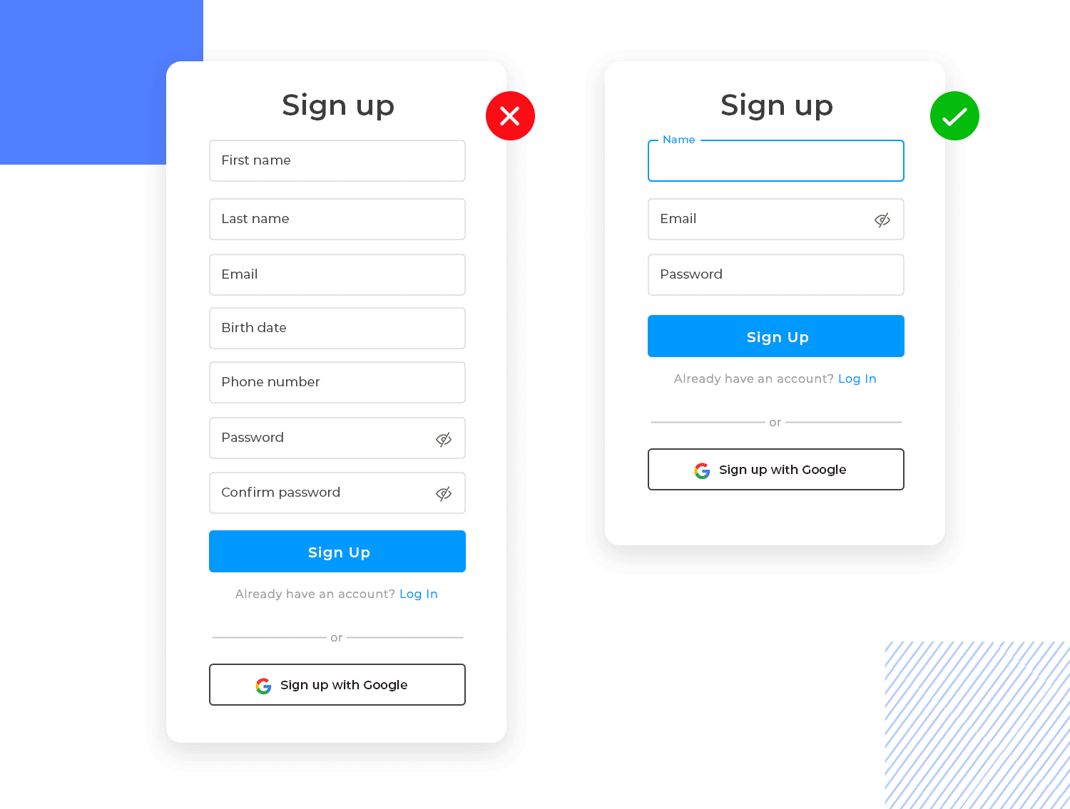
Craft a headline that’s as sharp as a knife. It should be clear, concise, and speak directly to your target user’s needs and desires. Think of it as your elevator pitch — short, sweet, and impossible to ignore. Limit the number of form fields to the absolute essentials. Name, email or phone number should be enough.
Connecting through socials is, in our opinion, the fastest and smoothest process as users don’t have to do much other than clicking that button and voilà! they’re in. In other words, the less information you request, the faster users can get to experiencing your product’s magic.
Another prime tip is to never underestimate the power of visual appeal, especially in UX design! A well-designed sign up page with clear icons, contrasting colors, and a clean layout will guide users effortlessly through the process. Speaking of effortless guidance, make sure your form labels and instructions are clear and concise. There should be no room left for confusion, so avoid any jargon that might leave users scratching their heads.
Finally, the call to action (CTA) button is your gateway to conversion heaven. Use clear, action-oriented language and make sure it stands out visually. Nobody should miss the big, beautiful button that unlocks the magic of your product. Try A/B testing different colors, text, and placements. Doing so can reveal valuable insights on what resonates best with your target audience. Remember, the perfect CTA is an ever-evolving beast!
Looking for a broader list for inspiration? Check out these incredible UI design examples. We also have a wonderful list of awesome research survey examples. If not, just keep scrolling for some wonderful sign up page examples!
This sign up form example, with its welcoming “Welcome Albert!” greeting, champions simplicity over clutter. The subtle inclusion of “Forgot your password?” and “Don’t have an account? Sign Up” options maintains accessibility without overwhelming the user. It’s a winner in our eyes!

The next example of a sign up form gently invites the user to begin their journey with its calming teal background and subtle forest imagery, The direct question, “What’s your name?”, immediately establishes a personal connection. Another one for the win!

This signup page example nails simplicity and clarity. Its sleek design with a soft gradient background makes it easy on the eyes while highlighting the essentials: email address, username, and password.
The password field even gives you helpful reminders on what’s needed for a strong password, nice touch, right? Plus, there’s an optional checkbox if you’d rather skip the promotional emails. They’re respecting your inbox, which is always a plus!
The “Sign up” button pops in bold purple, just asking to be clicked. And if you’re a returning user, the “Sign in” link is right there for an easy, smooth process.

A clean, blue background sets a welcoming tone for this signup page. With just a single email field, it keeps things quick and straightforward, no clutter, just what you need to get started.
Before hitting that big “Next” button, you can easily review and accept the privacy policy and terms of use. Prefer not to type in your details? No problem! There are options to sign up instantly using Google, Facebook, Apple, or LinkedIn. And for those already registered, the “Sign in” link is conveniently placed at the top for smooth access.

This signup page example strikes a perfect balance between minimalism and elegance. With a calming background image on the right, it creates an inviting atmosphere while keeping the signup process simple.
Users can choose to sign up quickly using Facebook, Google, or Apple, or fill out just three basic fields: name, email, and password. The “Sign up” button stands out in bold blue, making the next step clear and easy. For returning users, the “Sign In” link at the bottom provides a seamless way back.

Following the same style of simplicity, this signup form keeps it easy with just three fields: name, email, and password. For those looking for a quicker option, it offers sign-up through Facebook, Google, or Apple. The bold “Sign up” button is hard to miss, and the “Sign In” link at the bottom is there for returning users.

Ready to start your success story? This form gives off a friendly vibe, with a catchy headline and a playful illustration on the side. It asks for just three things: your full name, email, and area of interest, keeping it personal yet simple.
The “I agree to the Terms & Conditions” checkbox is there to keep things clear, while the soft blue “Sign up” button gently encourages you to take the next step. Perfect for users who want a quick and tailored sign-up experience.

Designed for mobile, this signup form gets right to the point. It asks for just the essentials: your email address, a password, and a quick repeat to confirm it. The clean layout and sky-blue accents make it easy on the eyes.
The “Sign up” button is prominently displayed, while a “Sign in” link at the bottom keeps things flexible for returning users. Straightforward and user-friendly, perfect for on-the-go access.

Keeping up with that welcoming vibe, this sign-in page makes things easy. Right up top, there’s a “Sign in with Google” button for a super-quick login. Not a fan of shortcuts? No problem! Just fill in your email and password, and you’re good to go.
The “Remember for 30 days” checkbox and “Forgot password” link are there to keep things smooth and hassle-free. On the right, there’s a friendly nudge for newcomers, 30 days of free access, no credit card needed. And if you’re ready to join, the “Sign up” link at the bottom is waiting for you.

Here’s another signup page example that keeps things light and welcoming. With just three fields – name, email, and password – it’s all about getting you started quickly.
The sunny yellow “Sign up” button stands out, guiding you effortlessly to the next step. Plus, if you’re already a member, the “Sign In” link at the bottom is there, keeping everything simple and easy to navigate.

Following the same smooth design style, this form welcomes users back with a simple layout. It asks only for an email address and password, keeping it straightforward.
The “Remember for 30 days” checkbox is a helpful touch, adding convenience for frequent users. The purple “Sign in” button is bold and easy to spot, with a “Forgot password” link nearby just in case. Want a quicker option? You can sign in with Google. And if you’re new here, there’s a “Sign up” link at the bottom, inviting you to join effortlessly.

Keeping with the mobile-friendly trend, this sign-in form greets you with a warm “Welcome back.” It sticks to the basics, asking for your email address and password. Need to make life easier? The “Remember for 30 days” checkbox is a handy touch, and there’s a “Forgot password” link just in case.
The bold black “Sign in” button stands out against the bright yellow header, and if you’re in a hurry, you can use the “Sign in with Google” option. New to TrackTV? The “Sign up” link at the bottom is ready to guide you in.

This signup page keeps things simple and to the point. With a welcoming “Welcome back” message, it starts by asking for just an email and password. The handy “Remember for 30 days” checkbox is a nice touch, making it easier for regular users.
The blue “Sign up” button is clear and stands out, while the “Sign in with Google” option provides a quick alternative. Plus, the “Forgot password” link ensures you’re never locked out. New here? The “Sign up” link at the bottom invites you to join in a few clicks.

Straightforward and versatile, this signup example covers all the essentials. Name, email, and password fields keep it simple, while the “Remember me” checkbox adds a convenient touch for frequent users.
The bright blue “Sign up” button makes it easy to move forward. Want to skip typing? Choose from quick access options like Google, LinkedIn, or SSO. Already have an account? The “Sign in” link at the bottom is there to guide you back in smoothly.

Sometimes less is more, and this sign-in form proves it. With just two fields, email and password, it keeps things simple and clutter-free.
The light design is easy on the eyes, and the “Forgot Password?” link is conveniently placed, offering a quick way to recover access if needed. Perfect for users who appreciate a no-nonsense, straightforward login experience.

With a friendly “welcome” at the top, this signup page is all about keeping it easy. Just three fields, name, email, and password, make the process quick.
The bold purple “Create account” button stands out, showing you where to click next. If you’re already signed up, there’s a handy “Sign in” link right at the bottom for easy access.

We chose this sign up form as an example because it is simple with a very fast sign-up process: just drop your email and you’re in. To keep things secure, ChatGPT throws in a phone verification step after you’ve settled in. It’s a small price to pay for peace of mind, and honestly, it doesn’t slow things down too much.

For the busy folks out there, you can skip the whole sign up ordeal by logging in with your Google or Microsoft account. It’s like they’re saying, “We know you’re busy, so let’s cut to the chase.” This one-click wonder probably boosts those activation numbers, too.
Salesforce takes a more comprehensive approach to sign-up forms. Unlike simpler examples, they use the form itself as a platform showcase, offering a quick glimpse into the platform’s benefits. Rather than overwhelming users with information after sign-up, they provide a concise value proposition upfront.

To make things even easier, Salesforce provides both a chatbot and a phone number for those who prefer human interaction. While the form itself might seem longer, a progress bar helps to guide users through the process and makes it feel less daunting.
Monday’s sign up page is a textbook example of minimalism. It cuts straight to the chase with a single email field and no unnecessary distractions. No pop-ups, no extra steps – just pure efficiency. For those who prefer the Google login life, Monday’s got you covered there too.

Plus, the cherry on top? It’s free and no credit card required. Talk about a no-brainer.
Dropbox gets it. Their sign up form is a breath of fresh air. Instead of burying users in a sea of fields, they focus on the why – why should you care about Dropbox? By front-loading the value proposition and using a progress bar to visually represent the storage boost, they’ve turned a mundane task into a mini-celebration.

It’s a subtle, yet effective way to keep users engaged and excited about what’s coming next. We love you Dropbox sign up page!
Leadinfo’s sign up form is a prime example of minimalist UX. Their onboarding is straightforward, with clear error messaging that prevents user frustration. By prominently featuring a 14-day free trial, they alleviate concerns about unexpected charges. The clean copy and straightforward layout help keep the focus on the core action: signing up.

You can choose between signing in to Leadinfo manually using your work email or connecting through Google, LinkedIn, and Microsoft accounts for a smoother sign in experience. A sign up page example for the books!
Design signup pages with Justinmind
PayPal’s sign up process takes a multi-step approach, but it’s actually quite user-friendly. By breaking it down into focused steps, they avoid overwhelming new users. Additional steps are taken in this example for email and phone verification, which is necessary for a financial platform.

However, the overall flow remains smooth due to the clear focus in each stage. PayPal’s use of clear, contrasting CTA buttons also deserves recognition as a small but effective design choice that guides users through the process.
Quora’s sign up page is a great example of user-centric design. Firstly, the background image is just calling for you to get in the zone and start connecting to others. Also, they have decided to combine login and sign up which eliminates unnecessary steps and reduces cognitive load for the user.

Offering social login options like Google and Facebook further simplifies the process, catering to users’ preference for convenience. We love this sign up form example!
Understanding the pain points of KYC (Know Your Customer) in financial services, Wise adopts a multi-step sign up approach. However, they do prioritize a smooth user experience.

Wise offers a variety of social login options with clear icons for Google, Facebook, and Apple. These visual cues also enhance the form’s UX by providing a more scannable and user-friendly experience.
Crazy Egg gets straight to the point with a free trial-centric headline that won’t leave you guessing. Instead, contrasting color schemes guide your eyes exactly where they need to go.

Thinking about trust? Crazy Egg’s got your back. Client testimonials boasting real-world success stories are strategically placed to build confidence. And to keep things visually clean, the sign up section is smartly separated from the social proof area with a distinct background color. So it’s clear, concise, and colorful – an example of everything a good sign up form should be.
Trello might just have one of the best sign up processes in the land of SaaS. Forget deciphering text menus — they throw down a buffet of sign up options on their page, each with its own icon. Google, Apple, your trusty email — pick your poison (or rather, login method) in a flash.

But Trello knows your time is valuable. That’s why they sneak in a hidden gem at the sign up bottom: one account unlocks the entire Atlassian suite! Imagine a Trello Workspace for Jira, Confluence, and the whole Atlassian fam — streamlined login across the board. Now that’s what we call frictionless efficiency.
Facebook has a lot of users. Billions, in fact. It would make sense for Facebook to make their sign up as easy as possible – to encourage potential users!
This is a succinct sign up form and asks for only essential information. It’s short with only 4 input fields. It works as users won’t feel fatigue at the idea of having to spill their life’s details with this form page.

It’s flexible, too. Users can sign up with an email or a mobile phone number. A great option if you don’t want to unsubscribe from those emails at a later date.
On a similar note, the copy complements the form nicely. It highlights the benefits you’ll get by signing up: photos, what’s new and find out what’s happening.
Like we said, people don’t enjoy filling out forms. Designers have to create forms that are so easy to fill out that the user doesn’t have to do much work.
This leads us to Medium’s sign up page. After clicking the “Get started” call to action button on the homepage, a modal pops up. You see an engaging illustration for visual interest. But what is striking is there are no input fields. Are we on to a winner already?

Users can either sign up with Google or Facebook in just one click.
There’s a catch though. If you’re not a member of either Facebook or Google, you’ll get directed to their sign up forms. Interesting move, Medium! Make people fill out the form elsewhere. We see you.
Mint is a personal finance app. Personal finance must be taken seriously because of the amount of data stored on these apps – it’s both personal and delicate information.
Mint does a great job of reassuring users by adding a padlock icon to their call to action buttons. This reinforces the idea of trust and security. Icons don’t usually work well in buttons but if paired with some strong copy, they’re a match made in heaven.

Then we come onto the sign up form itself. When you click sign up, you’re taken to a form which is labeled “Intuit”, which is the parent company for Mint. If you didn’t know that, you might suddenly be skeptical. This is nothing a little reassuring copy can’t solve: “Create an account for all of Intuit’s products including Mint.” Perfect.
The sign up form has 3 input fields:
- Email address
- Phone (optional)
- Password
Your phone is the most secure method to verify your identity. Mint stresses this with some copy in the color orange:

Another brilliant tactic that Mint uses is when you write your password. Suddenly, out of nowhere another field appears asking you to confirm what you’ve just written. That’s progressive disclosure at its finest.
Reddit’s sign up form couldn’t be simpler. After you click the sign up button on the homepage, a modal appears asking for you to continue with your phone number, Google account, or through Apple. And then, of course, there is the option of manually typing in your email.
It’s true that there’s something for everybody on Reddit. Any niche you think of and there’s probably a community of people dedicated to it.

And, to top it all off that checkbox with excellent UX copy saying “I agree to get emails about cool stuff on Reddit”. It’s great when your expectations are set from the beginning.
Mailchimp’s sign up form page is clean and minimal. Their cheeky little monkey mascot, who is there to encourage you to join, greets you with a wink. This sign up form only has 3 fields: email, username and password.
What’s nice about Mailchimp’s sign up form is the option to show your password. Registration and sign in are different patterns. It doesn’t make sense to show password on sign in – you know your password.

Seeing the password I write for the first time, I’m less likely to forget it because it isn’t hiding behind a string of asterixis. This pattern removes the need for a confirm password field, which saves the user time and improves the UX design of the form.
X. It’s what’s happening, apparently. Their sign up form is the starkest of our examples. But it makes sense because this signup form is a three-step process.

First, you’re asked to provide a name and phone number (or email, if you so dare). Then you include your date of birth, without really explaining why they need it. Not the best for building trust. The design is cool though, we’ll give you that, Musk!
Design signup pages with Justinmind
Typeform, the data collection company, adds a little humor to their sign up page. It uses unique microcopy as placeholder text.
Placeholder text is useful in a user interface because it provides an example to the user of what to write, improving the usability of the entire page.

Typeform went with a Batman theme – which adds both humor and personality. Little elements of joy in the UI can provide a great user experience for the user and Typeform knows this. This is one way companies can add flavor to what is normally a boring or uninteresting experience.
The word free in “Create my free account” on the call to action button entices the user to click because who doesn’t love free stuff?
If there’s one company that should be getting its sign up page right it’s Google. And when you try to create a Gmail account, you see all the signs of an awesome sign up page design.
The copy is neutral and concise which is what you want in a sign up page. Nobody wants a lecture.

It says in a subtle way that you just need to sit back and relax. Google’s got you covered. This is some good UX writing. But, then again this is Google we are talking about, how dare anyone expect anything less?
GetResponse’s sign-up page is a textbook example of UX done right. It’s simple, clean, and gets the job done. They nailed the minimalist approach with just three fields – name, email, and password. Less is definitely more when it comes to sign-up forms.
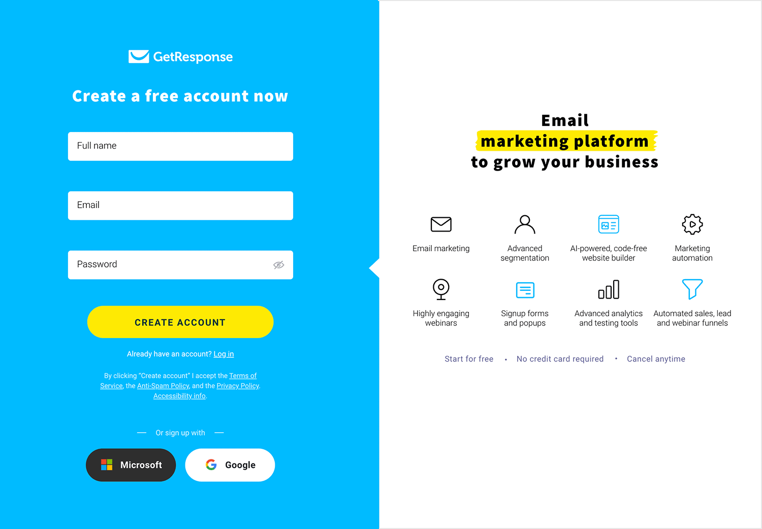
Plus, they’ve cleverly highlighted the benefits right there on the page, reminding people why they need their product. And that accessibility button? Genius. It’s a small touch, but it shows they really care about inclusivity.
Designmodo gets it right with their signup flow. Starting with just an email is smart. It’s simple and straight to the point. Plus, if someone bails, you’ve at least got their info to try and reel them back in. It’s all about managing expectations and staying in control.

You can either sign in through your Google account or enter your email manually. Hit that green CTA to continue and you’re in! This design company sure knows what it’s doing.
Asana’s signup page is as simple as it gets. In signing up, the platform asks only the work email of the user, wasting no precious time and leaving the cognitive effort down to a bare minimum.

We love that Asana managed to create a signup page that delivers a good experience. It speaks to professionals everywhere, and alludes to the fact that the tool will make their lives easier in the office.
This is something many signup page designs try to replicate: Asana’s signup form is easy, effortless and requires no thought from the user. Just perfect!
Airbnb is a company that requires no introduction. It’s famous for the impact it’s had on the tourism sector and for its vibrant and unique presence online. With the white and spacious design it’s website is known for, Airbnb’s signup page design isn’t overwhelming even though it asks for more information than some others on this list.

We like that Airbnb’s signup form breaks it’s questions into as many parts as possible, bringing the effort needed to complete it down. The birthdate being separated into 3 different dropdown menus is a wonderful example of taking something that is easy, and making it even easier for the user!
The general design of the signup page is pleasing to the eye, and creates an impression that the form isn’t time-consuming at all. We particularly love the microinteraction of the eye icon on the password input field – it showcases Airbnb’s strong personality!
One of the main reasons we like Microsoft’s Outlook’s signup page design is that it’s broken up into several steps. By now, we all know that user’s aren’t excited to fill out any type of form – so breaking the questions down into several screens is a smart move.

It makes the signup page design feel quick and easy. As each screen has only one question, users don’t have an initial impression that the form will be complicated. As users fill out questions, they advance through the pages, giving them a feeling of progress.
Shopify has grown to be a massively popular ecommerce platform, helping people all over the world sell their goods online. It’s really no wonder that it’s signup page design makes it as easy as possible for people to create a trial account – people have been flocking to shopify!

The signup form is short and sweet, you can sign u with email, Apple, Facebook, and Google. We love that Shopify kept the page simple and to the point, with no big animations or other distractions. The signup page has some great copy too, as we can see in the first two lines, calming you down by letting you know that you have one last step before you are rewarded with a free trial!
Asos’ website is a great point of reference for web design in many ways – from their great information architecture to their SEO-oriented website structure. Asos delivers a specific experience to users, including not just retail but also lifestyle content. And so it should come as no surprise that their signup page design is also up to par.

The signup page design gives users the simple option of signing up using their social media accounts, with a single click. It also gives users a simple one-column signup form that holds a total of 6 questions. It may seem like a lot, but design is smart in using different UI components.
For the bottom part of the signup page, we see dropdown menus, radio buttons and checkboxes. These are a good way to ask for additional information, without making the user sigh at the need for more typing.
Design signup pages with Justinmind
Netflix is another name on this list that needs no introduction. Known for their ground-breaking product and great all-around usability, Netflix doesn’t disappoint when it comes to its signup form.
The entire signup form is divided into 3 steps, all of which as easy and quick for any user to get through. We love forms that are well-structured and help users see it through to the end, and Netflix’s signup form design is among our favorites!

Users are asked to first choose a plan from a comparative table – all it takes is a click, with no typing needed. In fact, users type only their email and password on the next step of the signup process. After that, it’s all about setting up their preferred method of payment. It’s as easy as it gets!
The famous water-proof/everything-proof boots we all know and love. Dr. Marten’s website is filled with personality, with bright flashes of color that reminds us of their own colorful boots. Their signup page design follows a similar style, sticking to black and white with pops of yellow to mark the call-to-actions.

The signup form itself is one column and keeps things quick, just asking for basic information from users. Users surely appreciate that there are separate input fields for their first and last names, making the form just a little bit easier.
An interesting detail is that the signup form gives users a bit of assistance in creating a password. This comes only after the user has started typing the password, in the form of a progress bar that represents the password’s strength. Very helpful!
Tasty has grown massively popular with their cooking videos on social media spreading faster than the common flu. Tasty did something great, aside from having a website that is young and casual – they put their signup form right above the footer.

This is rather different from the rest of signup pages in this list, mainly because it’s a link that regards signup to a newsletter as opposed to a service or platform. This means that Tasty only needs one piece of information, the user’s email address. The signup form consists of a single input field, accompanied by a simple form of validation under the field itself.
We love that Tasty doesn’t make a big deal about its signup page, simply distributing it across their website. It makes it so casual, so easy for users who might consider getting recipes in their email inbox. We love it!
Nike’s website has two different signup form designs: one for their newsletter and one for their premium membership. We will be focusing on the membership signup page, even though the two forms share a lot of traits.

The signup form itself comes in the form of an overlay window in the middle of the screen. It has the standard option to signup using social media (Facebook) while also offering the classic signup with an email. The input fields are marked only by borders that contrast slightly with the white background, making the whole thing seem light and simple.
We like that while the general color scheme of the signup page is white, gray and black – the validation for each of the fields is bright red. It makes for a big contrast, being impossible to miss. Even better is the fact that the validation doesn’t rely on color alone to convey its message, offering users a descriptive error message.
Another signup page design that went for the light and simple feel. Canva, one of the world’s most popular visual editing tools, has a signup form that showcases minimalism and simplicity. The form itself takes place right on the homepage, and has little color aside from the call-to-action in the Canva shade of blue.

It’s great that the form blends effortlessly with the rest of the homepage, with the image to the right not distracting from the form itself. Another big win for Canva’s signup form is that it offers users helpful copy in the validation – such as a specific message that the password needs 8 or more characters to be valid.
Creating a signup form is easy. Getting users to fill it out is difficult. But all good signup forms tend to:
- Be clear and concise
- Ask for the right information
- Avoid exhausting the user with too many fields
All the signup forms in this article meet those criteria. Some do it better than others. When it comes to making your own, be sure to keep the user in mind. Use a sprinkle of empathy. And cut the fat. If it isn’t necessary, don’t put it on the form.