
Designing a good user onboarding is the key to product growth and keeps users coming back. Read on for some best practices and awesome examples!
All users need a little guidance when they first come to use your product – it’s only natural that you take them by the hand around the key parts of your design. But a good user onboarding flow is much more than a simple tour of the product.
Design interactive user onboardings with Justinmind

You need to illustrate why the product is a good thing for the user, how they can make the most of it and help them get the ball rolling. You want to leave users feeling like they have known your product for a while, and they can start building up a habit of using your design in their everyday lives.
Big ask, right? Don’t worry, we’ve got you covered with 11 best practices to design awesome user onboarding experiences and thrown in 20 examples of popular products that got it right.
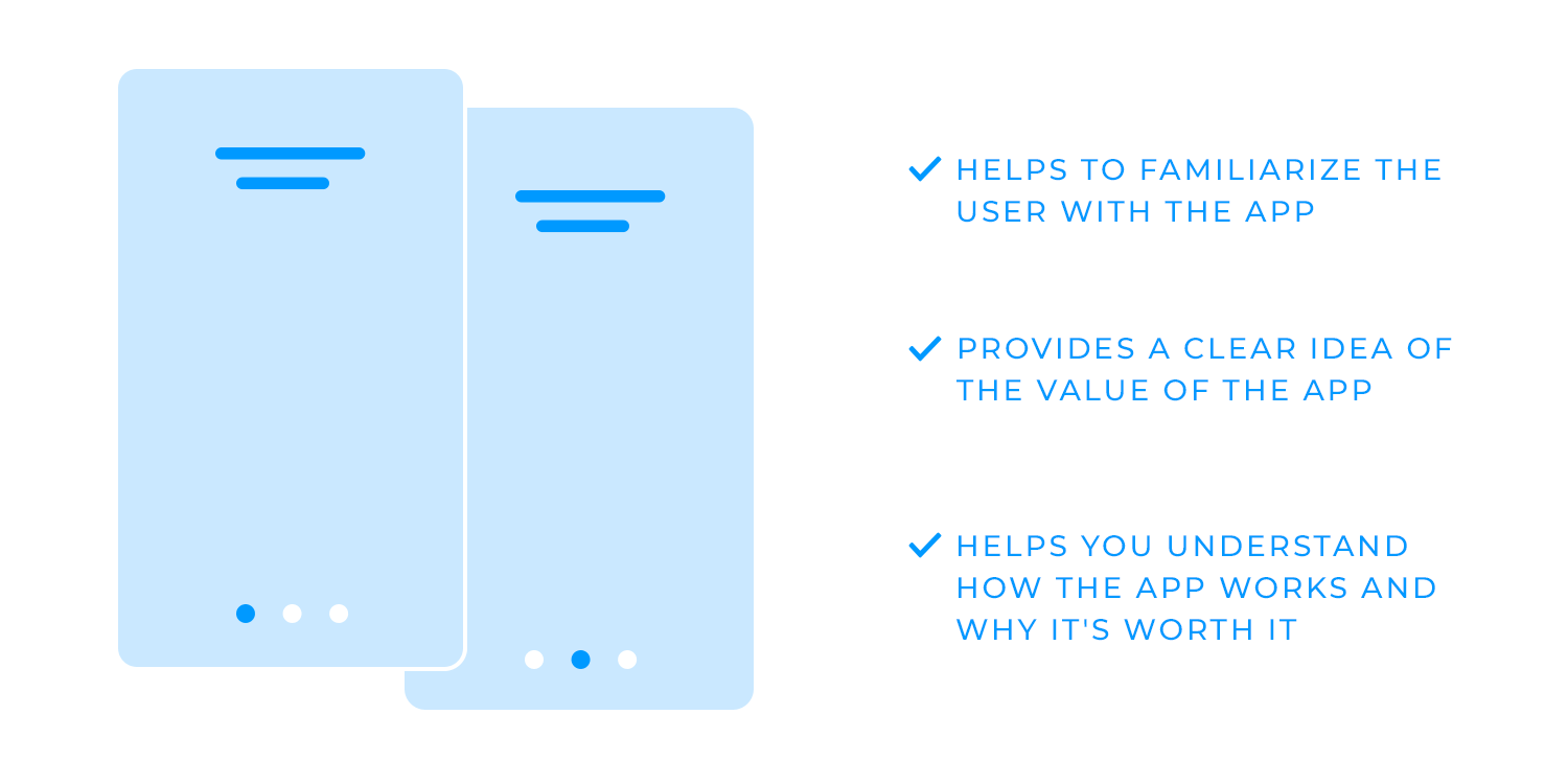
Imagine downloading an app for the first time, ready to solve a problem or jump into something exciting. The user onboarding experience is like a friendly guide, easing you into the app, showing you around, and helping you feel at home. It’s the first experience (or FUX) that greets users and gets them up to speed with the main features and benefits in just a few, easy steps.
So why is app onboarding so crucial? Because it’s the difference between a quick one-time visit and a lasting relationship. Effective onboarding gives users a clear sense of your app’s value – how it solves their problem or makes life easier. This is called activation: helping users immediately understand how your app works and why it’s worth their time. Retention, on the other hand, is what keeps them coming back. The best user onboarding experiences activate users from day one and build momentum to keep them engaged.
This isn’t easy in such a competitive space. Today, app stores are packed with millions of choices, yet studies show that most apps lose 77% of new users within just three days, and that number climbs to 90% within a month. That’s a big challenge, but also a huge opportunity for apps with strong onboarding flows to stand out.
The top-performing apps manage to keep nearly half their users after three months by nailing mobile app onboarding: they set expectations clearly, connect users to the features they need, and create that “aha” moment when everything just clicks. With a well-designed onboarding flow, users don’t just get familiar with your app – they see its potential to fit right into their daily lives.
Goals of great user onboarding:
- Reveal the value quickly: show users exactly why your app matters to them right from the start.
- Increase engagement: keep users interested and build momentum, so they’re eager to return.
- Reduce drop-off and improve time to value (TTV): guide users to that “aha” moment as quickly as possible, helping them see the app’s benefits right away.
In the end, user onboarding isn’t just about a walkthrough. It’s about creating a welcoming experience that makes users feel that they’re exactly where they need to be.
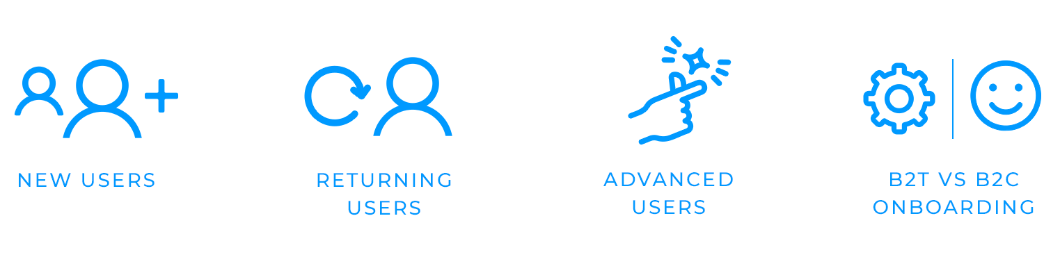
Different users have different needs, so effective onboarding adapts to meet them where they are:
- New users: for first-timers, onboarding should focus on guiding them through the basics. It’s all about getting them comfortable with key features, step by step, so they feel at home and can start using the app with confidence.
- Returning users: sometimes, users need a gentle nudge to return. For those who have been inactive, re-engagement works best by highlighting fresh updates and new features, reminding them of what’s new and valuable.
- Advanced users: power users are often looking for ways to work even smarter. For these users, onboarding can introduce advanced tips, shortcuts, or hidden features that make the experience more efficient and rewarding.
- B2B vs. B2C onboarding: the approach here depends on who you’re onboarding. For B2B users, it’s often beneficial to focus on productivity and collaboration features, while B2C onboarding might lean more toward a fun, simplified experience tailored to individual needs.
Each of these strategies offers a unique touchpoint to build connection and relevance, helping every user get the most out of the product.
Design interactive user onboardings with Justinmind
User onboarding often combines several elements to create a smooth experience. Let’s break down each type and how it helps make a positive first impression.
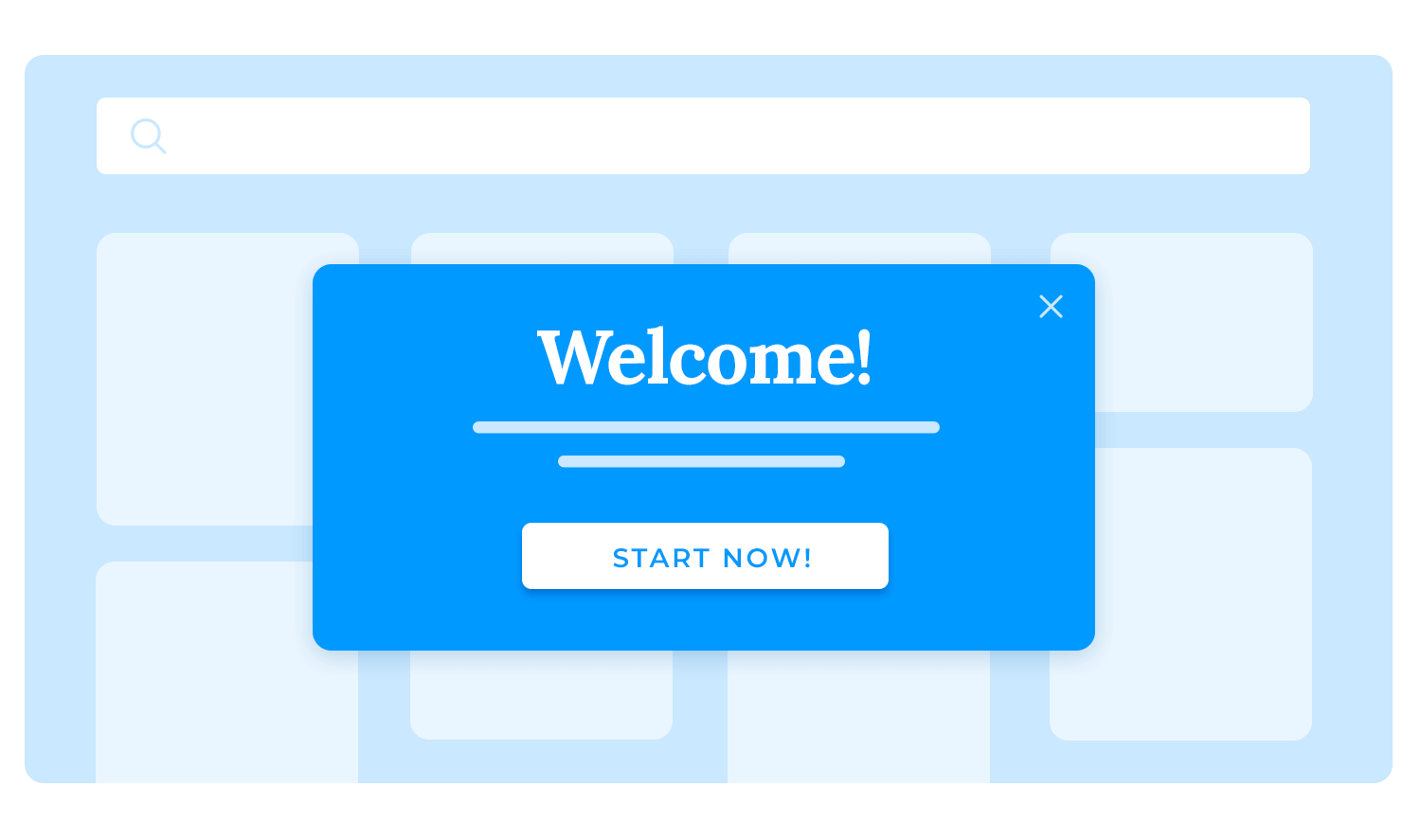
The welcome screen is where first impressions are made. This screen should give users an instant understanding of what the app offers and why it’s valuable to them. A clear, welcoming message sets the tone, while a simple overview of what they can expect reassures them they’re in the right place. Think of it as a friendly handshake that makes users feel excited to continue.
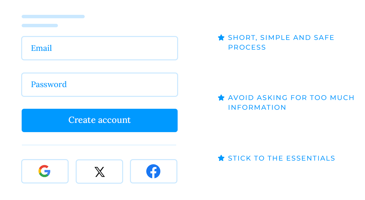
Account setup should be quick, easy, and seamless. This step often involves registration or login, but the goal is to make it as friction-free as possible. Whether users sign up with an email or link an existing account, prioritize a process that feels straightforward and secure. Avoid asking for too much information upfront; keep it to the essentials so users can quickly get through this step and into the app.
A product tour, whether through a walkthrough or tooltips, highlights the app’s key features and core functions. This type of onboarding should be visually engaging and keep instructions brief. Users prefer to discover things as they go, so focus on showing them the basics they need to get started. Interactive elements, like tapping on tooltips to reveal more information, can help users feel they’re learning the app hands-on rather than just passively reading instructions.
Progress indicators are like a roadmap for users, showing them where they are in the onboarding process and what steps remain. These can be visual cues like progress bars or numbered steps that reduce uncertainty and make onboarding feel more achievable. By knowing how far they’ve come, users are more likely to stay engaged and complete the process without frustration.
Personalization makes the app experience feel unique to each user. Offering options for customizing preferences or settings right at the start allows users to shape the app around their specific needs. This might mean choosing notification settings, picking themes, or adjusting display preferences. Personalization helps users feel a sense of control and connection to the app, which can improve long-term engagement.
Encouraging users to complete essential tasks, like creating a profile or performing their first action, gives them an active role in the onboarding process. This helps users familiarize themselves with key features while feeling productive. For example, asking users to upload a profile picture or add a friend can guide them through important actions and reinforce the app’s purpose.
Ending with a success message leaves users with a sense of accomplishment and readiness. Once onboarding is complete, a friendly, congratulatory message like “You’re all set!” or “Welcome aboard!” makes users feel they’ve successfully integrated into the app. It’s a simple touch that can make users more excited to start exploring on their own.
Each type plays a role in easing users in, creating an onboarding flow that’s welcoming, informative, and ultimately, memorable.
Creating a user onboarding experience that’s clear, helpful, and welcoming is essential for keeping users engaged. Here’s how to design onboarding that feels natural and gets users off to a great start.
Imagine opening an app and knowing exactly where to go and what to do. That’s the goal here – mapping out the user journey so each step flows naturally. Creating a clear user journey map helps you understand the steps users take from their first tap to when they start seeing the app’s value. With this insight, you can guide them seamlessly through every moment that matters.
Think of onboarding as a journey with important landmarks along the way. These are the actions that set users up for success, like completing their profile or using a key feature for the first time. When you define these milestones, you’re giving users clear points to aim for that help them get the most out of the app and see its value right away.
It’s tempting to teach users everything up front, but people often learn best when they can explore a little on their own. Give them just enough guidance to feel confident, while leaving space to discover new features as they go. Think tooltips for essentials and a little freedom to roam – this balance keeps the experience fresh and keeps users engaged.
The fewer hoops users have to jump through, the better. Too many steps or too much information can slow things down and make users lose interest. Keep onboarding simple and focused by showing only what’s needed. This way, users can move through it without feeling overwhelmed or distracted, keeping the process smooth and enjoyable.
Making onboarding feel personal can really enhance the experience. Tailor the flow to different user types – beginners, returning users, or power users – so it feels relevant to each one. For example, new users might benefit from a step-by-step guide, while returning users could skip the basics and get a quick overview of new features. A personalized approach helps users feel the app “gets” them.
Quick wins keep users motivated and excited to keep exploring. Simple actions like completing a setup step or saving a preference show immediate results and make the app’s benefits clear from the start. It’s these small moments of success that help users feel like they’re making progress and encourage them to dive deeper.
Keep mobile app onboarding to the point. Users want to get into the app and start exploring, so avoid unnecessary steps that slow them down. Focusing on what’s truly essential gives them a faster, more engaging experience that keeps them eager to continue.
Visuals can make app onboarding much more engaging. Think of animations, images, or videos that break up text and make steps easy to follow. A well-placed graphic or animation can clarify a point instantly, adding a layer of interest that keeps users moving forward with ease.
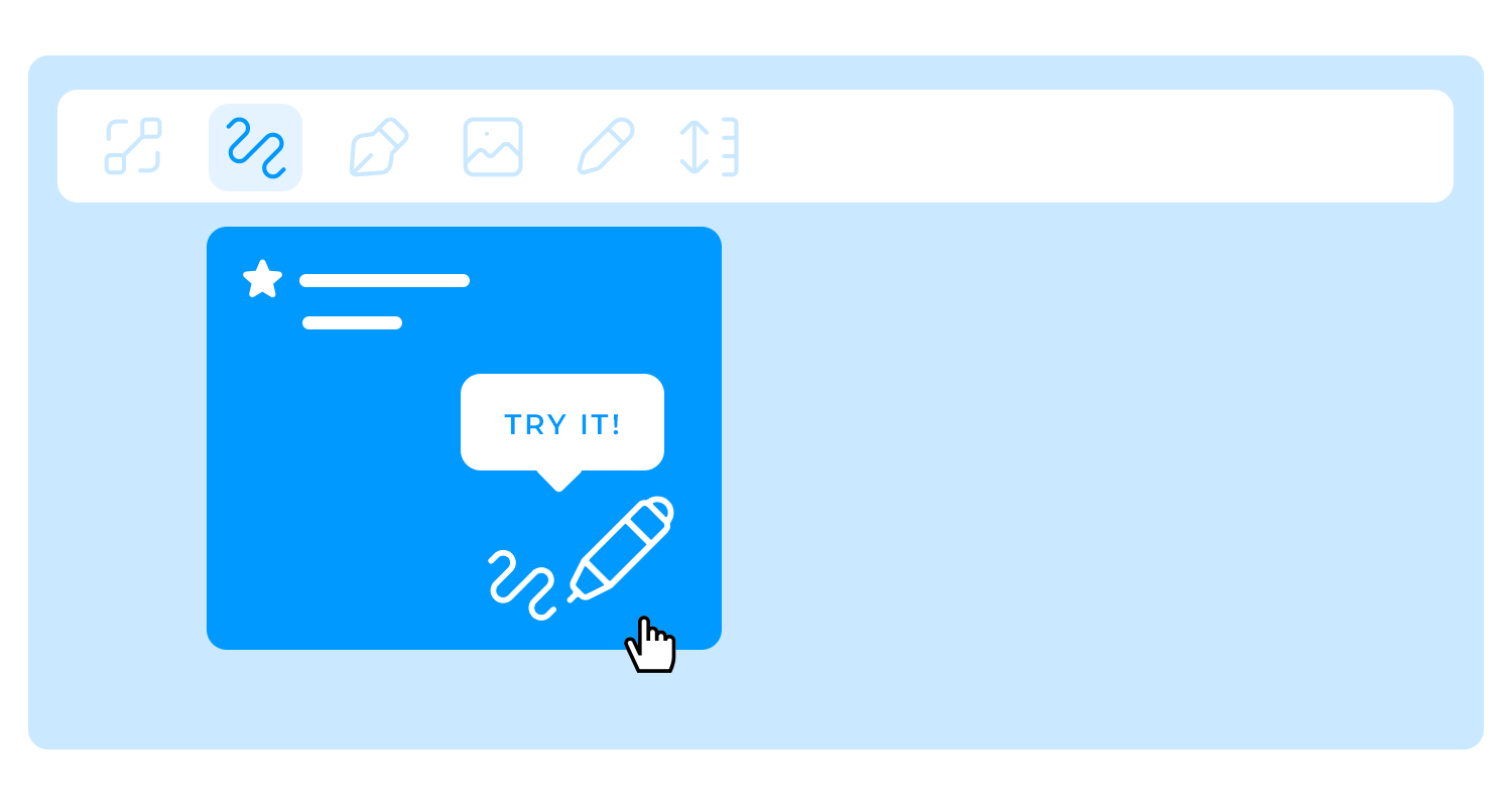
Let users get hands-on from the start. Encourage them to take small actions – like tapping a button or trying out a feature – so they’re actively involved rather than passively reading. An interactive onboarding flow not only makes the experience more engaging but also helps users remember what they’ve learned.
Onboarding doesn’t have to end after the first session. A few reminders or tips along the way, like in-app messages or helpful prompts, keep users supported as they explore. Testing different types of communication, such as timing, tone, and format, helps identify what resonates most with users. This ongoing communication reassures users that they’re not alone, building confidence as they learn more about the app and deepening their connection with it.
Design interactive user onboardings with Justinmind
A good product tour helps users get comfortable with an app’s main features without feeling overloaded. It’s about creating a smooth, friendly introduction that guides users to the essentials while encouraging them to explore more on their own as part of mobile app onboarding. Here’s how to design product tours that engage without overwhelming.
Product tours are best used when an app has a lot going on, like in feature-packed or complex tools. For apps with lots of functions, a tour can be the perfect way to introduce users to key areas so they don’t feel lost right away. Even for simpler apps, a quick tour can highlight unique features or high-value options that new users might miss.
Deciding when to use a product tour depends on how intuitive the app feels and whether users might need a little help getting started. When applied thoughtfully, product tours help users feel guided without being slowed down.
The right product tour gives just enough information to keep users on track, without overwhelming them. Too much detail can make onboarding feel like a chore, while too little can leave users guessing what to do next. A good balance keeps things interesting – offering a mix of brief explanations and chances for users to try things out themselves.
Encouraging interaction helps users feel actively involved, making onboarding feel like a natural part of exploring the app, not a lecture. This way, users learn by doing, keeping them engaged and easing them into the experience.
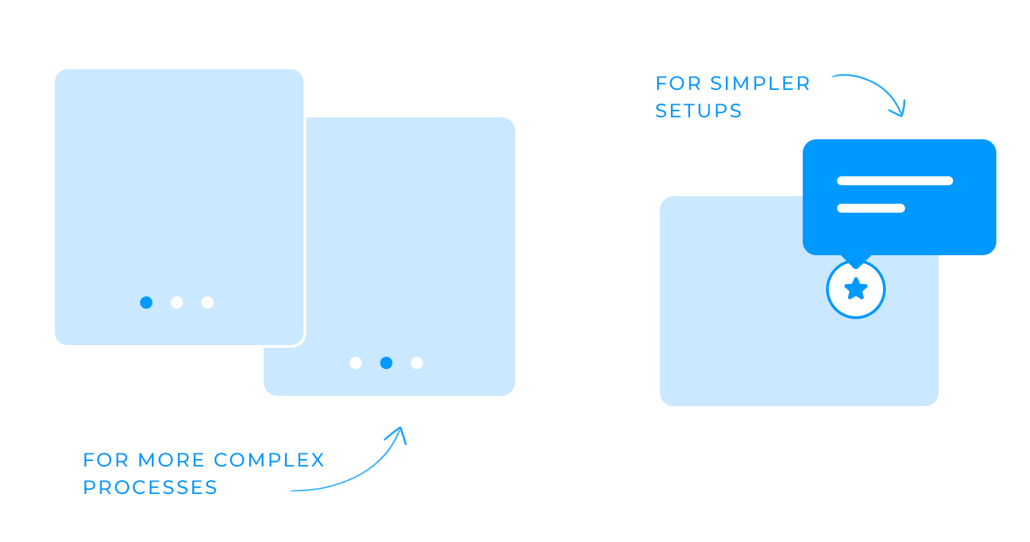
There are a few ways to approach product tours, depending on what the app needs. Step-by-step walkthroughs are great for guiding users through more complex processes, making sure they understand each part before moving forward. Guided tooltips work well for simpler setups, showing up only when users reach specific functions so they get help when they need it most.
For unique or advanced features, focused explanations can provide a quick introduction without requiring a full tour. Choosing the right type depends on the level of support your users need and how much freedom they’ll want as they explore.
Effective product tours are short, skippable, and show up at the right times. A short tour lets users dive into the app quickly, giving them only the essentials without slowing them down. Making tours skippable respects users who prefer to explore on their own, letting them skip the tour if they want and revisit it later if needed.
Contextual relevance is key too – showing tips only when users are likely to need them makes the experience feel natural and keeps users from feeling interrupted. Following these principles makes the product tour a helpful guide that supports users without interrupting them, helping them feel ready and confident to explore.
After designing effective product tours that guide users smoothly, it’s just as important to avoid common onboarding mistakes that can derail the experience. Here are some of the key missteps to watch out for to keep user onboarding smooth and user-friendly.
A major pitfall in user onboarding is overwhelming users with too much information too quickly. Bombarding new users with every feature or step right away can make them feel lost and unsure of where to start. Instead, focus on introducing the essentials first, allowing users to get comfortable with the basics before gradually discovering more advanced features.
Onboarding works best when it grows and improves based on real user feedback. Overlooking users’ comments – whether they felt confused, encountered issues, or wanted extra guidance – can leave onboarding lacking the support users need. Listening to and acting on feedback helps shape an onboarding process that’s intuitive and genuinely helpful for new users.
A generic onboarding flow can make users feel disconnected, especially when the app serves a variety of needs and user types. Adding a touch of personalization – whether through content tailored to different roles or preferences based on well-defined user personas – makes onboarding more relevant. Users are more likely to stay engaged when they feel the app “gets” their specific needs.
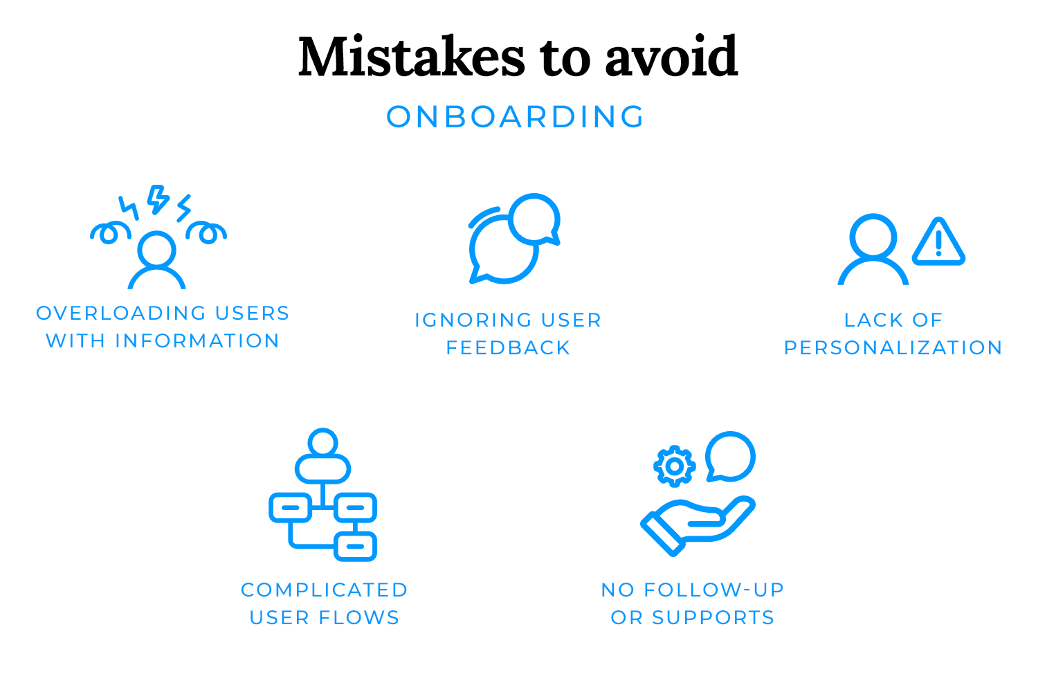
A complex onboarding process with too many steps, unclear instructions, or tricky navigation can frustrate users and prompt them to abandon the app. Keeping user flows simple and straightforward makes onboarding feel smooth, guiding users easily from one step to the next. Each step should have a clear purpose, helping users build confidence as they progress.
Onboarding doesn’t end after users complete the initial steps. Failing to offer ongoing support – through follow-up messages, helpful tips, or easy access to help – can leave users feeling adrift as they continue exploring the app. Consistent follow-up gives users the confidence to dive deeper and discover more value over time, reinforcing their connection to the app.
Avoiding these common mistakes creates a welcoming, supportive onboarding experience that encourages users to feel engaged and successful right from the start.
Design interactive user onboardings with Justinmind
Here at Justinmind, we’ve just updated our mobile app onboarding experience for first-time users. Now, when new users download our prototyping tool and open the desktop app, they are presented with two options: the traditional ‘full mode’ and ‘beginner mode’.

Full mode shows the full extent of the UI and all floating palettes and actions. Beginner mode guides users through the interface with interactive tooltips linked to our support section and YouTube tutorials. Beginner mode users are guided through features and floating palettes step by step and, once they feel up to speed, can easily switch to Full mode at any point.
By adapting the onboarding experience to different user abilities, we can create a Justinmind experience tailored to user needs.
When we interviewed Basecamp’s UI Designer Jonas Downey, he told us that his team aims to make Basecamp “an enjoyable collaborative space”. That design ideology is obvious from Basecamp’s onboarding process for new users.
Starting from a landing page with a distinctly approachable vibe (client testimonials and a distinctly homely design aesthetic), Basecamp moves users along a seamless app onboarding conveyor belt that includes account creation, and a personal note from Basecamp’s friendly-looking CEO.

This is all great, but then comes the real onboarding juice: the flow asks new users which projects they’ve got going on right now and takes them straight over the project template they need. Say you want to set up a company HQ, a central point for shared documentation and news – Basecamp directs new users through that set up in three steps.
Basecamp also provides new users with sample projects on the Account page, which users can use as templates to build out their own projects. Users are encouraged to upload information, add members and start working with the tool almost without realizing it. The onboarding flow is unobtrusive, useful and helps boost retention by ensuring users upload documentation sooner rather than later.
Getting started with Netflix could be a nightmare for users: a potentially overwhelming number of movies and series to choose from, plus worries about data crunching and monthly payment, could make users reluctant to dive into the paid streaming service. Netflix cleverly assuages any uncertainties with its personalized onboarding flow. The landing page gets the payment thing out of the way first off, with the claim “Watch anywhere. Cancel anytime”.
With that out of the way they take users right along to an easy to understand pricing page – they also offer the first month free with no commitment. ‘Hooked’ author Nir Eyal, quoting Evernote’s CEO, points out that the free trial is a great tactic to get more paying users: “As usage increased over time, so did customers’ willingness to pay. After the first month only 0,5% of users paid for the service. …By month 33, 11% of users had started paying… At month 42, a remarkable 26% were paying for something they had previously used for free.”

Savvy pricing presentation apart, Netflix’s user onboarding is strong on personalization. By asking new users to rate a selection of movies on a sliding scale, Netflix then algorithmically produces a list of recommended content in much the same way Amazon or Spotify does, to keep users moving through the app, discovering and engaging with content.
Dropbox keeps app onboarding simple and straightforward, making it easy for users to dive into file saving and sharing. After account setup, users are guided through essential steps like uploading and sharing documents, shown clearly in a progress bar that sits at the top of the interface. This progress bar not only tracks each step but also gives users a sense of achievement as they move forward, reducing any anxiety about getting started.

The onboarding flow is uncluttered and clear, focusing on helping users understand the basics without overwhelming them. Instead of flashy elements, Dropbox opts for direct, easy-to-follow instructions and minimal distractions, ensuring users can complete each task confidently. This simple, friendly approach aligns with Dropbox’s emphasis on user-friendliness and functionality, making it an ideal starting point for anyone new to the platform.
Language app Duolingo wastes no time in its mobile app onboarding process: users select their language and choose their goal right from the landing page. In asking new users to commit to a goal, Duolingo is cleverly tapping into behavioral science theories of goal achievement and commitment, in a bid to keep users engaged for longer.

Kind of like Justinmind, Duolingo also provides new users with two options once they’ve set their language goal – they can start from the basics, or take a placement test. The experience thus becomes personalized at only the third interface step. Light-hearted tooltips then introduce the user to useful features based on their knowledge and chosen language.
Duolingo’s user onboarding aims to get users started as soon as possible, and within 10 clicks users are deep into language learning. By enabling users to get into core functionality from the start of their app experience, Duolingo presents itself as highly intuitive.
Canva’s app onboarding flow makes it simple for users to start creating right away. Rather than a step-by-step tutorial or a series of questions, the app subtly highlights key features on the home screen, encouraging exploration without feeling intrusive. This approach allows users to dive in and discover Canva’s tools in a natural, intuitive way, making the onboarding experience feel effortless and personalized.

Canva gently guides users through the main offerings, helping them feel supported while free to explore. This approach creates a comfortable introduction that resonates with both beginners and experienced users alike.
One of most popular productivity tools out there, Evernote has quite the reputation for its great user onboarding flow. The reason why we love their app onboarding experience is that it shows off all the key advantages and selling points the product has, while never crossing over to a long and boring onboarding flow that will lose users on the way.

The initial part of the user onboarding reminds users of the big selling points of the tool, using great custom illustrations that add visual storytelling to the experience. The next part requires action from the user, where the tool takes the user by the hand on a short tour of the main features.
We love that Evernote gives users the option to bypass the onboarding experience altogether – with a product that stretches across several versions, you need to consider users that already have one of these versions. People that are used to the desktop version of Evernote are unlikely to need a tour of the mobile app – and forcing users down a certain path is always tricky.
Slack’s messaging platform is widely used in the corporate world due to how handy it is for team communication. Their app onboarding experience is quick, to the point and interactive. Brand new users are asked to set up the basics such as the name for their Slack, and are then put into contact with a chatbot that walks them through the tour. The chatbot both shows the main features and asks for further information from the user – a clever way to get data from the user in a smooth, interactive way.

Popups are used to highlight all the most important features, leaving the user to discover the smaller functionalities in their own time. The microcopy is well thought out as it offers an explanation to every field users need to fill in, giving context to the effort demanded from users.
A great side of the user onboarding experience Slack has is the lack of unnecessary steps. There’s no asking for permission to send notifications, no verifying of emails or even setting up a password until users are settled into the tool. That way, users aren’t distracted by anything that can interrupt the onboarding flow.
Glovo’s mobile app onboarding makes getting started quick and easy. It prompts users to share their location right away, instantly showing nearby stores so they can dive into browsing. With a simple option to confirm or edit their address, Glovo ensures that each delivery reaches the correct spot easily.

A prompt to enable notifications keeps users in the know, delivering live updates on their orders effortlessly. Glovo also encourages users to connect with friends to discover new dishes together, making the experience more social and personalized.
WhatsApp, the world’s most commonly used messaging app bought by Facebook back in 2013, has an amazing user onboarding experience. Planning user onboarding in messaging apps can be tricky, mainly because the tool requires the user to insert quite a bit of personal data and grant the app permissions to do quite a bit.
The clear example is the struggle to get users to enter and validate their phone numbers in the platform, or grant access to their contacts or files. These steps can overwhelm the user, or make them sweat at the thought of giving so much liberty to the app. WhatsApp makes quick work out of the onboarding process, using clever ways to decrease the time this process takes.

The best example is how WhatsApp can automatically detect the verification code sent to your phone, so users don’t have to go digging their messages for it. This is a great idea not only because it makes the whole thing easier for the user, but because it closes the window of distraction users see when they close the app to look for the message.
The user onboarding experience here is good because aside from the granting of permission to the app or inserting your phone number, there is very little the user actually needs to do. On the few steps the user needs to do something, there is always some text offering guidance or context to that action. This is a huge plus, especially when dealing with older users who aren’t necessarily tech-fluent.
X (formerly Twitter), is a brilliant example of the AHA effect in real life. It helps its users, whether young or old, to understand immediately what X is about by making them use its main features as soon as they download the app.

For example, as the user begins the mobile app onboarding process and after they have their account set up, the first thing they’re asked to do is follow new users. Immediately following 35 users and subsequently seeing their tweets pop up in your feed organized by date activates the AHA effect, as you quickly understand how the platform works.
In our opinion, Pinterest is among the best examples of a user onboarding experience that encompasses what values the main feature offers the user. As soon as the user signs up, they’re advised to select the categories and the pins that most interest them. BOOM! They’ve already learned about the core features that retain their most loyal user base.

Pinterest also gently persuades app users to incorporate their browser button, they make sure that they are benefiting from the app even when they’re not currently logged in to the website. If they wish to not add the browser button, a brief modal explains what they’ll be missing out on.
We’ve included language learning app Babbel in this list of great app onboarding examples because, not only is it a brilliant case of learning by doing, but also because of how it asks its first-time users permission to send push notifications!

Babbel asks for permission to send push notifications very early in the user onboarding experience. It’s upfront and gets straight to the point. And it works because they use a technique called “mobile permission priming”. Their permission priming takes the form of a modal window that immediately states the benefits of allowing notifications: to stay on track with their language acquisition goals.
Instagram is another cool example of how to get user onboarding right, with their easy-to-navigate FUX.
As soon as the user downloads Instagram, they’re told to sign up to see photos and videos of their friends – already stating upfront one of the major benefits and retention features of the product.

This sign up process in the user onboarding flow is done in three quick steps. First of all, the user can sign up with either their email ID or using their Facebook profile. After that, they’re already in the app’s home screen where they have an unobtrusive in-app guide. This guide lets users know, for example, that they can upload their first video or photo to their network by tapping the camera icon.
Quora is yet another example of user onboarding done right. Their process is quick, fun and to the point.
As soon as the user signs up, they’re invited to follow topics that interest them and then to find their friends with a modal window that pops up after they’ve selected the topics. They even include a checklist that lets you see how far you are in the app onboarding process. It lists out which steps you still have to complete, such as “click on and read 3 stories” and “upvote a story you like”.

The checklist part of Quora’s user onboarding experience is a particularly interesting feature. Not only does it give the user an idea of when they’re fully done learning how to use the platform, but it also serves as a useful internal indicator for what stage of activation the user is currently in.
Design interactive user onboardings with Justinmind
Calm’s onboarding experience is all about setting users up for a personalized journey. Right from the start, users are greeted with a “take a deep breath” screen, creating a sense of calm that aligns perfectly with the app’s mission. The mobile app onboarding guides users to select their top goals, like reducing anxiety or improving focus, making each choice feel meaningful.

Calm introduces notifications with a gentle nudge, explaining how reminders can help users stay on track with their wellness goals without being intrusive. The sign-up process is simple, with the option to join via email or Facebook, so users can jump right into the app.
Here we have MasterClass, another great example of app onboarding done right. The app immediately draws users in with video snippets of famous instructors like Gordon Ramsay and Serena Williams, instantly showcasing the unique value it offers. This visual approach hooks users right from the start without overloading them.
MasterClass keeps the signup process simple, offering quick options like continuing with Google or Apple. Once inside, users are encouraged to explore courses displayed front and center. This setup not only makes navigation easy but also gives users a taste of what they can dive into.

MasterClass’s onboarding flow focuses on simplicity and visual impact, inspiring users and making it easy for them to jump into their first class with excitement.
Fitbit makes getting started simple and motivating. Right from the first screen, it sets a positive tone, encouraging you to take the next step toward a healthier lifestyle. You have options for signing in, so it feels flexible and easy to get started.
Once you’re in, Fitbit asks for a few details to make sure it’s tracking your activity accurately. This part is straightforward, just some basic info like height and weight, and it’s clear that privacy is a priority, with your data set to private by default.

Fitbit then lets you decide if you want to use the app on its own or pair it with a device, putting control in your hands. As you move forward, it highlights all the essentials: tracking steps, logging exercise, recording meals, and even staying social with friends for a bit of healthy competition. It’s all about making you feel supported and ready to dive into your health journey, whether you’re using a device or just the app on your phone.
SoundCloud makes onboarding about discovering music that truly connects with you. Right away, you’re asked to pick a few favorite artists, letting the app tune itself to your tastes from the start.

This simple choice personalizes your feed, making sure that what you see feels relevant and exciting. And with a smooth pitch for ad-free, offline listening, SoundCloud keeps it straightforward but effective – highlighting the perks of upgrading without disrupting the experience. The flow feels natural, inviting, and perfectly suited to a platform that’s all about finding sounds that resonate with you.
Flipboard is a content curator that connects people to stories from all around the globe. The app onboarding shows how customizing the experience can boost the entire experience, much like Calm. Flipboard asks users to select what topics users are most interested in, which in of itself gets users thinking about the benefits of the app.

We like that Flipboard waits until the user has set up their preferences before asking them to create an account. Another good aspect of this app onboarding sequence is that even once they need to create their account, they can do it using their other social media like Facebook.
Your user onboarding experience can make all the difference when it comes to user retention. It’s not a complete guarantee that your product will be successful in the long term, but if you skimp on this important stage, it is a guarantee that it will end up in your user’s trash can.
The best apps and websites dominate the market in part thanks to their tremendous onboarding experiences that help get users hooked from the start.
Every mobile app onboarding flow differs based on the type of product it’s designed for but there’s always an optimal way to reel users in. We hope that the best practices and examples have given you some food for thought for your next user onboarding design!
PROTOTYPE · COMMUNICATE · VALIDATE
ALL-IN-ONE PROTOTYPING TOOL FOR WEB AND MOBILE APPS
Related Content
 Learn how to design better e-learning platforms with user-centered UX principles, real examples, and high-fidelity prototyping tips to boost engagement and learning outcomes.13 min Read
 Infinite scroll keeps users engaged, but it’s not always the best choice. This guide breaks down when to use it, when to avoid it, and how to design it right.14 min Read
 Learn how to design web and mobile app prototypes, how to test them and what to look for in a prototyping tool in this complete guide.15 min Read


