iOS UI kit: design sleek prototypes for the iPhone and iPad
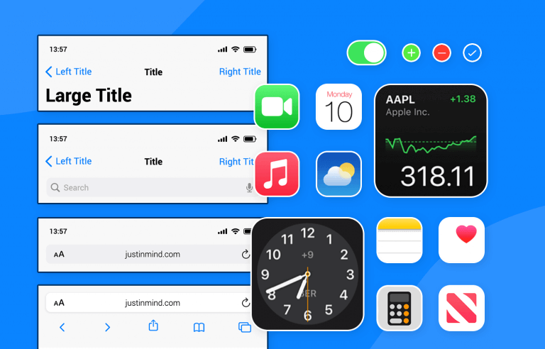
Introducing Justinmind’s iOS UI kit - everything you need to design eye-catching iOS apps that Apple fans will love
If you’re looking for a simple, yet fun and effective way to create amazing apps for iOS, then look no further than the Justinmind iOS UI kit. Our kit is always up to date with all the latest trends in mobile apps and contains a plethora of iOS elements and components that can be used interchangeably between all iPhone and iPad screens in your favorite UI design tool.
In this post, we’ll draw your attention to exactly what’s inside our iOS UI kit. We’ll also give you some great tips on how you can harness the powers of our iOS UI kit to create stunning apps that your iOS audience will love and appreciate. Not looking to create iOS apps? Check out all our UI kits and find the right one for your project.
The Justinmind iOS UI kit is a UI library that comprises hundreds of up-to-date iOS elements and components that just need to be dragged and dropped onto your screen canvas.
Our iOS UI kit always reflects the latest developments, not only in mobile app trends but also in the instructions set out in Apple’s Human Interface Guidelines (HIG). Each and every element and component reflects a clear and intuitive typeface, lucid icons and shapes, along with fresh colors, to provide the smoothest user experience possible.
There are many reasons we could touch on why using our iOS UI kit is a good idea but, instead, we’ve outlined some of the best reasons for you to use the iOS library, in case you needed more convincing.
All of the elements and components in our library are grouped into an iOS UI kit that lets you put together a real iOS app within no time at all. How? The fact that all the elements and components in our library adhere to the strict HIG means that you don’t have to go doing it all from scratch. It therefore also means you’ll get an app that looks like a real living, breathing iOS app.
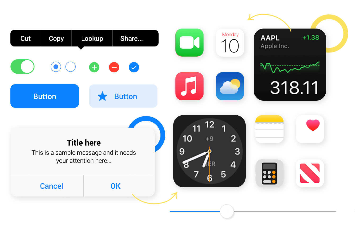
You’ll find that many of the elements and components in our iOS UI kit are very complete and by that we mean you can find anything from single elements, to components comprising multiple elements.
The fact that many of our iOS UI kit components, buttons, and screens already have the basic interactions added frees up your time to focus more on advanced interactions, color, graphics, and branding because the technical iOS stuff is already taken care of.
iOS UI kit content blocks and dialogs bring you components with a pre-determined textual hierarchy, meaning you just have to add the content. The content blocks available include blocks with a title, a paragraph of text, and one or two buttons for the user to choose an option or an answer based on that text.
It doesn’t end there, however. There are a plethora of other content blocks, some of which can be used for communication apps such as FaceTime, contact details numbers, message sending, list items, settings, alphabetical lists and many more.
This section contains every type of button you could ever imagine using in your iOS app. There are large and small action buttons, buttons with icons, navigation buttons, scrolling buttons, switch buttons, radio buttons, as well as checkbox buttons, ok and delete buttons, call buttons, app buttons, and more.

Forms can be complex and require a lot of thought. The great thing about this section, however, is that you can find forms and controls with most layouts and interactions already added.
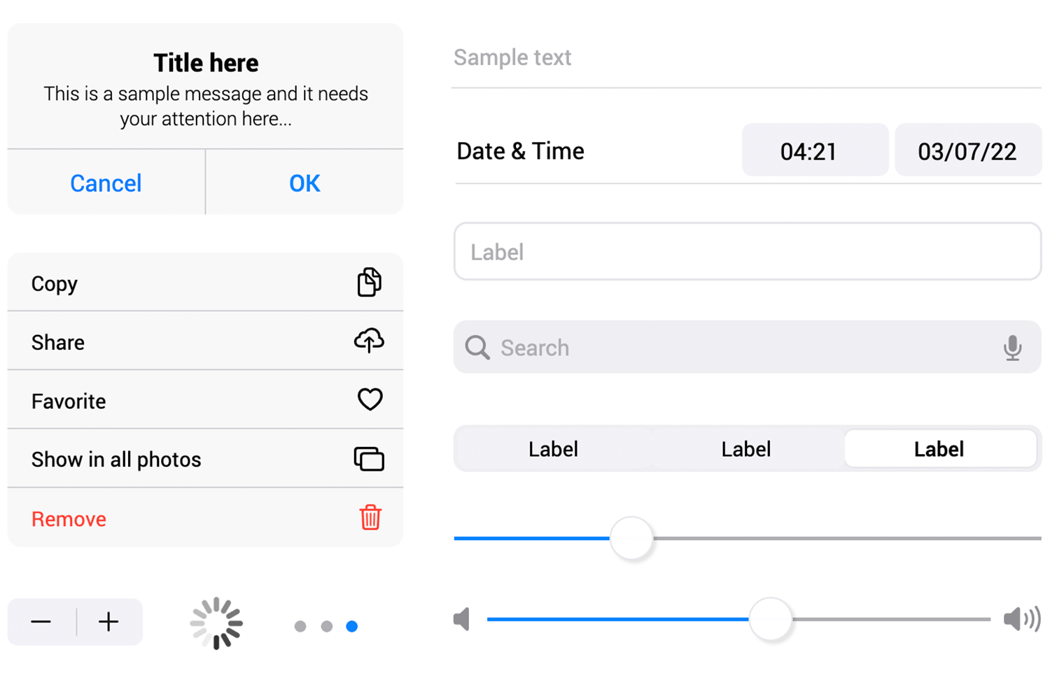
In this section, you’ll be able to find labels, input text fields, password fields, slider controls, volume selectors, date and time inputs, list dropdowns, and even a loading spinner, along with loading bars and pagination bars.
This section is incredibly helpful, given the fact that iOS applications require you to build navigational features into your app to help users navigate back and forth between the various screens of your app.
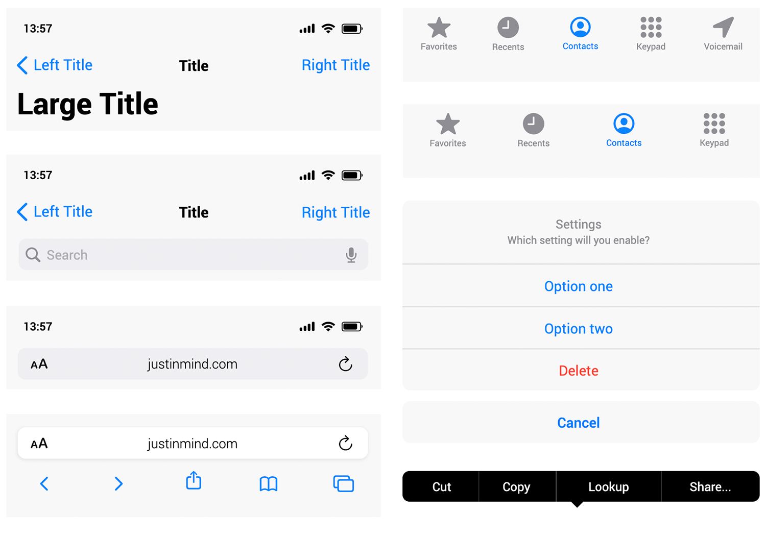
In this section, you’ll find top bar navigation tabs and various control combinations that have parent titles. You’ll find toolbars with back and save buttons, contacts toolbars, browser headers, label bars, floating text editor bars, and many more.
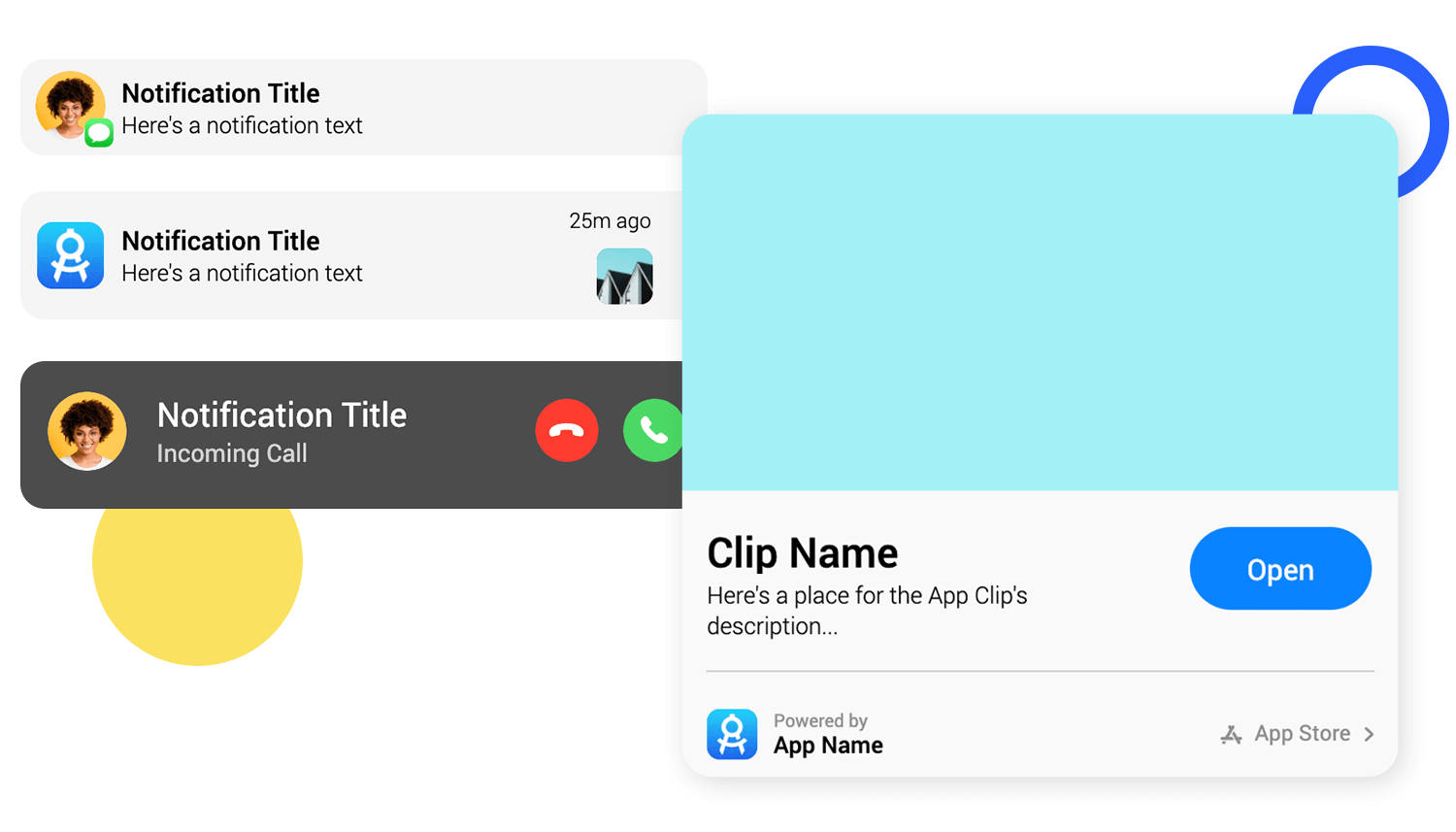
You can find every type of element and component for notifications you could need in this section. Among the screens available in the section is the notifications lock screen. The elements available include the standard notification element, in addition to the notification lite, medium, and large.
You’ll also find an element to depict simple notifications, in addition to a weather notification element.
As the name suggests, you’re given access to a wide selection of ready-made iPad widgets to just drag and drop onto the canvas like it was nobody’s business. Among these, you’ll find light and dark status bar widgets, dual headers, search bars, bubble agendas (made with cards), and many more.
Our iOS UI kit has 300+ vector icons to cover most scenarios in your iOS apps. Your iOS users will recognize these icons more easily and be able to navigate your app more smoothly.
The UI kit includes icons such as wifi, mobile and Bluetooth signal, menu icons, calendar, trash, radio buttons, camera control icons, and many more. It also includes icons for browsing and navigation, either in apps or for browsers such as hamburger menus and refreshing. Other icons include topics such as e-commerce, Apple maps navigation, and social media.
Creating a great app for the iOS system doesn’t have to be complicated. Here we’ve narrowed down a few tips for you to bear in mind while creating with our iOS UI kit, to help you make something that’ll shine off the face of your user’s iPhone.
According to HIG, branding should be subtle, yet noticeable. After all, people will mainly be using your app as a means to an end. Think of it as your job to make that as fun and as effortless as possible. That means no brand logos or advertising that takes up usable space in your app.
At the same time, however, you’ll want to include subtle signs that help them remember your brand. Consistent use of color is a great way of achieving this, along with minimal logos.
Aim to use a bright, consistent color scheme, with colors that clearly complement each other. To do this, Apple recommends choosing limited colors that unify with your brand logo.
Color should be used to communicate, such as red for warning messages and green for success messages. You should, however, be careful about using these same colors in other parts of your app, otherwise, it could make messages like warnings stand out less.
Lastly, colors can affect usability. You’ll want to test that your color scheme works under various lighting conditions. If you have the time, you should even consider creating two distinct versions of your color scheme to ensure that it works in both dark and light modes.
Using Justinmind’s iOS UI kit to create your next iOS app is a great idea. It not only makes your app look like a real iOS app, but it also means you’ll be more likely to stick to Apple’s strict HIG.
As a direct result of using our iOS UI kit, you’ll have more time to focus on your users, in addition to more time to work on your branding, graphics, color, content, and specific interactions. At Justinmind, we believe that every little bit helps, and with our kit, you’ll do very little from scratch.
So, go ahead, download our iOS UI kit free and take it for a test drive today!