
Responsive layout, table taking over page
I'm trying to create a responsive layout using a table, per the posts. I have a rich text widget inside a cell and am using the same formulas as the responsive example provided on the example page. When I simulate my prototype, instead of the table staying the width I set at the beginning, it's going past the width of my screen. What is the best way to handle this and what am I doing wrong?
Honestly I'm not thrilled with the amount of money I'm paying for this and the fact that it's so hard to create a responsive layout. I shouldn't have to edit the example to get what I want, I should be able to recreate it. 
FWIW, the basic responsive example provided also does this. Is it something about Macs? It happens in Firefox, Chrome, and Safari.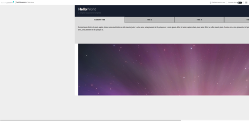
FWIW, the basic responsive example provided also does this. Is it something about Macs? It happens in Firefox, Chrome, and Safari.
If anybody is looking for an answer, this is because the prototype had the "Center screen's content" attribute checked on the canvas. If you uncheck that it will work.
If anybody is looking for an answer, this is because the prototype had the "Center screen's content" attribute checked on the canvas. If you uncheck that it will work.
Replies have been locked on this page!