
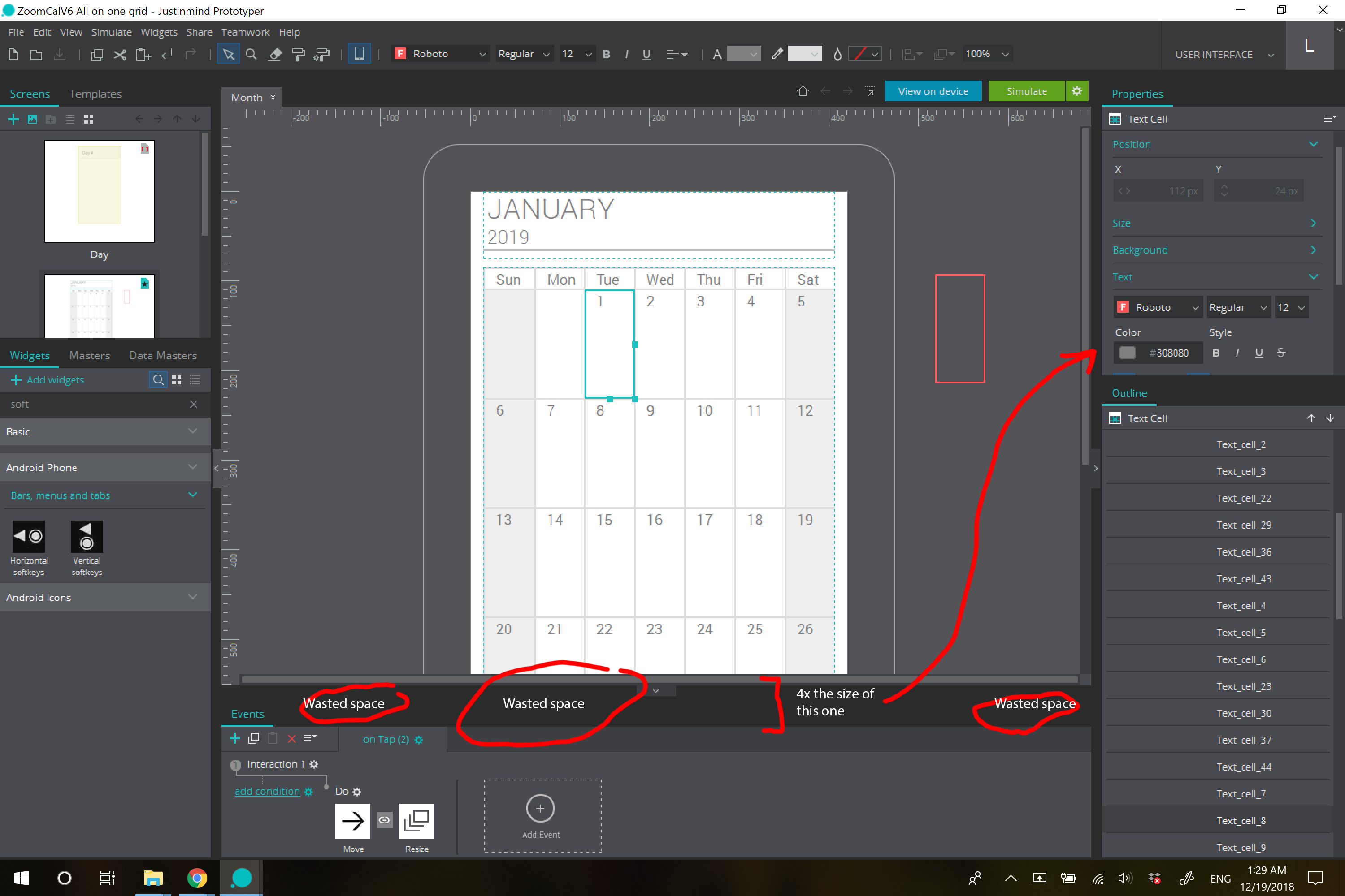
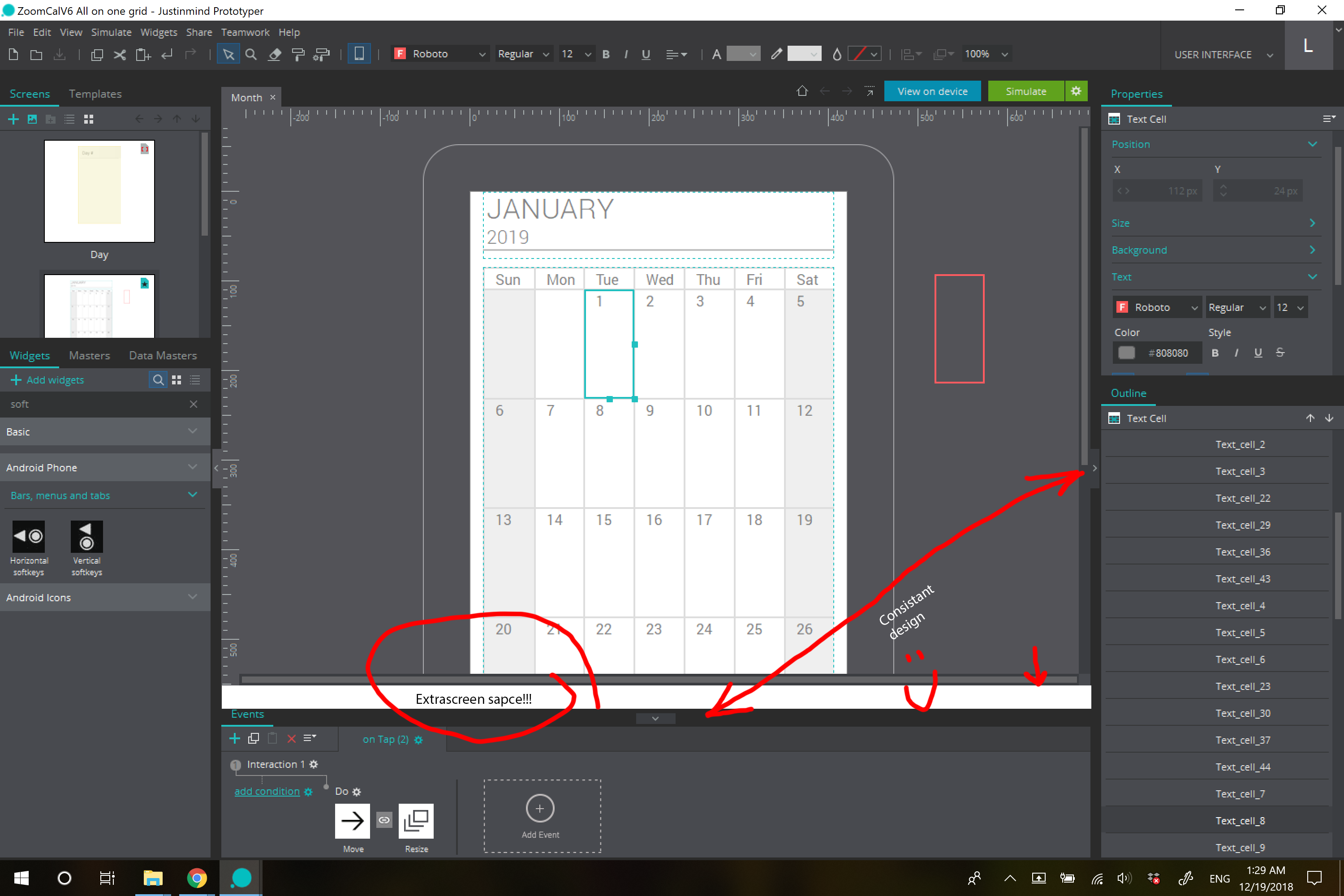
Optimize screen space by reducing wasted space in events arrow menu
Should be relatively easy to implement, basically, the events tab and accompanying arrow wastes valuable screen space. An easy way to fix this would be to move the arrow into the same horizontal alignment as the "Events" title.
This accomplishes 2 things mainly.
1. More screen space (invaluable)
2. Consistent design (the properties tab's arrow is much smaller and is well designed, taking up as minimal room as possible)
Hope to see this change as soon as possible if people agree, can't really think of a reason why it is the way it is now. Thanks, loving JIM and hope to make it easier to use not just for me, but others.
Thanks for the feedback! We're redesigning some parts of the UI right now so this couldn't come on a better time
Thanks for the feedback! We're redesigning some parts of the UI right now so this couldn't come on a better time
Replies have been locked on this page!