
Take a look at our favorite wireframing examples to help you create the ultimate web and mobile app designs
On the hunt for some UX design inspiration? We have you covered! We’ve scoured the web to find the most creative wireframe examples.
Start wireframing web and mobile apps with Justinmind. It's Free!

We’ve got everything from banking, beauty and healthcare website wireframe examples to travel, leisure and weather app wireframe mobile app examples. Check them out below!
Justinmind’s wireframe for a webshop is a blank canvas brimming with potential. The minimalist approach allows designers to focus on the core functionality and navigation, ensuring a solid foundation for future growth.

By prioritizing the overall structure and user flow, this wireframe provides a flexible framework that can be easily customized with specific product details and visual elements. It’s a starting point that invites creativity and innovation, setting the stage for a successful online shopping experience.
A good dashboard is not just a tool, it’s a strategic partner. JustinMind’s dashboard wireframe offers that and more. With its clean and intuitive design, this dashboard offers a clear and concise overview of key performance indicators (KPIs), empowering users to make informed decisions and drive growth.

At a glance, users can identify trends, pinpoint areas for improvement, and celebrate milestones. The dashboard’s focus on essential metrics, such as total customers, members, and active users, provides a snapshot of the business’s health and vitality.
Imagine a makeup shop that’s as visually appealing as it is easy to navigate. Justinmind’s wireframe for this concept offers a glimpse into that vision. The homepage’s design, though still in its placeholder stage, suggests a visually striking and inviting experience.

The clear navigation elements and thoughtfully curated product cards hint at a smooth and enjoyable shopping journey. The consistent design aesthetic and intuitive layout demonstrate the potential for a well-organized and user-friendly interface.
This landing page wireframe example created by our designers is a captivating canvas for your brand’s story. The clean, minimalist design draws the eye while delivering a clear and concise message. The prominent headline and supporting text are strategically placed to pique interest and inspire action.

The hero image placeholder offers a blank slate for your brand’s visual identity, while the featured logos and taglines add credibility and showcase your brand’s partnerships.The footer section provides essential information and navigation options, ensuring a seamless user experience.
Imagine a travel planning platform that’s as intuitive as your favorite app. Justinmind’s booking wireframe offers just that. It showcases a streamlined interface with a clear search bar, making it easy to input your destination, check-in and check-out dates, and number of guests.

The search results section envisions a curated list of hotels, each with essential information like hotel name, city, price per night, and a “View more” button for in-depth details. The “Services” section hints at a comprehensive overview of additional offerings, such as transportation or activities, to enhance your users’ travel experience.
Tim Knight’s sketch wireframe perfectly illustrates the initial stages of UX design on paper. It effectively demonstrates strategic planning and the importance of aligning design with project goals, showcasing the designer’s thought process behind each section of the website. The use of white space is notable, allowing each element to breathe and making the layout easy to follow.

This is a wonderful wireframe example, because it shows an aspect of UX design that can be often overlooked or misunderstood. The designer, JT Grauke, shares that the wired-up wireframe was created with close collaboration with the folks in charge of content strategy and copywriting.

It goes to show that wireframing can also be done in order to reflect and promote the content in its full glory. Of course, other things like visual hierarchy are done beautifully in this wireframe, showing us the best of both worlds!
Here’s a remarkable e-commerce wireframe that excels in managing data-heavy elements of an online store. We love that the information architecture is well-planned, making the checkout process intuitive and easy. Brought to us by Albert Girfanov, this wireframe is available for purchase on their website.

This wireframe by Adam Kalin is a prime example of making efficient use of the available space. With a clear separation of sections, along with the use of both cards and a grid – the Earth Tribe Wireframe shows us the best aspect of wireframing. We love that the structure leaves plenty of empty space, giving the eye a bit of rest.

This high-fidelity wireframe impressively incorporates all key visuals and makes efficient use of space. The Method 4 react wireframe includes several screens of a website that could easily be adapted to suit any ecommerce or service website. The best of all? This wireframe by Craftwork Studio can be bought on Dribbble and used in your next project.

This low-fidelity layout design shows us the power of content structuring. The screen space is well-divided, with clear sections that are easily processed by the user’s eye. Sahil Bajaj used the zig-zag approach, alternating with modules that place the content on the left and then on the right.

Despite the fact that this wireframe only enjoys low fidelity, we appreciate the use of real written content. Even without the images, it’s easy to see what the finished experience would be like. It goes to show that using the final (or as close as possible) content is always a good idea.
Start wireframing web and mobile apps with Justinmind. It's Free!
Captured in a lively Flickr image by LookatLao, this sketch illustrates the foundational stage of a website focused on interactive media. The layout includes designated areas for multimedia elements, interactive menus, and social integration, suggesting a highly engaging user interface.

The use of different shading techniques to emphasize various sections allows us to visualize the hierarchy and flow of user interaction. This sketch is an excellent example for those looking to integrate complex features into a coherent design efficiently.
This sketch offers a glimpse into the layout of an e-commerce website, as seen on Flickr by Vince Welter. It outlines a structured, user-friendly interface that emphasizes a clear shopping experience.

Product categories, a search bar, and promotional spaces are detailed, illustrating their strategic placement. Hand-drawn annotations highlight functionality and user interactions, making this e-commerce site sketch a valuable tool for understanding how design principles can create an engaging online shopping environment. It’s especially beneficial for designers aiming to optimize the e-commerce journey from browsing to checkout.
Brought to you by Max Schneider, this wireframe example is a wonderfully practical resource to have at hand. It focuses the eye on the header, using a very well-planned distribution of the screen space. With a navigation menu at the top-right, the design is a classic homepage example. The best part? The Source Wireframe is available for purchase at the sweet price of $69.95.

In the e-commerce website wireframe, brought to you by Rafal Cyrnek, we see a great take on content structuring. The design allows for plenty of striking visuals, as well as the accompanying sales pitch. We like the use of white space, which makes the entire wireframe seem easy on the eyes. In this single shot, we can appreciate the different approach to different types of content, from the homepage to an event page.

If your client offers some type of service, this wireframe might be the perfect material for design inspiration. Designed by Masadur Rahman for a catering service, this high-fidelity wireframe design shows us the power of simplicity and whitespace.
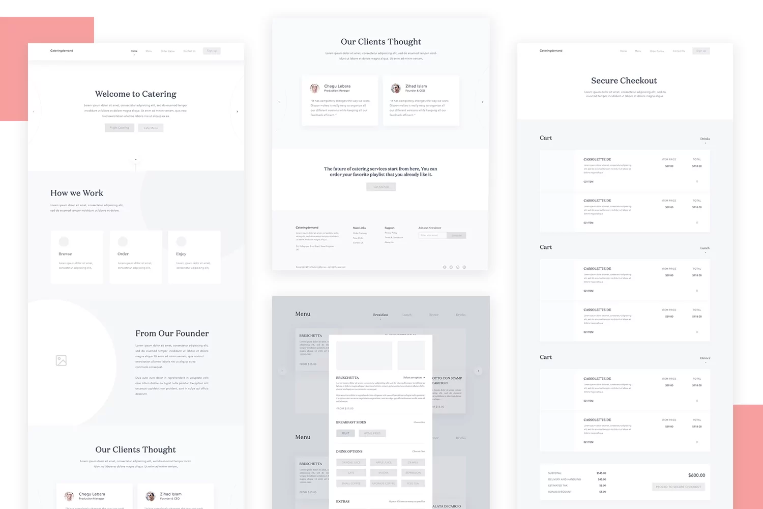
Notice how different colors separate the screens that present various information, such as the company details or the services they offer. Great work on ensuring good accessibility with the simple navigation bar at the top.
This wireframe is a classic case of effectively managing and displaying extensive information. In this case, we have a settings page design. We love how Steve Schoger organized all this information, both in the categories of settings to the left and the content itself, on the right. We can see that in each setting category, there’s not only an icon but also a description to help users find what they’re looking for.

The form itself on the Account page is also an example of a good wireframe design. There’s plenty of space between elements to allow for visual hierarchy, the labels are descriptive and easy to understand.
Designer Zahid Hasan Zisan created this wonderful wireframe which is a streamlined design approach – it doesn’t have visual elements as of yet. But due to the simplicity of the wireframe, we can fully appreciate the smart structuring of the landing page.

With a navigation menu at the top of the page and the clever positioning of different components such as text boxes, this wireframe is a great example of how to make the most of the screen space you have. You’ll notice plenty of whitespace, which both guides our eye around the wireframe, and gives us relief from the information on the screen. Pretty smooth, eh?
UX designer Sergei Pikin shared this wonderful wireframe on Dribbble – it regards a homepage built for a digital marketing agency design. You’ll notice that the design already has the real content and some visuals such as icons and logos.

The design uses color to give a sense of organization and separation of areas. The real images are missing, and were most likely, added at a later stage in the product development process.
The navigation bar at the top gives us a preview into the information architecture and the navigation flow of the whole website – all that, without ever overloading the eye. Impressive!
This wireframe is an intuitive design approach that shows the skeleton of Sweet.io, a social media management tool, designed by David Kovalev. Notice the use of real content and even a few basic visual components, that give us a glimpse into the final design.

This is an interesting example of wireframe, because of its modular nature design. The idea is that Denis Abdullin created several modules, which can be arranged in the most convenient way for each individual page. The wireframe example we see is simply a combination out of many possible ones.

This dashboard wireframe, brought to you by Seçil Kalem goes into much more detail and contains complex data, as you would expect from a banking platform. This wireframe design is impressive, precisely because that complex data is presented in a logical and well-organized layout to the user.

As a good dashboard should, the user can see all the crucial information in a glimpse. Using real written content, we can get a real feel of the finished product. This high-fidelity wireframe example is a great pointer on how to get a lot of information on the same screen in a coherent way.
This wireframe made the list due to its wonderful use of whitespace and strong sales pitch. Yes, we have very little text and most of the experience is left for the visual elements – but that’s ok. Sometimes, online shopping can indeed be a visual experience, and this wireframe design potentialized that. Sometimes, a simple design can be powerful, like in this Muscat wireframe example made by Emil Gleguła.

This wireframe design is low-fidelity but still enjoys quite a few details. We can appreciate the use of components and elements to clearly divide the space, creating noticeable sections on the page. There’s plenty of breathing room, while still offering a lot of visual and written content.
Even more interesting is that the designer also included the mobile version of the same wireframe, where we can see how elements are prioritized and compressed to offer the same user experience. It is a great adaptive layout design brought to you by Craftwork Studio.

It’s true that this one is more of a components kit than a wireframe example. However, it still teaches us something about the art of wireframing content. Even with a small amount of content to play with, Denis Abdullin still managed to create a hierarchy and build a good layout. This kit serves as an excellent foundation design that can be expanded upon effortlessly.

This is another case where designers create UI kits for their wireframes, with their example wireframe featuring on this list. In this case, we particularly enjoy this effective layout transformation that Max Schneider chose to display his work. At first, we can see the low-fidelity wireframe which includes the basics but focuses primarily on the layout. Then we can see a finished design, which includes all the details and visuals. It goes to show that a truly good layout design can be a practical resource to have at hand for a large number of websites.

This website wireframe example, brought to you by Michał Roszyk, comes with a mid-fidelity level, including some of the content but not all the visuals. We can appreciate the division of the space, with a layout that creates separate sections of the page. The header section could be perfect for any kind of high-impact visual, like a powerful sales pitch or a featured article. We love the use of white space, which allows each little element to sing, without ever becoming too much for the user’s eye.

In this wireframe example, we can appreciate the use of spacing and the clear visual hierarchy of the components. The wireframe enjoys a zig-zag layout, which makes it easy for the user to skim the content with minimum cognitive effort. This layout design is brought to you by Karol Woźniak.

Another wireframe example that is all about layout and space allocation. The Construction Company Wireframes shows us that creating a defined header area can help us to deliver a powerful argument right off the bat.

The wireframe, made by Mathijs Lemmers, follows the classic arrangement of placing navigation links to the left, with the branding to the right. We enjoy the simplicity of this wireframe, knowing that it can be truly illuminating to analyze the allocation of space without distractions.
Start wireframing web and mobile apps with Justinmind. It's Free
This wireframe is the perfect example of the first wireframe to create a new smart TV interface for streaming movies. It adapts to large TV screen sizes and presents different ways to interact with the content available. Brought to us by Andrew Mialszygrosz you can find it in his Dribbble page.

This wireframe prototype includes all the main visuals and interactions. It shows a simple design layout that is clear and efficient for the end user. This wireframe by Emannuel Rojas can be an excellent reference point for anyone who wants to move onto a high-fidelity wireframe design for their TV web app.

This example by Piotr Kaźmierczak shows a complete low fidelity website wireframe that is simple and easy to analyze. With clear content blocks and functionalities clearly laid out, it is the perfect starting point to create any type of website wireframe and present the basic look and feel of the brand or design project.

When it comes to designing a smart car dashboard, functional and clear interfaces are a must. We love this dashboard example where driving and car related information is displayed clearly and requires minimum attention from the driver. Brought to us by Louis, this high fidelity wireframe shows us great use of screen space and features layout.

This streamlined home dashboard example from Naga Shiva shows us an effective content structure with clear sections to organize all the information that is given to us. It includes a left side navigation menu with categories, and displays the corresponding information to the right in sections, making it easy for the user to find what they are looking for.

This high fidelity wireframe is part of a grayscale series of wireframes designed by Gobi B. This example shows a highly detailed design that fills in the key content of the design. Giving us an accurate representation of how the final product will be structured as well as the user and task flow.

This Hotel brand website wireframe by Sean Taylor can be considered a mid-fidelity wireframe. It focuses on the content structure and flow of the page, and includes notes in the margins for an extra level of details.

Data visualization is key for any dashboard project, in this educative dashboard example by Aufait UX, they have managed to effectively show all the key data in their dashboard by organizing it into sections. This high fidelity wireframe has a clear structure and defines the type of data and images that will go into each section.

This redesign by Mario Yepez showcases the web version of the well-known meditation app, Headspace, in a high-fidelity layout. The wireframe shows a high-level content of the app while keeping the brand’s personality. It is a great example of the importance the use of space and real estate can have in a design.

This multiple screen wireframe design by Prakhar Neel Sharma is the perfect example of a clean design that is straight to the point. The basic structure is organized by sections with the sizing of sections and elements laid out proportionally to their level of importance. Although originally designed for a Real estate investment, this wireframe is a great template for any dashboard as it can be easily adapted to any brand identity or project.

Now that we’ve explored various examples of website wireframes, let’s shift our focus to mobile app wireframes. Mobile apps often require a different approach due to their unique user interactions and screen sizes. Here are some mobile app wireframe examples to inspire your next project.
Justinmind’s wireframe mobile store app example is a gateway to effortless shopping right at your fingertips. The app’s sleek and intuitive design makes it a joy to navigate, with features like a clear navigation bar and a visually appealing product carousel.

Thanks to the user-friendly interface and intuitive category tabs, let your users discover the latest trends and find their perfect match with ease. The product cards provide essential information at a glance, inspiring users to explore and make informed decisions.
This photo app mobile wireframe example, also by Justinmind, is a visual organizer that puts your users memories at their fingertips. With its clean and intuitive interface, managing a photo library has never been easier.

Organize photos with ease using the app’s customizable folders and albums. Keep your favorites close at hand, archive old photos, and securely lock sensitive images (it’s okay, we won’t tell). The wireframe design allows you to focus on what matters most: your photos.
The articles mobile app by Justinmind has a clean interface and intuitive navigation that make it easy to discover and consume insightful articles on design trends, best practices, and industry news.

With features like a clear navigation bar and a well-organized article list, you can effortlessly browse through content and find the information you need. The app’s bottom navigation bar provides quick access to essential features, allowing you to save articles for later, stay updated on notifications, and manage your account.
Justinmind’s mobile community hub wireframe offers a glimpse into a potential social networking platform. The sleek and intuitive design hints at a user-friendly experience, while the clear layout and navigation elements suggest a seamless interaction.

The profile page, though still in its placeholder stage, promises a space for users to showcase their identity and connect with others. The feed section, with its placeholder posts, envisions a dynamic space for sharing and engaging with content. The bottom navigation bar, while simple in its current form, provides a foundation for easy navigation and access to key features.
This mobile app wireframe also offers us insight into how wireframing can be so closely linked to other aspects of UX design. Like some of our previous examples, the portfolio wireflow is all about the marriage of wireframing with user flows and information architecture. To us, this is a wonderful and practical example of how UX design delivers the best results with a holistic approach. By Jonathan Centeno.

This wireframe is actually a part of a whole project that was posted on Behance, complete with user flows and the finished high-fidelity prototype. The Yes of No wireframe by Havrykdesign .com itself isn’t all that visually pleasing – but wireframes don’t have to be. They have to be functional, which this wireframe definitely is. It makes for a straightforward representation of the bare bones and it helps us to appreciate how the final design relies on the wireframe.

This is another great example of a health services mobile wireframe that knows how to make the most of the limited space. We love the use of a grid system, which helps the screen to offer more information while keeping the cognitive load light. The visual hierarchy is done beautifully in this mobile wireframe example, with elements having a clear relationship to each other, making the entire wireframe and user flow easy to understand at first sight. By Yehor Haiduk.

This is another great e-commerce-themed example. The low-fidelity wireframe by Sahil Bajaj shows us several screens of an e-commerce app, going from the login screen all the way to the checkout, all of which enjoy wonderful visual balance. We love that the wireframes use the right types of UI elements to make the most of each step along the shopping experience.

As we mentioned before, translating hard data and numbers into a more digestible design can be very tough. Simplifying complex things is one of more sure ways to truly test UX designers – and this one passed without any trouble.

The loan app wireframe, by Ryszard Cz, is all about handing people bite-sized pieces of data, to make the entire experience of having a loan easier. It’s also about giving the whole situation a feeling of certainty, helping users with the mental stress of the loan itself.
From the Visme travel app wireframe template, we get a fantastic example of a streamlined travel app design. This wireframe offers a clear and user-friendly flow from logging in, selecting travel destinations and origins, viewing the feed, and progressing through booking, payments, messages, and settings.

Users start with a login screen, then select their destination and origin, followed by browsing a personalized feed. Additional features include an intuitive booking calendar, secure payment options, messaging functionality, and comprehensive settings.
Digital grocery shopping has soared in recent years, stamping out the drudgery and inconvenience of in-store browsing. But that means that the sites that we buy from need to be quick and easy to use.
Based on UX research and testing, Volodymyr Melnyk’s clickable online grocery shopping & delivery service mobile app wireframe is very impressive.

Volodymyr Melnyk's UX wireframe for mobile app of online grocery shopping & delivery service on Behance
With helpful feature descriptions on the homepage, a smart side-menu, quick login system using social media and latest search options, this wireframe looks like it could compete with many of the online grocery stores currently in place.
ResMed Senior Visual Interaction Designer, Marc Caldwell presents his sensual ‘Logic ‘n’ flow’ online dating wireframe, and it’s everything we hoped it would be. His designs are complete and easy to follow, with forms, labels and content placeholders to provide additional – if somewhat raunchy! – hints to the user.

Marc Caldwell's Logic 'n' Flow wireframe series on Dribbble
How about a smart weather app that allows you to demonstrate descriptive weather statuses such as the temperature, pressure, and humidity.
In this wireframe mobile app example below, designed by Matt Sclanrandis, we can clearly visualize each feature that the final weather app will contain. Helpful stats, graphics, and history charts can be put in place, as well as interactive maps, and the forecast around your area.

Matt Sclarandis's Weather App Wireframe on Behance
When presenting a weather app to colleagues or stakeholders, we would recommend showing them a clickable wireframe, or mid-to-high-fidelity prototype, so that they understand the functionality as well as the visual structure and attributes. Weather is pretty interactive!
If you’re unfamiliar with the company, San Francisco-based Boosted makes skateboards with light and powerful electric motors. The team used Justinmind to wireframe and prototype their iOS mobile app last year, and their feedback was awesome!
“Closing the gap between my simpler wireframes and interactive prototypes. I chose Justinmind because it strikes a balance and it’s nailed what I need from prototyping”
Emilio Gonzalez - Boosted Board’s Senior UX Designer
Working closely with the Product Engineering team, the designers created a series of paper wireframes before “taking it to the pixels”. After this, the team moved on to create wireframes with detailed user navigation flow. These helped them to fully define each design element, and make sure that everyone – software engineers included – was on the same page.

You can read more about their journey, and how the final app prototype came to be here in our Boosted Boards case study.
Start wireframing web and mobile apps with Justinmind. It's Free
Alexandra Davis’s low-fidelity wireframe offers a comprehensive look at the Bandsintown app redesign. This detailed sketch outlines the app’s key features, including the home screen, search functionality, user profiles, and event listings. Her focus on clear navigation and interaction makes this wireframe an excellent tool for understanding the app’s structure without the distraction of visual elements.

Want to see how to streamline your app design? Dheeraj D_Ru’s wireframe process for the Car Mate car-sharing app on Behance is a great example. He cleverly combines low and high-fidelity wireframes – basic sketches for quick ideas, then grids for a more polished look. Perfect for designers who want to get their concepts out fast and then refine the details.

Witness the fascinating transition from concept to completion with Marko Peric’s wireframe GIF. This visual journey takes you from the initial low-fidelity sketches, through mid and high-fidelity stages, and culminates in a polished, fully-designed app site.

The GIF illustrates how each phase progressively incorporates more detail, such as photos, fonts, and colors, culminating in a visually rich and functional application. Peric’s creation not only showcases the meticulous process behind great product design but also emphasizes the crucial role of well-structured wireframes in turning ideas into stunning realities.
These preliminary sketches for the Trip Tracker app illustrate the initial design steps, focusing on user journey elements like starting and ending a trip. Simple yet functional, these wireframe examples facilitate early discussions by outlining core functionalities and user interactions. Ideal for streamlining the feedback process, they set the stage for refining detailed wireframes, showcasing the practical application of basic shapes to define a user-friendly mobile app experience.
Anami Chan’s case study of the Sundayz app showcases her detailed design process from initial sketches to the final product. The evolution of these wireframe examples demonstrates the transformation of basic layouts into sophisticated user interfaces, with specific focus on elements like login screens and user settings.

Chan’s methodical approach underscores the importance of each developmental stage in crafting an intuitive and visually appealing app.
This wireframe banking app example for the Better banking app highlights a clear, step-by-step development from basic layouts to detailed user interfaces. Focusing on essential features like balance overviews and transaction tracking, these wireframes emphasize functional simplicity and user engagement. The minimalist approach in design ensures clarity and usability, effectively guiding users from concept to a polished end product.

This mid-fidelity app wireframe example by Jamal Nichols offers a detailed look into the Kyte car booking app’s design process, juxtaposed with its final user interface. Nichols employs a content-centric approach that clearly delineates how users interact with the app, from choosing a vehicle to booking a ride.

This approach not only enhances the usability of the app but also emphasizes the significance of UX writing in shaping the user experience. The side-by-side presentation of wireframes and final design illustrates the evolution from concept to completion, demonstrating how strategic textual content can influence and refine the overall design.
Kritika Pasricha’s wireframe examples for a health and wellness mobile app show how to effectively outline an app’s structure. Using the tool Whimsical, these wireframes cover essential screens like Login/Signup, Personal Details, and Fitness Goals. This early design work serves as a basic framework, which is crucial for developing more detailed website and mobile app wireframe examples. These basic wireframe examples set the stage for adding visual details and interactive elements, clearly showing how designs evolve from simple app wireframe examples to detailed mobile app functionalities.

This high-fidelity wireframe already has the key animations of the finished product. With a simple design that has the visual components but not the color scheme, we can appreciate the simplicity and practicality of the product.

Designed by Alyoop, this wireframe was even used for user testing. What’s not to love, right?
This wireframe example for a cooking app showcases icon-based navigation, optimizing the recipe search process. It begins with a grid of culinary icons, guiding users to a detailed recipe view.

This method enhances the user experience by combining intuitive navigation with comprehensive content presentation, making it a standout choice among mobile app wireframe examples, particularly for culinary applications. This approach not only streamlines the user journey but also serves as an excellent reference in both app and website wireframe examples for those seeking to enhance functionality and visual engagement in their designs.
This music mobile app wireframe by Afshin Mohammadi is a simple and powerful design that lets the practical functionality of the product shine. It showcases how music will be displayed, and how users can explore new types of music using the product.

Designer Reiss created this high-fidelity wireframe for a sports mobile app that deals with all things football-related. The wireframes we see below are a great example of how we can use real content, and even add some color to wireframes before taking it to the prototype level.

In the wireframe, we can appreciate the navigation components and the different aspects of the product. Simple and straightforward – just the way we like it!
Another great wireframe example by Kishore – this one, concerning a mobile app that helps parents stay up-to-date on their children’s school work. We love the navigation bar at the bottom of the page that shows us the most crucial features of the app.

Start wireframing web and mobile apps with Justinmind. It's Free
This wireframe example is as low-fidelity as some designers will get. It’s stripped of any visual fluff or minute detail. In part, that is what earned it a spot on this wireframe examples list. When we are free of any details, we can focus on the actual content structure and allocation of space.
The mobile screen comes with very limited space, but this design ensures that the most important elements have their place. This wireframe was made by Anton Tkachev.

This hotel booking app wireframe plan shows a lodging booking tool that’s both easy to use and nice to look at. The wireframe’s steps highlight how the tool changes from a simple idea to a polished finished product. Each step the user takes, from logging in to finding and booking a place to stay, is shown clearly and simply. Even the first design ideas hint at how smooth the tool will be to use, proving that good planning leads to a great finished product.
This example, with its detailed pictures, shows how thinking about the user’s experience from the beginning leads to a tool that’s both pretty and works well.

Moving from dashboards to apps, this high-fidelity wireframe by Andrew J. for a car rental mobile app makes the most of limited mobile real estate. Each screen includes a high level of detail, making it easy to understand for everyone involved in the design process. This clarity allows the design idea to be effectively communicated to all stakeholders, facilitating necessary iterations before moving on to the next stage.

This high fidelity wireframe by Andrew.J for a car renting mobile app shows how to make the most of the limited mobile real estate. Each of the different screens include a high-level of detail making it understandable to everyone involved in the design process. Consequently it allows to easily communicate the design idea to all stakeholders, and make the necessary iterations before moving on to the next stage.

This is another great smart home mobile app wireframe example. What we like about it is that it optimizes the mobile screen space and makes use of simple shapes and graphs to show content. The wireframe by Marcin Janas uses the right UI components to show how the app would control different IoT devices via the mobile app.

The Hairdresser app wireframe by Ricardo Arroyo is all about aesthetics and clean structure. The wireframe for this mobile app platform shows a personal central hub where users can easily book their beauty appointments. With a clear task and user flow, this wireframe allows to visualize the complete user’s journey.

Pradyut Meher has created a great mobile wireframe for booking yoga classes. This high fidelity example comes complete with information architecture in place and clear screens layout. It includes the usual sign in screens and goes on to offer other app features such as location, and videos to ensure key objectives can be easily completed by its users.

Electric cars are making a big impact recently and locating charging stations is key for current and future electric car users. This electric car charging app by Tadas Neverdauskis tries to solve that with this app wireframe, which includes the complete user journey -from easily finding a charging station to completing payment, without never having to leave the app.

Now, let’s check out a grayscale wireframe by Patryk Moskot. This one does a great job of showing the main features on each screen. It’s a perfect example of how to shrink a website down to mobile size without losing its key elements. The wireframe keeps the look and feel consistent across all screens, making sure the brand stays strong.

This wireframe by Sahil Bajaji is a simple and straight to the point design that lets the features and functionality of the product shine. From the login screen to checkout screen, this low fidelity shopping app wireframe showcases ease of use through a clear user flow.

Following the theme of usability, this health app wireframe by Karina Tarhoni is a great example of how to display core features and key data within the limited screen space of a mobile device. With clear sections that include graphs and different font sizes, the information architecture is thoughtfully designed to make data easy to digest and accessible for the user.
Continuing with the focus on user-friendly design, this low-fidelity wireframe by Fernando Aleta shows a complete wireframe for an app that combines podcasting with social media. It uses simple shapes and icons to showcase the main structure of the product and show the actions the user can accomplish. The content is organized into sections and follows a consistent layout for a clear user flow.

In the tenants app wireframe screens, we see how designers can make a mobile screen with plenty of information and content while still allowing things to breathe. There’s a great visual hierarchy at play here, with elements having the right separation between themselves to allow the right interpretation.
We can see a total of 8 screens, including a welcome screen, a sign up/login screen, and a payment method screen. Brought to you by Prakhar Neel Sharma, he has also included the screen flows to show functionalities and how the app works.

For a detailed exploration of designing effective website wireframes, including step-by-step processes and key considerations, check out our comprehensive Website Wireframe Design Guide.
To wrap up our exploration of diverse wireframe examples for web and mobile, let’s highlight how a tool like Justinmind can streamline and elevate your wireframing process. Building a robust wireframe from the get-go is key, helping you spot and fix potential design flaws before they become major headaches.
Justinmind isn’t just about making wireframes, it’s about perfecting them. Our widely used UI kits cater to both web and mobile projects, packing in over 500 UI components. We’re talking buttons, data lists, sliders, even pricing tables – basically, everything you need to whip up complete website and mobile app wireframes quickly and beautifully.
The Web wireframing UI kit is extensive, with over 500 different UI components. It includes everything from different types of buttons, data lists and ready-made sliders to pricing tables. It’s a one-stop-shop for anything you could need for creating your wireframe the quickest and most practical way possible.
The Mobile wireframing UI kit serves the same purpose but focuses on elements better suited for mobile devices. You’ll find everything from icons, notification components, numeric keyboards to maps.

When it comes to building a wireframe, Justinmind makes it as easy as possible. Aside from the UI kits, the website wireframe tool comes with several other advanced features that can take your design to the next level:
Create high-fidelity, interactive wireframes: step up the fidelity of your wireframe and even cross the line into prototyping by adding the key interactions of the product. With Justinmind, you easily build on your wireframe, and come to a fully-functional website or mobile app prototype.
Use parallax scrolling: Parallax layouts can give your design a sense of depth by using different speeds for the background and foreground. Use pinned elements to create fixed components of the design that stay at a certain spot as the user scrolls.
Have data-driven design: Some designs need to simulate how the product would act with different types of data. Use dynamic data lists and grids to replicate conditions – and obtain forms that behave like the finished product.
Put the widget library to good use: Just like the UI kits mentioned above, Justinmind has plenty of other ready-to-use UI kits – all of which are free, and carefully designed to suit your needs. Covers both mobile and web design components.
Dipping your toe in the pond of wireframing before jumping head-first into the deep pool of prototyping is always a good idea. We know that, sometimes, mustering up the inspiration to get the ball rolling can be tough. But hopefully, with these wonderful web and mobile app wireframe examples, you’ll find yourself having an idea or two about how to approach your next project!