Prototyping forms is a way to improve the usability. Testing your form is a way to make sure you and your users speak the same language!
Forms usually serve a very specific purpose – to gather data from users to your database. And while the purpose behind forms is very straightforward, the way to create a form that users can complete quickly can be surprisingly challenging.
Prototyping forms is a key part in the design process. It forces designers to confront different aspects of their form they might have otherwise missed – user testing forms works to identify issues that survived the prototyping stage.
But why go through all that trouble? Why is that a good thing and how do users benefit from it? Read on to find out.
There are a few reasons why UX designers usually prototype all their designs before coding a single line.
For users, a form may look simple and straightforward when you first encounter it online, but oftentimes that illusion of simplicity falls away as you start to notice cryptic labels and the strange behavior of control buttons. For designers, simply putting a few entry fields together may seem tempting but won’t result in a form that helps users along the way.
By prototyping forms before they actually go online, you do your users a huge favor. Most designers will know this already, but it’s always worth saying it yet again: prototyping and testing is the only way to spot trouble on the horizon.
Prototyping forms can be as cheap or as expensive as the situation calls for. Done quickly at low fidelity, your form MVP may save you a considerable amount of cash by protecting both you and your users from design pitfalls.
Testing form prototypes plays a key part in reiterating on your design. There’s nothing like putting your form in front of real users, real people, and seeing how they react. By watching and learning from users, you’ll come to understand the good and bad aspects of the form.
And here is an important distinction: in UX design, there is hardly ever a right or wrong; there is only the user and their experience. Sometimes, the ugly design that gives your design team the chills can seem more comfortable and simple to users than elaborate creations.
Tip: Instead of using your own idea of what is good, it’s key you wrap your head around the user’s perception of what flies and what sinks.
And that’s where testing your form comes in. Do users like that little label? Was it helpful or was it just taking up screen space? Does that entry field leave users confused? What about the format of the input – was that obvious straight away? Put your form design to the test and find out.
Creating a form can seem pretty easy at first – but depending on your usability standards, they can require quite a bit of time and care. It’s not always easy to come up with a form that flows well and doesn’t work against users. And when it comes to usability, the structure of your form can make or break the user experience.
Wireframing your form is a must because it will make you confront some crucial questions. For example, how many questions should your form have? Does having a responsive website affect the layout of the form?
It’s always advisable to have a brief form, but sometimes you need a bit more information. So, where do you draw the line? Where is the right balance between what we want and what the user wants?
You can find more ways to approach putting a design together with this post on prototyping methodologies.
When coming up with the wireframe of your form design, you want to focus exclusively on the crucial – now isn’t the time to worry about color schemes or interaction. You want to decide what you will ask, how you will ask it and where the main elements of the form go.
Quick tip: The order in which you ask things is also important. Always leave the complex questions to the end.
Once you start looking at the basics of your form, you’ll come face-to-face with the bigger picture. Designing a form comes with many related concepts you need to keep in mind, such as data integrity.
How do these action control buttons help the user? Is there anything in our form that could be considered ambiguous? If there is, you may find yourself second guessing the data your form gathers – which beats the purpose of the form altogether.
After understanding the role each element plays in your form, and how it affects the product and user – you’ll be left with a blueprint that you can follow as you develop on your design. This brings us to the next step: prototyping forms.
BTW, if you want some serious form design inspiration check out our list of awesome research survey examples.
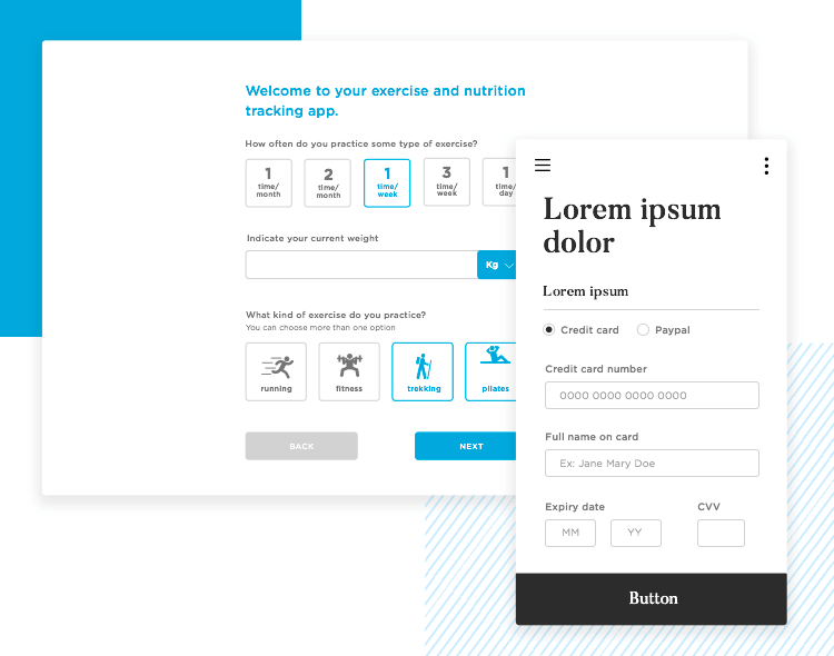
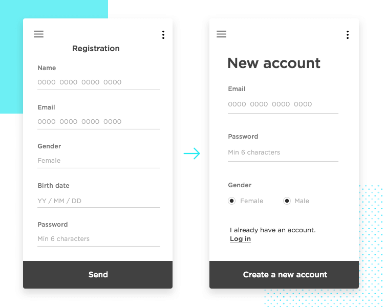
You have the form wireframe and a clear idea of what needs to be in there, and where. After the wireframe, comes the time to think about the details of your design – and to open up your favorite prototyping tool.
Work your way up from wireframe to high-fidelity prototype – now is the time to consider the looks, interactions, and everything related to your form design. Just like wireframing your form will force you to focus on creating a solid structure, prototyping forms will make you build on that structure.
This, in turn, will make you turn your attention to the more visual and behavioral part of your form design. And so, let’s take a closer look at what you should pay special attention to when prototyping forms.
This can include most of the classic guidelines of form design. Visual cues like field focus are important because they help the user stay focused on the field in question and lower the chances of confused users. You want to include every possible bit of context, so that users can have something to lean on for clarity and guidance.
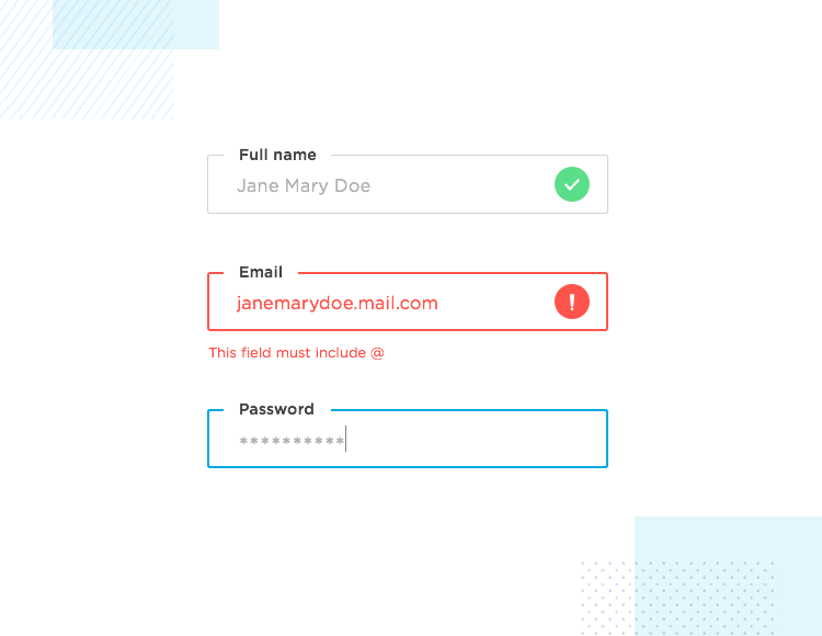
The way your form behaves is crucial – users can’t speak computer, so your form needs to communicate in a visual manner. This applies to everything from field focus to error messages, inline validation and button states.
When prototyping forms, you want to include all the interaction the real form will count on. These interactions are important hints about what is happening in the form – visibility of system status is not something you want to overlook when prototyping forms. Users are already making a cognitive effort in completing the form. Don’t make them wonder if that button is working!
We’re all grateful when roads have simple and visible signs, aren’t we? Especially in unfamiliar places. You can (and should) apply that same concept when prototyping forms. People are likely to be filling out the form for the first time, and will be largely in unfamiliar territory.
The way you can help users is to offer as many road signs as possible. Take a good look at your form prototype and try to think of any gaps in instructions or failures to explicitly direct users. Here are some elements that can help you achieve a smooth and stress-free form design.
Always include placeholders and masks. People write things in their own way, and it’s preferable your form specifies how data needs to be written – masks are common in dates, credit card numbers, and even email field entries. Placeholders can be used in all text field entries for added clarity.

Have descriptive copy. The written text of your form is a key piece of giving information to the user. The copy of questions, labels, popup windows, and buttons – must be as descriptive as possible.
Ensure inline validation when prototyping forms. There is something deeply upsetting about filling out an entire form and find you can’t submit it due to a small mistake in the second entry field. Inline validation helps users avoid the added stress and frustration by telling them exactly what went wrong as soon as the mistake has been made.
Prototyping forms can go further than the actual form. In terms of usability, users tend to appreciate a confirmation that things have gone smoothly and the goal has been achieved. Frequently, designers do this by showing users a success state screen or statement after the form has been completed.
It’s a good idea to consider these post-task screens as a part of the process of prototyping forms. They may not necessarily be the same thing, but they work together to get data from users while still offering a good experience.
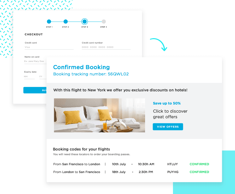
Some designers make a connection between the form and a landing page that serves the dual purpose of giving a success statement and an additional one. That additional purpose can be cross-selling, content promotion or something unrelated to the form itself – you already have the user’s attention… you might as well!
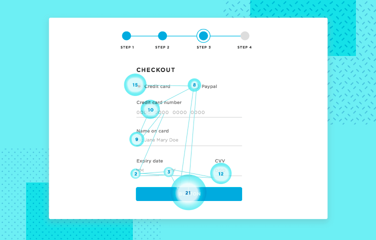
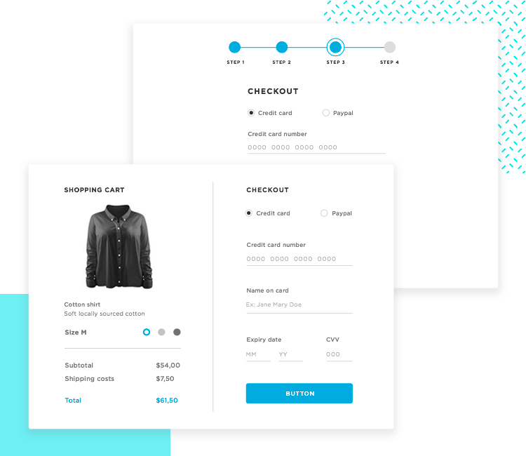
Right. Prototyping forms is the step before actual testing is carried out. Your high-fidelity form prototype is the tangible manifestation of your ideas, and now is the time to put those ideas to the test. Literally.
Testing form prototypes differs only slightly from testing other web products. You want to make sure you observe and notice as much detail of people’s reaction – don’t just notice they look confused. Take notice of what they were doing when confusion hit and how they tried to work around the issue.
Here in Justinmind, we’re firm believers of qualitative testing. And by that, we mean that when carrying out user testing of any kind, you need to have the main metrics at hand. These metrics work as an indicator of how close or how far your form prototype is from being ready.
Define what is most important in your form. After all, how can you tell your form is good enough to be released into the virtual wild? What kind of things should you be paying close attention to?

Frequently, UX designers will notice the time it takes for users to complete the form as a key sign of its complexity. Other teams look to heat maps to see if any of the questions needed clarification, or the number of tries users needed to successfully fill in individual fields.
Example: If users need a few tries to get a date field in the right format, maybe it’s time to consider adding a mask or placeholder text to guide users.
Your metrics are likely to vary depending on what kind of form you’re prototyping, as longer and more complex forms tend to have several metrics that evaluate each page, screen, or section of the form prototype.
Now that you’re established what you and your team care about when it comes to form prototype testing, you need to set the bar of what is acceptable and what isn’t.
This will mean that from your key metrics, you need set a certain standard that marks the minimum usability needed for a good form. And so, if you found that time to completion is the single most important metric for your form prototype, you need to establish the maximum time users can take.
You need these standards to work as a line on the sand. After prototyping your form and getting that prototype to real users, these standards will be the benchmark that will tell if your current design succeeded or failed.
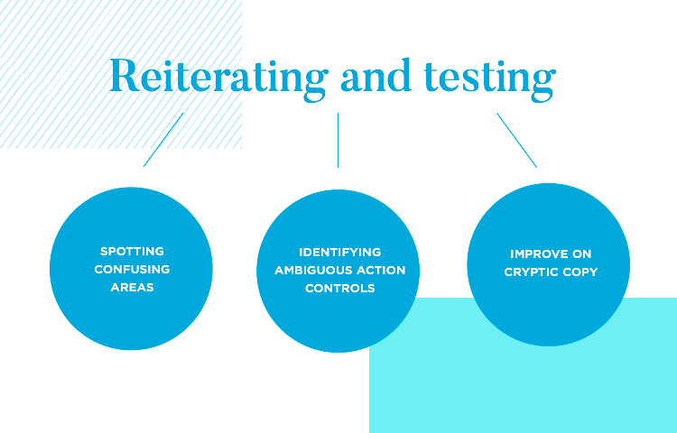
If you compare your form prototype’s performance against the set standards and it falls short, don’t fret. Spotting areas that are confusing, identifying ambiguous action controls or improving on cryptic copy is worth the trouble of reiterating and testing the prototype again! You’ll be saving time, effort and a considerable amount of cash by fixing these issues now.
By iterating on your design several times after each user testing of the form prototype, you identify and dispose of problematic areas – resulting in a more efficient use of your funds and generally happier users! It’s all about understanding user feedback and modifying the design accordingly.
Prototyping forms is the moment of truth. That’s when you’ll come face-to-face with the ideas that seemed great in your head. But are they ideas that users can enjoy? Do they result in a form prototype that helps users get to where they want to go?
Prototyping helps UX designers gain more perspective on the form, communicate their ideas and to validate the work done so far. Each new change made to the form prototype means you’re a step closer to a top-quality product – assuming you have a solid base of data from user testing.
Prototyping forms and testing those forms are the two roads that lead to success. Most shortcuts are dangerous routes that take the user on a slippery slope of unclear copy, confusing questions and overall frustration. Ignore prototyping and properly testing your form at your own peril!