
A website redesign project can be really hard work. Here are five examples of excellent web redesigns.
Your website is probably the most important marketing and sales tool you have. It’s too important to leave with a stagnant design for 5 years or more. In this article, we look at some recent website redesigns we liked, and we consider what to take into account when redesigning your website with your go-to prototyping tool.
Design new websites today. Enjoy unlimited projects!

There are those who argue that rather than redesign your website, you should think about realigning it to your business strategy. On the surface, it’s sound advice: there’s absolutely no point in changing your website unless its alignment to your business is your primary aim.
In other words, when we talk about website redesign, we factor in prototyping and realignment with business and marketing goals as a vital part of the process. All successful website redesigns include a degree of realignment. After all, that’s how we work here at Justinmind.
The most important thing to remember before you start out on your website redesign project is to have a clear plan in place. Ask yourself:
- What do we want to achieve with a redesign?
- What are the business and marketing goals we’re hoping to meet?
- Who is our target user?
- How can we improve their experience on our website?
And don’t forget to check out our article about how to survive the website redesign process.
We’ve picked 5 websites that have undergone recent redesign processes. We’ll take a look at how they were before the redesign and how they look now.
Online transcriptions and captions service, Rev.com went for a complete redesign for a more modern, professional look.

The old look was a little outdated. The main UI element was a central carousel with three cards illustrating the company’s three value propositions: speed, quality and service. The cards used 50s style retro graphics to illustrate each claim, though arguably the rocket ship and the telephone worked better than the quality dial.
Above the carousel, a menu bar linked to the company’s main services (nested in the Services tab), and these services were linked to individually with more retro graphics, and some basic pricing info, below the carousel. Each service included a large call to action link. Below the fold, the page listed customer testimonials and then full service descriptions in structured if monotonous text boxes.

Carousels are inherently problematic. Users often skip past them, failing to notice that they are navigable elements. It’s generally better to go for a simple, clear value proposition, without any navigation elements getting in the way. For interactions with content, the latest trends are more towards animations, parallax and micro-interactions, rather than the outdated carousel.
Graphical elements, meanwhile, are more subjective. Current trends point away from 50s retro and more towards natural, organic shapes, large, striking hero images and video headers.
The new incarnation of Rev.com ditches the carousel and the retro graphics in exchange for a modern, clean look. The page leads with a simple, bold value proposition, and jumps straight into three service cards, each with a brief explanation, simple pricing info and a call to action. Better still, the cards feature modern-looking, colorful, organic shapes and low-key animations which grab the eye and encourage a click on the CTA.

Scrolling down, we see more big changes. After listing out some corporate clients, we have a more in-depth value proposition followed by some nicely formatted service descriptions. Each service is easily identified by color, matching the colors used above. Customer testimonials follow the services, and this time they’re clickable, which adds to credibility.
Overall, the redesign is a huge success from a UX perspective. A lighter, more modern look accompanied by cleaner navigation, clearer value proposition and a great use of color. Even better, redesign project manager Barron Caster wrote about his experiences during the 9-month redesign project and provides some inspirational data: with the new design, Rev.com improved its conversion rate by 18%.
Documentary photo and film agency Panos Pictures completely overhauled its site, changing the look and feel as well as the underlying architecture of the site.

Panos’s previous incarnation was a non-responsive, not-very-mobile friendly site which was heavy on JavaScript and low on navigation options. The homepage consisted of a navigation menu and search box at the top, followed by one large hero image and two or three smaller images, each linking to photo stores.
Hovering over the images brought up a nice info layer, and the user could click through to view more information about the photo story being highlighted. The top navigation was an old-fashioned nested menu but beyond this and the 3-4 photos on the homepage, there was no clear path for users to follow.

The redesigned Panos website includes familiar elements – after all, a photo agency is more or less obliged to go all in with photos. But the way it’s done has changed.
First of all, the Panos site is now fully responsive, so the content and elements resize automatically to fit the user’s display. Gone is the top navigation menu, now hidden behind a hamburger menu button and appearing as a layer when clicked. The only other elements in the top bar are the agency’s unchanged logo and a simple search field.

The main content area is dominated by a single large image, with title and CTA overlaid. Space is handled well, so the hero image ends short of the fold and content lower down the page can peek out, directing the user to scroll down. In this section a filter option triggers an attractive animation effect.
In all, the Panos redesign makes for a better user experience without losing the essence of the brand.
Design new websites today. Enjoy unlimited projects!

Mailchimp’s website game was already strong. The homepage was simple: top menu navigation followed by the super-clear value proposition and CTA, followed by more detailed feature descriptions and a few more CTAs. All this was illustrated with a hero image depicting the look and feel of the tool, in a whimsical home office setting. The page was already responsive and pretty well structured, but that doesn’t mean that it couldn’t be improved.

Mailchimp’s new incarnation looks totally different while remaining somehow familiar. The first thing you notice is the bright yellow, the smart black serif font for the value proposition, and the whimsical animated sketch. Immediately below, we see the first big material change that accompanies the rebranding. A new section drills down into Mailchimp’s four main features, each accompanied by a small sketch illustration.

A nice big block is set aside for a bold customer testimonial and then some space is set aside for tutorials and content marketing articles (nice!). After highlighting some big clients – more hipster than blue-chip, reinforcing Mailchimp’s indie brand experience – the page closes out with another call to action and then a simplified footer.
There’s no question that Mailchimp’s new branding is what you’ll notice first but the underlying UX has undergone a complete renovation too. Brave, bold and well-executed.
Design new websites today. Enjoy unlimited projects!
Customer Experience research platform UserTesting is no stranger when it comes to prototyping and iterating to achieve a better user experience. This year saw the firm redesign its homepage, and bump its brand a little into the bargain.

UserTesting’s homepage was dominated by a three-slide carousel promoting sign-ups for the main user testing service and CTAs pointing to additional services. Apart from the risks inherent to carousels, the second and third slides felt unclear and unlikely to generate the intended leads. What is the Success Kit, anyway?

Under the carousel, and after mentioning some satisfied corporate clients, the UserTesting at a glance section listed out the service’s three main value propositions. This was followed by some big and bold customer testimonials, a link to some case studies and knowledge base articles, then another CTA and the footer.
That’s right, it was all a little jumbled. And while we don’t doubt for a second that this homepage was subjected to regular user testing, we kind of get the impression that a fresh start was needed.
The new UserTesting homepage is a breath of fresh air. The whole page is lighter – even the word count has dropped by 25%. After an improved top navigation, the carousel is dropped in exchange for a smart, professional and inspiring illustration – and more organic shapes – with a bold value proposition and call to action.
The expanded value propositions which appear below the client list are short and snappy, and are illustrated with graphics that change with a slight animation as each is hovered over. More microinteractions are seen in the attractive use cases section.
The customer testimonial that follows is big and bold – definitely a theme – and it’s followed by a few more client logos, which is perhaps laboring the point a little. Next, we see the knowledge base section, rebranded simply as Learn More, before the final CTA and footer navigation.

UserTesting’s redesign is lighter, clearer and more logical. It’s less jumbled, easier to understand and easier on the eye.
Design new websites today. Enjoy unlimited projects!
This hugely popular museum – the Art Institute of Chicago has one of the finest collections in the United States – opted for a usability-boosting redesign. Unsurprisingly, powerful images remain front and center but the changes to the homepage design bring these images to life.

The old version of the AIC’s website was a pretty simple fixed-width deal. At the top, some navigation buttons triggering cascades of semi-opaque drop-down menus, which were usable if not a joy to interact with.
The page was dominated by a huge carousel detailing some of the museum’s exhibitions in six slides. Another problem with carousels: controls can almost disappear if the underlying image matches their color, making for a more confusing user experience. The images in the carousel were certainly strikingly beautiful but white text on a light image with no masking can be tricky to read. Another UX fail.

Below the carousel was a footer navigation menu using quite a small font and squeezing in links to various different pages, the museum’s opening times and some social media profile icons. And that was it.
The new website for the Art Institute of Chicago is much improved in UX terms. Firstly, it’s fully responsive and can now be read comfortably on any device. The top navigation has been simplified to include a handful of clear links without clunky drop-down menus. There’s also a space for temporary announcements.
The carousel has been dropped in exchange for a single hero video, adding movement and life to this primary graphical element. Exhibition info is now presented over an opaque gray layer, vastly improving readability.

Scrolling down, we now see a responsive grid layout with modules for exhibitions and events, highlights from the museum’s collection and items to buy in its shop. This is followed by a lead-generation email sign-up. The footer navigation is much improved, organized into easily understood sections.
The AIC took what was, when it was last redesigned, a very decent website, and applied some much needed updates to usability, readability and SEO. The redesign simultaneously adds to the page’s elegance and protects and boosts the museum’s brand. The museum even put thousands of high-resolution images online, for free. Website redesigns don’t come much better than that. Read more about the museum’s redesign process.
We think that from these examples, it’s pretty easy to see how website UX design trends are evolving. We’re not at all surprised to see that of the three websites that used a carousel as a primary element, none kept the carousel in their new design.
Big, bold images, graphics, and even video make a much better impression on the user. Small animations are increasingly used to add a cheerful note to a page. And responsive design is now a standard applied well beyond the big tech and media companies.
PROTOTYPE · COMMUNICATE · VALIDATE
ALL-IN-ONE PROTOTYPING TOOL FOR WEB AND MOBILE APPS
Related Content
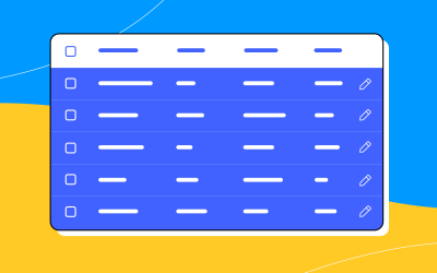 A fun look at different data table designs, from basic lists to smart, interactive ones, based on how complex the data is and what users need.18 min Read
 Single page design v multi-page design – everything you need to help you choose the right design for your site’s content18 min Read
 Website backgrounds can be a powerful tool in creating an experience. But what kind of experience can you convey and how? We got the full run-through for you!14 min Read


