Getting users to complete a sign up form is no easy task. In this post, we take a look at 40+ form examples that did it right.
Forms are tricky territory in user experience design. After all, it’s tough to design something that has users sighing at its mere sight.
People just don’t enjoy filling out forms. The upside of this conundrum is that most designers tend to be problem-solvers —which makes form design an interesting challenge. Designers have to figure out a way to encourage people to fill them out, or risk users abandoning the form halfway.
Start designing web and mobile apps forms with Justinmind. It's free!

Unfortunately, having users not submit the information via the form means two crucial things that never fail to give UX designers the chills: low conversion rates and a broadly failed design. But while there isn’t a one-size-fits-all approach to good form design, having solid examples that managed to hit the nail on the head can’t hurt, right? Let’s open our favorite wireframe tool and dive deep!
We decided to get a few form examples that achieved the tough challenge of offering users a good experience. In this post, you’ll see exactly why these form examples work and what tactics were used to improve the user experience that they offer. Let’s take a look!
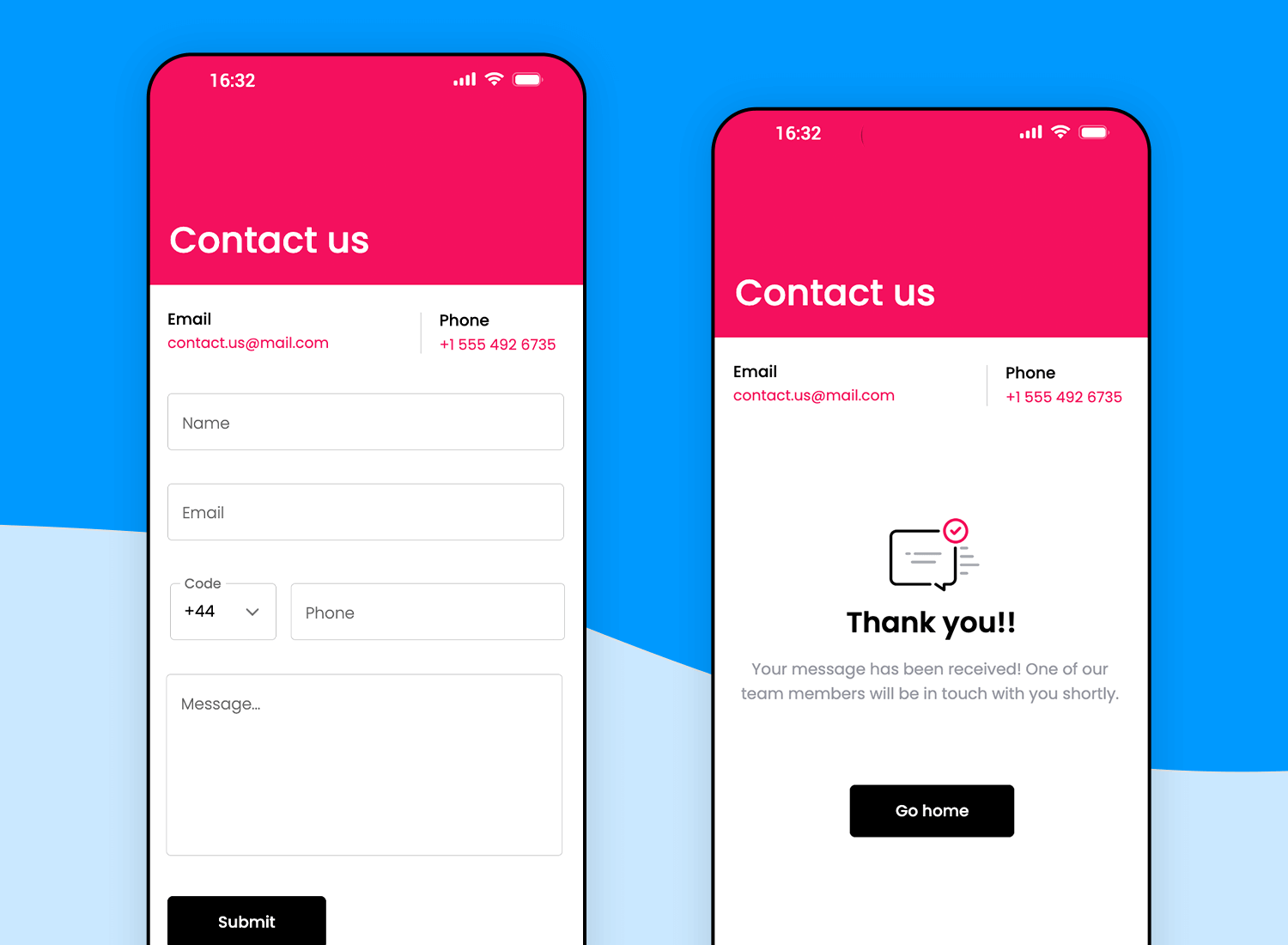
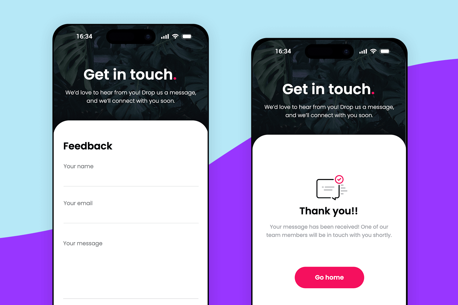
Reaching out feels refreshingly easy with this contact form. Right from the top, the bright design draws you in, and every detail feels thoughtfully laid out. The form keeps things simple and direct – just fill in your name, email, phone, and message, and you’re good to go. There’s even a handy phone code selector, so international users feel just as welcome.
Once submitted, a friendly “Thank you” screen appears, adding a nice touch that lets users know their message is on its way. It’s a perfect example of making contact forms feel warm and user-friendly.
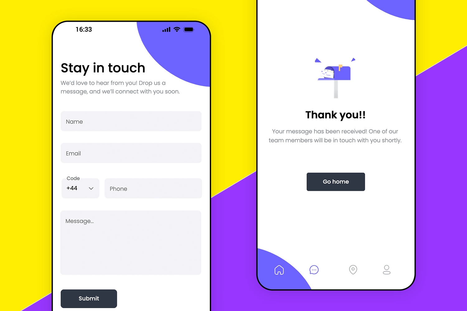
Moving along, this contact form brings a vibrant, playful vibe with its bold colors and clean layout. It invites users to reach out in just a few quick steps, thanks to simple fields for name, email, phone, and message.
The form feels intuitive, with each element spaced just right, ensuring a smooth experience. And once the message is sent, users are met with a friendly confirmation screen, adding a sense of closure and reassurance. It’s a great example of how a form can be both functional and visually engaging.
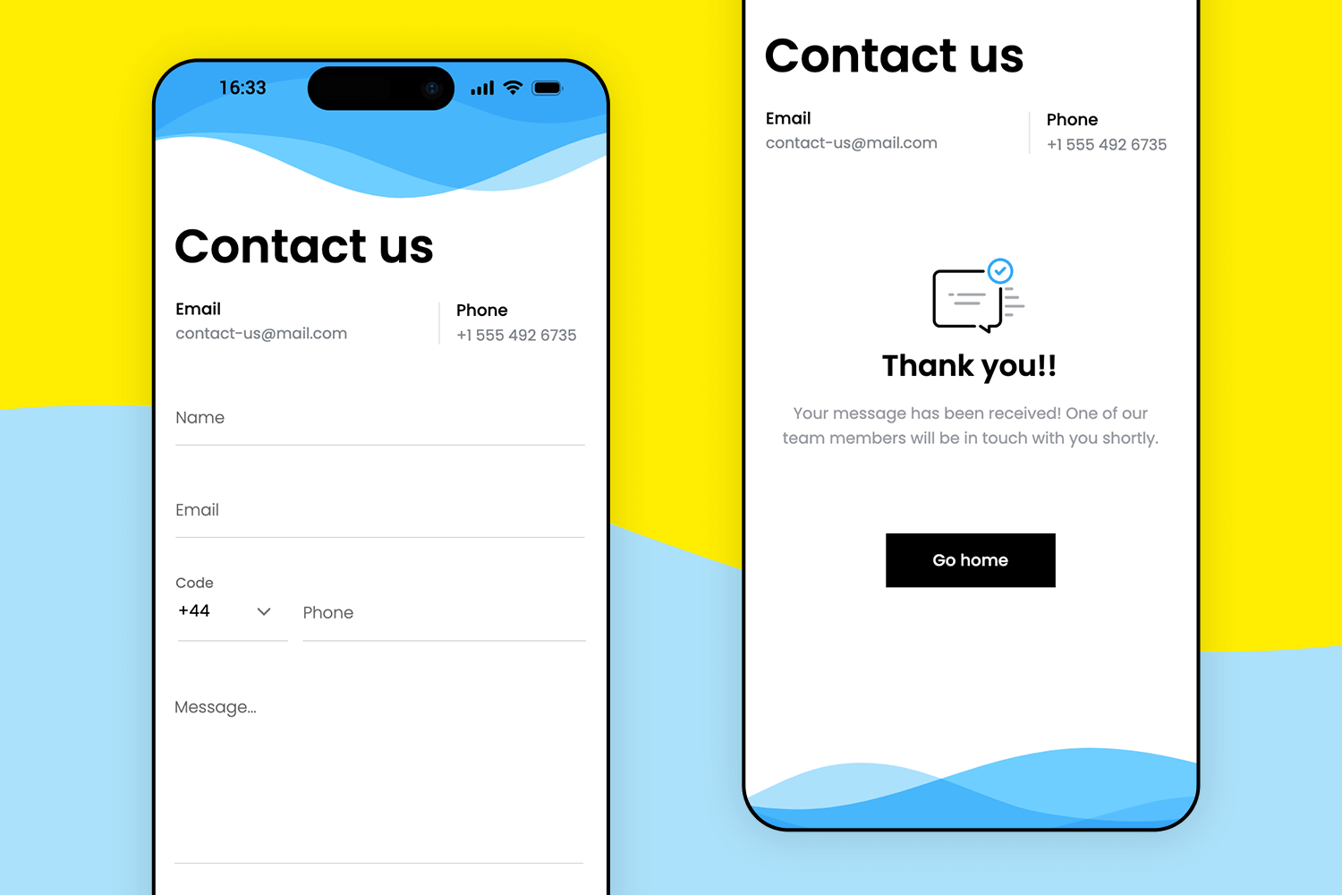
This next contact form example brings a calming vibe with its soft blue wave background, creating an inviting atmosphere for users. The layout is crisp and straightforward, featuring only the essentials and keeping the process smooth and stress-free.
After submitting, users are greeted with a friendly “Thank you” screen, a simple touch that adds warmth and confirms their message was received. This form is all about blending clarity with a touch of personality.
This contact form sets a friendly, approachable tone from the start, with its dark background that gives it a modern, polished look. The form is kept simple, asking only for the essentials, which makes reaching out feel effortless. The bright, inviting button at the bottom adds a pop of color, guiding users naturally toward completing their message.
Overall, it’s designed to make users feel acknowledged and valued, creating a smooth experience that’s easy to engage with and leaves a positive impression.
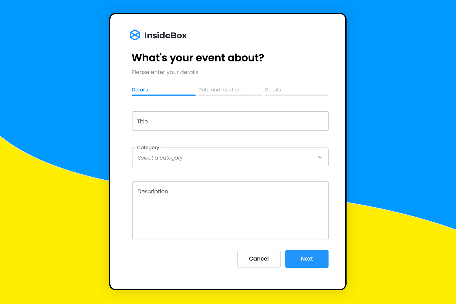
Planning an event with this form example feels effortless. Right from the start, the form breaks things down into easy steps, starting with the basics like title and category. Each section flows naturally, guiding users to focus on one part at a time, so they never feel overwhelmed.
With its clean design and simple prompts, this form is all about making the setup smooth and stress-free, perfect for capturing every detail easily.
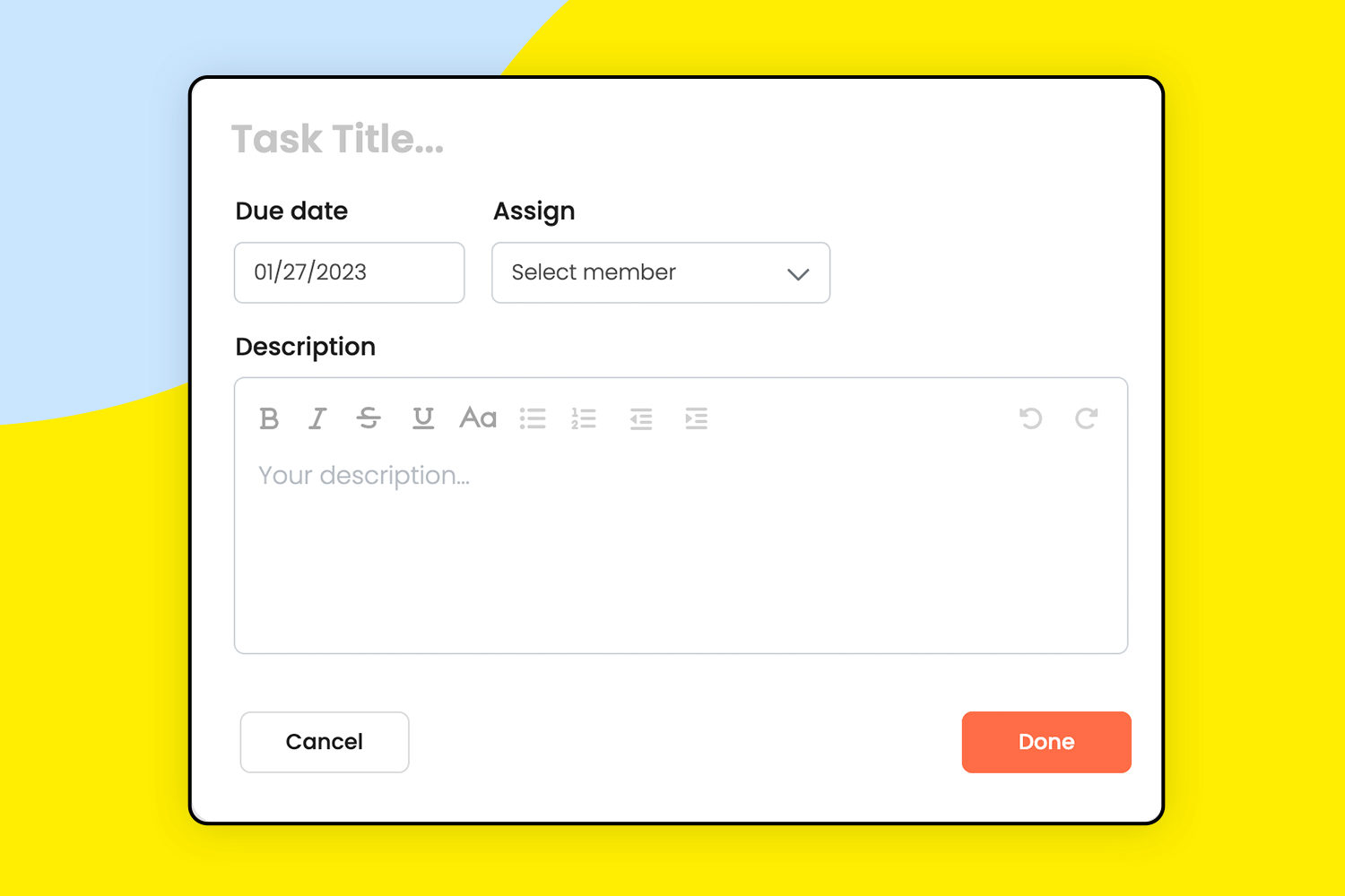
This task assignment form keeps things simple and clear, making collaboration feel seamless. Users can quickly set a due date, add a description, and choose teammates from a dropdown menu, all without any clutter. The form’s design is minimal but functional, with just the right amount of options to get the job done efficiently.
It’s perfect for teams looking to stay organized and assign tasks without any extra steps. The straightforward “done” button at the end adds a nice finishing touch, helping users wrap up the task setup in one click.
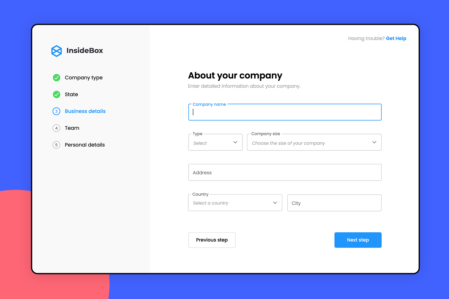
Setting up your company info with this form feels straightforward and smooth. You’re guided through each detail, like company name, type, and location, without any clutter to distract you.
The sidebar tracks your progress, so you always know what’s next. It’s designed to keep everything organized, making the whole process feel quick and easy.
This is an example of contact form that stands out for its clean and simple design, making it easy for users to get in touch. The form has only four entry fields, making sure users aren’t overwhelmed with too many questions. The placeholder text inside each field remains visible, even after clicking, allowing users to double-check what’s needed.
We love the concise microcopy under the message field and the clear “Send Message” button, which makes the process smooth and straightforward. Overall, it’s a great example of how a contact form should be; user-friendly and effective.
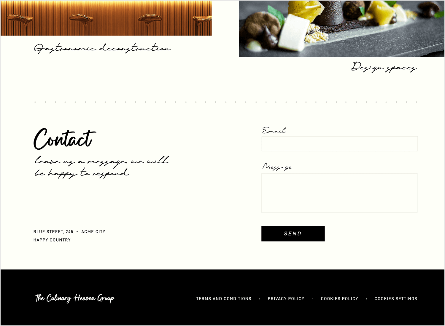
Got something to say? The Culinary Heaven Group makes it super easy to reach out. Just drop your email and message, and you’re all set. The handwritten text adds a warm, friendly feel, almost like you’re leaving a note for a friend. And that bold “SEND” button? You can’t miss it! It’s right there, guiding you through without any fuss. We love how effortless and inviting it feels as proof that sometimes, simple really is best.
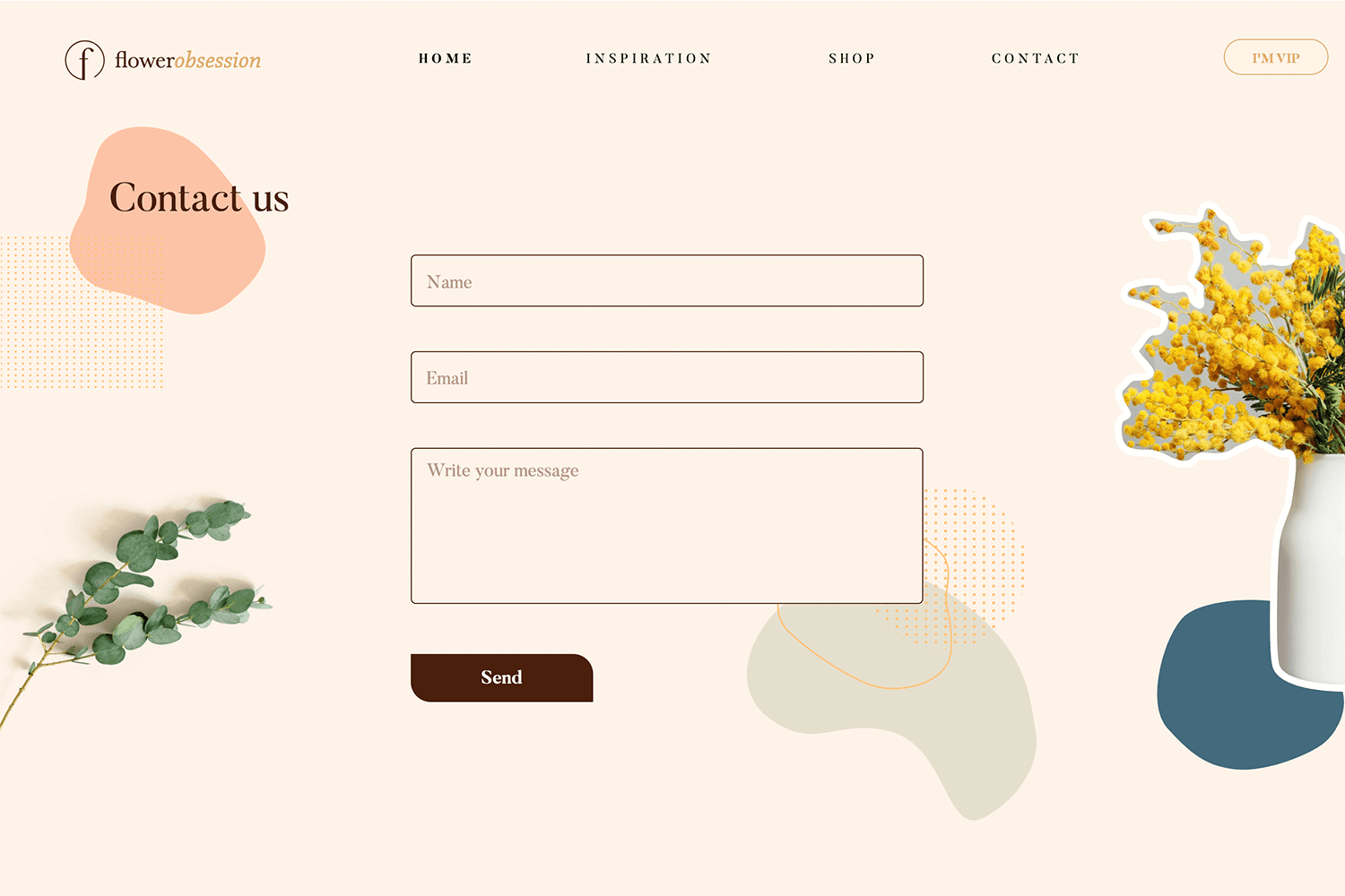
This form UI example from Flower Obsession makes reaching out easy and relaxed. Just three fields: your name, email, and a space for your message. The soft colors and floral touches make it feel calm and welcoming. The “Send” button is clear and right there when you’re done. It’s simple, friendly, and gets the job done.
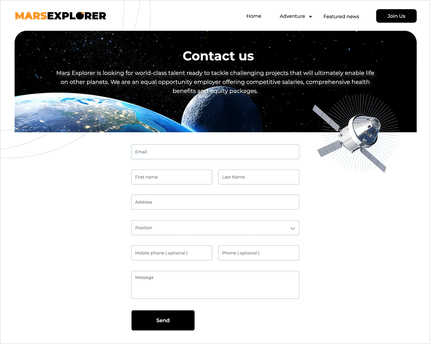
The Mars Explorer form is all about making things clear and straightforward. It’s got all the basics covered – email, name, address, and even a spot to choose your position. Plus, there’s an optional field for your phone if you want to share it.
The space-themed header and imagery make it feel exciting and adventurous, matching the whole Mars vibe! And when you’re done, the “Send” button makes it easy to reach out. Simple, direct, and perfectly fitting for a space mission.
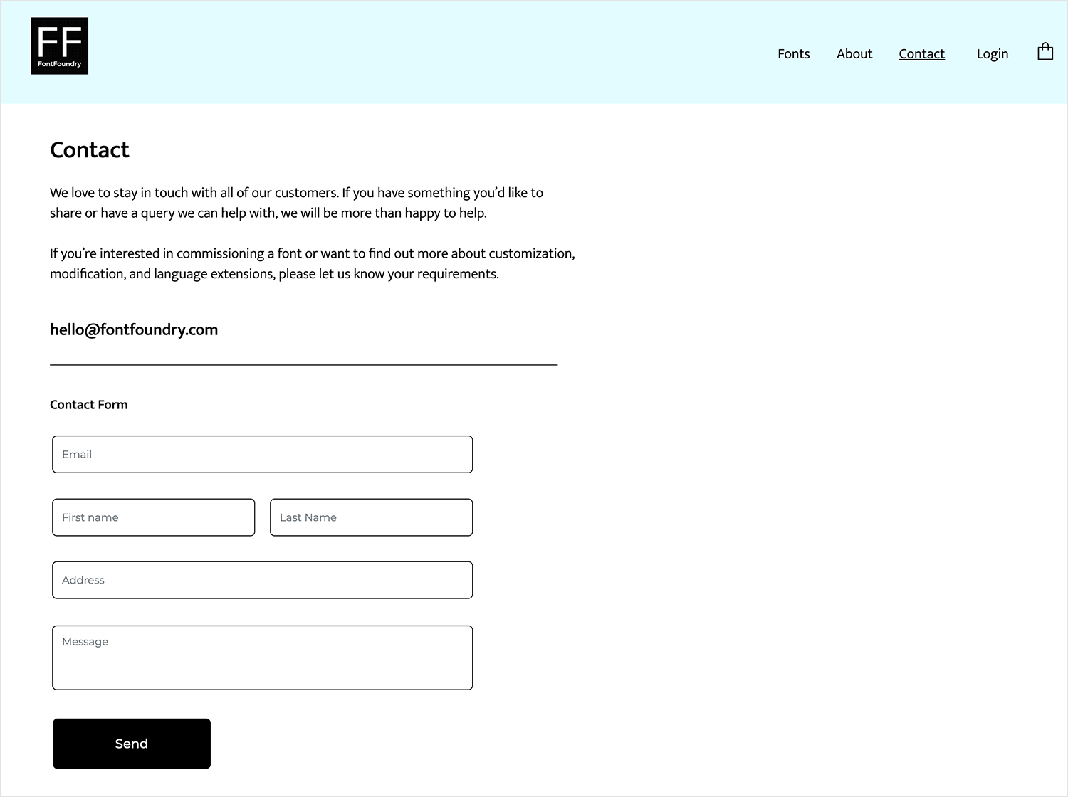
Now we have a form UI example that is very simple but gets the job done nicely. Font Foundry’s contact form kicks off with a warm and inviting message, letting you know they’re eager to hear from you. The form itself asks for just the essentials – your email, name, address, and message – keeping things easy and to the point. Plus, they even offer their direct email if you’d rather contact them that way. It’s a straightforward, no-fuss form that still feels welcoming and professional.
Here’s a checkout form that’s as easy as it gets. Justinmind keeps everything neat and straightforward, with all the details you need right in front of you. You’ve got spots for your card info, billing address, and a clear order summary, so there’s no confusion. The “Pay Now” button is easy to find, making the whole process super smooth. It’s the kind of form that makes paying a breeze.
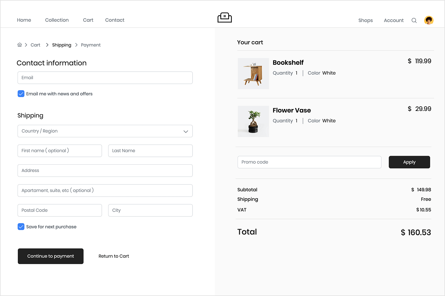
Just like the book checkout form, this one makes the process super smooth and easy too. You simply fill in your contact and shipping details, and you’re good to go. Everything is laid out clearly, so there’s no chance of getting lost.
The cart summary on the right keeps you updated, and the “Continue to payment” button is right there when you’re ready. It’s a simple, clear, and hassle-free way to finish up your purchase.
This UI form example keeps the sign-in process significantly easy. Just enter your email and password, and you’re ready to go. The layout is clear, and there’s even a “Forgot Password” link if you need it. Everything is in the right place, making it quick and easy to sign in without any hassle. It’s a great example of how a sign-in form should be – straightforward and user-friendly.
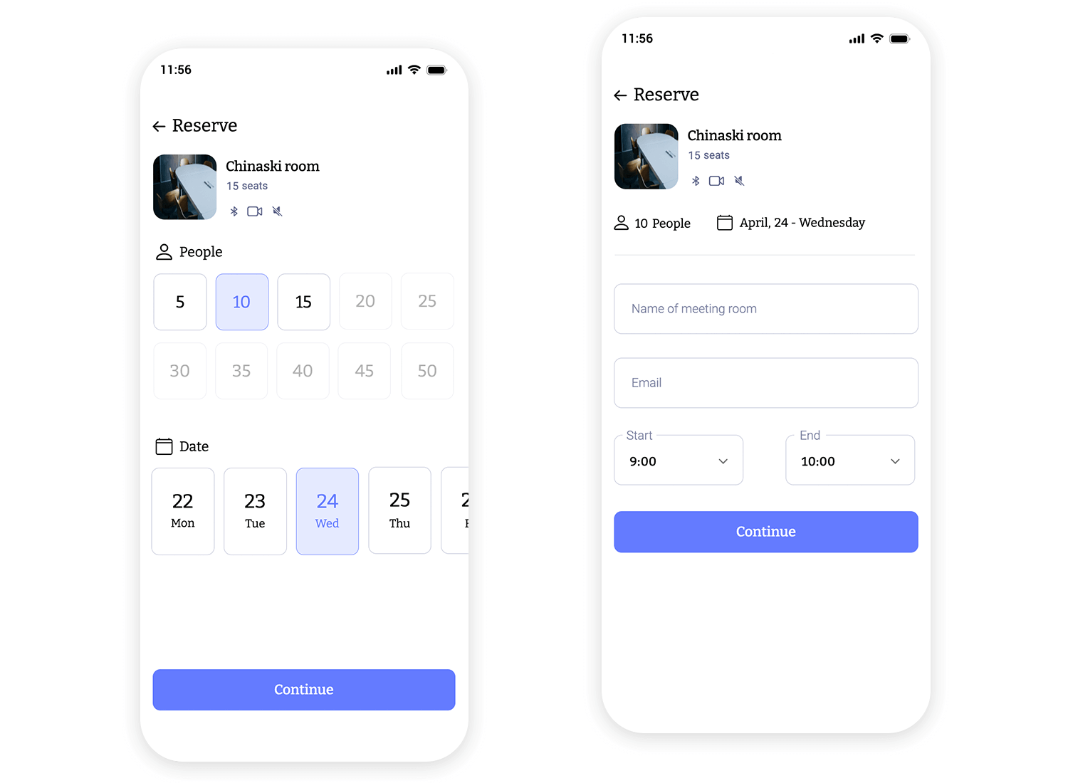
This mobile booking form makes reserving a meeting room super easy. It guides you through entering the room name, your email, and the start and end times for your reservation. The layout is clear and straightforward, with a big “Continue” button that stands out, making the process smooth. It’s a great example of how a booking form should be – quick, simple, and perfect for mobile users.
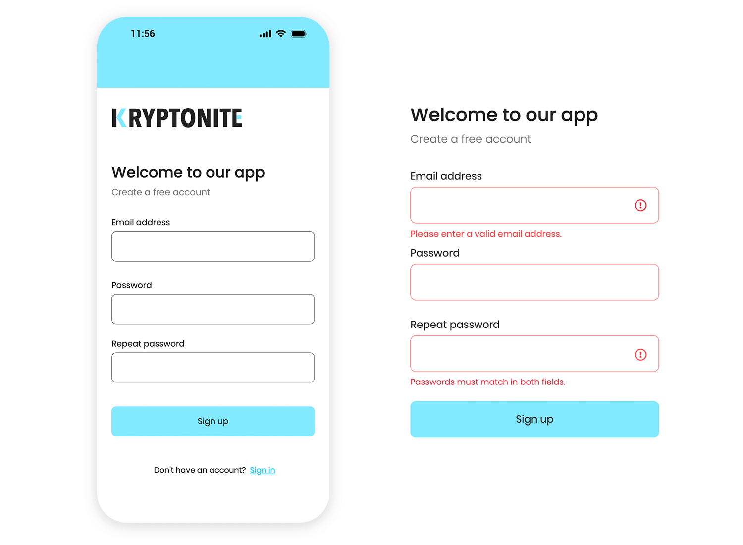
The Kryptonite sign-up form keeps things simple and easy on mobile. It asks for just the basics – your email, password, and a quick confirmation. The layout is clean, and the “Sign up” button is big and easy to tap. There’s also a quick link if you already have an account. It’s a great example of how to make signing up on mobile smooth and straightforward.
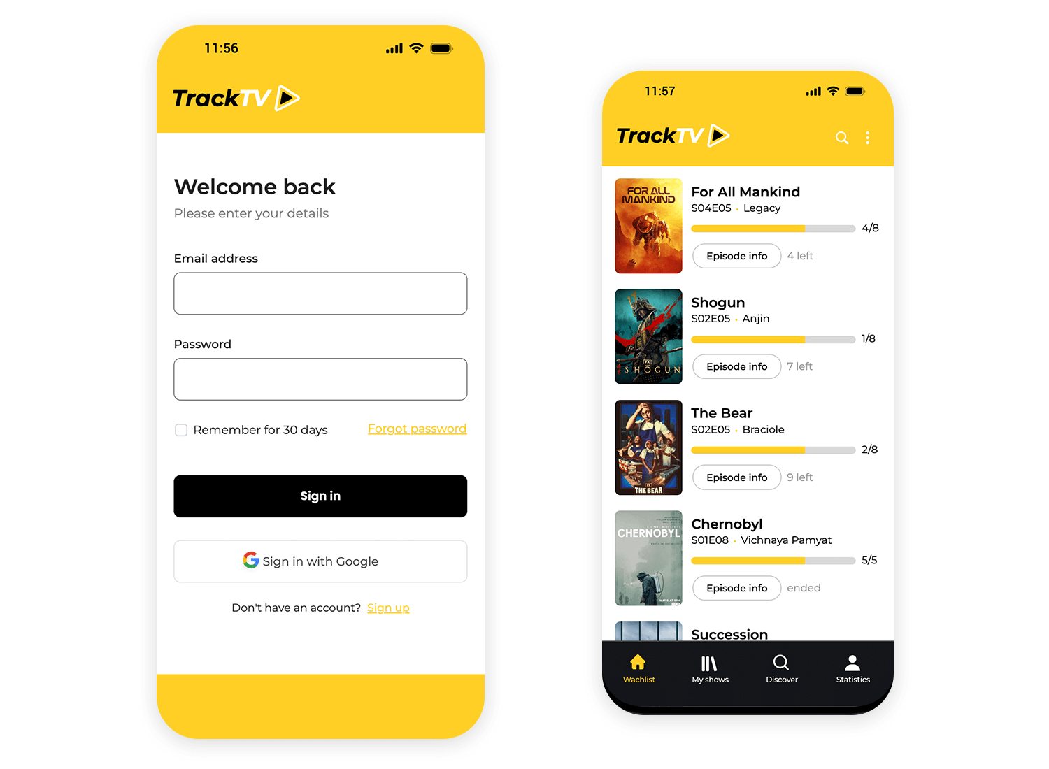
This sign-in form from TrackTV gets straight to the point. You just need to add your email and password, and you’re good to go. The “Remember for 30 days” checkbox is a nice extra, and the “Forgot password” link is right where you need it. The bold “Sign in” button makes it quick to complete the process. It’s all about keeping things simple and user-friendly.
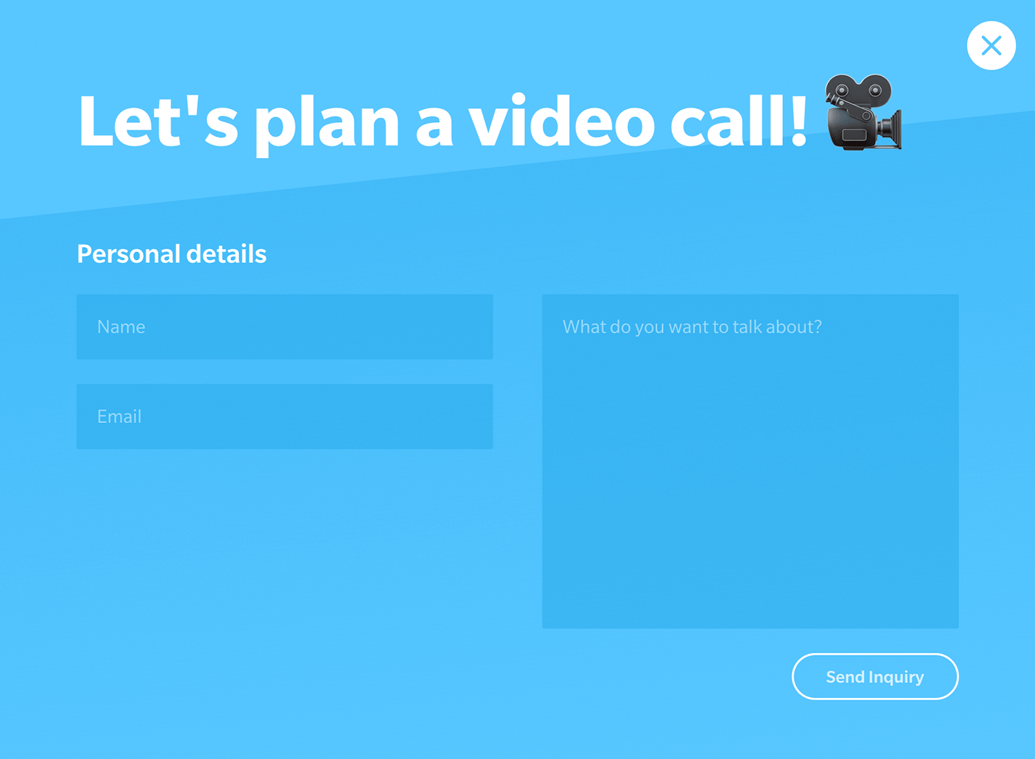
Dutch design studio Yummygum does a wonderful job at keeping their contact form simple and effective while also offering a good experience to users. This is a short form example, with only 4 entry fields and very limited visual elements. As a consequence, there is little distraction from the entry fields – unless you count the witty and light-hearted copy.
We here at Justinmind love that this contact form example has placeholder text that doesn’t disappear once the user clicks the entry field — allowing the user to double check if need be. Under the message field, a single button with descriptive microcopy: “Send inquiry”.
You can also find more inspiration with our list of awesome research survey examples.
Health software Omada Health has done a wonderful job at achieving a functional contact form. This is one of the few form examples on this list that manages to separate data with such ease – while respecting all the form design best practices out there.
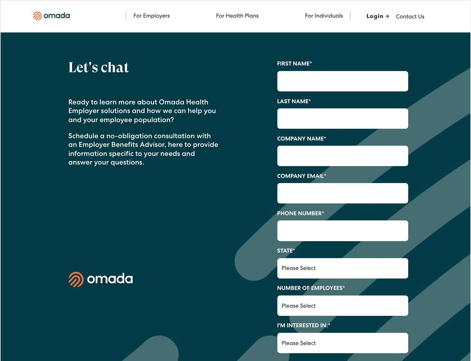
The form counts on labels, placeholders, inline validation, masks and descriptive microcopy. What’s not to love?
This Privy contact us form example hits the UX trifecta of clarity: the form itself is super skimmable. Three clear, concise labels and fields make it obvious what info they need. Plus, the font size is large enough to scan easily, and the text pops off the background for effortless reading.
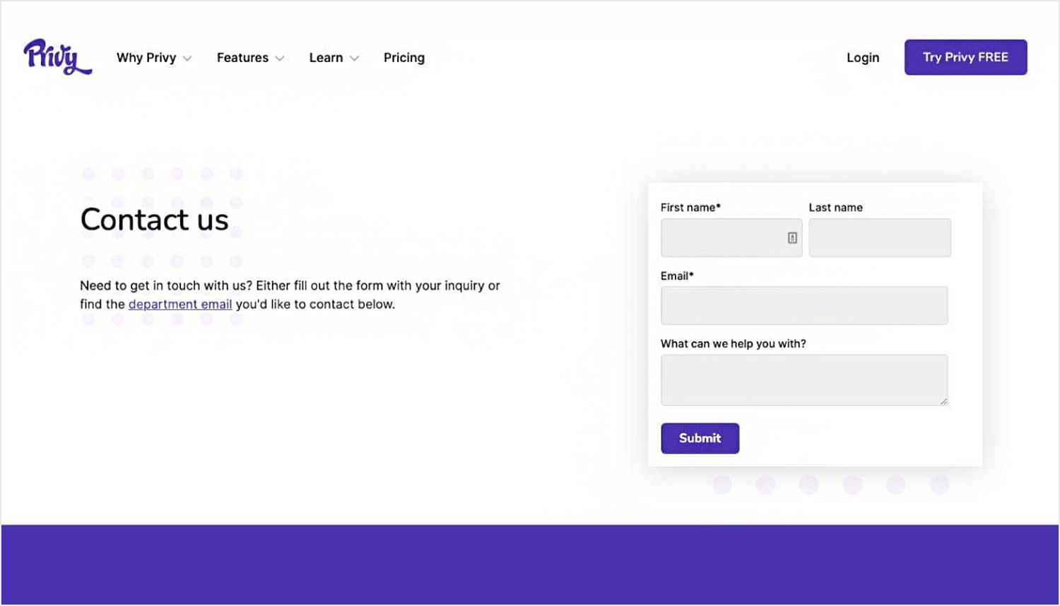
And to top it off, the bright submit button with clear text “Submit” leaves no room for confusion on what to do next. Nice work on the usability basics!
Honeylove’s contact us form example keeps things clean and user-friendly. The form itself is straightforward with clear labels like “Ask us anything.” There’s enough contrast between the text and background for easy reading on any device. The call to action says “Get help” which is clear and actionable.
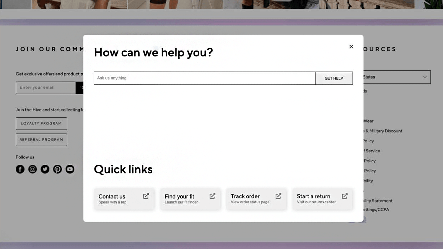
Also, the section with quick links that you can access easily allows users to first scan through previously or frequently asked questions just in case they can find what they are looking for without having to wait for a response from a real person. Overall, it does a good job of guiding users towards getting in touch.
Mika Michalak’s performance review form example for Mozaiq transforms the often-dreaded HR practice into a relatively easy and enjoyable experience. By incorporating emojis to represent different levels of professional conduct, the process becomes less intrusive and more engaging.
The form includes predetermined questions for all employees, with response options ranging from strongly agree to strongly disagree, as well as a neutral option. This approach acknowledges that not everything in life is black or white, providing room for nuanced feedback. We highly recommend this template!
We love this questionnaire form example, brought to you by Diana Medvedieva, for the colors integrated and large buttons and cards that make the text easier to read and the whole experience feel breezy.
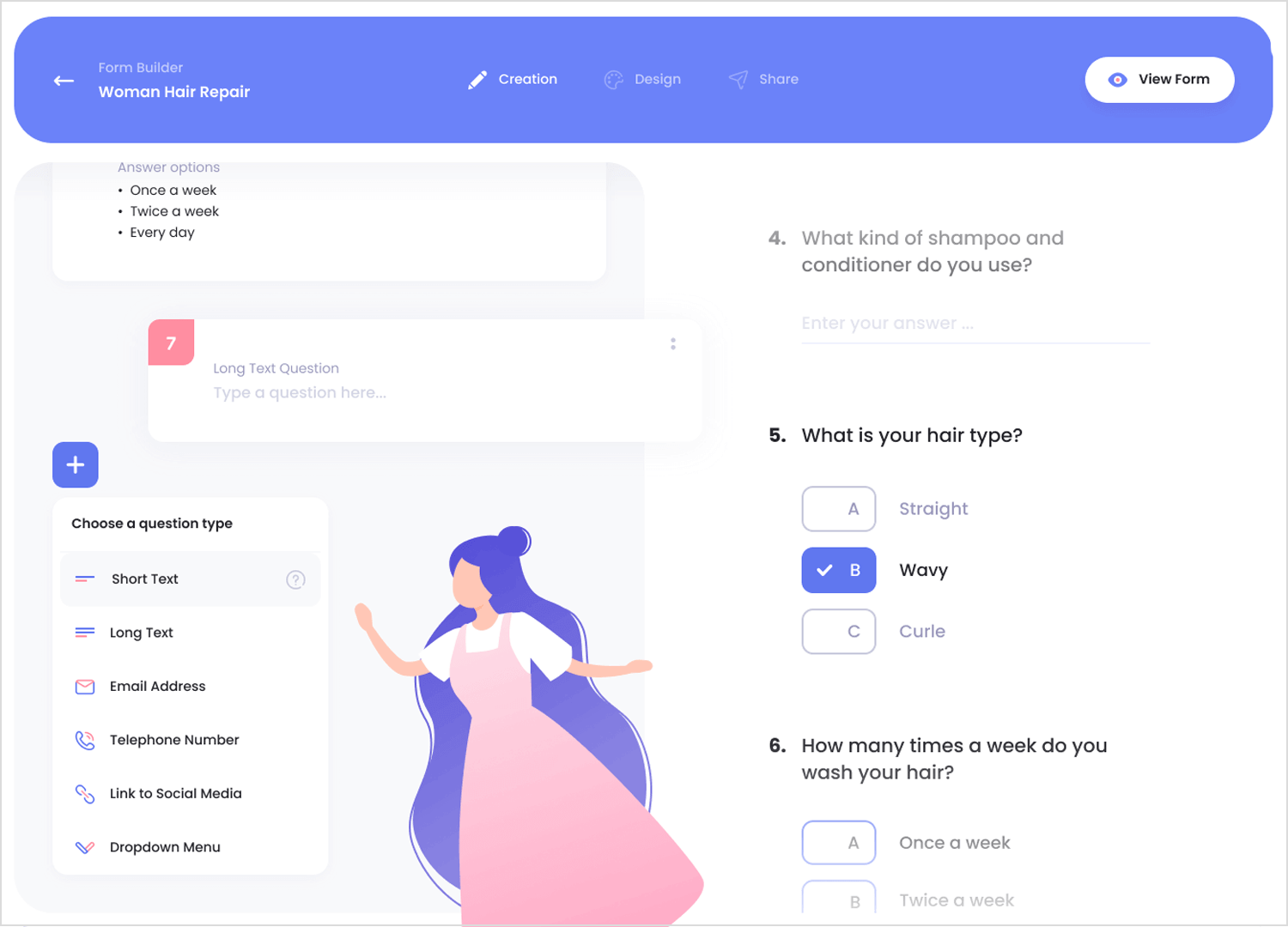
The single-column layout with stacked questions is a great scannable format, and the mix of question types (multiple choice, dropdown, short text) keeps things engaging and efficient.
Spotify Pets, a quirky and delightful feature that uses Spotify’s algorithm to whip up personalized playlists for both you and your furry (or feathery) friend. The UX itself is a tail-wagging masterpiece. Instead of clunky text input, an interactive drag-and-drop slider lets you playfully define your pet’s personality. It’s engaging and removes any friction from the process. Plus, forget clunky progress bars!
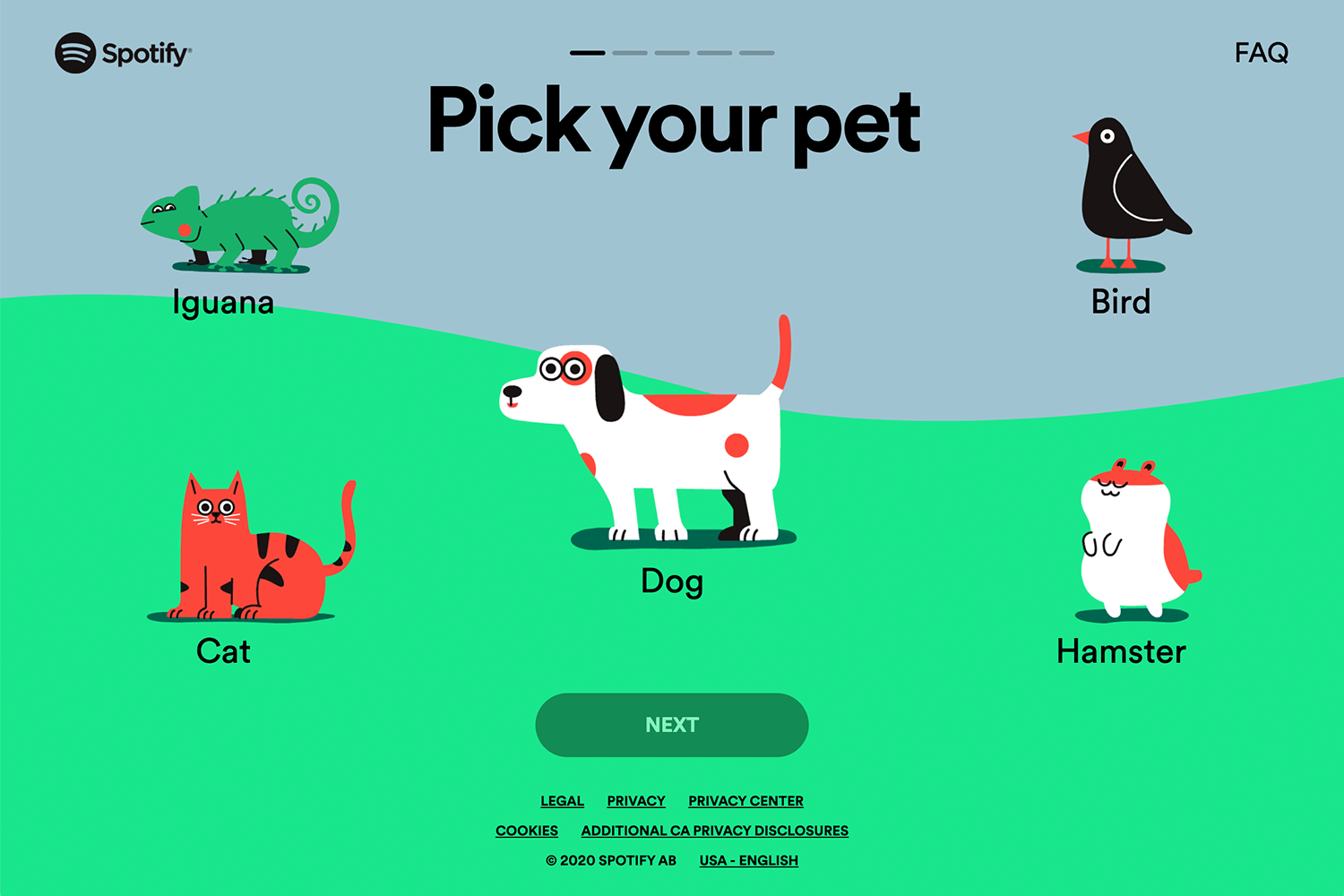
The design seamlessly integrates the progress indicator into the cheerful, illustrated background, keeping the experience smooth and visually appealing. One question per screen ensures a flawless experience on any device. This user-centric approach makes Spotify Pets a joy to use, and it’s sure to leave you and your pet feeling happy and entertained.
Start designing web and mobile apps forms with Justinmind. It's free!

There’s no beating around the bush with this calendar app booking form example. Clear labels like “Bookings” and “Event Types” make it instantly obvious what users are looking at. The table format is a UX classic for a reason — it efficiently displays all the event details we care about: type, date, time, duration, and even participants.
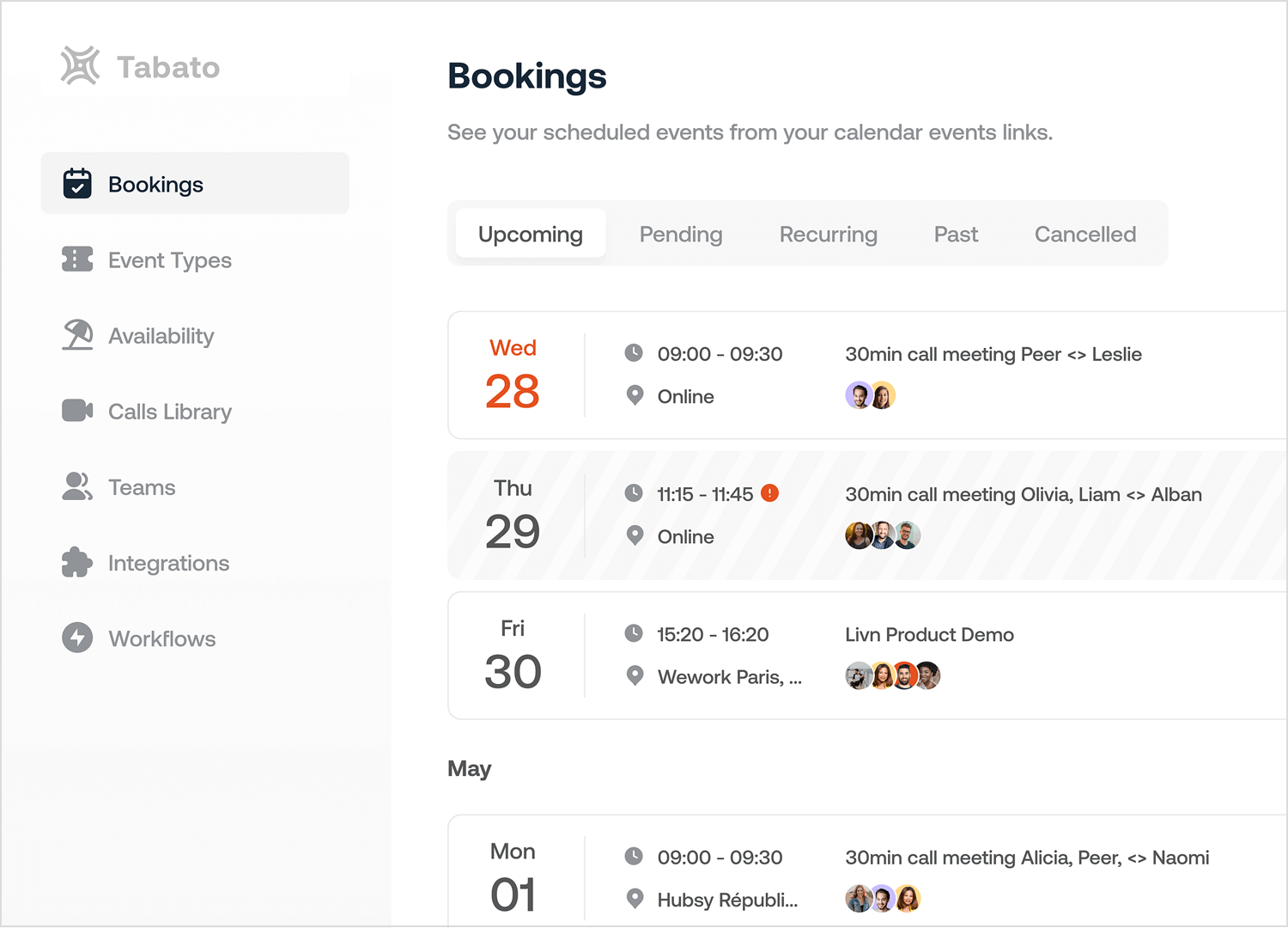
This lets users scan their schedule in a flash. They’ve also added color coding to the mix. Imagine green for confirmed events and yellow for TBDs — a quick visual cue to understand event status at a glance. Overall, a solid foundation for a user-friendly calendar!
This hotel booking form example is designed in a way that is extremely easy for users to navigate. The room selection is nice and concise, showing all the important details like price and description.
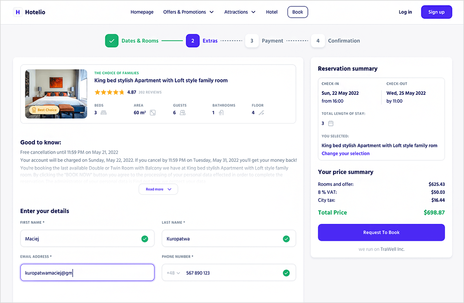
Users can also see the total cost with any extras they add on, which is a big plus for transparency. The “Request To Book” button is clear and doesn’t trick users into thinking they’re instantly confirmed — a good call in our book.
We love the use of space in this form. Its interactiveness works to not only make it more fun but also to break the form up into several steps — which requires less cognitive effort from the user. The use of color adds a pop and contributes to a clear visual identity. A clear well-designed form example!
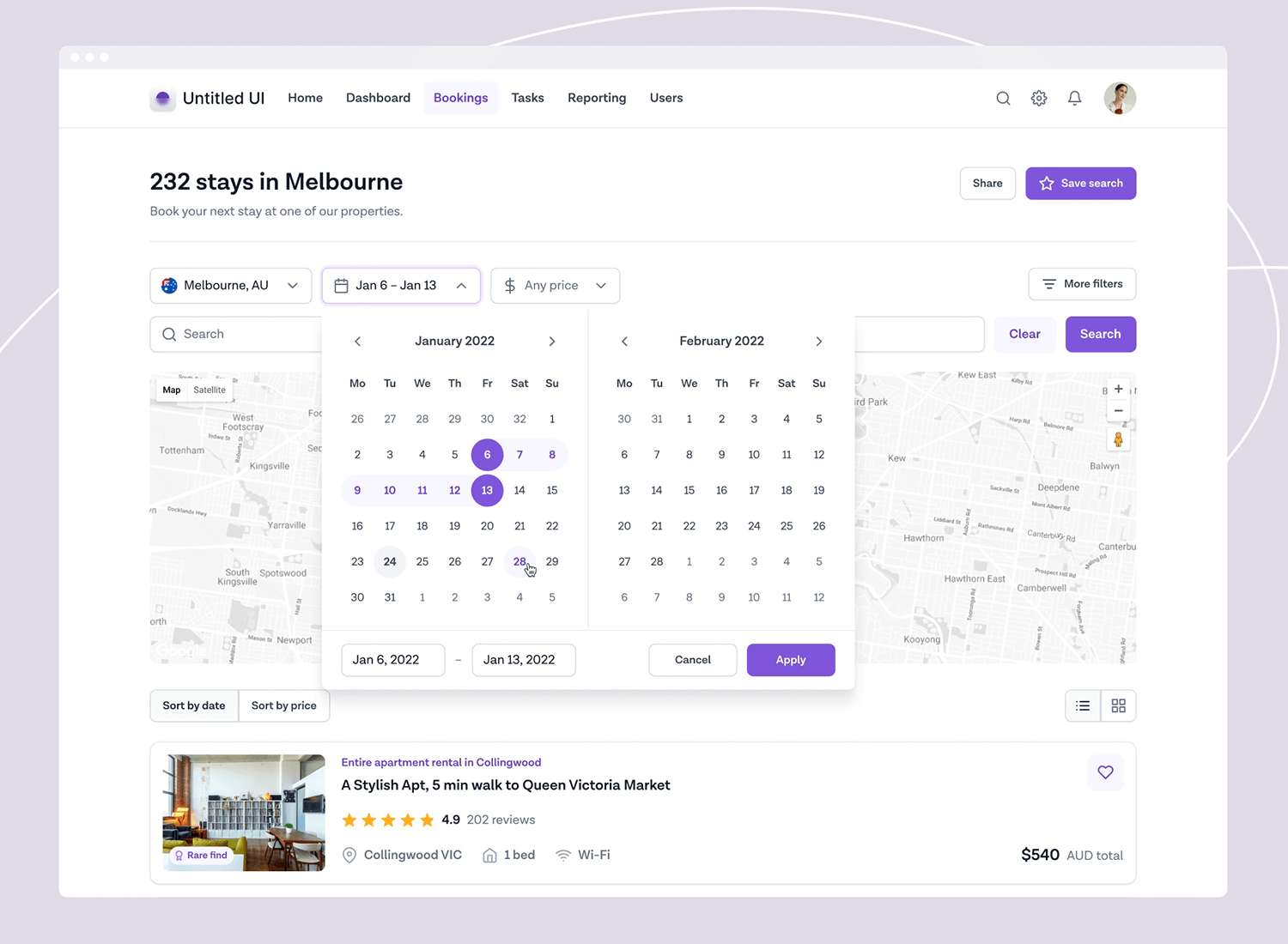
This beauty was made by Jordan Hughes for Milkinside.
This subscription payment form hits some key UX wins, making it one of the best form UI examples online! The three-column layout with clear plan options makes comparing between free, pro, and business accounts fairly easy to do. The hints of purple throughout the design reflect the brand colors adding to an overall homogeneous feel.
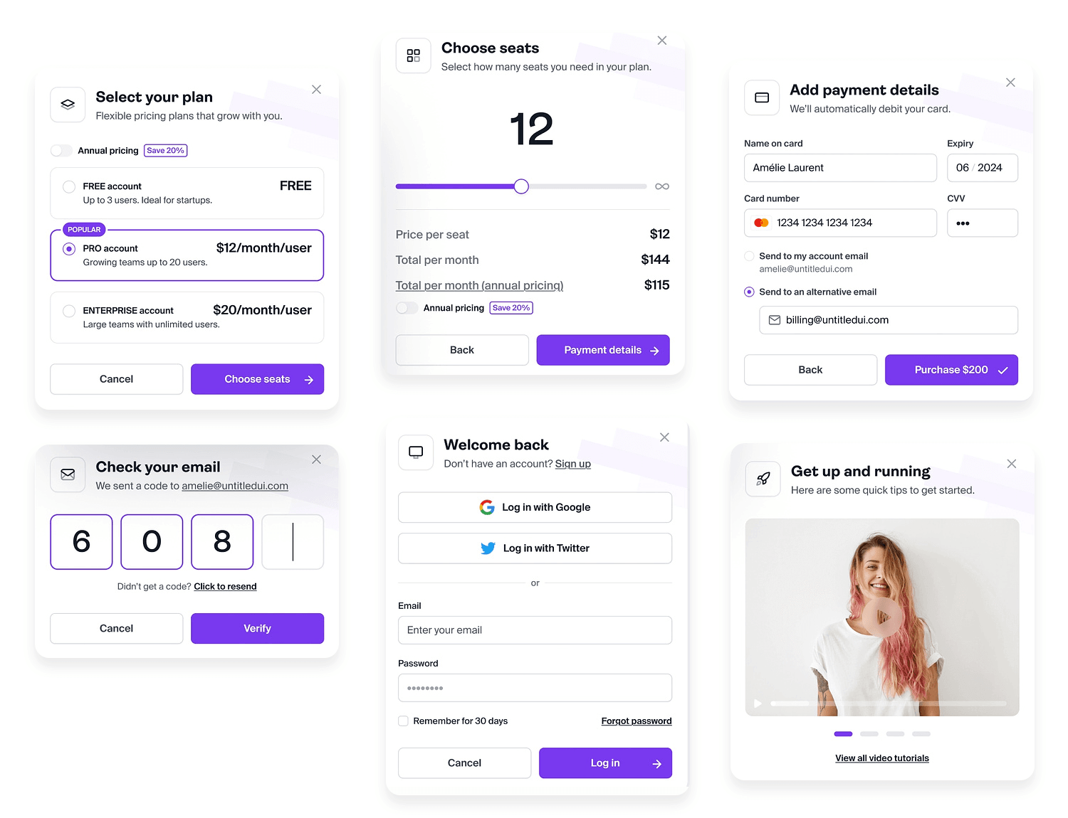
The input fields are clearly labeled to avoid any confusion, and the buttons use strong calls to action such as Purchase and Cancel. This subscription payment form example is an absolute winner in our eyes!
This is the perfect form example of how long forms can be broken up into digestible bits — with the animation adding a certain degree of gamification to the process. We particularly love the progress bar at the bottom and the success state screen. This is a form that users won’t mind filling out.
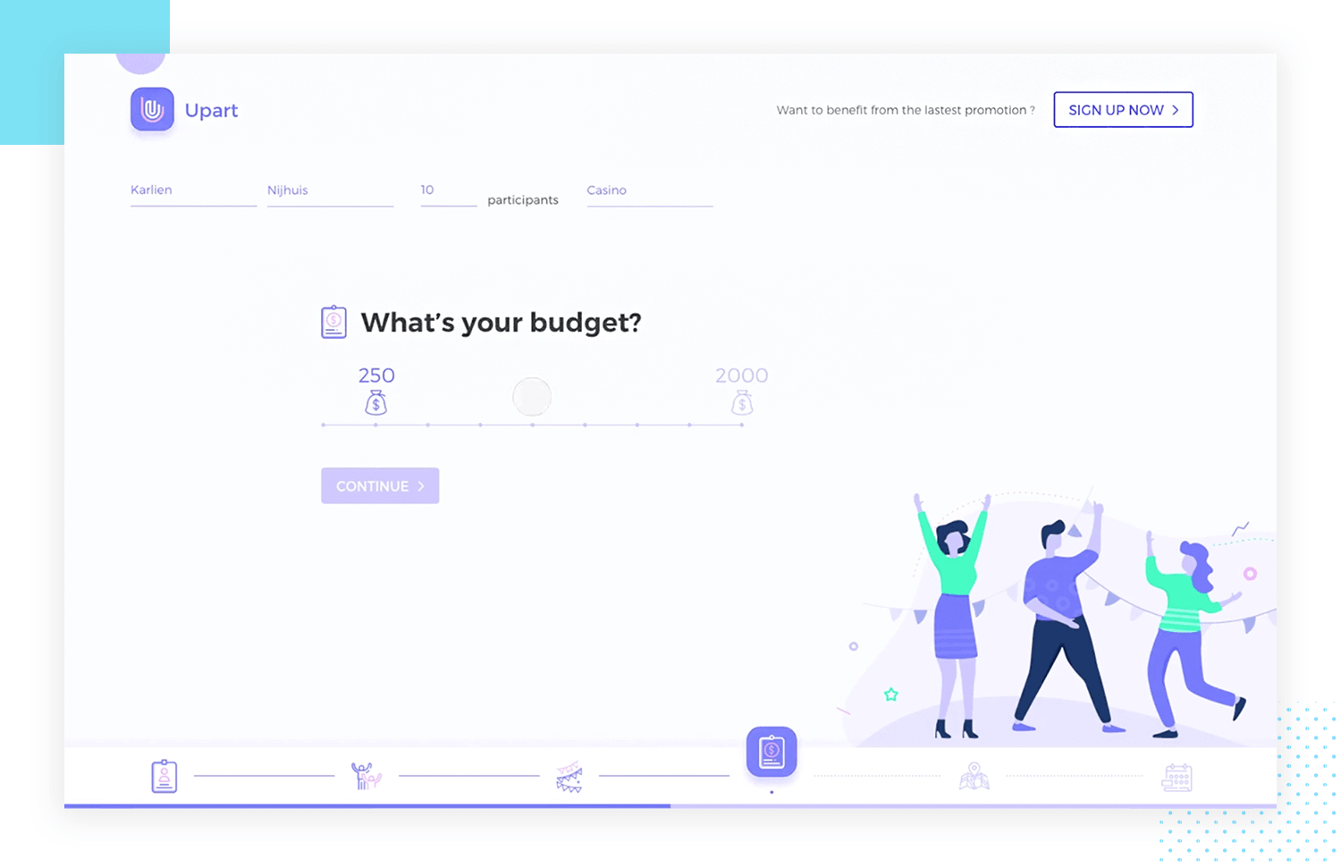
Awesome form example made by Yifan Ding n Dribbble.
This form example is short and sweet — just like users want forms to be. You’ll notice the grouping of input fields and price breakdown, and a well-designed button under it all. We are fans of the descriptive microcopy in that button, in particular.
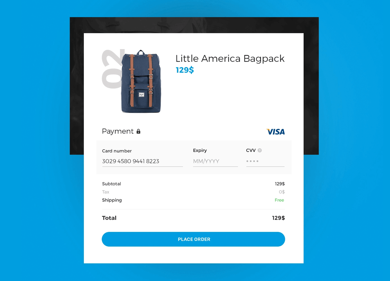
Original design made by Anna Wangler on Dribble.
Minnow‘s login screen prioritizes clean simplicity. Minimal elements keep the focus on the login task itself, a good thing! The background image adds a touch of personality, but it could be a missed opportunity to tease Minnow’s content library. The login form itself is clear with labeled username and password fields, and a straightforward “Sign in” button.
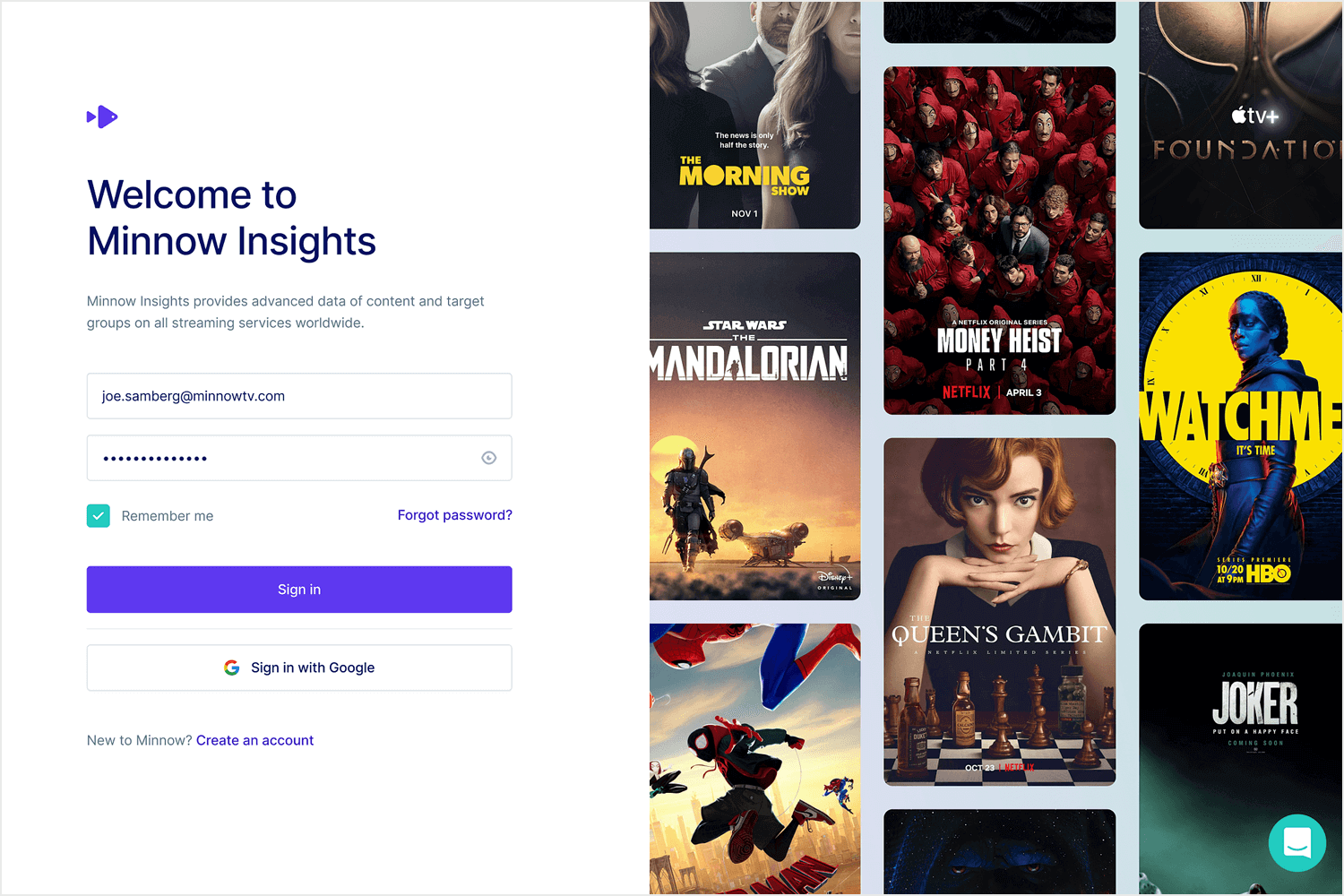
Functionality seems limited though — no options for new accounts, password resets, or social logins. These features could be helpful for new users or forgetful veterans. Social logins with Facebook or Google could streamline things for users with existing accounts. Some tweaks can take this login screen from great to brilliant. Still, this form example is a great place to start!
Dotwork‘s login form strikes a balance between clean and functional! It’s complete with clear labels for username and password, a straightforward “Login” button, and a lifesaver for forgetful users — the “Forgot Password?” link.
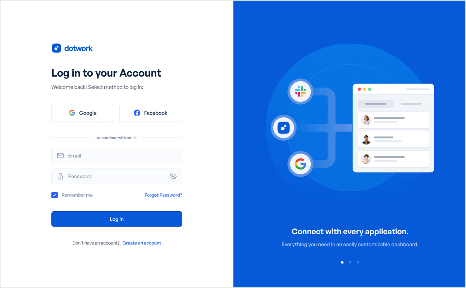
There’s also text provided that explains the functionality of the platform, connecting all your applications and a customizable dashboard. This login form example also features the brand colors throughout the design, that professional cool blue keeps it looking fresh. We adore it!
Snappet is a tablet-based platform that empowers teachers to personalize learning paths for elementary school whizzkids, all while monitoring their progress. The friendly, colorful interface with the image used of a teacher helping a student makes it clear who Snappet’s targeting. Here lies the secret sauce: that picture on the student login form page is an example of emotional genius.

It subtly reminds students of the catered support they will receive while using the platform. Snappet also uses a single, friendly typeface throughout, but with variations in color and size to keep things interesting and create a clear information hierarchy. Kids will clearly have a blast using this platform!
Hotjar doesn’t mess around when it comes to their web design — their website was also featured in our blog post on Testimonial Examples You’ll Want to Copy. This time, it’s their signup form we are drooling over. With only two input fields, there’s nothing in the form to dissuade users. With the subtle but unmistakable field focus telling users exactly where they are.
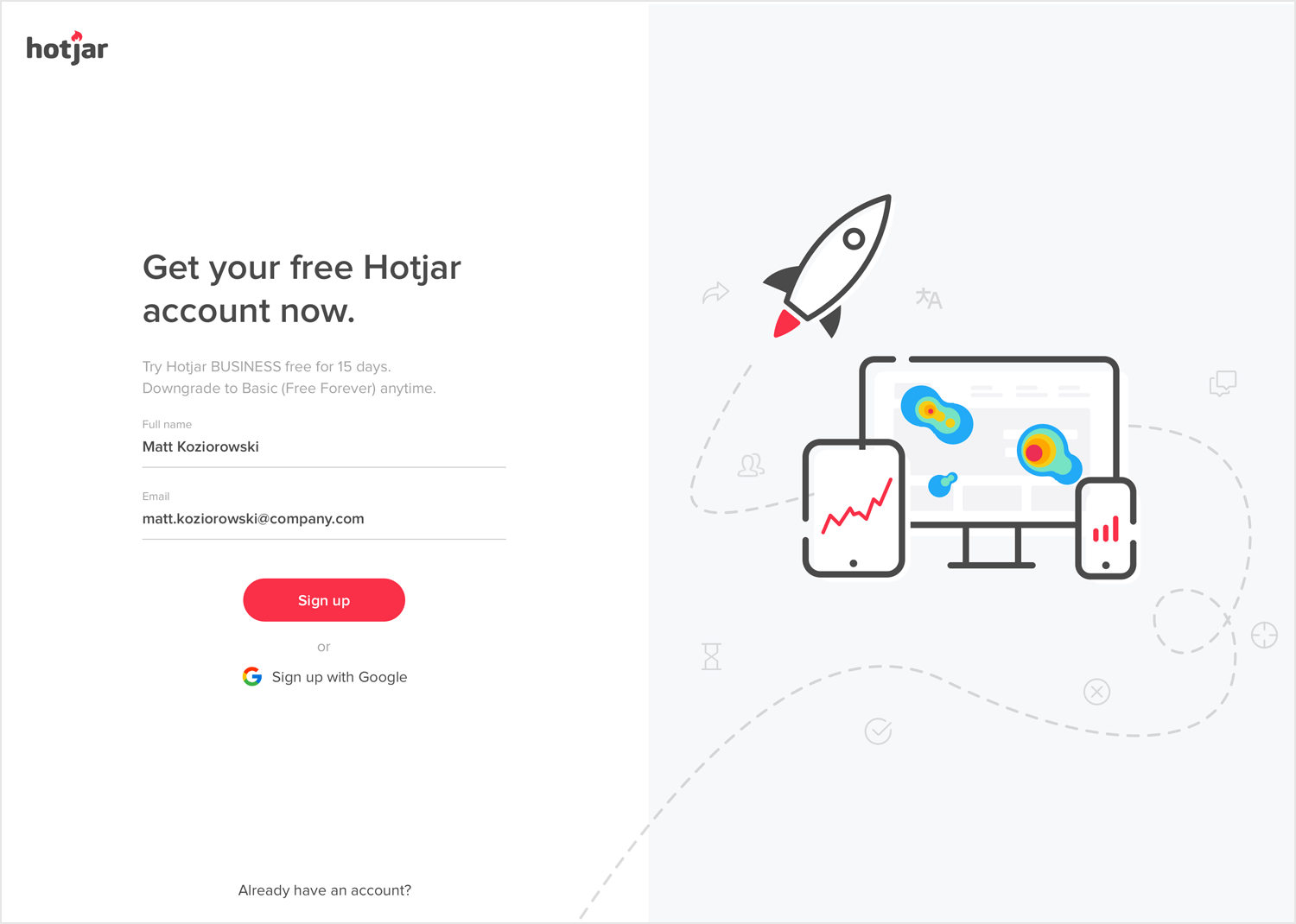
Awesome form by Matt Koziorowski for EL Pasion and Hotjar.
Even though we love short forms, we know that a simple form with two entry fields sometimes is just not suitable. That’s when you gotta give extra importance to context, and try to make the whole process as easy as possible on the user. This form checks all the right boxes, offering placeholders, masks, field focus and descriptive copy.
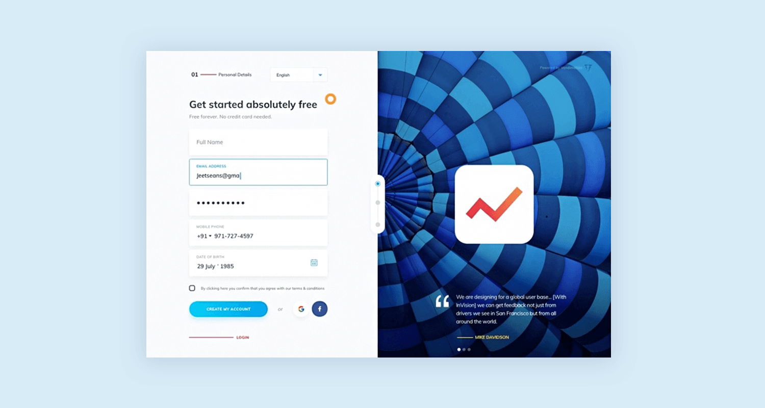
Form example brought to you by Jeet on Dribbble.
This registration form example for an email marketing online workshop aimed at authors hits the mark on clarity. The background image is a nice touch visually, using the brand colors to add some life to the form. The input area itself appears simple and user-friendly, with 3 fields marked clearly and a disclaimer placed right under letting you know how your information will be used. Smart move guys!
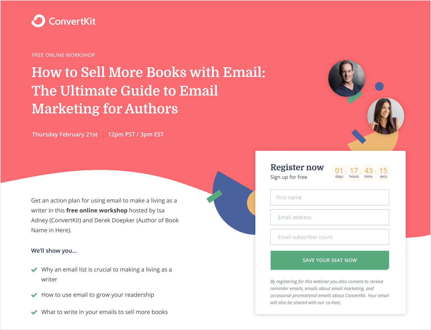
Another UI touch that caught our attention is the countdown to the workshop placed right above the input fields. This could just be included in the copy to the left, but it would have been less effective as users would have to scan the text to get that information. Smart, aesthetically pleasing, and functional. This registration form is a 10/10!
Maulana Farhan put together this registration form for +Medic and included Covid’s vaccination message to all, “Let’s protect yourself and those around you by vaccinating,” which leaves no doubt about the app’s purpose. Get vaccinated. The layout is as clear as its copy, simple, with a single column guiding users through the registration process in 4 steps. The app also uses clear visual hierarchy with bold headings and easy-to-read instructions.
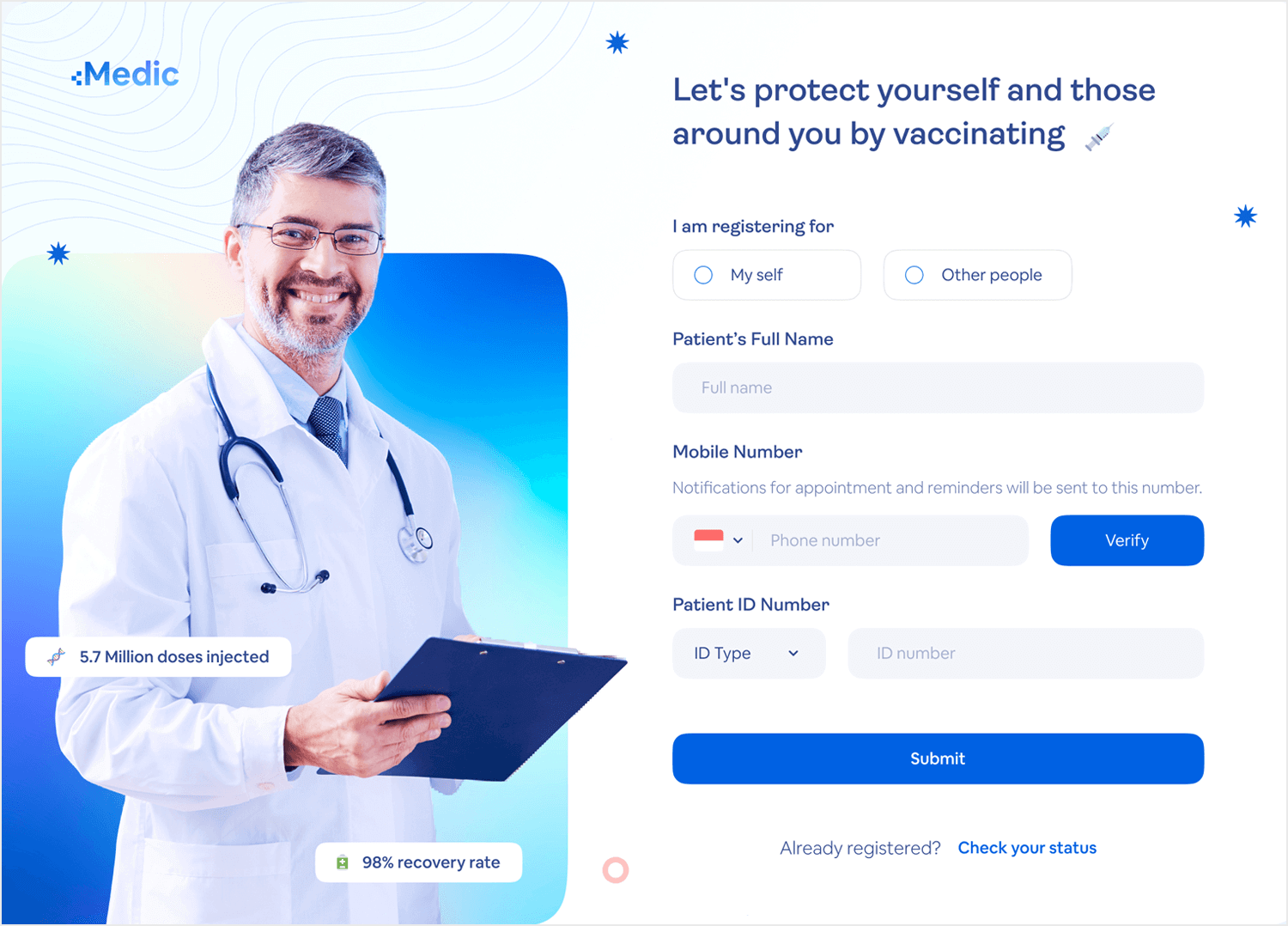
One thing we would change about it though is the over use of imagery that can distract from a meticulous process. You could be reading the statistics placed on top of the doctor and then mindlessly include it in your ID number — these things happen more often than people like to admit! Apart from that one minor detail, we find this form example to be attractive and inviting, despite the gravity of the CTA.
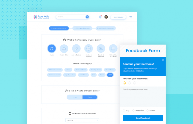
This form example enjoys great use of space! Notice how not only the visuals, but the actual lines group the questions together according to their nature — a nice bit of context all users will appreciate. Even though it’s quite a long form, the user only rarely has to type the answer, making this form easy and quick to fill out. Wonderful!
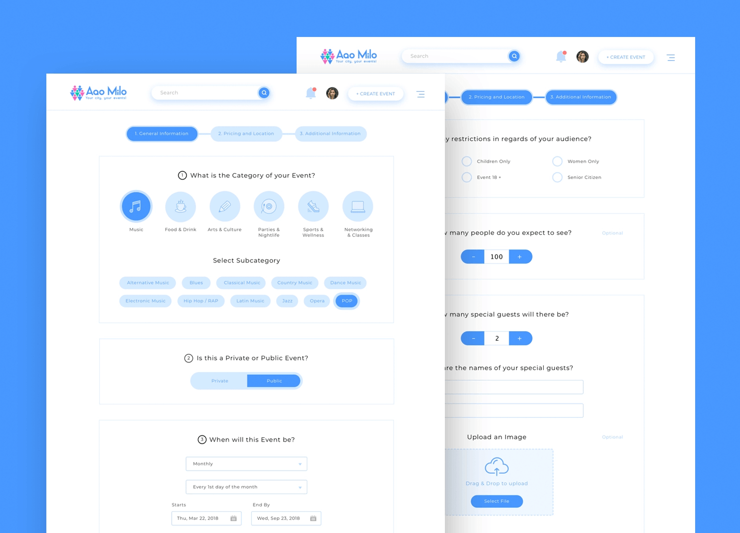
Form design by Olga for Netrix in Aao Milo.
Paperform’s newsletter subscription form is pretty clean and to the point. It uses strong visuals with the bolded text “Stay in the loop” to grab attention. The question below the headline is clear and concise: “Would you like to stay informed on events & news?” which directly addresses the user’s pain point of wanting to stay informed.
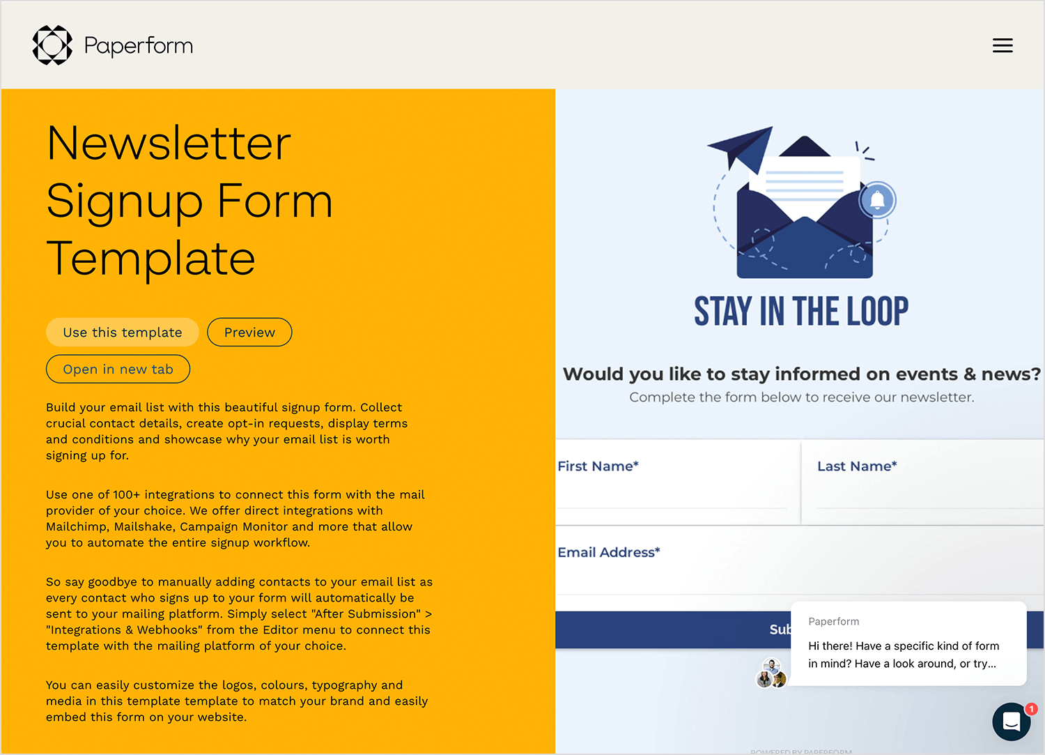
The form is made out of three fields, all labeled with asterisks to mark required fields. The labels are clear and the “Subscribe” button uses a contrasting color and clear action verb, making it easy to understand what happens next. Warm and inviting, this form example is perfect in our opinion!
The Flower signup form example uses a friendly and casual tone to encourage subscriptions. The headline “Join the bunch” is inviting and creates a sense of community. The text below the headline offers a clear benefit: “We’ll give you just the right amount of love!” This lets users know what to expect from the newsletter (presumably positive and interesting content) without being overly promotional.
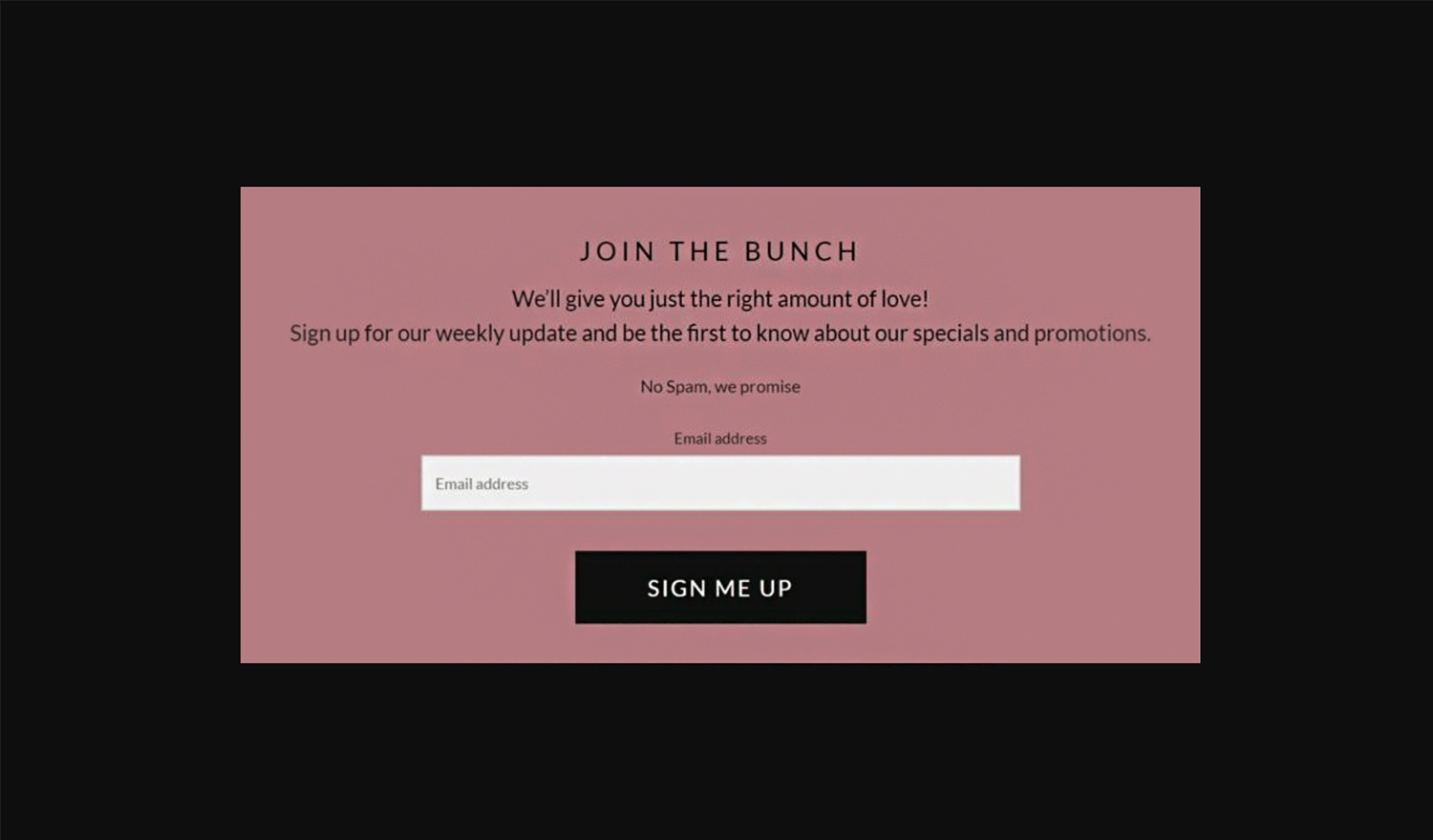
The form itself is very simple, with only one required field (“Email Address”). This minimizes the effort required to subscribe and avoids discouraging users from signing up. The “SIGN ME UP” button uses a strong verb and contrasts well with the background to make it clear what action to take.
Start designing web and mobile apps forms with Justinmind. It's free!

Byelorussian‘s form is one of the best form examples for apps on the internet. The visually appealing image adds a nice touch without being overwhelming, and the overall layout is clean and clutter-free.
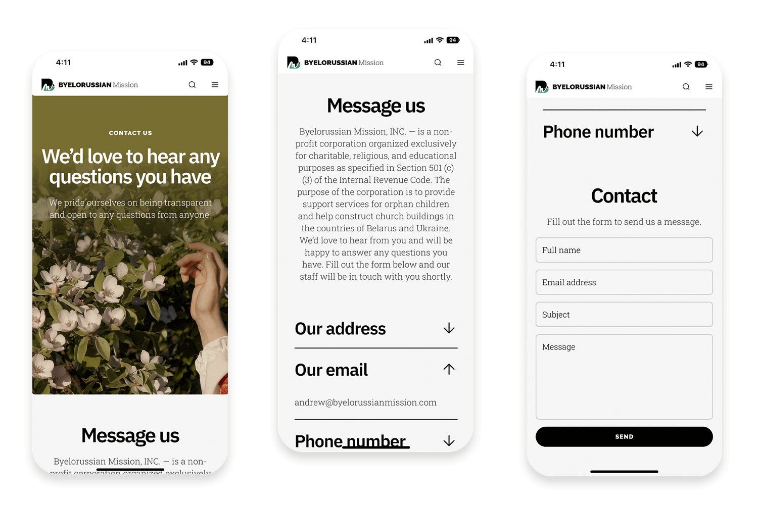
An “about us” text is placed above the form to allow users to get to know the company before reaching out, ensuring that they are reminded of their value proposition. Each field has a clear label, leaving no confusion about what info to enter. They also go the extra mile by offering multiple contact methods — a phone number and email address alongside the form itself — giving users the freedom to choose how they reach out. We love this form UI example!
Netflix’s contact us form prioritizes clarity and ease of use. The single-column layout with stacked questions makes it easy to scan and reduces the chance of users getting lost. It also uses a variety of question types, like multiple choice and dropdown menus, to keep things engaging and efficient.
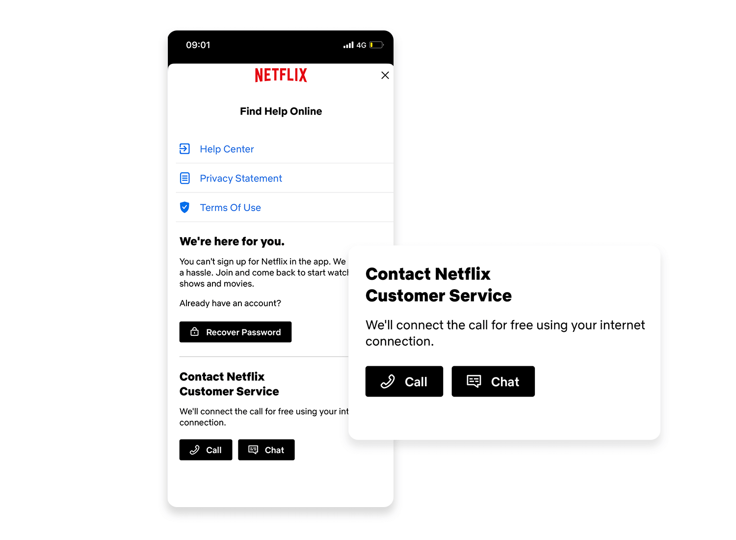
If you can’t find the answer to your question, the site offers a user-friendly fallback option: connecting with a real person. You can either call them directly or use their messaging service, both conveniently accessible within the platform. Plus, they take the extra step to assure you that calls won’t cost you a dime – they’ll utilize your internet connection for free calls.
In this smooth contact form example, we can appreciate the placeholders that turn into floating labels once the user starts typing. This helps the user maintain clarity of what is being asked if they lose their train of thought. The use of minimalistic lines to separate the fields as well as the use of color in the text for field focus contribute to an awesome contact form.
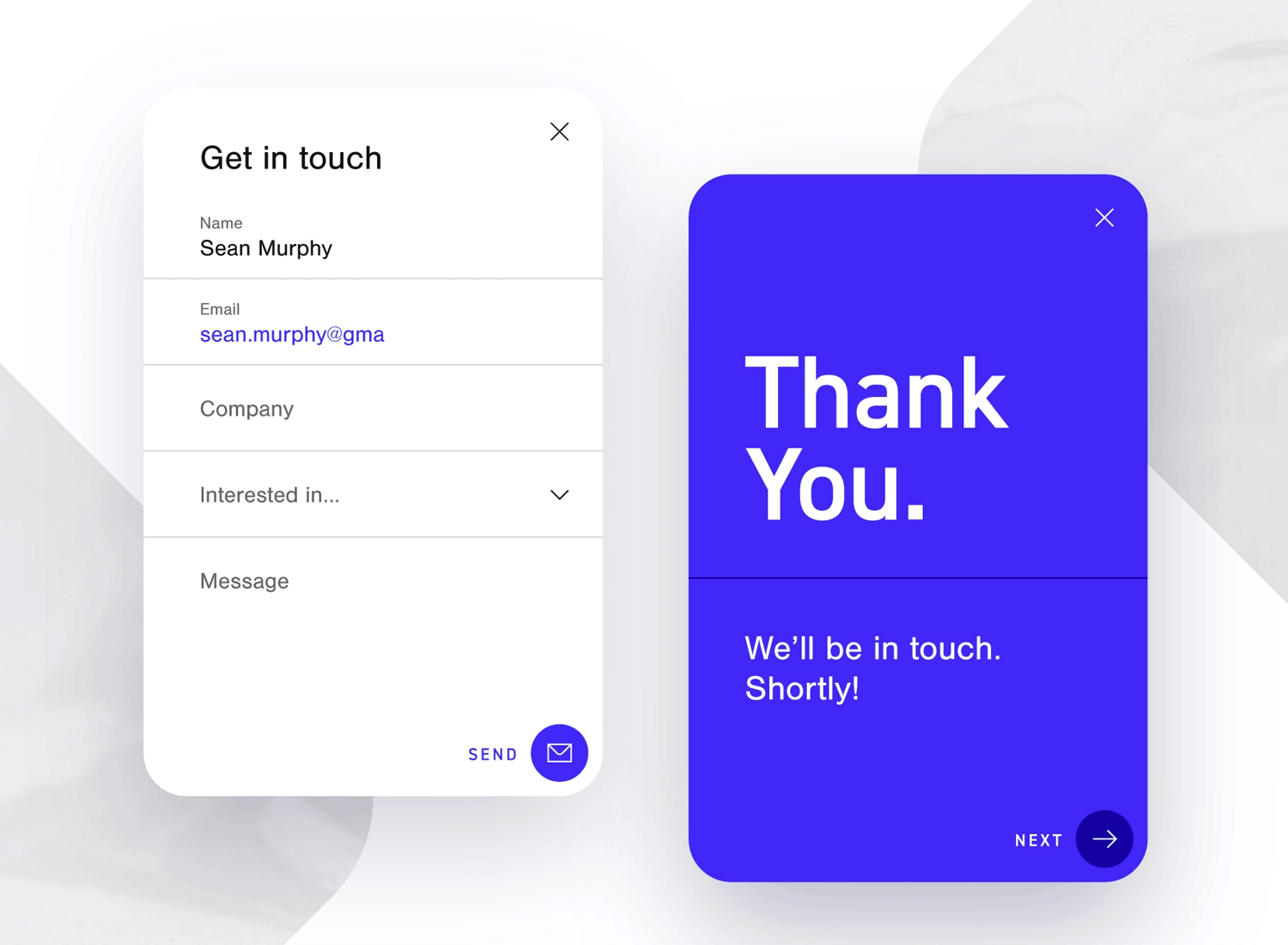
Original design by Matthieu Souteyrand on Dribbble.
The use of mint green is almost dreamy in Waison’s design. This design goes to show you don’t need lots of visuals to create a form with a good experience.
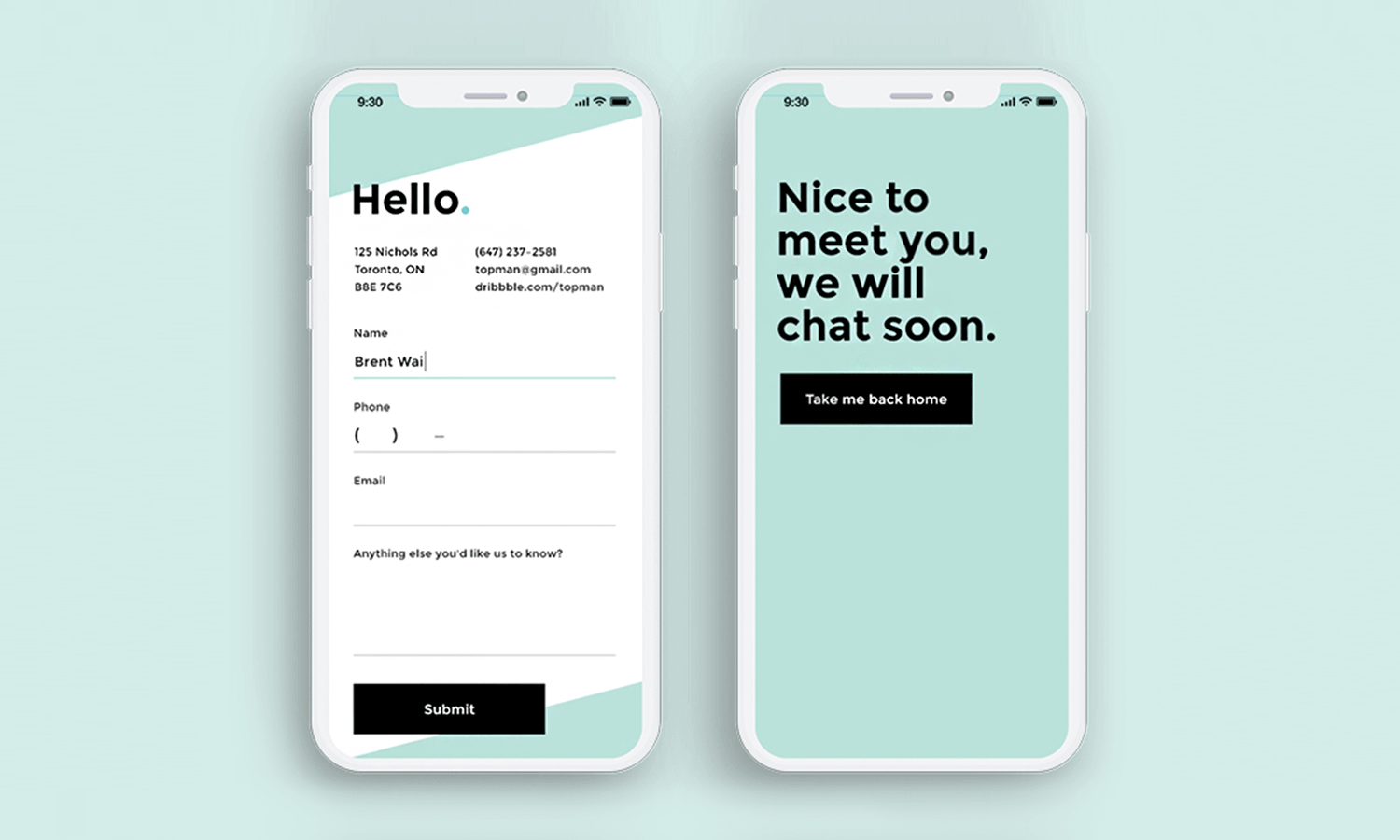
Sticking to the basics, this form example enjoys floating labels and a mask in the phone number field — which leaves little room for confusion. We also like the success statement screen, so users can walk away knowing they succeeded in sending their information.
Luminis Health‘s mobile app onboarding questionnaire form example nails it, making it one of the most attractive and best form ui examples out there. The questions themselves are short and sweet, using direct pronouns to engage the user better and offer a more personal experience — no jargon or complex sentences here to confuse users.
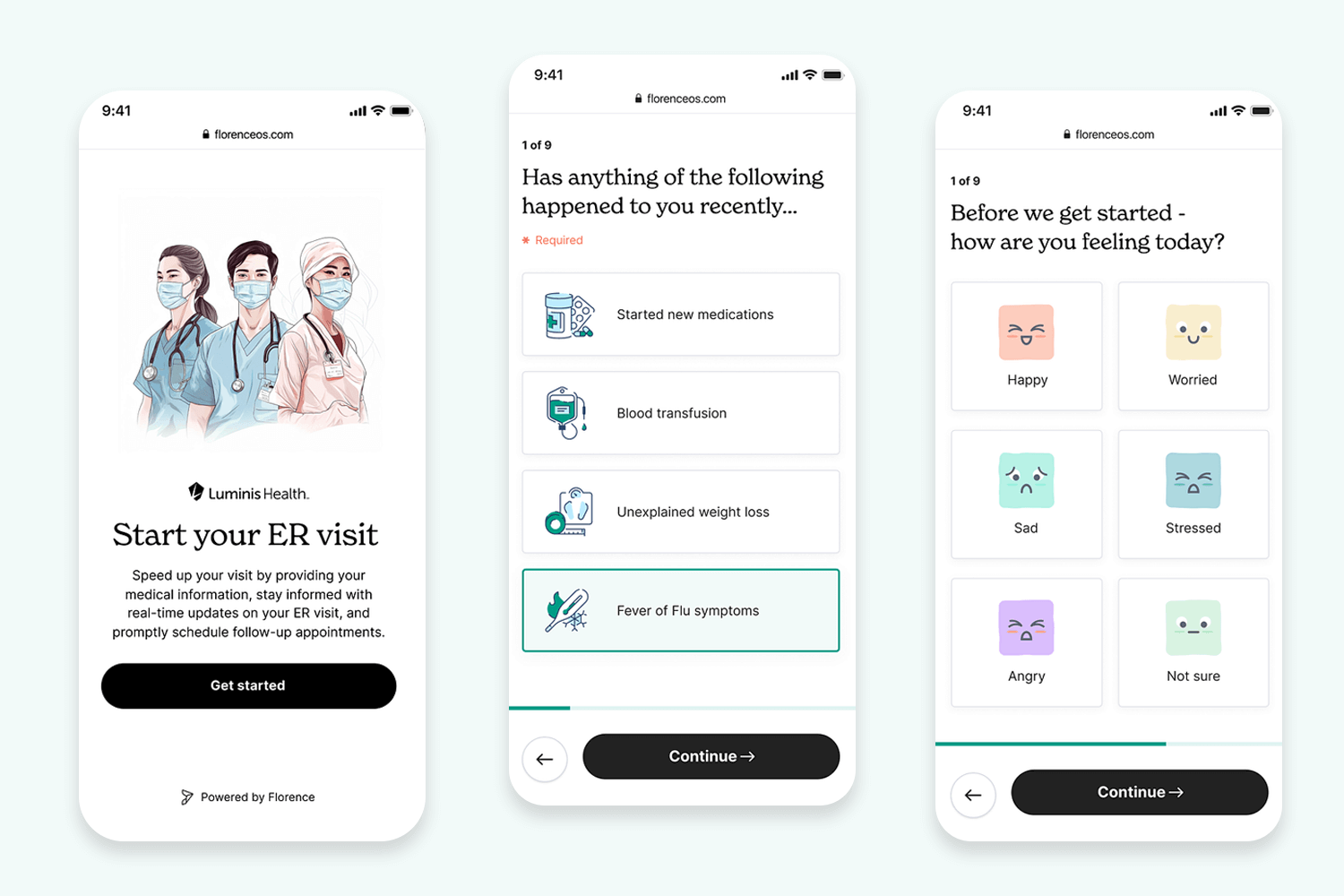
To add a touch of personality and visual interest, Luminis incorporates color and imagery to differentiate the answer choices. These design choices contribute to a user-friendly and visually appealing experience, making Luminis Health successful in its mission to simplify healthcare understanding for all.
This objectify survey mobile app form example is a masterclass in keeping things clear, concise, and visually engaging. The questions themselves are like UX tweets — short, and straight to the point. No room for ambiguity here, which means users can fly through them quickly. The color scheme perfectly complements InVision’s brand, and the illustrations add a playful touch without being overwhelming.
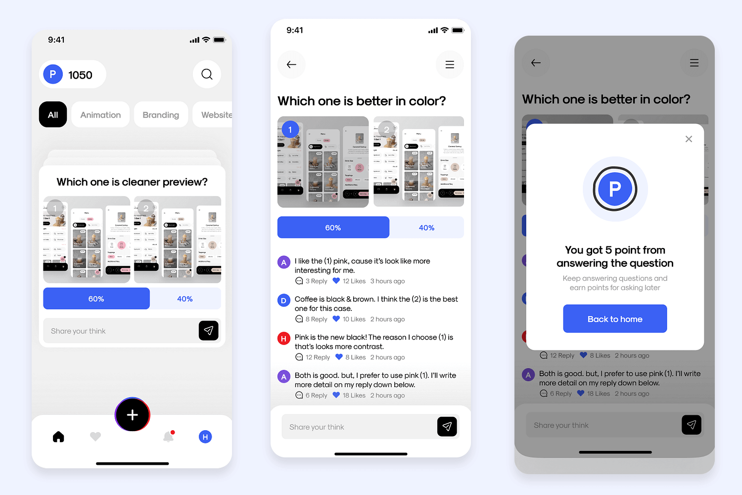
Finally, the answer format keeps things user-friendly and reduces the chance of anyone getting confused. Overall, Objectify’s survey is a winning formula for gathering valuable data in a user-friendly and visually delightful way!
Feedback forms don’t have to give users an aneurysm. They can be quick and to the point, just like this form example. The use of smileys to convey the feeling users have regarding their experience is a great way to get information without making the user actually type.
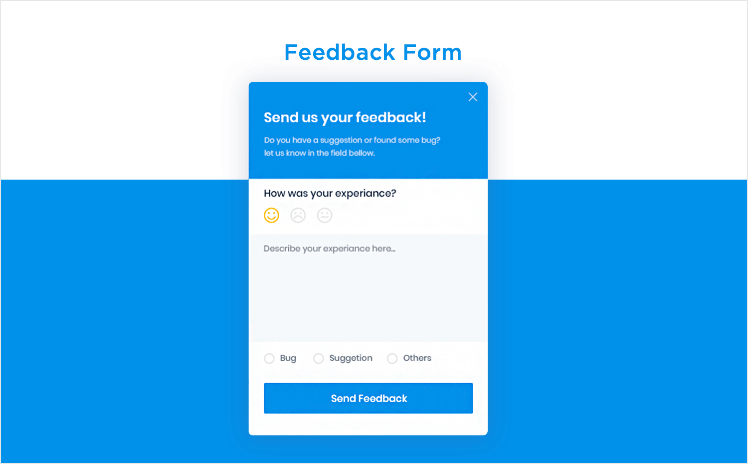
The suggestion field, as well as the radio buttons right below it don’t leave any room for doubt — just like that wonderful microcopy on the button! Form design by Zahir Patel on Dribbble.
This form example works well to illustrate how complicated surveys can be broken up while still remaining easy for the user to follow. The smart interface accounts not just for the survey, but also for the possible event of users trying to reach HR, in case of confusion.
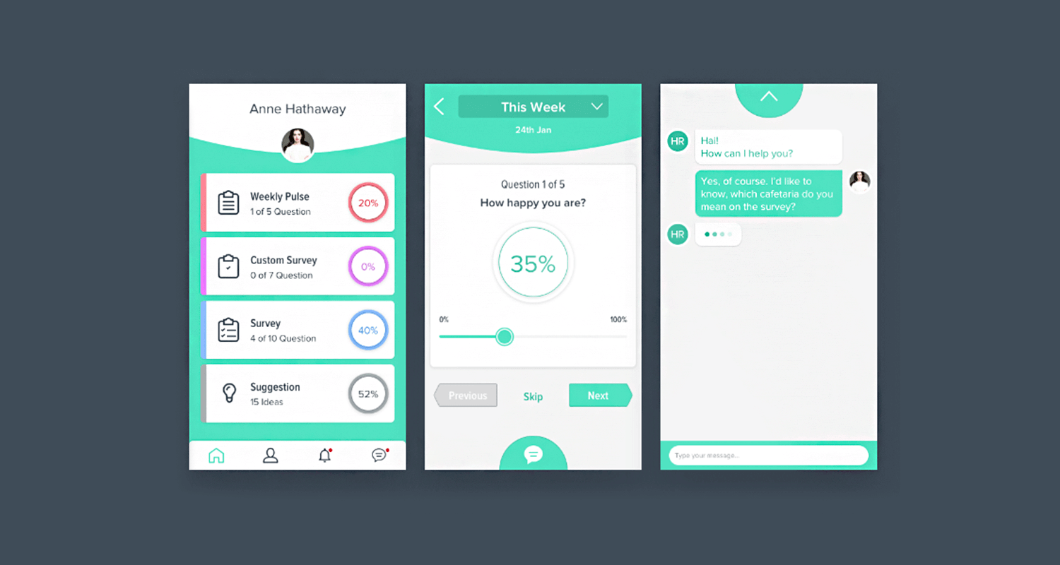
The percentages in the home screen are a great way to motivate users to get to the finish line, making this survey a wonderful design. Made by Amirul Hakim on Dribbble.
Amazon’s checkout form example is truly a UX wonder. The form itself is ridiculously clear, with labels that make perfect sense and a layout that’s easy to navigate. Plus, they pre-populate all that saved address and payment method stuff, so checkout is lightning fast — no need to type your life story every time you snag a new pair of headphones.
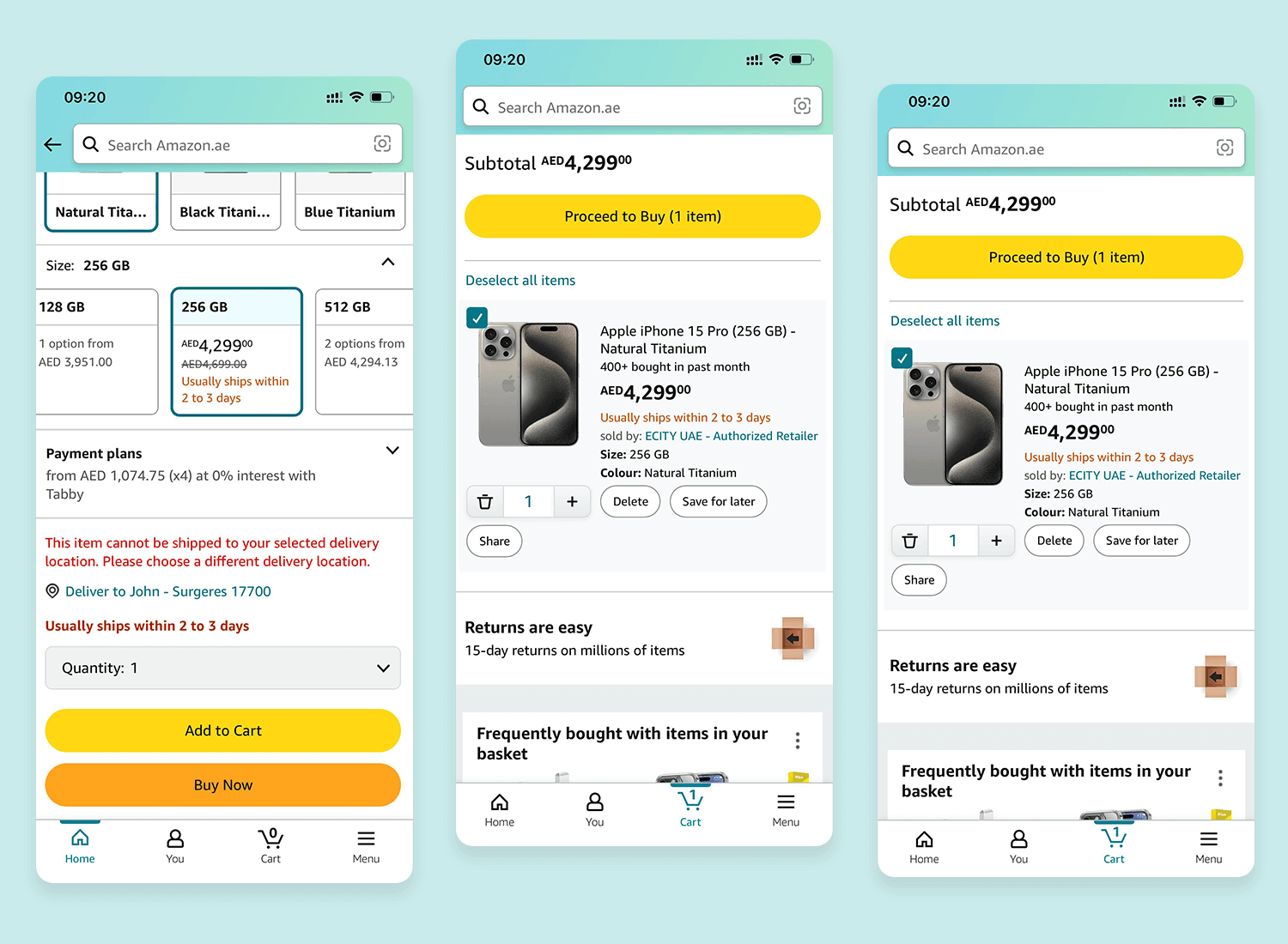
This focus on speed and ease of use is what keeps Amazon on top of the online shopping game. Smooth operator status achieved!
Airbnb’s app checkout form gets you from “wanderlusting” to “booked” with lightning speed. The layout is super clean and the navigation is like following a travel blog — step-by-step and easy to understand. They also pre-fill your info (if you’ve saved it before) so booking your stay is faster than swiping through travel inspiration pics.
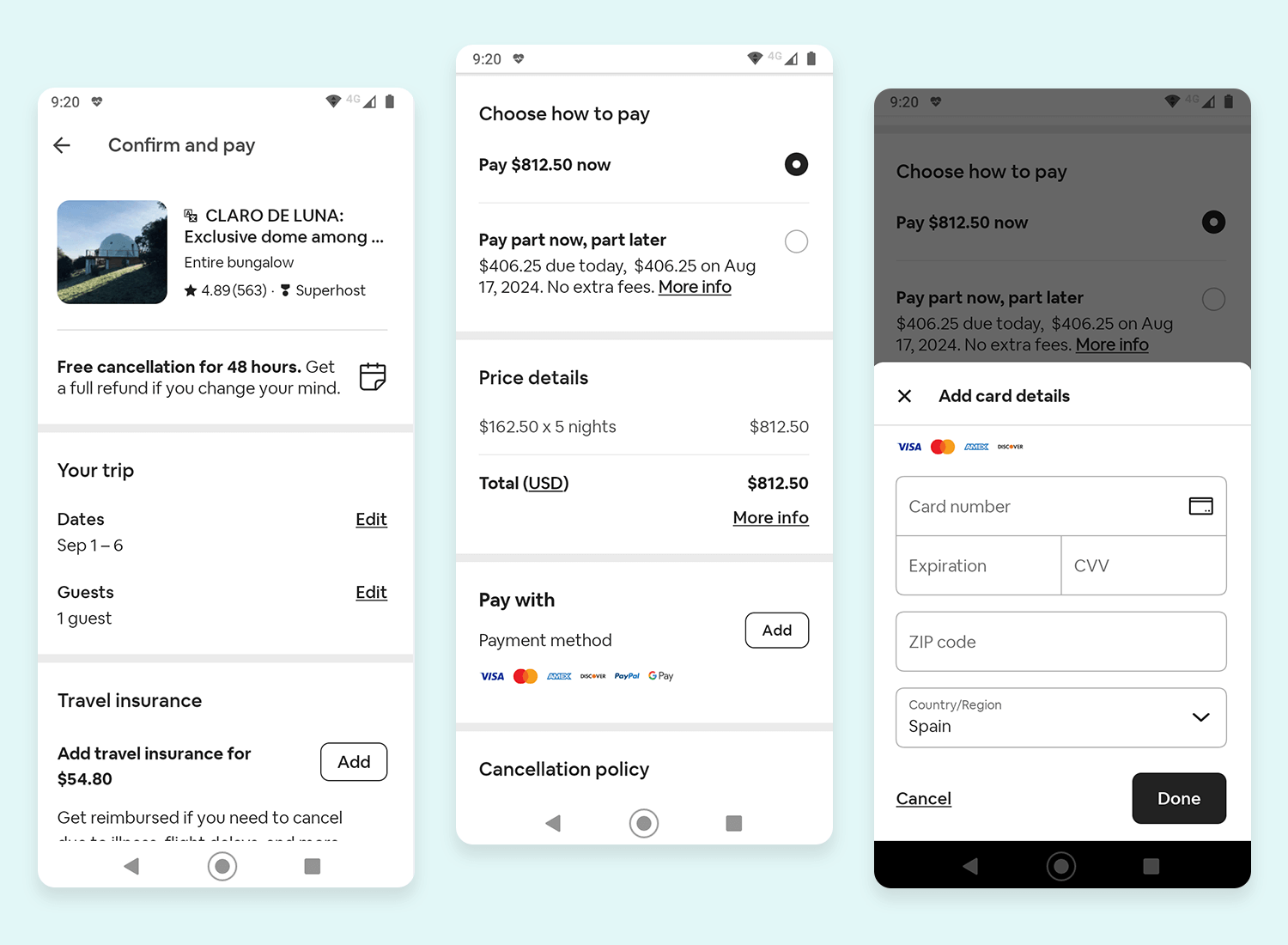
This focus on efficiency means less time wrestling with forms and more time planning epic adventures. Airbnb clearly understands that travel should be smooth sailing, and their checkout experience reflects that!
We love that the designer behind this form example planned the use of space to a high standard. These two screens allocate space for delivery information, a summary of the order, payment method and even manages to include a promotion. The breadcrumbs style of navigation and descriptive copy in the buttons earn extra usability points.
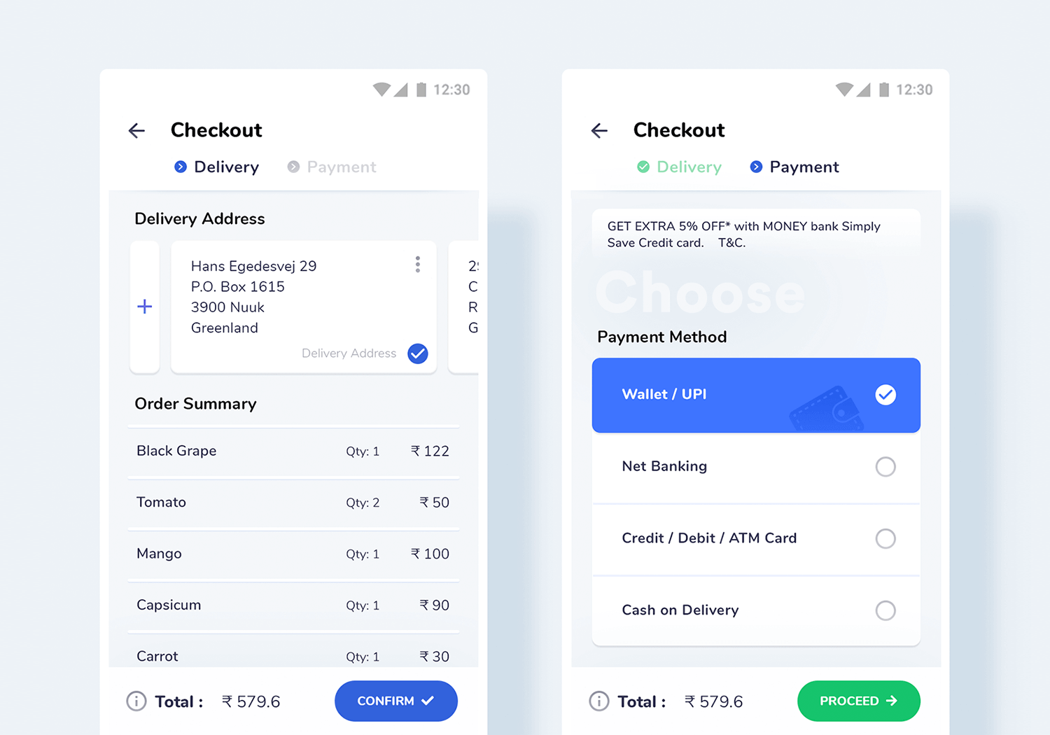
Form design by JD on Dribbble.
This is one of the best examples of how simple form UI design works. With a simple interface, there are no distractions and no room for doubt. We love that the action control button works by swipe, adding a bit of fun to a super straightforward checkout app form.
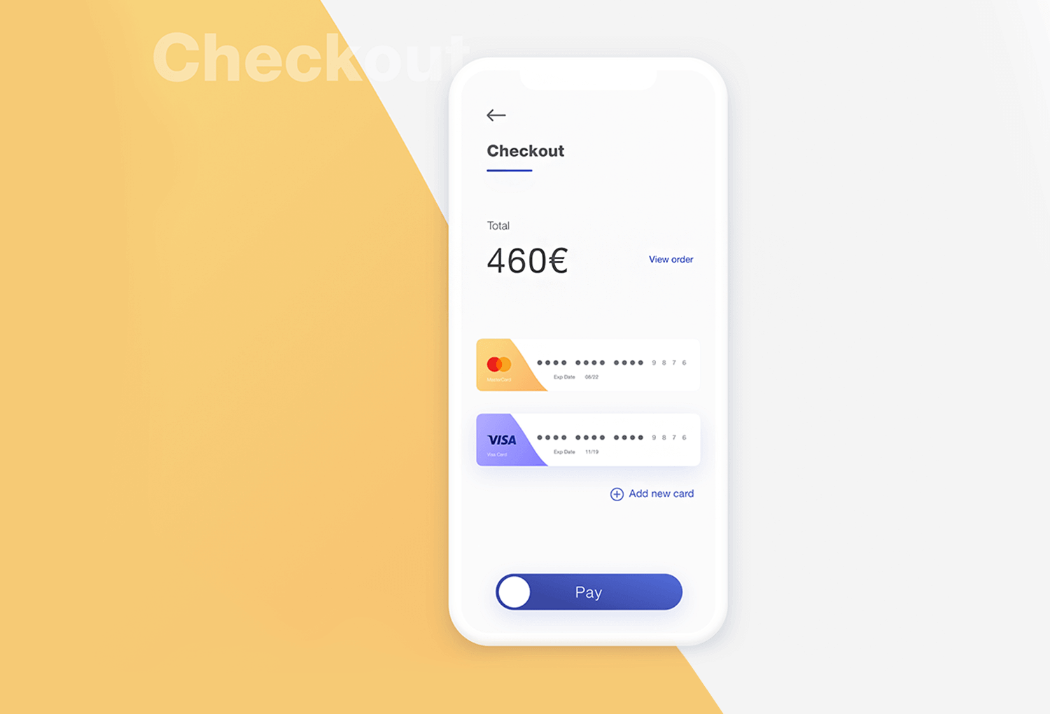
Design by Hasse Finderup on Dribbble.
Start designing web and mobile apps forms with Justinmind. It's free!

Clean layout, minimal fuss — Leafboard’s login form UI example goes straight for the essentials: email and password. Bold labels and clear spacing make it obvious what goes where, zero confusion. They’ve also snuck in social sign-in buttons for that extra dose of trust and familiarity.
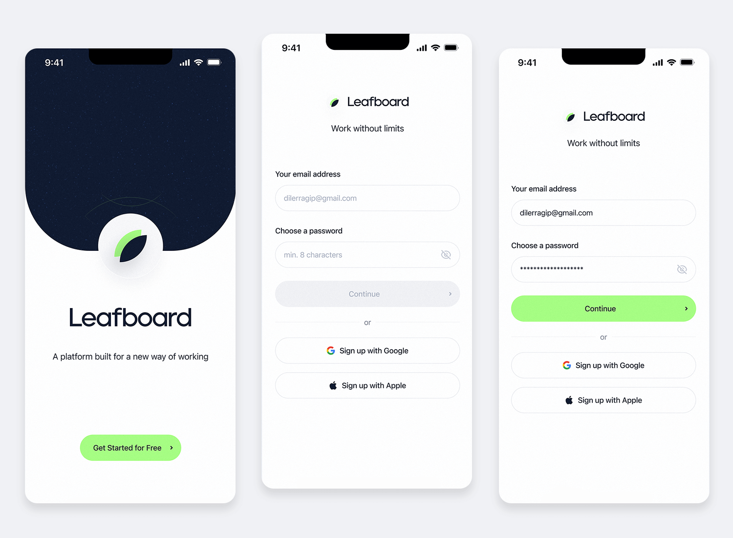
Since most users already have these accounts, logging in with a single click is a huge timesaver and might even nudge them to sign up if they haven’t already. Accessibility is on point too — high-contrast colors and a clear text field make it easy to read for everyone. Not bad at all!
Deep designs has stepped up the game with their clean-cut login form example. The orange adds personality without going overboard, keeping the focus on the task at hand. The UX designer cleverly puts the login front and center, but you can also see a peek of the app’s interface in the background, hinting at what’s to come.
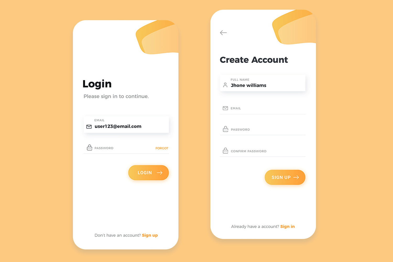
In short, it’s clear, concise, and gives users a taste of the app’s vibe. Nice work!
This form example makes quick work out of the signup process. Notice that very little information is required, paired with plenty of context. Users have inline validation and the possibility of seeing the password with an eye icon. We are sure users appreciate having those social media shortcuts — who doesn’t, right?
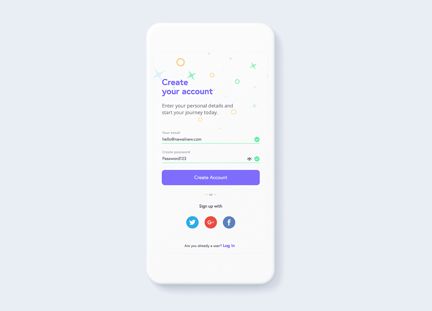
Original design by Sergej Nawalnew on Dribbble.
Sometimes, it’s better to go with a classic. This sign in and sign up app form examples show that users don’t need much from their sign in screen — they just need it to not be confusing. This sign in and sign up forms succeed in guiding users with inline validation and descriptive microcopy.
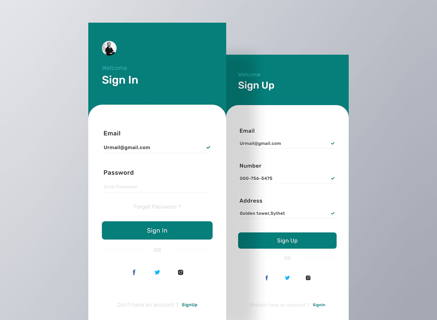
Form design by Sayem Ahmed for Team IronSketch on Dribbble.
Tiketim‘s form UI example for buying and selling event tickets is another winner in our eyes. The first thing that grabs your attention is the use of color — a mixture of dark and light grey with a touch of playful blue makes it come alive. The layout is clear and uncluttered, with easy-to-understand icons indicating ticket number availability.
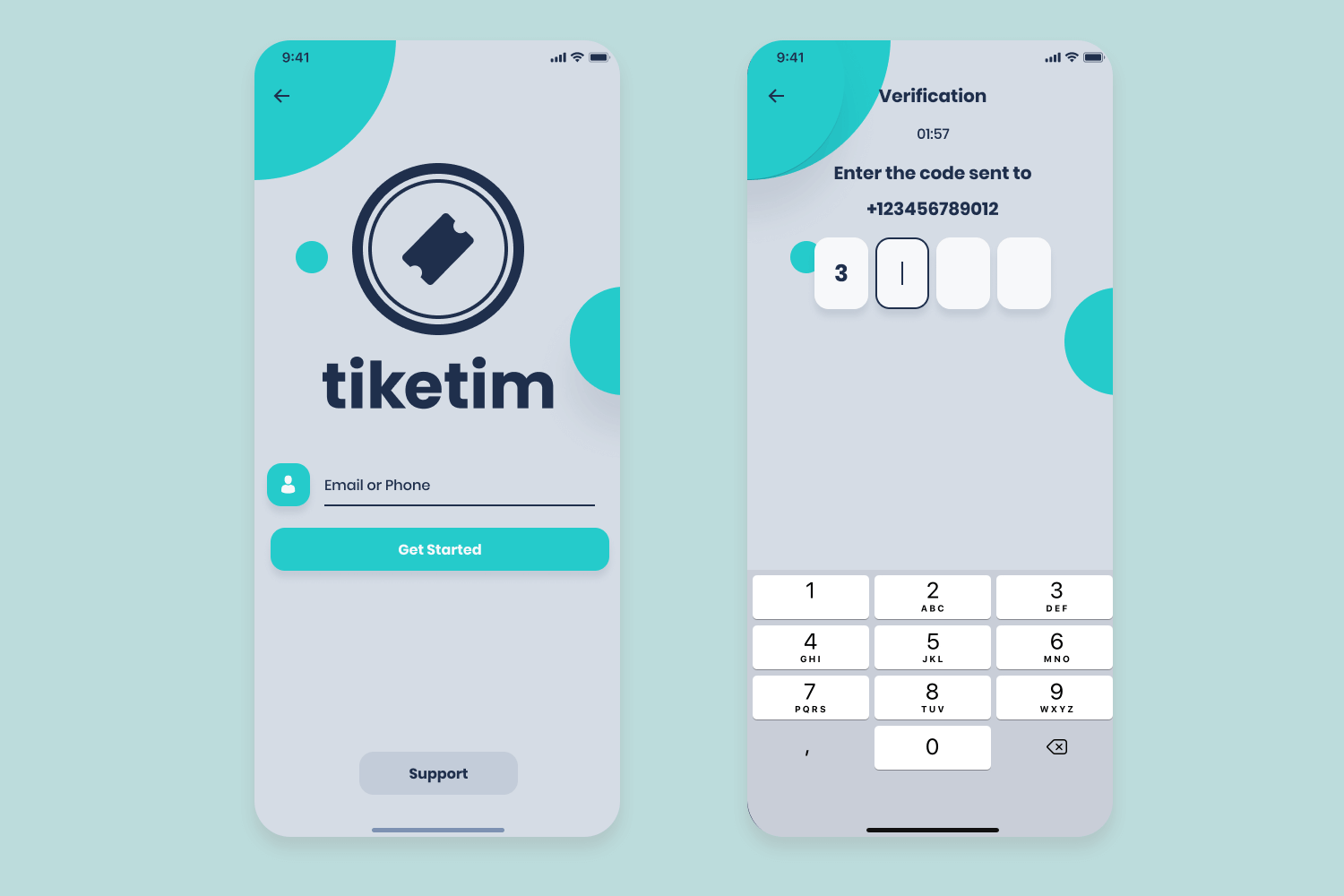
Tiketim also uses a carousel to showcase featured events, giving users a glimpse of what’s hot without overwhelming them with information. Simple, effective, and functional!
Dice’s event ticket booking app form looks like a fun time! The layout is straightforward, with clear labels and attractive images of your favorite artists. Information like date, time, and price of ticket are clearly indicated. Personal information is pre-inserted, with the option to use Apple Pay for more convenience.
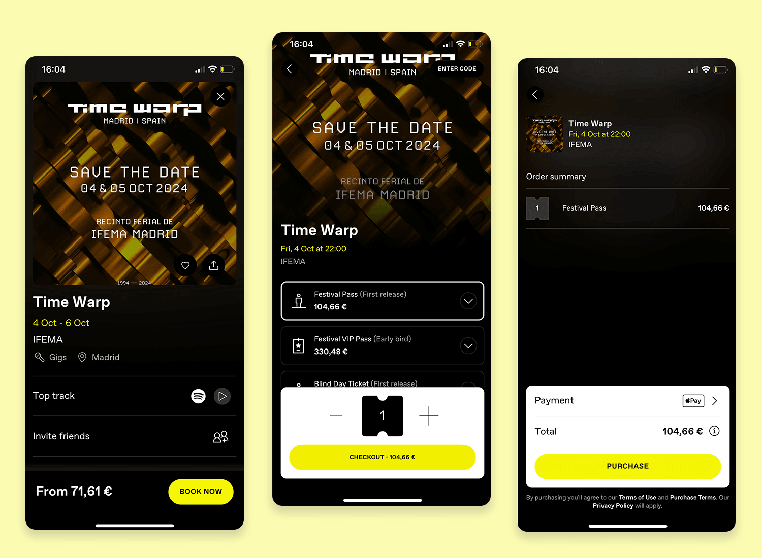
Dice even allows users to send their ticket to a friend or refund their tickets. From a design perspective dice’s colors are funky and fresh, just like how you’d want to feel before heading out to enjoy some good tunes with your buddies!
We love how smooth the booking process is in this form example. The form checks all the boxes: validation, masks, stepped screens and a varied use of action controls — all done with a high factor of gamification. By the time the user gets to the success state, the effort they’d have put into the form would be minimal. Just wonderful!
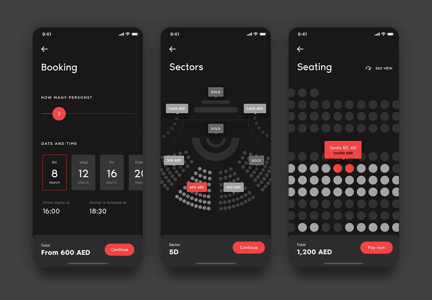
Awesome form design by Valeri Torf for Solvers on Dribbble.
Subscribing to the JRNL newsletter is as easy as 1,2,3. The three options available on this subscription form example are “Sign in” if you already have an account, “Continue with Google” for a smoother, more streamlined experience, and finally under all the usual suspects, registering manually.
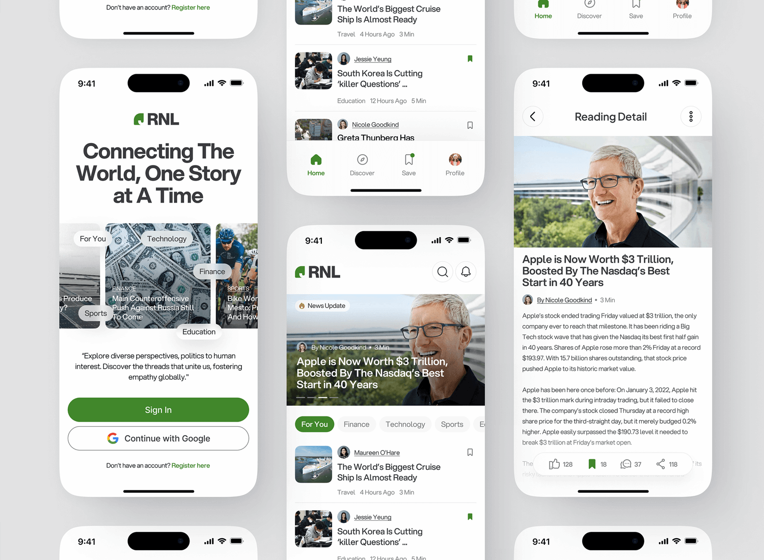
We like that the CTA button for “Sign in” reflects the brand colors, that rich green practically asks you to head to the nearest park to lose yourself in their newsletter. Great work RNL!
Element Pack provides us with yet another simple subscription form example. It’s not really a form as much as a clear as day CTA button with a simple “Join now”. No added information required, no need to connect with Gmail or any type of social media.
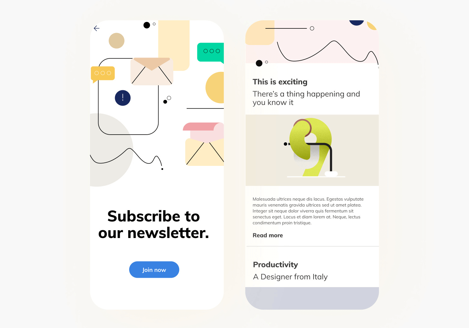
Simple, stylish, and straight to the point. We are living for this masterpiece!
These cool form examples are some of the many great and functional designs out there in the virtual wild. Not all forms are made equal, and your creativity will play a role as important as your attention to detail — usability is the name of the game here.
Hopefully, these form examples will get you inspired to get the ball rolling in your next form!
Start designing web and mobile apps forms with Justinmind. It's free!

