
We welcomed Essi Salonen, Senior UX designer at Fjord, to tell us more about Fjord’s research in a project that touched the lives of families in California.
Fjord is a design consultancy agency that works to deliver both service design and product creation. Since it was founded in 2001, it’s evolved into a point of reference in the UX industry and come to enjoy offices across the globe.
Fjord is a company that prides itself in its research-oriented way of developing projects. For the folks at Fjord, the research sets the tone of the entire project and has to be carefully carried out. In their own words “There’s always a better way, and we make it our business to look for it”.
In this case – they helped parents communicate with caseworkers, when in a deep crisis.
As Essi shared with us, there are many ways of looking for answers – and some are more appropriate than others depending on the project. Just for us, Essi walked us through a case study that her and her team lived through – and we couldn’t be more grateful.
Posted by Justinmind Prototyping Tool on Wednesday, 21 February 2018
Essi told us that she was excited about sharing the details of this project, as service design is usually crowded with non-disclosure agreements. This case, she said, was particularly important – not just because each project is crucial to Fjord – but because the project was emotionally charged.

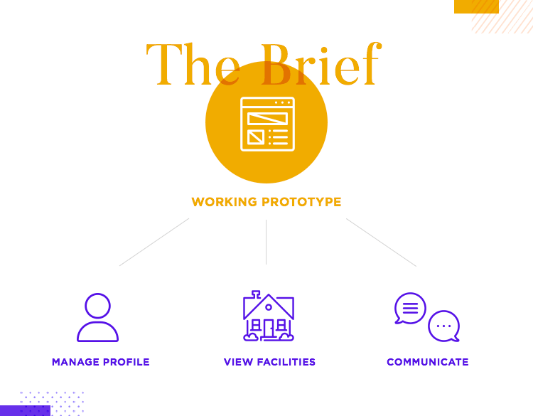
The mission: to create a working prototype of a tool that would help parents communicate with their caseworkers and deal with one of the most stressful situations anyone can experience. The target audience of the product were the parents of children taken into foster care – which made Essi’s team even more keen on delivering something meaningful.
Essi then gave us a brief summary of the process these parents and their children go through:
- Someone thinks a child might be experiencing abuse or neglect, and calls Child Welfare Services.
- A caseworker then investigates the situation, usually through interviews and visits to the family home.
- If appropriate, the child in question is removed and taken to a temporary home. This might be a relative’s house, such as an aunt or grandmother. However, if the home of a relative isn’t an option, the child is taken into foster care.
- Caseworker then works with the parent to arrange visits and communication with the child.
Logically, this process proceeds and can extend to a long list of steps. Depending on the situation, the process can head one way or the other – but for Fjord, this is as far as their solution needed to get.
All the designers knew they needed to deliver something that added value – these parents are already dealing with a lot of stress. Adding on to that stress by having a tool that doesn’t work properly was not an option.
For Essi, service and product design are about the process. At Fjord, they have a certain way of doing things, a workflow that directs everyone in their work. Having a defined process helps the team stay on track and not deviate from the original objective.
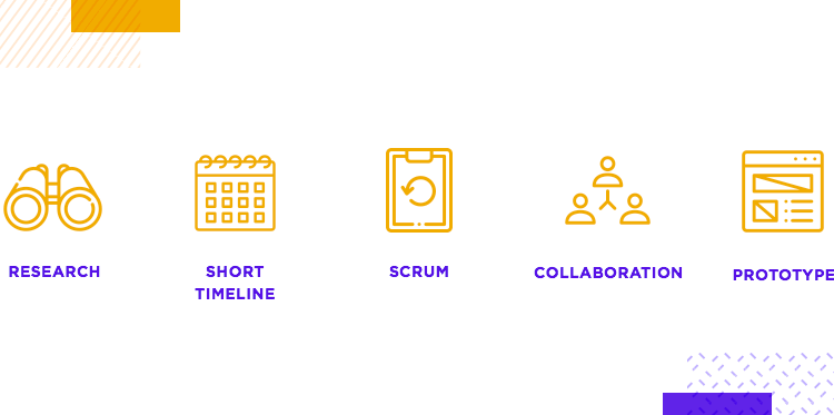
However, not all projects are created alike, and some of the projects that Fjord works on have serious time-constraints. Tight deadlines can be a real obstacle in any project – and this is a company that likes to mind the small details. The case study she brings us showcases that perfectly: they had only 3 weeks to deliver a prototype!
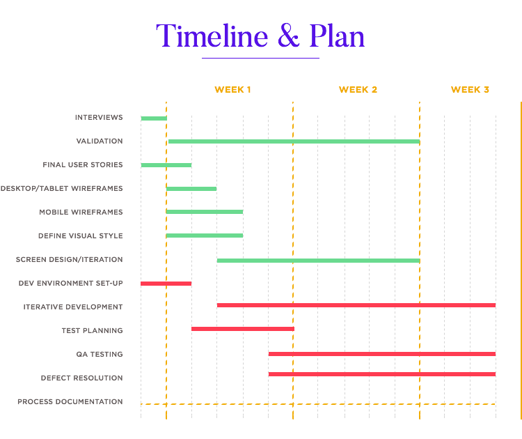
In order to keep things moving at a quick pace and to save time, some work is done simultaneously. It’s important to arrange the work that can be done at the same time, and possibly have two projects that can feed into each other as the work progresses.
For a workflow like this to be effective, collaboration is crucial. Essi, for example, worked closely with an interaction designer on this project. But communication went beyond just these two people, and also needed to include, for example, developers.
While Essi and her teammate focused on the details of the visuals, developers could work on the wireframe based on the research findings. In fact, all designers at Fjord touch on the research of projects in one way or another. Sometimes, even PMs do.
In this case, specifically, Essi said she faced other problems – on top of having a complex workflow that faced dreadful deadlines.
The logistics represented another challenge. The people involved in the project were located in 3 different American cities: San Francisco (where most designers are), Austin and Houston (where most of the developers are). Everyone in the team needed to be on the same page at all times, making communication a top priority.
Staffing was also an important factor. It’s important to look for the right talent and knowledge – but Essi points out that it’s also important to have versatile talent. People that can apply their knowledge on more than one front.
Example: Essi herself is a good example of this versatility in staffing, being a designer that handles both research and visual design.
To get everyone to work together in a smooth fashion, simply setting the tasks isn’t enough. At Fjord, they get everyone together and define the “team norms”.
They discuss how each one likes or prefers to work – things like who’s an early bird and who’s a night owl. The specific skills each of them would like to develop during the project. And perhaps most importantly: what does success look like to each team member. This helps the manager understand the team better, and helps everyone communicate more efficiently.
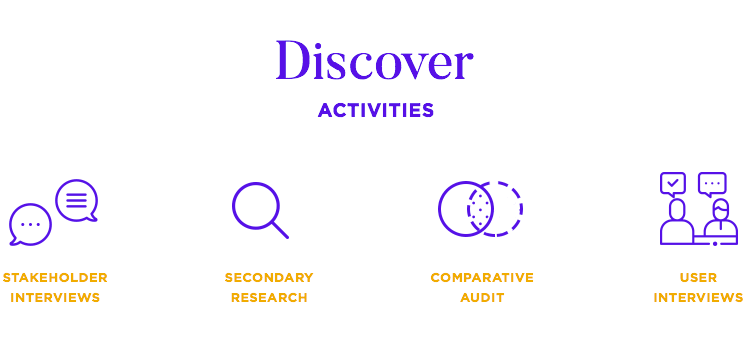
Essi introduces us to the first step in any project at Fjord: the discovery. According to our speaker, this phase is crucial and can be quite challenging. Not necessarily because it differs from other phases in the project in difficulty – but because it requires the right mindset.
In a past project, Fjord was tasked with creating something that would help newborn babies survive their first few days of life. In particularly poor countries, it’s all too common for newborns to pass away as a direct result of hypothermia, and lack of proper medical attention.
Tackling child mortality rate was the mission.
Their first thought was that a low-cost incubator would solve the issue. However, once they had settled in Nepal and started to research why and how these babies came to pass away – they came by an unsettling fact. The country had incubators – and the majority of them went by unused for long periods of time.
The issue wasn’t the lack of incubators. The real problem was that people didn’t have enough time to reach the hospital with babies in such a delicate state. This changed their focus entirely: not hospitals, but parents were the key. Preparing the parents, helping them get to the hospital was the real root of the project.
They came up with a new product: a bag-style holder that insulated the newborn. This wasn’t the definite solution the team had originally wanted, but it was the right solution for the situation at hand.
No one could have guessed that incubators weren’t the issue – in fact, the initial brief had focused on the incubator factor. For Essi, it’s crucial that researchers approach the problem with a completely open mind.
“Sometimes, even stakeholders don’t know what they want.”
Essi Salonen - Senior UX Designer at Fjord
The data we’re given to begin with can be misleading – and if the team hadn’t challenged the original brief, they wouldn’t have created something truly meaningful to the people of Nepal. That is the key about discovery for Essi. You want to have a wide perspective of all the factors, not just the ones we are told to focus on.
In this project, Fjord didn’t have access to actual parents – which meant they couldn’t interview the user they were designing for. For Essi and her team, this meant they needed to get creative. And so, Fjord moved on to the next best source of information: subject matter experts.
In this project, the subject matter experts were people familiar with the process of a child being taken into the care of the State. People who have seen it all up close and understand the hardship it brings about to everyone involved.
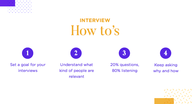
These experts were carefully interviewed, as the team needed to make up for the absence of parents by asking smart questions – to make the most of the information available to them.
Aside from the carefully planned interview, Essi recommends that all research previously done need to be taken into account – if there is any, that is. If you do have past research data at hand, you want to look into it again and try to figure out where it failed. Knowing where others went wrong can help you watch out for those same pitfalls.
Essi then introduced us to two of the experts that participated in the study:
- Janay is a caseworker for Child Welfare, and a former foster child herself. Being so close with the process, she knows how both parents and children feel throughout the entire process.
- Lisa is a social services consultant that knows the trends and general patterns in this process, making her a source of valuable insight.
After spending 2 hours talking to each of them, Essi came across several insights that had a direct impact on the solution’s design:
- It needs to be easy and simple: the users are people in the middle of a crisis that likely takes up all of their energy and attention. The product ought to be as if for a 4th grader – so that these parents don’t even need to think to be able to use it.
- Parents are often in an emotional state: the users are dealing with a lot of stress and sadness – which creates a need for bigger fonts and bigger text that is easy to read.
Essi hadn’t interviewed a single parent, but she could start to see a picture about the state of mind of users – their emotional state, which was both altered and substantially meaningful to the design. For Fjord to get this right, they needed to understand how these parents feel, so they could start to try and find ways to help them through these crises.
But for that, Essi needed more. She needed more data, more information. That’s when they came up with the parent survey.
The survey wasn’t sent to actual parents of children in foster care as this type of data is very sensitive – but Fjord needed to understand what parents would do in this situation. Without access to real users, they settled for sending a survey to parents that worked in Fjord all around the US.
Rule of thumb: Use your interviews to explore needs. Use your surveys to confirm the assumptions derived from the interviews.
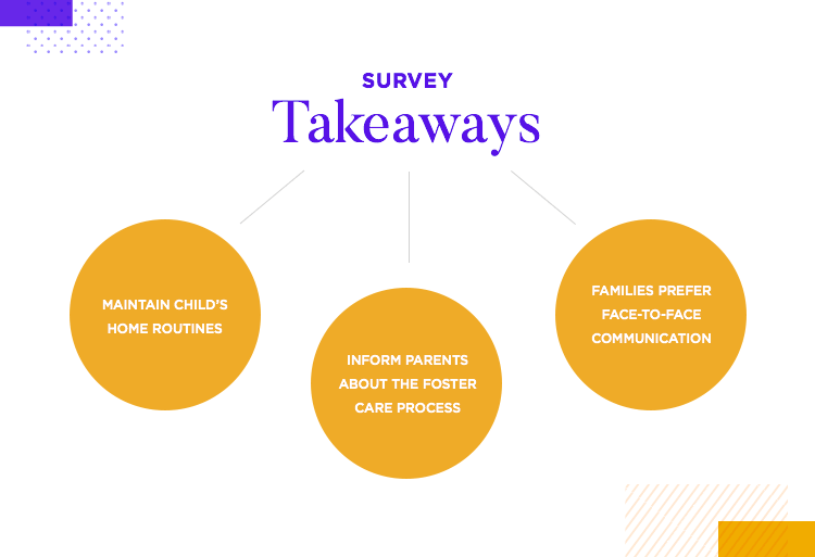
They used SurveyMonkey, which made the survey itself easy and cheap to create. They wanted to know more about family routines, as well why and how that impacts children. Using both the interviews and the surveys as a base, Essi and her team managed to create user stories.
The conclusions that Essi drew from the user stories included the fact that the average parent actually has very little knowledge of the process of a child being taken into foster care. She also pointed out that routines are very important for children – and that families prefer face-to-face communication.
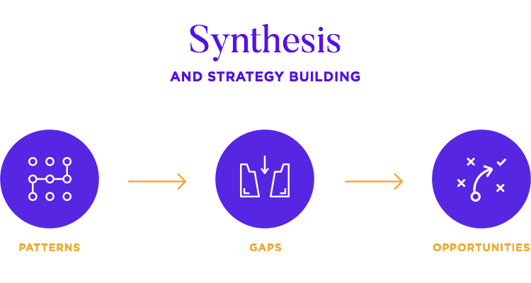
In a classic project at Fjord, this is when the team write down all the takeaways from the research and display it all in sight – Essi mentioned covering an entire wall with post it notes.
The main objective is to see everything we’ve learned out in the open, so we can try to identify patterns and clusters. With this, Essi and her team aim to understand where the gaps in service are – to find ways to fill those gaps.
At Fjord, the findings are synthesized by the same people who carried out the interviews and the results are then shared with the entire team. Everyone takes part in formulating a strategy based on what research shows.
“In a way, strategy is set by the process.”
Essi Salonen - Senior UX Designer at Fjord
Sharing the synthesis with the entire office is a good thing, not just to get everyone on the same page – but also to create true empathy for the user.
Suddenly, the project wasn’t about questions and features – it was about real people going through a terrible time. For Essi, it’s important to bring the user to the forefront, to make them real. If you can include a quote from the user, all the better.
Without access to real users and no previously existing product to refer to – Essi and her team found that the parent’s emotional state was the base of their synthesis. Their emotions were the things Fjord needed to account for in all aspects of the design.
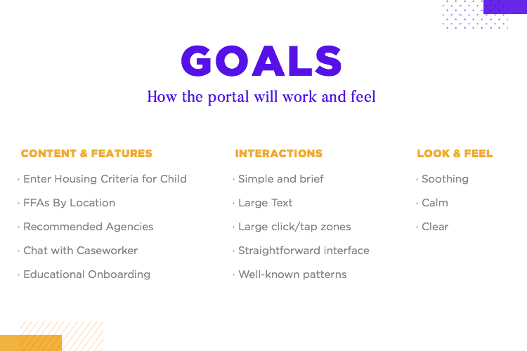
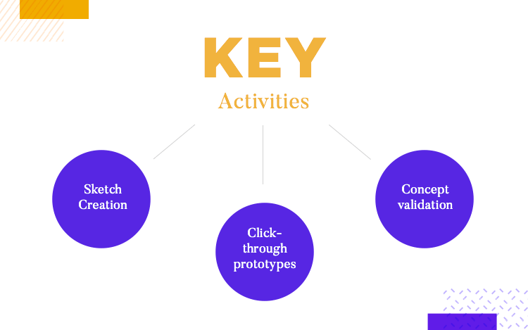
The result was an emphasis on the simplicity and ease of use, which was a noticeable characteristic of the entire prototype. Essi then listed out the things you generally want to obtain from your UX research as a whole:
- What the features of the solution will be
- How the user interacts with the solution
- How the product would look and feel
Turning insights into tangible design isn’t easy, but a challenge we all must face. Only by this process of reaching concrete aspects of design after research, can we hope to move on to prototyping.
“The key was finding a visual language that corresponded to our strategy.”
Essi Salonen - Senior UX Designer at Fjord
The parents are already exhausted and frustrated, which made the entire team clear on what the product should be and have. For the folks at Fjord, the research led them to the following conclusions:
- Keep interactions simple: no bright colors or long animations, no funny business
- Large text: make it big so that people don’t need to make an effort to read
- Big click zones: being accurate requires effort and the users are already stretched out beyond belief
- Straightforward UI: stick to well-known patterns instead of making people learn
- Clear and simple visuals: it doesn’t need to be pretty, it needs to work
After all the defining, we reach a point where we can actually build a prototype. Creating a prototype is important, not just for testing purposes, but also to get stakeholder buy-in. Based on all this information, an interaction designer created the wireframes of the solution.
After all this research, Essi and the Fjord team created a scenario that is representative of what users experience. They included 3 people in the scenario:
- Janey: mother whose son has been recently removed from her care
- Jayden: Janey’s son, who is in foster care
- Lisa: Janey’s caseworker, who is the point of contact for Janey
Lisa informs Janey that there is a digital platform on which she can login and know more about her son’s experience. Lisa sends Janey an email with a link to the platform. Janey follows the link to the Parent’s Portal, where she signs in.
This represented a clear path that user follows to the product. The team knew what Janey was feeling and what she wanted to accomplish by signing in – which told them the features and content she needed for that goal.
With a total of 4 screens, Essi showed the audience the wireframes for the mobile version of the solution. The first screen was the welcome, but it also allowed parents to give suggestions on what could comfort their children. Things such as an affinity for dogs, cats or sports, for example.
The second screen consisted of a map in which parents could see the nearby Child Welfare facilities. The third screen was the parent’s portal homepage – where they could see all the information they had given so far, as well as a button that led to a chat with their caseworker.

Fjord then went on to validate their wireframe before they could move on to the visual design. This, as Essi points out, is a smart move. As it so happens, validation changed their idea of what the wireframe needed to be.
Caseworkers made a meaningful suggestion: instead of having a “wish-list” style of guidelines for children, have a way for parents to offer more information on what the child is used to. The family makeup, was a good example.
Was the child used to having one parent at home? Issues such as bath routines and family dynamics are crucial for children – and had been missing from their solution.
Crucial details are what separates a truly effective solution to a mediocre one. The team found that there were other factors missing from their wireframe – such as parent’s financial situation, and how that impacted the solution.
“Even though you’re moving in the right direction, you still need to get the details right.”
Essi Salonen - Senior UX Designer at Fjord
They learned that parents often don’t have access to a car, and need to move on foot or by public transportation. This led to them imposing a limit on the facilities display: nothing should be further than 5 miles from the parent’s location.
On a similar note, they found that parents needed the ability to update their location. This was due to the fact that the intervention regarding their children and other hardships combined to extrapolate negative outcomes – such as parents becoming homeless.
The validation exposed information they wouldn’t have otherwise gotten. Having limited knowledge about the key issue represents a real danger – and validation is on the frontlines of making sure you got it right.
After the wireframes are validated, they are sent to the developer team so they can start working on the back office – while Essi’s team built on the visual aspect. In part, Essi worked to make sure the developers had all the material they needed, so they could build the solution exactly as it needed to be.
Communication was even more important at this stage, since developers needed the ability to tell Essi immediately about any issues or problems. For example, the developer team warning Essi that some of the designs stipulated were simply unachievable within the time restraints and budget they had.
Essi was proud of how everyone at Fjord worked hard to deliver something truly meaningful, to tackle an issue that touched the hearts of everyone involved. Given the little time they all had and the collaboration obstacles, they excelled in delivering a tangible prototype in only 3 weeks.
For folks at Fjord, design’s very nature is collaborative – not just with team members, but with all stakeholders in the project.
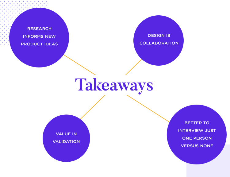
If there’s any lesson we can draw from this case study, it’s that by focusing on the user’s needs we have the opportunity to create something that will make a difference. In this case, the main problem touched the hearts of everyone involved, but all projects need to be focused entirely on the user.
Essi is proud of their final design, but does express regret she could never talk to real users – as they could have helped improve the product even further. We, here at Justinmind, agree that no matter how much you try – there will always be room for improvement.
This constant fight for being better is what UX design should be about: to keep looking for ways to help the user faster and better. Just because the solution is good doesn’t mean it can’t be better – and it’s people like Essi and her team that deliver innovative products and make a real difference.
DESIGN · PROTOTYPE · VALIDATE
ALL-IN-ONE PROTOTYPING TOOL FOR USER TESTING
Related Content
 Learn how to design better e-learning platforms with user-centered UX principles, real examples, and high-fidelity prototyping tips to boost engagement and learning outcomes.13 min Read
 Infinite scroll keeps users engaged, but it’s not always the best choice. This guide breaks down when to use it, when to avoid it, and how to design it right.14 min Read
 Learn how to design web and mobile app prototypes, how to test them and what to look for in a prototyping tool in this complete guide.15 min Read


