How to prototype websites with Justinmind’s Foundation UI kit

Justinmind’s brand-new Foundation UI kit: your UI framework for designing mobile-first, responsive web prototypes
Stop wasting time recreating standard UI elements for your design projects – prototype solutions to real problems with Justinmind’s Foundation UI kit!
Using a framework that allows you to reuse code and design patterns to build your web and mobile prototypes will make the process faster. It also allows yuou to streamline a standardized process across your designs. Justinmind’s brand-new Foundation UI kit allows you to quickly design content-first websites and mobile apps that capture all of the UI components of Zurb’s Foundation responsive front-end framework.
From huge brands like Adobe, Amazon, Barclays and HP to startups like not-for-profit Life Services Alternatives, millions of designers and developers are using Foundation to create amazing responsive websites and apps. From clickable prototypes to production-quality websites, find out why Foundation is the right solution for your next project below.
It all starts with a wireframe. In this post, you’ll learn all about Justinmind’s Foundation UI kit and how to get started creating an eCommerce app with Justinmind prototyping tool.
“Foundation is used by hundreds of thousands of sites every day to deliver rock-solid responsive sites.” Zurb Foundation
Zurb’s Foundation code and design pattern framework is the most advanced framework for web and mobile app development available. A responsive, front-end framework, Foundation works on any device, including smartphones, desktops and TV displays.
Foundation is a quick-starting browser-run framework – no need to involve IT or the back-end team in installation or downloading processes. Foundation is also an ideal partner to pair with several back-end such as Laravel, Composer and NPM and CMS technologies such as WordPress and Adobe Business Catalyst.
Responsiveness in the Foundation UI comes down to its mobile first approach. The framework encourages designers to build from the bottom up, starting with smaller, mobile devices and working their way up to larger displays and devices with wider ranges of features. This approach can help designers to perfect each break point.

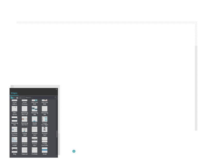
Foundation 6 by Zurb is jam-packed with features that help you design content-focused web and mobile sites and apps. It comprises an extensive library of UI components mobile, tablet and desktop. From UI elements such as buttons, forms, callouts and labels to navigation elements including accordions and side navigation, here’s the complete list of Foundation’s UI components now available in Justinmind’s UI kit:
- Accordion
- Accordion Menu
- Badge
- Block Grid
- Breadcrumbs
- Buttons
- Button Groups
- Drop down Buttons
- Split Buttons
- Callout
- Cards
- Forms
- Labels
- Orbit (slider)
- Pagination
- Progress Bars
- Sliders
- Tabs
- Side Nav
- Sub Nav
- Tables
- Thumbnails
- Title Bar
- Tooltips
- Top Bar
- Type

The Foundation framework also includes typography styles to help you stick to default styles for all of the most basic typographical elements related to Foundation.
With so many elements, it’s easy for designers to fit Foundation into their design specs. No need to work your designs around your framework, use a versatile framework that molds to your needs. You can customize your build to include or remove UI elements as well as define the size, color and fonts.

The leading framework helps designers build beautiful, responsive websites, apps and emails and deliver a unique brand and experience.
UX and web designers face more and bigger challenges than ever before. Their websites and mobile apps must be engaging as well as accessible in order to provide a complete user experience. Designs must be delightful, interactions must be seamless. On top of this, users are getting savvier with technology, and demand more from their web and mobile services. It’s essential that designers therefore stay on top of emerging trends and solutions.
Foundation provides designers with a framework with all the design components, UI templates and navigation patterns they need to create unique designs. With components for mobile, tablet and desktop, Foundation’s responsiveness will ensure a smooth experience no matter the device.
With Justinmind’s Foundation UI kit, you can prototype websites that look and feel just like the mobile-first sites built with Foundation’s framework. Quickly build interactive prototypes so you can get from idea to website in less time than ever. See how next.
With Justinmind’s Foundation UI kit you can prototype & test your ideas in double time before getting into code. It’s got all Foundation 6’s UI elements for mobile, tablet, desktop. Prototype any Foundation framework you want and it’ll be responsive, mobile-first and fast.
Getting started is easy as 1, 2, 3!
Download the Justinmind prototyping tool
Download Zurb Foundations from our UI kits page
Open Justinmind and create a new web or mobile prototype
Import the UI kit into Justinmind
Have fun designing responsive prototypes!
The Foundation UI kit for Justinmind makes it a snap to prototype eCommerce apps. The eCommerce portion of the UI kit includes a slick responsive pricing table, headers, product cards and sliders and even add to cart interactions, as well as all the buttons you’d need to create a user-friendly eCommerce application or website.
Let’s break down how to create an eCommerce web prototype from scratch with Justinmind’s Foundation UI kit:
To get started, open Justinmind and create a new Web prototype with the predefined specs. We’ll begin by creating the site’s homepage.
As UI designers know, the homepage needs to be solid. In a purchasing environment, website usage can suffer dramatically if the homepage isn’t user-friendly and overwhelms the user with too much clutter and UI noise. Usability studies show that many eCommerce teams don’t spend enough time making sure that their design conveys clarity to the user. Clutter isn’t simply a problem of aesthetics, it filters down to the business. With too much cognitive load, the user is going to drop off the conversion funnel as early on as on the homepage, without ever converting. So, we suggest keeping things simple.
Your homepage should provide a strong, unified message that represents your brand.
The message and your branding should be displayed clearly, so it’s the first thing that users come across on your homepage. Center it on the screen for optimal viewing.
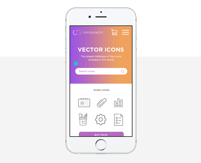
Use Foundation’s Promo Hero ready made screen to achieve this effect. Drag it to the canvas. The headline is displayed with a Paragraph widget and is totally customizable: change the text, font family, size and color. Choose from the range of Google fonts available in Justinmind to make your headline yours. Add a sub header too if you like.
The Hero screen contains two buttons by default, great for getting users up and running onsite in a flash. Update this screen as desired – remember, first impressions are important!

Designing a no-noise UI relies on the visuals. But making sure that the user can then move through that UI involves designing a clear UI flow. Navigation should be clear from the word go, or perhaps in your case ‘Shop Now’. A coherent UI pattern will help the user find their way around your site, so choose a navigation menu that makes sense.
Use Foundation’s Ecommerce Header to create a solid navigation menu in your web prototype. Customize the menu as desired, and remember to write the name of each of your purchasing categories in the Category text boxes.
Jakob Nielsen of the Nielsen Norman Group advises that mega menus work well for site navigation, particularly when there are lots of options like in an eCommerce site. They eliminate scrolling which saves time and are a visual way to guide users through their options. Why not try designing a mega menu in your Justinmind eCommerce prototype?
Make your search bar searchable with data-driven prototyping.
Finally, you may wish to add a footer to your homepage, to complete the navigation experience. Use the Ecommerce Footer for this. You’ll see that there are several suggestions for links you might want to include, such as Help, My Account, About and Social Media – customize this section as desired.
You’ll need a new screen for each page that your navigation menu takes users to – just like any online site that you access via a browser. To create a new screen, go to the Screens panel on the right-hand side in Justinmind. Click the plus button and the new screen a name. Do this for each new screen you need to create.

You may want to use the Foundation UI kit’s Product Card template in the screens that display products and items for items with lots of detail to be displayed. And if you want to add several options to the same item (e.g. different colors, patterns or sizes) use the Product Details screen. The Product filters and sliders are great options to help users sort items in each page.

Conversion in an eCommerce site relies on a user-friendly checkout experience. Make things easier for you and your user by using Foundation-standard elements. You’ll need to add Checkout, Order Summary and My Account screens too. Make use of the Foundation Add to Cart, Shopping Cart, Pricing Table and Multi-step Checkout features. Get the checkout right to prevent shopping cart abandonment.

Making your Foundation eCommerce web prototype come to life is easy with Justinmind’s native Events system. Similar to Foundation’s standalone Motion UI library, Justinmind’s Events system contains effects and animations, transition effects and mobile gestures to make navigation come to life and allow the user to interact with and browse your site.
As we’re creating a web prototype, most of our events are going to start with an ‘On Click’ trigger. This means that the user will need to click on a UI element to interact with it. We need to use ‘On Click’ + ‘Link To’ events to connect a navigation source link to the relevant target.
Note that the navigation UI elements in the UI kit already have these links set up. For example, click on the ‘My Account’ button and then go to the Events tab. You’ll see a URL event already set up. Double click on the event to add a target, i.e. the My Account page you previously created. Do this for all the navigation options in your web prototype.
Making your site responsive is really easy with Justinmind. Start by creating the differently-sized screens in the Screens tab (i.e. add a screen for Tablet, e.g. iPad would be 1024 X 768 pixels, and one for mobile e.g. iPhone 8 would be 2800 x 1342 pixels). Linking events and the constants component in the Justinmind expression builder will help you complete your responsive site.
Like most of Justinmind’s UI libraries, the Foundation UI kit is made up of modular and flexible components which means that they can be easily styled and customized. The atomic nature of the UI elements means that designers can build from the bottom up, with no design limits. Standard icons can be updated in line with brand guidelines and company style guides.
Justinmind’s Foundation UI kit offers a complete set of responsive navigation elements, including formatted breadcrumbs, tabs, accordions, pagination, vertical (columns) and horizontal (rows) drop down menus, collapsible navigation bars.
These navigation elements make for great responsiveness as they can be changed according to specific screen sizes. For example, the Full Navigation Bar for desktop switches to a drill down for mobile, the Mobile Navbar.
These individual elements can also be combined to create navigation flows and UI design patterns. For instance, create a mobile grid menu with items that appear upon expanding the slide navigation bar. To create this hidden navigation, pair the Featured Image container widget with Justinmind’s hamburger icon (found in the mobile widget libraries). You’ll need to use ‘On Toggle’ + ‘Resize’, ‘Move’ and ‘Set Value’ events to make the menu interactive . See our tutorial for more information on how to create grid menus as well as slide menus for iOS and Android mobile app prototypes.
These container widgets are great because they allow you to move and render multiple elements at the same time. Justinmind has a whole bunch of them too, including dynamic panels, data lists and data grids.
Foundation allows devs to adjust styles and properties of its UI elements easily using the Settings file (src>assets>scss>_settings.scss). The Settings file contains all the variables you need to adjust the default CSS styles and settings of components, such as button size, color, padding and spacing. This is great when you want to customize a website or mobile app.
Justinmind enables designers to do the same directly in their web and mobile prototypes. Select any Foundation UI element you’ve got on the canvas and head to the Properties tab. Here you can also change font, color, spacing and padding, as well as positioning, shadow and borders. Developers can even copy these CSS style changes directly from Justinmind and use them elsewhere.
Global styling in your web and mobile prototypes is also possible with Justinmind. Use our Templates to apply your corporate image to your prototype and maintain consistency throughout screens and across different prototypes. Masters are another helpful feature that allow you to spread global changes within a prototype.
Just download the Foundation UI kit from our UI kits page and install it in your Justinmind prototyping tool. For mobile-first, responsive web wireframing and prototyping, there is no better UI kit. See the difference now!