
We created a list of the top UI design principles that capture some of the most interesting faces of digital design. Check them out!
UI design has a huge margin for creating new things, but it’s not free from general rules. These UI design principles are all good to have in mind when designing a digital product, making for better experiences for all.
Free UI Design Tool for individuals and teams. Unlimited projects!
What makes a good UI design easy to read? What makes it easy for users to navigate? How do designers create an interface that makes the primary feature shine? What UI design tool are most popular? UI design is a rapidly changing game but it does come with general guidelines. Let’s take a closer look and see what these principles look like.
While these are often unspoken rules amongst the more experienced designers, they’re worth mentioning for newbies. When designing any interface, you want to know which bases need to be covered, no matter what.
If you want to venture into an inspirational type of post, check out our list of incredibly creative UI design examples.
This can sound a bit broad and general, but it’s a fundamental principle in UI that connects to many important concepts. A product that is easy to use is more likely to offer a high standard of usability, enjoy a short learning curve and be effective in helping users achieve tasks.
This can manifest itself in many different ways in a screen design. Ease of use tends to be closely related to high standards of usability, which can be difficult to live up to even to the most experienced among us.
A good example is the navigation design, which is the backbone of any product but represents a challenging aspect of UI. You want the navigation to feel effortless, to have users driving down the right roads with no need for signs to help them. The more content the product holds, the tougher it is to create a system that holds it all together in a way that makes it easy for users to navigate and discover new areas of the product.

Users that encounter any product for the first time have to explore a bit and discover the primary features, sometimes waiting a bit to advance onto the secondary ones. This first encounter is crucial, because it sets the tone for the experience and tells users what to expect. Their first impression is likely to dictate if they stick around or if they give up and abandon the product right there on the spot.
One of the most difficult things about UI design is that everything depends. The nature of the product will dictate what navigation is more appropriate, the users will affect the way that information is categorized and presented. The right UI pattern will depend on the function and the people using the product. Unfortunately, there’s never a one-size-fits-all approach to UI design. Part of the art of UI design is seeing the context and using that information to create an interface that still lives up to high standards of usability.
People want control over their experience with the product and it’s up to UI designers to make that happen. This applies to classic things like allowing people to get familiar with the basics of the product and then giving them power to create shortcuts to the tasks they do most often. It could also mean giving users the power to customize their interface, including things like the general color scheme.
There’s a right balance of power that users want. They want to feel in control, to have freedom to approach tasks in their own way. With that said, they also don’t want too much control, which can lead to overwhelmed users that quickly grow tired of having to make so many decisions. That is called the paradox of choice. When faced with too much freedom, most users stop enjoying the experience and instead resent the responsibility. Choosing, after all, requires cognitive effort.
This requires a balance that those in the gaming industry are intimately familiar with. Gamers enjoy choices, but overdoing it can ruin the game experience. Game UI design is all about giving users just the right amount of power.

That’s why UI designers operate within a certain margin of control that they pass on to users. They narrow down which parts of the product and the experience can be customized, identifying areas where users can create their own take on the design. A color change may sound silly to some, but it makes users happy to have a choice in the interface.
More complex stuff, like changing the general hierarchy of information or customizing highly technical aspects of the product – those don’t fall on the user to decide. People are happy to be walked to success, so they don’t need to worry about the complex or small. They want to focus on the task, on having fun. As UI designers, it’s our job to help them get there.
A solid example of this can be seen with any dashboard design, where complex information is broken down and made easy to digest. Even if you can customize the dashboard itself, the soul of the design will remain in order to get the main job done.
Free UI Design Tool for individuals and teams. Unlimited projects!
The layout is often called the foundation of any screen. This is where UI designers shine the brightest, some would say. Creating a product with a hot trendy style such as neumorphism is great, but functionality is the true art here. To create a layout that works, UI designers will use their visual skills to highlight the important things and encourage users to take a certain action. Ecommerce websites are well-versed in making compelling layouts that nudge people to give into temptation and buy those beautiful sneakers.
But what makes a layout UI work? How do designers know where each component goes, and how it all fits together?

The answer is a combination of factors that UI designers take into account. First, there’s the general rule of proximity of elements and visual hierarchy. This is about making the important things bigger and brighter, letting users know right away that this is what they should be focusing on. The hierarchy is a way of communicating to the user where their eye should go, what they should do.
The right hierarchy has the power to make users understand the content immediately, without using a single word. The proximity between elements plays a similar role, with components in close proximity being somehow related or closely connected.
Whitespace also plays an important role in the layout design. Most people who are only beginning to learn about UI design often underestimate the importance of whitespace or how much of it they’ll need to create a good visual hierarchy. The truly skilled designers use that empty space to give the user’s eye some relief and let the component guide their gaze through the screen. This can be taken to an extreme with the trend of minimalist website design.
UI designers know that maintaining a consistent design is important, for multiple reasons. When the word “consistent” is thrown around in the world of web design, it applies to both the visual and the interactions. The product needs to offer the same icons and elements, no matter its size or how much content it holds. That means that once the design team has settled on a visual identity, the product can’t stray from it.
The consistency is important because it will significantly help users learn their way around the product. That first learning curve is unavoidable for a brand new experience, but UI designers can shorten it. Ultimately, you want users to recognize the individual components after having seen them once.

Buttons, for example. After using the product just for a little bit, users should recognize primary and positive buttons from secondary ones. Users are already making the effort to learn how the product works and what it does – don’t make them learn what 9 different buttons mean. This means that buttons should not only look the same, they need to behave the same.
When it comes to the consistency of UI design, you want to be predictable. You want users to know what that button will do without the need to press it. A good example is having consistent button states, so your users know exactly how buttons behave throughout the entire product.
Despite the fact that most of us are now extremely familiar with digital products, it’s still a good idea to use real-world metaphors. Some designers feel very strongly that these metaphors improve the general usability of the product, because they are so easy to understand even at first glance.

There are many examples of these metaphors in elements that users will know and recognize. The silliest one, perhaps, is the garbage bin icon. It immediately tells us that anything placed in there will be removed from sight, possibly eliminated forever. There’s power in that kind of familiarity. It’s the reason why buttons look like real physical buttons or why toggle switches look like actual switches. Arguably, all icons are real-life metaphors.
These metaphors can be a handy way to communicate an abstract concept, putting into more concrete terms. Without using any words, designers can use their visual skills to convey ideas and the product becomes much easier to understand.
Free UI Design Tool for individuals and teams. Unlimited projects!
What would UI design be without user personas? It would probably result in broad experiences that have an absurdly high failure rate, aimless and directionless. Not just user personas, but all design materials are important for both UI and UX designers.
User personas capture the idea of the final user, giving them a face and offering details of their lives and what they want. Originally created by the marketing industry, they are just as helpful for UI designers. Despite it being a fictitious profile of a person that doesn’t exist, the idea and the group of people that it represents are very much real. It gives the design team clarity on what the users want, what they experience and their ultimate goals.

On a similar note, mental models are also crucial. Rather than capturing the ideal user they capture how those users think. It showcases their reasoning, which can be very helpful in UI design. More often than not, when screens or elements don’t perform well it’s because they simply don’t respect the user’s mental models – which means users don’t get it. For them, that just doesn’t make sense.
The same can be said for other materials, such as user flows or user scenarios. All of these materials add value to the design process, resulting in a tailored product that is more likely to succeed.
Most experienced designers will agree that starting off an interface with the visual details like the color scheme is a bad idea. There’s a good reason why most wireframes start with nothing more than varying tones of grey – colors and details are distracting.
Most UI designers will start their planning of the basic bones and layout with UI sketching on paper. From there, the project evolves into a digital rendering of the design in black and white. This gives them a chance to focus only on the efficiency of the space, prioritizing things like the visual hierarchy of key elements.
Slowly and over time, designers will build on this grey base and add more details. It’s true that some design teams start testing very early, even when wireframes are nothing but a bunch of boxes. Regardless, this grey design grows as the designer adds colors, details and actual content.
The concept at play for this UI design guideline is that users need feedback for the experience to be truly good. Unlike people, who send out tiny body language signals, the device won’t communicate anything unless the UI designer stipulates so. People need to know not only that their actions were registered, but also a general context that helps them around the product.
This user feedback and context can come in many forms. One of the most commonly used is microinteractions, which tell the user that things are clickable or that the system is working behind the screen. A loading icon that holds a brief interaction is the perfect example.

You want the feedback to be instantaneous, so there’s no room for confusion. Users don’t like uncertainty and using feedback can be a way to have much more efficient communication between user and product. With something as simple as a button moving slightly up when the cursor hovers above it, UI designers can tell users that button can be clicked or that the element is responsive and dynamic.
These simple cues are something UI designers have grown to do almost instinctively. They know that users need this sort of context in order for the product to shine, and so they look for these opportunities everywhere. These little details matter and make the entire experience better for users.
A classic example of simple but crucial feedback are the different states of key components, such as toggle UIs, dropdown UIs as well as the feedback from the well-loved card UI design pattern. If you’re interested in specific components, we also recommend you read our post on the debated choice between radio buttons vs checkboxes.
Free UI Design Tool for individuals and teams. Unlimited projects!
Wireframing the ideas and the general product tends to fall to UI designers. As a general UI design rule, wireframing is unavoidable. It’s the first few steps of the product, representing the first tangible representation of the digital solution.
Starting off as a bunch of boxes and tones of grey, UI designers will use the design materials like user personas to create a wireframe that fits the user. This is about capturing the general functionality of the product, laying the foundation of the bare bones. Things like the navigation, main pieces of content and the representation of the primary features – they all play a part in the wireframing process.

As the team begins to test the general usability and performance of the wireframe, a cycle emerges. The wireframe is tested and the results will dictate what parts need to be improved or completely changed. One of the best things about wireframes is that putting them together quickly is possible, bringing the ability to quickly change course if need be. Feel free to check out our guide to accessibility design for more on that.
Truly skilled UI designers are all about wireframing. They understand the process and what information to use, which factors influence the design. They go out of their way to validate the wireframe at every turn, before a new layer of detail is added. Slowly, the wireframe will give way to a high-fidelity prototype, where all the final visuals are represented.
Usability can mean different things to different design teams. It’s often the case that most designers will associate user testing to the performance of the design – in terms of how many users can complete a task under X time. To others, the testing takes a bigger meaning, representing the very point-of-view of the users, with the data being the only way to know what users truly want.
Ultimately, user testing is done for an extended period of time. Starting in the wireframing stage and going all the way to the release of the product (sometimes even further). Designers will invest real time and effort into testing, simply because it pays off. Any changes that the testing leads to are welcome, because they represent improvement done for little cost. If these improvements needed to be done much later on the project, they would have come in the form of delays and absurd costs.
The methods can vary due to how many alternatives there are out there now. From unmoderated tests that enjoy hundreds of participants to moderated interviews and observation sessions – there’s a right path for every team no matter the budget and time restraint.
For UI designers, there’s a real need to get familiar with the world of usability and user testing. Why and how it’s done, which methods work best depending on what needs to be validated. Acceptance of changes made due to testing results and true understanding of the role of testing in the entire project. These are all crucial things to UI designers, even if their team includes a UX researcher.
UI design guidelines can feel very broad, we get it. But that’s only because UI design in itself is indeed a wide world that includes many factors to be considered. With that said, it also comes with ample margin to let our creativity run free with artists all over the world flocking over to UI design.
PROTOTYPE · COMMUNICATE · VALIDATE
ALL-IN-ONE PROTOTYPING TOOL FOR WEB AND MOBILE APPS
Related Content
 Shopping carts are a key part of any ecommerce. But what makes a shopping cart good? And what can we do to improve its conversion? Read on and find out!13 min Read
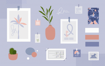
 Communicating UI design ideas isn't easy. Mood boards project your creativity in a visual way, letting you get back to what you do best: designing. They also serve as a useful style guide as you work. Here are some great examples and tools for your next brainstorming session!10 min Read
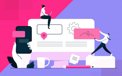 See 30 responsive website examples along with what makes them good or bad. Get 5 best practices to follow for your next responsive design!15 min Read

