
Creating a good survey involves a lot of different factors, but what makes a great survey? Check out these examples for serious inspiration!
Research surveys are all about asking the right questions and gathering data. Especially during the initial stages of the product design, surveys can help us better understand users and their lives. While creating a survey can seem like a rather easy task, there are a few crucial factors we have to consider with this type UI design.
From making sure we choose the right words to establishing a sound visual hierarchy, designing a survey can have its own pitfalls. So, what do great surveys look like? You’d be surprised at how much room there is to get creative with research surveys while still getting the job done. Let’s take a look at some inspiring research survey examples that got it right! Keep your UI design tool ready to go – we’re about to dive deep into design.
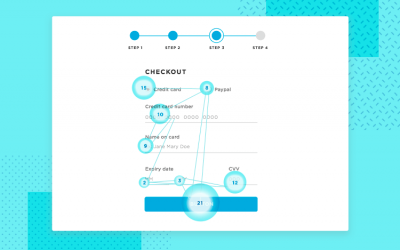
Designing a good research survey can seem deceptively easy at first. Slap a couple of relevant questions, divide the space with a layout and add a CTA button. However, a research survey that gathers good data and offers a good user experience to users isn’t quite so simple to put together.
From an administrative point-of-view, there’s the question of wording things correctly. While this isn’t always up to the design team, it’s worth remembering that each question has to be written in a clear and exact way. This is to avoid users feeling confused, as well as to make sure the data we obtain from the survey can be trusted.
You can find a full story, with all the details, in our guide for web form design. From a design point-of-view, here are a few key factors you want to consider:
The layout is crucial. Surveys serve an important role of gathering data that will, hopefully, orient design decisions. No matter how important they are, no user truly likes having to answer all those questions – so it’s up for designers to make it as easy as possible for them. By dividing the space well, we can get that initial perception of complexity that can intimidate users. The right UI layout can put users at ease and create a clear survey that doesn’t overwhelm people.
The right UI components. It’s important to respect the main function of the common UI components found in surveys and forms. Using radio buttons for questions that accept one single answer or checkboxes where many options can be selected at once is a good practice. As seasoned designers will tell you, users already know these components and how they behave – don’t fight the usual suspects.

Offer as much context as you can. Surveys and forms already require a lot of cognitive effort from users. The last thing you want is confused users who aren’t sure of what is being asked or if their answer is acceptable. That’s why it’s important to use things like in-line validation methods to assure users that they did things right, or offer descriptive error messages that help them fix any mistakes. You can find more details on our post: how to design error messages.
Buttons are important. Simply having a large button that says “SEND” might be easy to include in the survey design, but you want the button to do more than just sit there. The CTA needs to draw attention, help users understand what the pressing of the button means. Things like the microcopy can make a real difference in the general UX of the survey. You can find more details on our post on button design.
The research long-form survey example, brought to us by Ahmed Yasser, is all about negative space and smart use of proximity between the elements. The layout is divided into sections by horizontal lines, improving the initial perception of complexity. This is just another way of saying that the layout and distribution of the elements help users to not feel intimidated by the number of questions upon first glance.

Created by Boris Milosevic, this survey example shows the power of creating two different takes on the same form. By allowing users to choose which type of certificate they need, Boris basically created two forms that adapt to the user’s needs. The form expanding interaction survey is dynamic and showcases a survey example that adapts to the user’s actions!

This makes for a very interesting research survey example. Designed by design studio Floab, the Cekaja survey is a good example of a flexible and adaptable form design. The survey works both in web and mobile format, using lines to outline the available options under the questions. This works to clearly show users which option they have selected, with the entire outline changing states as opposed to only the radio button changing.

Unlike the other previous survey examples, this Questionpro survey is also a template that anyone can make use of. Perhaps because it’s a template, this product satisfaction survey is free of any eye-grabbing visuals which makes it a great base to start with and add your own flare. Designers can see the template in action both in web and mobile format, with the survey design adapting well to both. It also brings us some very well-planned visual hierarchy.

This research survey example is also a template that designers can build on. Created by the folks over at SurveyMonkey, this survey makes for an interesting case. The questions in the market research survey are well spaced, with some of them being very interactive. A good example is a question regarding what users like the most about an image – where users can click on different areas. This shows that surveys don’t always have to be static and predictable, but can still surprise users in a good way.

This research product testing survey example is somewhat similar to the previous template, also including the dynamic image question. Like all survey templates created by the professionals at SurveyMonkey, every care is taken when it comes to offering users as much context as possible. Every available option, be it a radio button or a picker, all components are interactive and change states according to user actions.

This survey example is interesting because it deals with a topic that can be difficult to quantify. Exercise and diet habits can often have shades of grey as opposed to black and white terms – but how do we reflect that on the survey? SurveyMonkey found that a slider can help users put their opinions into words, making for a visual survey that doesn’t force users to categorize their own health in absolute terms. It’s a smart approach to surveys, offering an intuitive form that works with users!

This research survey example goes to show that you don’t always need special components or striking visuals for a survey to get the job done. This SurveyMonkey school climate survey template showcases a basic structure that can easily be adapted for everything.

You can also check out these two trendy styles of UI design: neumorphism and skeuomorphic design.
This survey, unlike the other examples on this list, uses a blue background. The bold use of color doesn’t take away from the usability of the fundraising feedback template, maintaining the context and changing states of the available options. We like that SurveyMonkey has a progress bar at the bottom, even if the survey doesn’t occupy several screens – users always appreciate knowing where they are.

This research survey example by SurveyMonkey goes even further than the last one. Instead of using color in the background, we have a textured wood visual. The text in the TV viewing survey is done with a relatively large font in white, conserving the changing states that give the experience a bit of context. It’s creative and goes to show that an unusual approach to surveys can result in a memorable experience.

This concept is all about making the process of interviewing stakeholders easier, using a survey template. In this research stakeholder interview survey example by Grzegorz Oksiuta for Talebook, we see a modular approach to building surveys. It’s all about open-ended questions, which means we won’t find radio buttons or checkboxes. Instead, we have input fields where the answers can be developed as much as needed.
You can also find some great general advice on how to approach dashboard design in our post.

We like that Glenn Van Bogaert created a survey that makes the best of the space, using color to draw the eye of the user. The free code camp survey questions use radio buttons and checkboxes, dropdowns and input fields. Each component comes with changing states and great usability – a hallmark of any good survey!

Another basic template brought to us by SurveyMonkey. This one comes free of any visuals, focusing only on the functionality. The price testing survey example uses a mix of radio buttons and checkboxes, as well as input fields. We like that the questions paint a picture, offering specific scenarios to users and trying to assess how they’d react in real life.

This is another great example of a survey that focuses on functionality as opposed to visuals. It’s a basic business travel template by SurveyMonkey that relies on a radio button system that often includes an input field at the bottom in case users want to add to their answer. It’s simple, interactive and a great building block for designers looking to add their own style.`

In this survey template, we can find a few interesting details. Created by the folks over at SurveyMonkey, the market sizing survey template is already spaced out between several screens. It includes error messages, like a warning that the questions need to be answered before the user can move on to the next screen.

In this survey example, also created by SurveyMonkey, we have a series of questions that make use of varied UI components. From radio buttons, checkboxes, input fields and dropdowns, the target market survey example is all about function – including the error messages. Anyone looking to have a great base to build their own survey on will likely find an ally in this template!

This research survey example is all about keeping things visual and dynamic. Created by Typeform, this process improvement survey template makes it so that users can only see a question at a time – making the whole thing feel simple and easy. We love that the interactions are vibrant and exciting, creating a survey that is easy for users to complete.

Another survey example that feels dynamic and easy, this Typeform vendor satisfaction survey template is all about the visual experience. We love that Typeform makes it easy to understand the keyboard shortcuts, as well as the visual illustrations and components that make up the survey. It relies on contextual changing states, offering great usability all around!

Check out our full guide to game UI design and explore a new type of UI that you can have fun with!
This system usability survey example tries to quantify how users feel and who they are, which results in a lot of pickers and visual components. This survey by Typeform doesn’t force users to categorize their experience in absolute terms, instead offering a scale from which users can select the option that is closest to their feelings. It’s dynamic, it’s easy and doesn’t go on for longer than necessary.

Yes, a survey… to schedule a survey! This research scheduling survey example makes great use of the available space, offering users a calendar and a list of radio button options. We love that Diana Palavandishvili took the time to create different states for the days of the calendar. The current day, the selected day and the day that the cursor is hovering over all showing different states, making the experience easier for users.

UX design doesn’t deal well with absolute terms, which is why the line between a survey and a simple form can often be blurry. In this survey example, we have another design that spreads the questions throughout several screens which effectively decreases the perception of complexity. We love that each question takes up the entire screen, making the entire experience easier for the user. Another great point with the daily UI form survey example is that Namika Haiji Hamasaki created more visual ways to approach the answers, making it dynamic and enjoyable!

This research survey example, created by Amit Das, doesn’t use bright colors but instead relies on the visual hierarchy and smart choice of components. We love that the components have enough empty space between them for visual relief, as well as the progress bar at the top. The questionnaire on mobile and web survey is also divided into several screens, with the progress bar showing users just how close they are to the final screen.

Another wonderful example of a mobile research survey, this one brought to us by Derlaxy. We love that this survey makes smart use of color to draw attention to the CTAs, as well as more visual and interactive components, making the survey app v.2 wonderful. Together, these two factors create a survey that doesn’t overwhelm users, helping them get to the end with the least bit of cognitive effort needed. Go, Derlaxy!

This survey example is in a mobile format. It’s not a template, and therefore it already includes all the visual design to make it a beautiful experience. Designed by uixNinja, the mobile application form survey offers a new take on radio buttons that add a fresh feel to the survey experience. We love the spacing of the elements, as well as the color palette.

This research survey offers a minimalist approach. The minimal app questionnaire is all about white space and allocating more space for the possible answers. We love the visual impact of such large buttons, making it easy for users to select their answer without worrying about their finger missing the target.

Unlike our previous survey example, the goal creation in treatment app survey is all about layout. The screens are divided into sections, with a clear distinction between where one question ends and another begins – even in a small mobile screen. We love that this survey example tries to have a more visual approach, offering users things like a variety of emojis to represent their emotions.

We love that the survey for iPhone X takes familiar UI components that we all know and love, and adds a fresh spin to them. Classic components, like radio buttons, maintain their familiarity but are also personalized – creating an unique experience. Another great detail is the progress bar at the top, as well as an indicator of the number of questions at the top of each new question. It creates a context-rich design that tells users exactly where they are.

This survey example also makes for a memorable experience, with the design creating a modern and sleek vibe that isn’t often found on civic engagement projects. It’s true that dedicating so much of the screen space to the question itself has been known to be the center of debate in the design community, but Jay Goggin pulls it off. In our book, the Polco policy types survey is a win!

This research survey example is one single screen, but it’s a great one. The survey mobile app is all about bold color and sleek interaction design. We love the bright background, which delivers quite an impact but doesn’t take away from the question at hand. The general design feels modern and friendly, making for a young vibe.

Surveys can be a handy way to harness information about users or stakeholders – but they need to be done right! Whether it be a functional layout, a well-placed interaction or a simple CTA that works, surveys can deliver a great experience while getting the job done. Hopefully, with these examples, you’ll be feeling inspired and ready to ask your users all the right questions.
PROTOTYPE · COMMUNICATE · VALIDATE
ALL-IN-ONE PROTOTYPING TOOL FOR WEB AND MOBILE APPS
Related Content
 Prototyping forms is a sure way to improve the usability of the resulting form. Testing your form is a way to make sure you and your users speak the same language!13 min Read
 With the rise of mobile devices, we can fill out forms on the go and enjoy the practicality of it all - until a particularly poor app form design gets on our nerves.16 min Read
 Login page designs should be easy to understand and require no thought from the user. Here are 20 to inspire your next design13 min Read


