
Splash screens give UI designers the chance to make a bold first impression and reinforce brand identity.
Splash screens may be an innocuous part of the user experience. It’s just a launch screen, there’s not much to it. But first impressions count and the devil is in the details. With the right prototyping tool, you can even make your own in a matter of minutes.
Start designing new products today. Enjoy unlimited projects.

Before you do, let’s take a closer look at splash screens, and 30 inspiring examples to get you started.
A splash screen is a screen that appears when you open an app on your mobile device. Sometimes it’s referred to as a launch screen or startup screen and shows up when your app is loading after you’ve just opened it. When the loading is finished, you’ll be taken to a more functional screen where you can complete actions.
Splash screens appear on your screen for a fleeting moment – look away and you might miss them. Traditionally, you’ll see a logo and company name and, if you’re lucky, the company motto.
You might think of them as a waste of time, an afterthought or something not to bother thinking about. But they’re good for strengthening brand identity and perception. Google’s Material Design highlights that they’re the user’s first experience of your application. And first impressions count, right?
Take Skype’s splash screen. It shows their logo in pride of place, with a soft gradient. Then when the loading is ready, the icon will animate and bounce around. A nice bit of UX whimsy. Whereas there are other splash screens, like Medium and Etsy, which incorporate fun, relevant and bespoke illustrations that fit in perfectly with the brand and reinforce their identity, be it a form of dashboard design or a social media platform.
Sometimes an app doesn’t take very long to load. In this instance, you may come across a placeholder UI instead of a branded launch. Maybe your app doesn’t need to reinforce its brand identity in which case you’ll see core structure elements on your app upon open which don’t display any content like so:

Splash screens are simple. They’re used to enhance a brand and give users something nice to look at as they wait. In this regard, here are some best practices for when you design your own splash screen:
- Keep it free from unnecessary distraction
- Don’t use multiple colors or logos
- Use animation sparingly
- Include it in the design early on, on the low-fidelity wireframe.
If you can, allocate some time and space in your paper prototype for your splash screens. The earlier you consider them, the more aligned they will be with the rest of the product design.
Creating a splash screen in Justinmind is super simple. When you download Justinmind and start a new prototype, you have at your disposal a treasure trove of awesome pre-built UI widgets.
Using a default mobile screen, you can just drag an image widget and a text widget onto your canvas in the desired position. Add your own images and color preferences and voila. Combined with interactions, your screen will change after your desired time (it’s a splash screen, so don’t leave your users hanging!).
Go here for more on prototyping mobile UI animations with free downloadable examples.
Looking for other types of inspiration? Don’t miss out on our post of wonderful wireframe examples or on this list of creative UI design examples.
We have two very different approaches to splash screen design here. On the one hand, Amazon keeps it simple and focuses on branding. On the other hand, Etsy communicates creativity and transmits the brand identity in a completely different way!

While it may immediately appear so, this is another example of different takes on splash screen design. Booking.com makes an impact with its background color, while Airbnb keeps things light with nothing but its logo on the screen.

This splash screen for Uber is actually a Dribbble concept from Bryant Jow, but we love it so much we included it here. Like Cabify, this aims to make a visual impact.

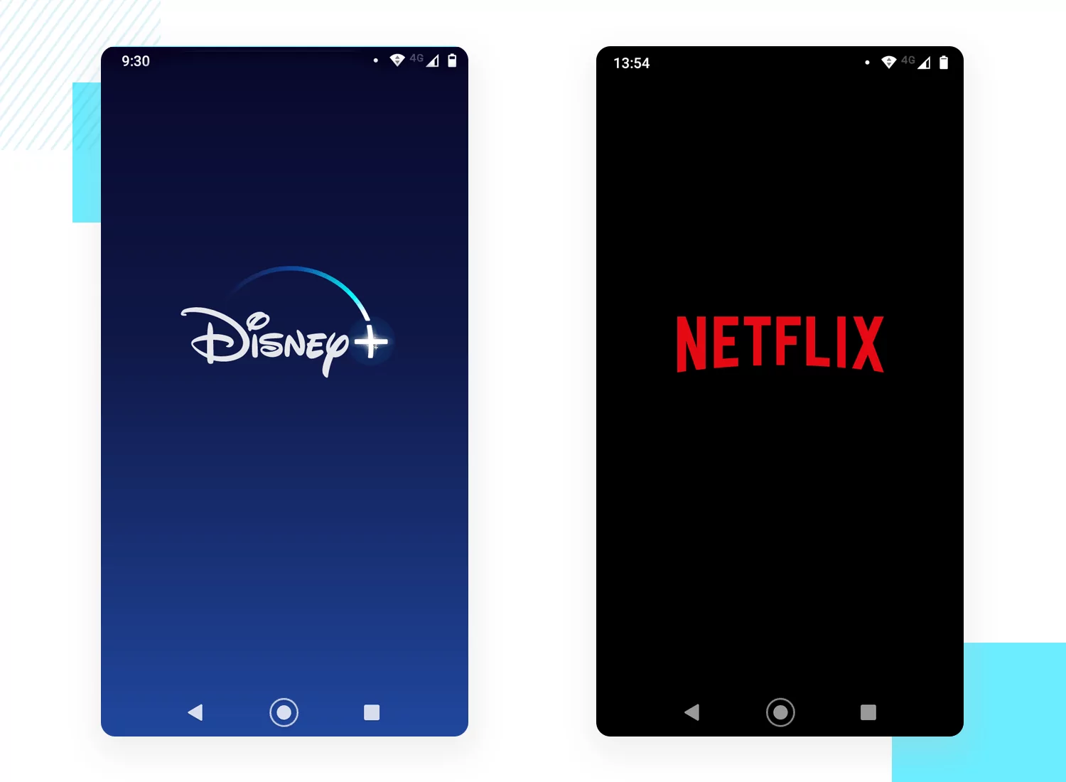
Both Netflix and Disney+ make the most of their background, creating a sharp contrast between the background and the logos. It’s dramatic in the best way!
Start designing new products today. Enjoy unlimited projects.
Another good example of different takes. 8Fit keeps things light and clean, including only their logo. VG-FIT goes in the opposite direction with a dramatic background and their name as well as their logo.

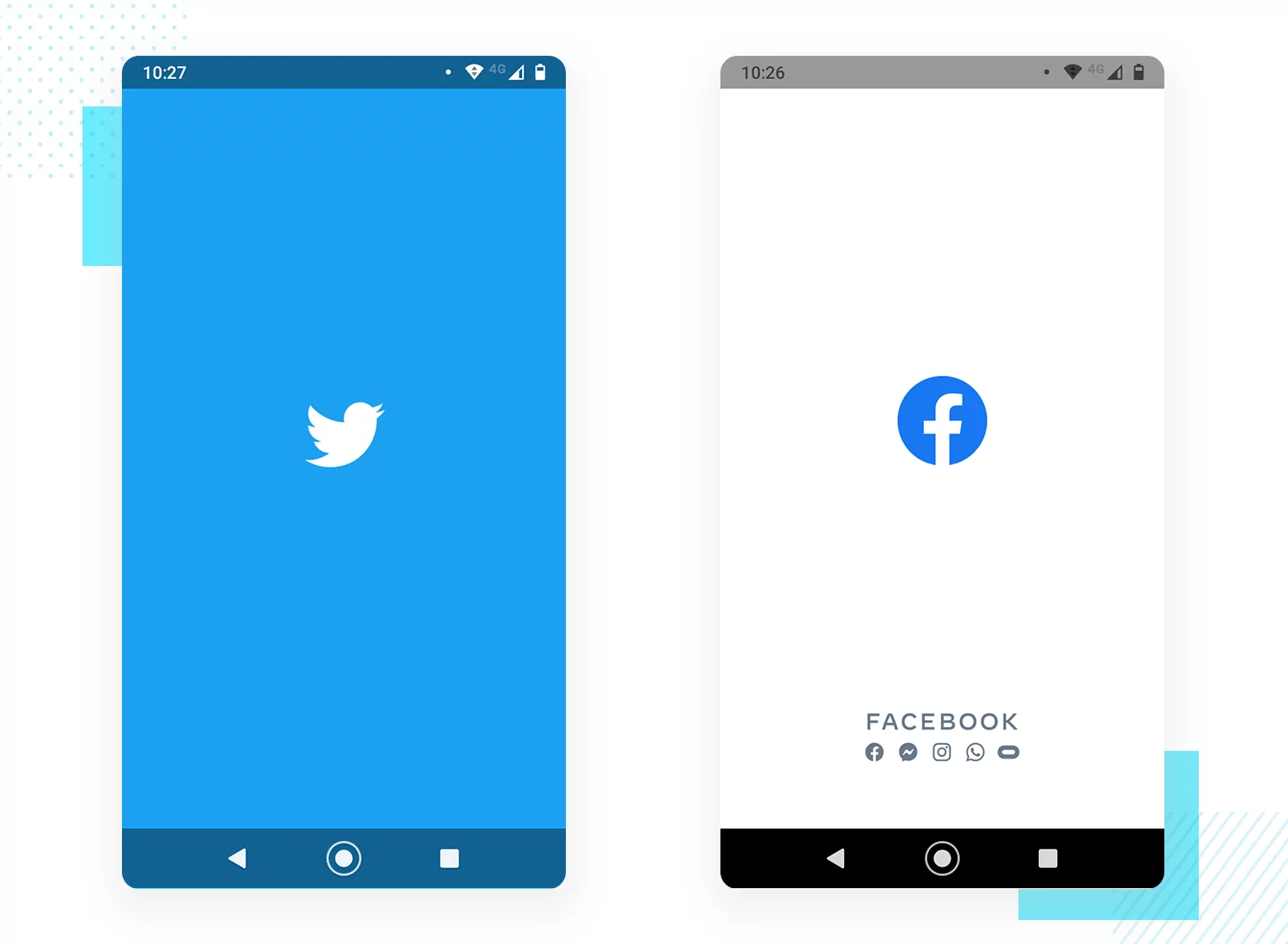
Both social media networks go for a dramatic background that reflects their brand. It’s what is expected, sure. However, it still delivers a great impact and makes for a visually pleasing experience.
The Vueling splash screen was created by Victor López Gonzàlez, resulting in a screen that points to the brand identity and culture of origin. Ryanair goes for something simpler, aiming to create a nice contrast between logo and background.

The splash screen design that King offers users relies on a big visual impact of the background, creating a contrast with the logo. The Pokémon splash screen goes for a white background, allocating more space to their logo – establishing a visual experience that relies on the graphic design and not the palette.

Start designing new products today. Enjoy unlimited projects.
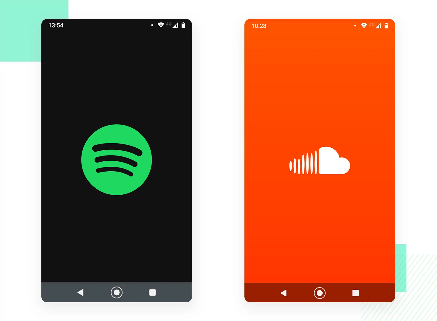
Skype uses its splash screen in order to reinforce its brand identity, relying on its classic blue and adding a gradient for extra flare. Discord, on the other hand, does something interesting: the splash screen colors will reflect the setting of the palette that users have on their device. It’s a smart way to customize every aspect of the experience!

Dropbox went for a bright splash screen that draws the eye, establishing a strong visual cue. Google Drive took a different approach, offering a soft white background that lets the logo shine bright.

Once again, we have contrasting choices of splash screen design. Twitch offers a bright purple background that reflects its brand color, with a white logo. Youtube maintains a fully white background, making its red logo stand out visually.

The Bitly splash screen, we confess, was uploaded by Matt Delac and not by the company. But we couldn’t leave it out of this list! It reinforces the brand identity and biggest selling point, making for a very smart use of the space. Owly relies on a solid black background that makes its logo stand out.

Start designing new products today. Enjoy unlimited projects.
Bear offers a bright red background that contrasts sharply with the white logo, and strikes an interesting disparity with Evernote. Although it used to have a splash screen that offered an illustrated green background, Evernote switched it up for a classic white background with a simple green logo.

Linkedin took a page from other social media networks’ books, creating a background that is of solid color. Tik Tok took a slightly different approach, using color but also creating a certain gradient style to the background.

Splash screens can be a way to bring a little delight to your users or an opportunity to reinforce your brand identity. Whatever reason you design your splash screen for, make sure that it doesn’t cause the loading time to go on any longer than it should.
PROTOTYPE · COMMUNICATE · VALIDATE
ALL-IN-ONE PROTOTYPING TOOL FOR WEB AND MOBILE APPS
Related Content
 There really is no faster way to get started than using a pre-designed web app template that you can tailor to your taste.6 min Read
 Looking for a quick start in a new project? Discover these 37 free practical app templates made by the Justinmind team just for you.13 min Read
 Looking for a quick start in a new project? Explore these 30 practical 100% Free website app templates designed by the Justinmind team just for you.14 min Read


